
When it comes to analyzing data, understanding its spread is crucial. The spread of data refers to the distribution or variation of values within a dataset. By measuring the spread, we can gain insights into the dispersion or concentration of the data points. This information is valuable in various fields, including statistics, finance, and data analysis.
Measuring the spread of data allows us to determine the range, variance, standard deviation, and other statistical measures. These metrics help us quantify the extent to which data points deviate from the mean or central tendency.
In this article, we will explore different methods and techniques to measure the spread of data. Whether you are a data scientist, business analyst, or simply someone interested in understanding the variability in datasets, this guide will equip you with the knowledge and tools to effectively measure and interpret data spread.
Inside This Article
- Definition of Data Spread
- Range as a Measure of Data Spread
- Variance and Standard Deviation
- Interquartile Range (IQR) and Box Plots
- Conclusion
- FAQs
Definition of Data Spread
Data spread, also known as data dispersion or data variability, refers to the extent to which data values are spread out or dispersed in a dataset. It is a measure of the diversity or range of values present in a set of data. Understanding data spread is essential in various fields, including statistics, finance, and data analysis, as it provides insights into the distribution and variability of data points.
Data spread is a crucial concept as it helps in assessing the overall characteristics of a dataset. By analyzing the spread of data, we can determine the range of values, identify outliers, and gain insights into the overall shape and distribution of the data.
There are several measures used to quantify data spread, each providing different perspectives on the variability of the data. Some commonly used measures of data spread include range, variance, standard deviation, interquartile range (IQR), and box plots. These measures help in analyzing and comparing the spread of data across different datasets or within a single dataset.
By understanding the concept of data spread and utilizing appropriate measures, researchers, analysts, and decision-makers can draw valuable insights and make informed decisions based on the variability of the data. Whether it’s identifying trends, detecting anomalies, or understanding the level of dispersion, a thorough understanding of data spread is essential for accurate analysis and interpretation of data.
Range as a Measure of Data Spread
When it comes to understanding the spread of data, one of the simplest and most intuitive measures to consider is the range. The range is simply the difference between the highest and lowest values in a dataset. It provides a quick snapshot of how widely the data is dispersed.
To find the range, you subtract the smallest value from the largest value. For example, if you have a dataset of cell phone prices ranging from $200 to $1000, the range would be $1000 – $200 = $800.
While the range is easy to calculate and understand, it does have its limitations. One major drawback is that it only takes into account the extreme values in the dataset, ignoring the distribution of values in between. This means that a dataset with a single outlier can have a range that is not representative of the overall data spread.
For example, consider a dataset of cell phone screen sizes ranging from 4 inches to 7 inches, with the majority of values clustered around 6 inches. However, if there is one outlier with a screen size of 12 inches, the range would be calculated as 12 – 4 = 8 inches. This can give a misleading impression of the actual spread of data.
Despite its limitations, the range can still be a useful measure of data spread in certain situations, especially when you need a quick and rough estimate of the overall range of values. However, for a more robust and accurate measure of data spread, it is recommended to consider other statistical measures such as variance, standard deviation, interquartile range, or box plots.
Variance and Standard Deviation
When it comes to measuring the spread of data, variance and standard deviation are two commonly used statistical measures. These calculations provide valuable information about the variability of a dataset, allowing us to better understand how individual data points deviate from the mean.
Variance is a measure of the average squared deviation of each data point from the mean. It quantifies the spread of data by calculating the average of the squared differences between each data point and the mean. By calculating variance, we can determine how widely dispersed the data points are around the mean value.
Standard deviation is the square root of the variance. It is often preferred over variance as it is expressed in the same unit as the original data, making it easier to interpret. Standard deviation provides a more intuitive measure of spread, representing the average distance between each data point and the mean.
Both variance and standard deviation quantify the spread of a dataset, but each has its own advantages and use cases. Variance provides a numerical value that is easy to calculate and understand. However, it is expressed in squared units, which may not always be meaningful. Standard deviation, on the other hand, is more commonly used due to its intuitive interpretation and ability to compare different datasets.
When interpreting the standard deviation, a lower value indicates that the data points are closely clustered around the mean, while a higher value suggests a more spread out distribution. This information can be crucial in many fields, such as finance, where understanding the variability of data is important in decision-making processes.
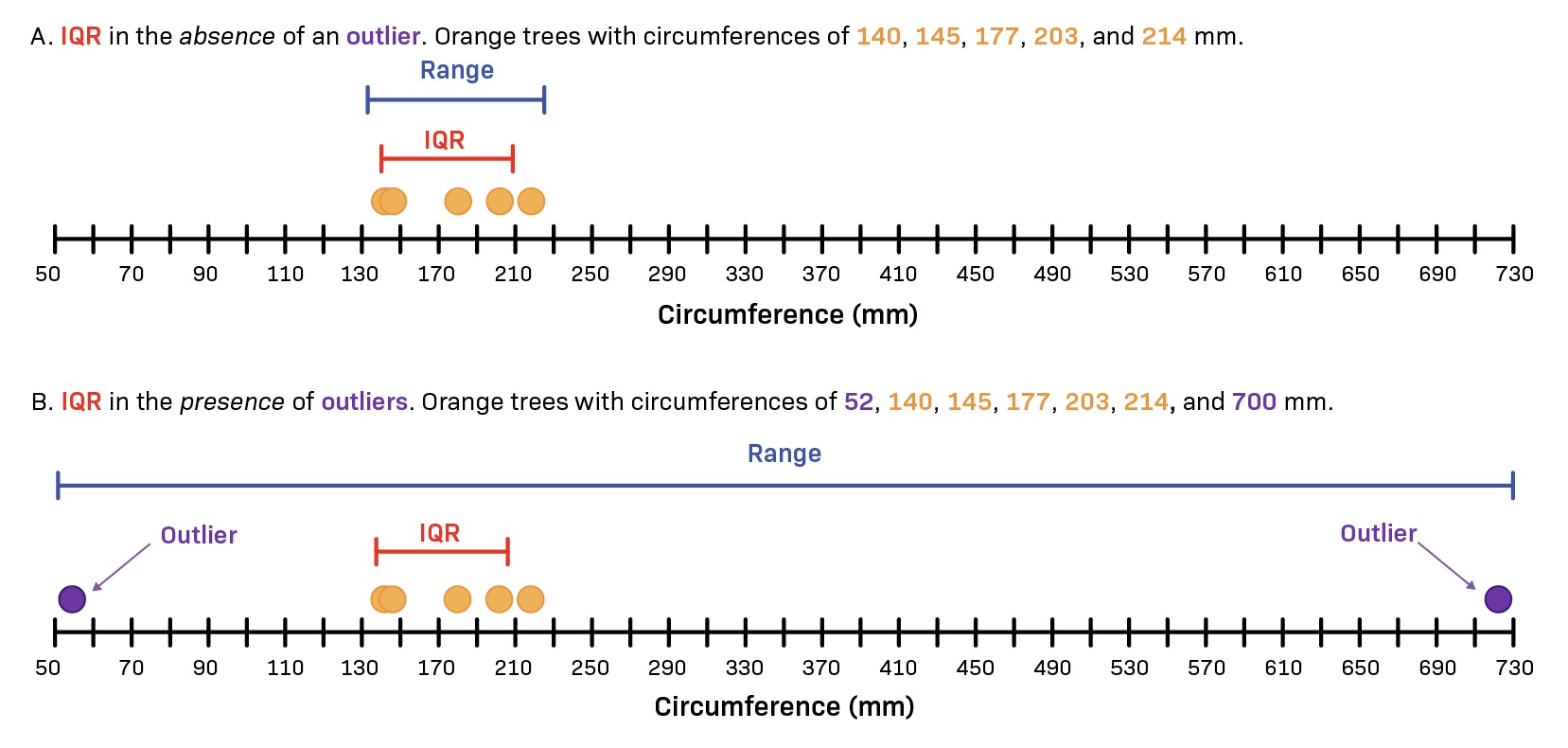
Interquartile Range (IQR) and Box Plots
When it comes to measuring the spread of data, one useful tool is the interquartile range (IQR) and its visual representation, the box plot. The IQR provides valuable insights into the distribution of data points and helps identify potential outliers.
The IQR is calculated by subtracting the first quartile (Q1) from the third quartile (Q3) in a dataset. In simple terms, it represents the range of values that contain the middle 50% of the data. This range is less sensitive to extreme values and can provide a more robust assessment of data spread compared to using the full range.
Box plots, also known as box-and-whisker plots, visually depict the IQR and other key statistical measures of a dataset. The plot consists of a box that represents the IQR, with a line drawn within it to indicate the median. The whiskers extend from the box to represent the minimum and maximum values within a certain range, typically 1.5 times the IQR.
Box plots have a clear and concise visual representation of data spread, making it easier to quickly identify outliers or skewed distribution. Outliers, which lie outside the whiskers, can indicate data points that are significantly different from the rest of the data. Skewed distribution can be identified based on the asymmetry of the box plot, with the whisker lengths differing on one side.
By analyzing the IQR and examining the box plot, you can gain valuable insights into how data is distributed and the presence of any unusual observations. This information is crucial for various fields, including statistics, finance, quality control, and data analysis.
Conclusion
The spread of data is a critical concept to understand when analyzing and interpreting information in various fields. By measuring the spread, we gain insights into the variability and dispersion of data points, allowing us to make informed decisions and draw meaningful conclusions.
In this article, we explored different methods of measuring data spread, including the range, interquartile range, variance, and standard deviation. Each of these measures provides a unique perspective on the spread of data, catering to different needs and objectives.
Remember, choosing the appropriate measure of spread depends on the nature of the data and the specific analysis goals. By understanding how to measure spread, you can ensure that your data analysis is accurate and reliable.
So, the next time you encounter a data set, consider using these measurement techniques to gain a comprehensive understanding of its spread. Armed with this knowledge, you’ll be equipped to make informed decisions, identify patterns, and drive meaningful insights from your data.
FAQs
Q: What is data spread?
Data spread refers to the measure of how dispersed or spread out a set of data points is. It provides insights into the variability and distribution of the data.
Q: Why is measuring data spread important?
Measuring data spread is crucial because it helps in understanding the distribution of data points and analyzing the variability within a dataset. This information can be used to make informed decisions, identify outliers, and assess the significance of the data.
Q: How do I measure the spread of data?
There are several statistical measures used to quantify data spread, including the range, variance, standard deviation, and interquartile range. Each measure provides a different perspective on the spread of data and is chosen depending on the specific context and requirements of the analysis.
Q: What is the range?
The range is a simple measure of data spread and is calculated by subtracting the smallest value from the largest value in a dataset. It only considers the extremes and does not provide insights into the distribution of the remaining values.
Q: What is the standard deviation?
The standard deviation is a common measure of data spread that takes into account the dispersion of data points from the mean. It provides a measure of how closely the data is clustered around the mean and is calculated as the square root of the variance.