
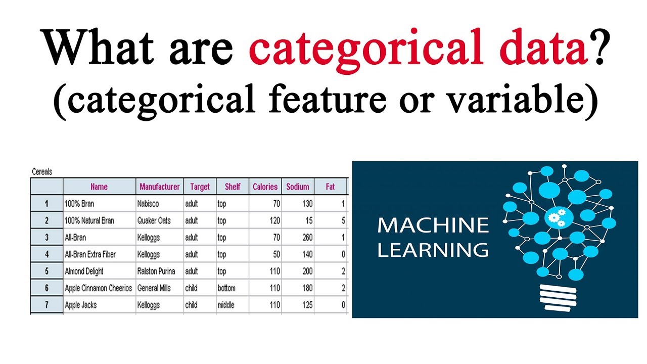
When it comes to analyzing and interpreting data, one of the fundamental tasks is describing categorical data. Categorical data consists of distinct categories or groups that do not have a specific numerical value associated with them. Examples of categorical data include gender, marital status, occupation, and education level.
Describing categorical data involves understanding the distribution of categories within a dataset and summarizing their characteristics. This information can be valuable for gaining insights and making informed decisions. In this article, we will explore various methods and techniques for describing categorical data effectively. Whether you are a researcher, data analyst, or simply interested in understanding categorical data, this guide will provide you with the necessary tools and knowledge to describe and analyze this type of data accurately.
Inside This Article
- Understanding Categorical Data
- Methods for Describing Categorical Data
- Frequencies and Percentages
- Bar Charts and Pie Charts
- Measures of Central Tendency
- Measures of Dispersion
- Conclusion
- FAQs
Understanding Categorical Data
When working with data, it is important to understand the different types of data that can be collected. Categorical data is one such type, which represents characteristics or attributes that can be divided into categories or groups. Unlike numerical data, categorical data does not have a quantitative value and is instead used to classify or label observations.
Categorical data can be further divided into two main subtypes: nominal and ordinal. Nominal data consists of categories that have no specific order or ranking, such as colors or types of cars. On the other hand, ordinal data has categories that have a specific order or ranking, such as rating scales or education levels.
Understanding categorical data is crucial because it helps in interpreting and analyzing the data effectively. By identifying and categorizing data into different groups, patterns and trends can be observed, leading to valuable insights.
Furthermore, categorical data plays a significant role in various fields and industries. For example, in market research, categorical data is used to analyze consumer preferences and buying habits. In healthcare, it is used to categorize diseases or medical conditions. Additionally, in social sciences, categorical data can be used to study demographic information, such as age groups or income brackets.
An important aspect of understanding categorical data is knowing how to describe and summarize it accurately. This involves using appropriate statistical methods and visual representations that effectively convey the information contained within the data.
Methods for Describing Categorical Data
When working with categorical data, it is important to have effective methods to describe and analyze the data. By understanding the different techniques available, you can gain valuable insights and make informed decisions based on the information at hand. In this section, we will explore some commonly used methods for describing categorical data.
1. Frequencies and Percentages: One of the simplest and most common ways to describe categorical data is by calculating the frequencies and percentages. This involves counting the number of occurrences for each category and expressing it as a proportion of the total. By presenting the data in this format, you can easily compare the distribution and identify the most frequent categories.
2. Bar Charts and Pie Charts: Visual representation of data is often more intuitive and engaging. Bar charts and pie charts are effective tools for displaying categorical data. A bar chart uses vertical or horizontal bars to represent the frequencies or percentages of each category. On the other hand, a pie chart divides a circle into sectors to represent the relative sizes of each category. These charts allow for quick comparisons and provide a clear visualization of the data distribution.
3. Measures of Central Tendency: While measures of central tendency are commonly used for numerical data, they can also provide useful insights for categorical data. The mode is a measure of central tendency that identifies the category with the highest frequency, representing the most common response. By identifying the mode, you can understand the most prevalent category in the data set.
4. Measures of Dispersion: Measures of dispersion provide information about the variability or spread of the categorical data. One commonly used measure of dispersion for categorical data is the range. The range indicates the difference between the highest and lowest frequency. A larger range indicates a wider spread of the data, while a smaller range suggests a more concentrated distribution. Other measures, such as the interquartile range or standard deviation, can also be used to assess the variability in categorical data.
By employing these methods to describe categorical data, you can gain a deeper understanding of the distribution, frequency, and variability of the different categories. These techniques provide valuable insights and allow for effective decision-making in various fields, ranging from market research to social sciences to healthcare. Ensure you choose the appropriate method or combination of methods based on the nature and objectives of your data analysis.
Frequencies and Percentages
When describing categorical data, one of the most common methods is to calculate and present the frequencies and percentages of each category. This provides insights into the distribution and relative representation of different categories within the dataset.
Frequencies refer to the number of occurrences of each category within the data. By counting the occurrences, you can determine which categories are more prevalent or less common. For example, if you are analyzing customer satisfaction levels, you can count the number of customers who rated their experience as “excellent”, “good”, “average”, or “poor”. The frequencies will give you an idea of how many customers fall into each satisfaction level.
Percentages, on the other hand, represent the proportion of each category out of the total number of observations. By calculating percentages, you can easily compare the relative importance of different categories. This is especially useful when you want to highlight the dominant or minority categories within your data.
For example, let’s say you’re analyzing the preferences of smartphone users. You can calculate the percentage of users who prefer brands like Apple, Samsung, or Google out of the total number of smartphone users surveyed. This will help you understand the market share and popularity of different smartphone brands.
Presenting frequencies and percentages can be done in various formats, such as tables or visualizations. Tables are useful when you want to provide a detailed breakdown of the data, showing the absolute counts and percentages side by side for easy comparison. Visualizations like bar charts or pie charts are visually appealing and can quickly convey the distribution of categories.
Bar Charts and Pie Charts
When it comes to visually representing categorical data, bar charts and pie charts are two common and effective tools. These charts provide a visual snapshot of the distribution of data and make it easy to understand patterns and trends. Let’s take a closer look at each of them.
Bar charts are ideal for displaying categorical data that is divided into distinct categories. Each category is represented by a separate bar, with the length of the bar representing the frequency or proportion of that category. Bar charts can be horizontal or vertical, depending on the preference. They are particularly useful when comparing the frequencies or proportions of multiple categories. The height (or length) of the bars allows for a quick visual comparison of the different categories.
Pie charts, on the other hand, are suitable for displaying the proportion of each category in relation to the whole. The entire circle represents the total data set, and each category is represented by a slice of the pie. The size of each slice corresponds to the proportion of that category. Pie charts are visually appealing and effective in showcasing the contribution of each category to the whole. However, they are best used when there are a small number of categories and the differences in proportions are significant.
When creating bar charts and pie charts, it’s important to choose appropriate labels for the categories, provide clear titles and legends, and use contrasting colors to distinguish between the categories. This ensures that the information presented is easily understandable and visually appealing.
Overall, bar charts and pie charts are powerful tools for visually describing categorical data. They provide a clear and concise representation of the distribution and proportion of each category, making it easier to identify patterns and draw insights. Whether you’re analyzing survey results or presenting market research data, these charts can help you communicate your findings effectively.
Measures of Central Tendency
In statistics, measures of central tendency describe the typical or central value of a set of data. They provide a single value that represents the entire dataset. The three commonly used measures of central tendency are the mean, median, and mode.
The mean is calculated by summing up all the values in the dataset and dividing it by the total number of values. It is also known as the average. The mean provides a balanced representation of the values in the dataset, but it can be influenced by extreme outliers.
The median is the middle value in a dataset when arranged in ascending or descending order. If the dataset has an even number of values, the median is calculated by averaging the two middle values. The median is less affected by extreme values and provides a better representation of the typical value in skewed datasets.
The mode is the value that occurs most frequently in the dataset. It represents the most common value or category. Unlike the mean and median, the mode can be applied to both categorical and numerical data. The mode is useful for identifying trends or popular choices in a dataset.
When choosing a measure of central tendency, it is important to consider the nature of the data and the purpose of the analysis. The mean is appropriate for data with a normal distribution, while the median is suitable for skewed or ordinal data. The mode is helpful in identifying the most frequent category in a dataset.
It is worth noting that measures of central tendency provide a general summary of the data, but they do not provide a complete picture. Additional measures, such as measures of dispersion, are needed to understand the variability or spread of the data.
Measures of Dispersion
Measures of dispersion, also known as measures of variability, are statistical calculations that help us understand the spread or dispersion of data values within a categorical variable. These measures provide important insights into the distribution of the data and allow us to quantify the degree of variability present.
There are several commonly used measures of dispersion:
- Range: The range is the simplest measure of dispersion and is calculated as the difference between the highest and lowest values in the data set. While it provides a quick overview of the spread, it is sensitive to outliers and may not fully capture the variability within the data.
- Interquartile Range (IQR): The interquartile range is a robust measure of dispersion that considers the middle 50% of the data. It is calculated as the difference between the third quartile (Q3) and the first quartile (Q1). The IQR is less affected by extreme values and provides a more reliable measure of the spread.
- Variance: Variance measures the average squared difference from the mean. It considers every data point in the set and provides a comprehensive measure of dispersion. However, it is sensitive to outliers and its value is influenced by the unit of measurement.
- Standard Deviation: The standard deviation is the square root of the variance and is widely used to quantify the spread of data. It provides a measure of the average deviation of each data point from the mean. Like variance, it is affected by outliers but is more intuitive as it is expressed in the same units as the data.
These measures of dispersion complement measures of central tendency, such as mean or median, as they provide additional insights into the distribution of categorical data. By understanding the spread of values, we gain a more comprehensive understanding of the data set and can make more informed decisions and interpretations.
When describing categorical data, it is important to consider both the measures of central tendency and dispersion to provide a complete picture of the distribution. By utilizing these measures effectively, we can gain valuable insights into the variability and patterns within the data, enabling us to make more accurate interpretations and decisions.
Conclusion
In conclusion, understanding how to describe categorical data is essential for effectively analyzing and interpreting information in various fields such as statistics, market research, and social sciences. By using appropriate descriptive statistics, such as frequencies, percentages, and graphical representations, we can gain valuable insights into the distribution and patterns within categorical data.
Describing categorical data allows us to summarize and communicate key findings, identify trends, and make informed decisions. Whether it’s analyzing consumer preferences, survey responses, or demographic data, a thorough understanding of descriptive techniques enables us to extract meaningful and actionable information.
By applying the methods discussed in this article, we can confidently explore and present categorical data, unlocking a deeper understanding of the variables and phenomena under study. So, next time you encounter categorical data, remember to employ the appropriate descriptive tools to harness its insights and make informed decisions.
FAQs
1. What is categorical data?
Categorical data is a type of data that represents qualities or characteristics and is typically divided into categories or groups. Examples of categorical data include gender (male/female), nationality (American/British/Chinese), and education level (high school/college/graduate).
2. How is categorical data different from numerical data?
Categorical data differs from numerical data in that it cannot be measured or assigned a numerical value. Categorical data represents specific categories or groups, whereas numerical data can be measured and assigned a numerical value, such as height or temperature.
3. Why is it important to describe categorical data?
Describing categorical data is important because it helps us understand the distribution and characteristics of different categories or groups. By analyzing and describing categorical data, we can gain insights into patterns, trends, and relationships within the data, which can be used for decision-making, problem-solving, and statistical analysis.
4. What are the common methods used to describe categorical data?
There are several common methods used to describe categorical data, including frequency tables, bar charts, pie charts, and cross-tabulations. Frequency tables display the number or percentage of occurrences for each category, while bar charts and pie charts provide visual representations of the distribution of categories. Cross-tabulations, also known as contingency tables, show the relationship between two or more categorical variables.
5. How can I interpret categorical data?
Interpreting categorical data involves analyzing the distribution of categories, identifying patterns or trends, and drawing conclusions based on the data. For example, you can compare the frequencies of different categories to determine which category is the most or least common. Additionally, you can conduct statistical tests, such as chi-square tests, to assess the significance of relationships between categorical variables.