
Are you looking for an efficient way to analyze and visualize your data from various sources in a single platform? Look no further than Google Data Studio Connector! This powerful tool allows you to connect and import data from different platforms, databases, and APIs, giving you the ability to create comprehensive reports and interactive dashboards.
In this article, we will explore how to use the Google Data Studio Connector effectively. Whether you are a data analyst, marketer, or business owner, understanding how to utilize this tool will enable you to make data-driven decisions and gain valuable insights.
So, let’s delve into the world of Google Data Studio Connector and discover how it can revolutionize the way you analyze and present data!
Inside This Article
- Setting Up Google Data Studio
- Connecting Data Sources
- Creating Visualizations
- Customizing and Sharing Reports
- Conclusion
- FAQs
Setting Up Google Data Studio
Setting up Google Data Studio is a simple and straightforward process. It allows you to connect and visualize your data from multiple sources in a visually appealing and interactive way. Here’s a step-by-step guide on how to get started:
- Create a Google Account: If you don’t already have a Google Account, you’ll need to create one. Visit the Google Account creation page and follow the steps to set up your account.
- Access Google Data Studio: Once you have a Google Account, go to the Google Data Studio homepage or search for “Google Data Studio” in your browser. Click on the “Sign In” button to access Data Studio.
- Create a New Report: After signing in, click on the “Create” button to start a new report. You’ll be prompted to choose a data source for your report.
- Connect Data Sources: In order to visualize your data, you need to connect Data Studio with the relevant data sources. Click on the “Data Sources” tab on the left sidebar and then the “Create” button to add a new data source.
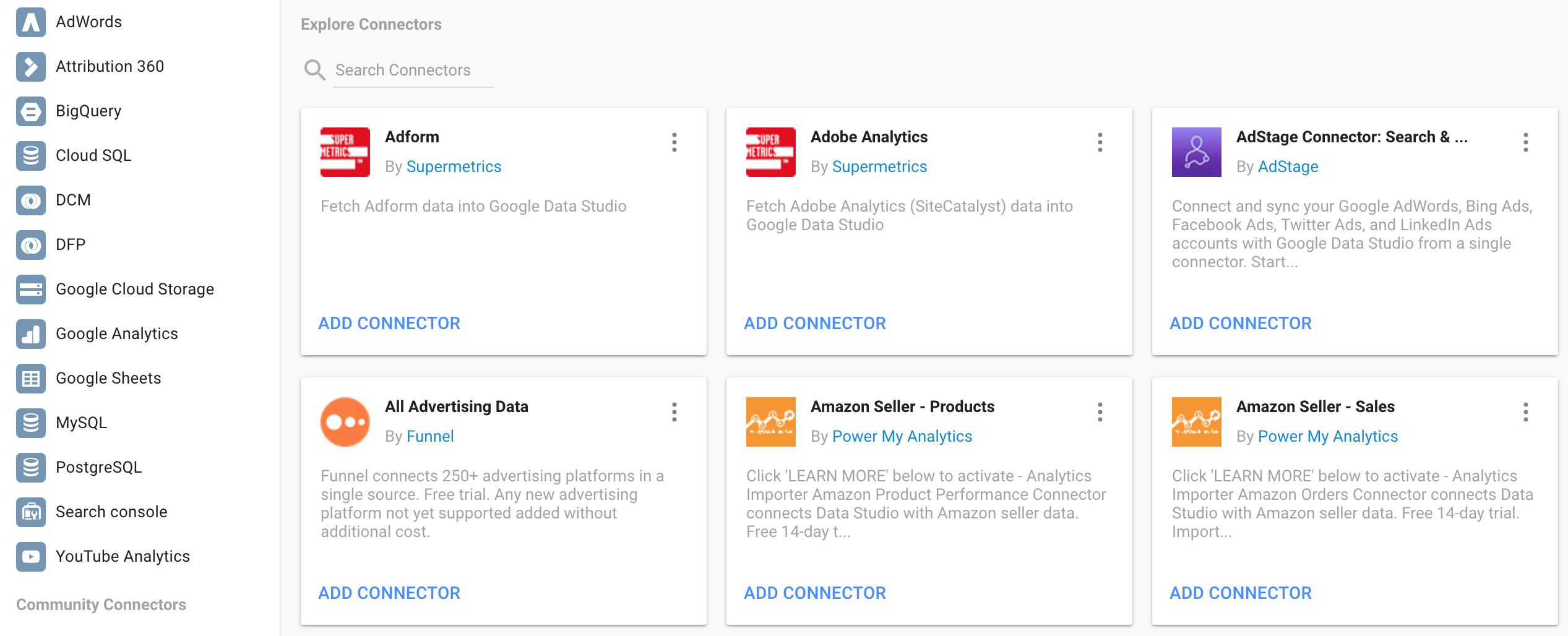
- Select a Data Connector: Google Data Studio offers a wide range of connectors for various data sources such as Google Analytics, Google Sheets, YouTube, and more. Choose the appropriate connector for your data source.
- Authenticate and Configure the Connector: Follow the prompts to authenticate and configure the data connector. This usually involves providing the necessary credentials or selecting the specific data set you want to connect.
- Explore and Visualize Data: Once your data source is connected, you can start exploring and visualizing your data. Drag and drop dimensions and metrics onto the report canvas to create charts, tables, and other visualizations.
- Customize Your Report: Data Studio offers a range of customization options to make your report visually appealing and informative. Add filters, change colors, adjust chart types, and format text to suit your needs.
- Share and Collaborate: When your report is ready, you can share it with others for viewing or collaboration. Use the “Share” button to generate a link or invite specific users to access your report.
That’s it! By following these steps, you can easily set up Google Data Studio and start visualizing your data in a meaningful way. Remember to save your report regularly to ensure your data is up to date and accessible whenever you need it.
Connecting Data Sources
Once you have set up Google Data Studio, the next step is to connect your data sources. Data sources are where your data is stored, such as Google Analytics, Google Sheets, Google Ads, or databases. Google Data Studio offers a wide range of connectors that allow you to easily import data from various sources.
To connect a data source, simply click on the “Create New Data Source” button in the toolbar. This will open a list of available connectors. Choose the connector that corresponds to the data source you want to connect. For example, if you want to import data from Google Analytics, select the Google Analytics connector.
After selecting the connector, you will be prompted to authenticate and grant permissions to access your data. This ensures that Google Data Studio can retrieve the data from your chosen source. Once you have successfully authenticated, you can begin configuring the data source settings.
Depending on the connector and data source, you may need to provide additional information, such as the account ID, view ID, date range, or specific metrics and dimensions. This is to ensure that the data imported into Google Data Studio is accurate and tailored to your needs.
Once you have configured the settings, click on the “Connect” button to establish the connection with the data source. Google Data Studio will then import the data and display it in the data source panel.
It is worth mentioning that Google Data Studio allows you to connect multiple data sources to a single report. This means that you can combine data from different sources into a unified visualization. To connect additional data sources, simply click on the “Add a data source” button and repeat the process.
Connecting data sources in Google Data Studio is a straightforward process that enables you to harness the power of your data and create meaningful visualizations. By seamlessly integrating your data, you can gain valuable insights and present them in a visually appealing and interactive manner.
Creating Visualizations
Once you have connected your data sources in Google Data Studio, the next step is to create visualizations that effectively present your data. Visualizations are key to understanding trends, patterns, and insights that can drive decision-making. Here’s how you can create compelling visualizations in Google Data Studio:
1. Select the appropriate chart type: Google Data Studio provides a wide range of chart types to choose from, including bar graphs, pie charts, line graphs, scatter plots, and more. Consider the type of data you want to visualize and select the chart type that best represents the information.
2. Customize the visual elements: Make your visualizations visually appealing and easy to understand by customizing various elements. Modify the colors, labels, fonts, and styles to match your brand or preference. Experiment with different options to find the best combination that effectively communicates your data.
3. Add filters and interactive elements: Enhance the user experience by adding filters and interactive elements to your visualizations. Allow viewers to interact with the data by providing options for filtering, sorting, or drilling down into specific details. This empowers users to explore the data further and gain meaningful insights.
4. Use calculated fields and metrics: Utilize calculated fields and metrics to derive more meaningful insights from your data. With Google Data Studio, you can create custom calculations that can help you analyze data in a more granular way. These calculated fields can be based on mathematical operations, logical conditions, or text manipulations.
5. Incorporate dynamic elements: Make your visualizations dynamic by incorporating elements that update automatically. For example, you can include date range selectors or dynamic parameters that allow users to change the timeframe of the data being displayed. This ensures that your visualizations stay up-to-date without manual interventions.
6. Utilize data blending and data blending: Google Data Studio allows you to blend data from multiple sources, enabling you to combine different datasets into a single visualization. This feature is particularly useful if you want to analyze data from various sources and identify correlations or trends across different datasets.
7. Preview and test: Before finalizing your visualizations, preview and test them to ensure they accurately represent your data. Check for any formatting issues, data discrepancies, or anomalies that may affect the interpretation of the visualizations. Make necessary adjustments to refine the visualizations for optimal presentation.
By following these steps, you can create visually impactful and informative visualizations in Google Data Studio that effectively convey your data-driven insights.
Customizing and Sharing Reports
Once you have created your reports in Google Data Studio, you can customize them further to match your brand or specific requirements. Here are some ways to customize and share your reports:
1. Adding Filters: Filters allow you to refine your data and view specific information in your reports. You can add filters to individual visualizations or to the entire report. This is useful when you want to focus on a specific segment of your data or exclude certain data points.
2. Applying Themes and Styles: Google Data Studio offers a range of pre-designed themes and styles to choose from. You can apply these to your reports to instantly change the color scheme, fonts, and overall look and feel. If you prefer a custom design, you can create your own theme or style using HTML and CSS.
3. Customizing Charts and Visualizations: You can modify the appearance and behavior of individual charts and visualizations in your reports. This includes changing the chart type, adjusting the axes, adding data labels, and applying conditional formatting. These customizations help you present your data in a visually appealing and meaningful way.
4. Adding Interactivity: Google Data Studio allows you to add interactivity elements, such as dropdown menus, checkboxes, and date pickers, to your reports. This enables users to manipulate the data and view specific insights based on their preferences. Interactive reports provide a more engaging and dynamic experience for your audience.
5. Collaborating and Sharing: Google Data Studio allows you to collaborate with others in real-time on your reports. You can invite team members to edit or view the reports, and they can leave comments and suggestions. Additionally, you can easily share your reports with stakeholders by generating a shareable link or embedding them on a website or intranet.
6. Scheduling and Emailing Reports: If you need to share your reports on a regular basis, you can schedule them to be automatically generated and emailed to specific recipients. This is particularly useful for sharing weekly or monthly performance reports with clients or team members.
7. Exporting and Downloading Reports: Google Data Studio allows you to export your reports in various formats, such as PDF or CSV. This gives you the flexibility to save and share the reports offline or include them in presentations or documents.
By customizing and sharing your reports in Google Data Studio, you can ensure that the insights and visualizations effectively communicate your data to your audience. Take advantage of the available customization options to create visually stunning and informative reports that make an impact.
Conclusion
Google Data Studio Connector is a powerful tool that allows you to integrate and analyze your data from various sources in one centralized platform. With its user-friendly interface, customizable dashboards, and real-time data updates, it offers a seamless experience for data visualization and reporting.
By connecting different data sources such as Google Analytics, Google Ads, and Google Sheets, you can gain valuable insights and make data-driven decisions to drive your business forward. The flexibility to create interactive charts, tables, and graphs, as well as the ability to collaborate and share reports with your team or clients, makes Google Data Studio Connector an indispensable tool for marketers, analysts, and business owners alike.
Whether you want to track website performance, monitor campaign metrics, or create comprehensive reports, Google Data Studio Connector simplifies the process and empowers you to harness the full potential of your data. Start using it today and unlock a new level of data analysis and reporting efficiency.
FAQs
1. What is Google Data Studio Connector?
Google Data Studio Connector is a tool that allows users to connect data sources to Google Data Studio. It enables you to import, analyze, and visualize data from various sources, such as databases, spreadsheets, and third-party applications, within Google Data Studio.
2. How does the Google Data Studio Connector work?
The Google Data Studio Connector works by establishing a connection between your data source and Google Data Studio. You can create a connector using the Google Data Studio Connector application programming interface (API) or use pre-built connectors available in the Google Data Studio gallery. Once the connector is set up, you can use it to import and transform data for your reports and dashboards in Google Data Studio.
3. What are the benefits of using Google Data Studio Connector?
Using Google Data Studio Connector offers several benefits. First, it allows you to centralize your data from multiple sources in one place, making it easier to analyze and visualize. Second, it provides real-time data updates, ensuring that your reports and dashboards are always up to date. Additionally, Google Data Studio Connector provides a wide range of visualization options, allowing you to create interactive and engaging reports for your audience.
4. What types of data sources can I connect to with Google Data Studio Connector?
Google Data Studio Connector supports a variety of data sources, including databases like Google BigQuery, MySQL, and PostgreSQL, cloud storage services, such as Google Drive and Google Cloud Storage, and popular applications like Salesforce, Google Analytics, and YouTube. You can also create custom connectors using the Google Data Studio Connector API for connecting to specific data sources and services.
5. Is Google Data Studio Connector suitable for non-technical users?
Yes, Google Data Studio Connector is designed to be user-friendly and accessible to both technical and non-technical users. While it may require some understanding of data sources and basic data analysis concepts, the interface is intuitive and offers drag-and-drop functionality for designing reports and dashboards. Google also provides comprehensive documentation and tutorials to help users get started with using Google Data Studio Connector.