
Google Data Studio is a powerful tool that allows you to create visually appealing and interactive dashboards to analyze and present your data. Whether you are a marketer, data analyst, or business owner, having a well-designed dashboard can provide valuable insights and help you make data-driven decisions. In this article, we will take you through the step-by-step process of creating a Google Data Studio dashboard. From connecting your data sources to designing your dashboard with charts, tables, and filters, we will cover all the essential components to help you create a compelling and informative dashboard. So, let’s dive in and discover how you can harness the power of Google Data Studio to unlock the potential of your data!
Inside This Article
- Overview
- Step 1: Connect Your Data Sources
- Step 2: Design your dashboard
- Step 3: Add interactive charts and visuals
- Step 4: Customize and format your dashboard
- Step 5: Share and collaborate on your dashboard
- Conclusion
- FAQs
Overview
Creating a data dashboard in Google Data Studio allows you to visualize and analyze data from various sources in one centralized location. With Google Data Studio, you can create interactive and customizable dashboards that present your data in a clear and insightful way. Whether you want to track website metrics, analyze sales data, or monitor social media performance, Google Data Studio has you covered.
Data Studio offers a wide range of data connectors, allowing you to connect to popular platforms such as Google Analytics, Google Sheets, and Google Ads. This flexibility enables you to import data from multiple sources and combine them into one cohesive dashboard.
The power of Data Studio lies in its drag-and-drop interface, which makes it easy to design your dashboard. You can choose from a variety of charts, graphs, and other visual elements to display your data in a visually appealing and meaningful way. With just a few clicks, you can create dynamic charts that update in real-time as your data changes.
Once you have designed your dashboard, you can further customize it to match your branding or specific requirements. Data Studio offers a range of formatting options, allowing you to adjust colors, fonts, and styles to create a professional-looking dashboard that aligns with your organization’s visual identity.
Sharing and collaborating on your dashboard is also straightforward with Google Data Studio. You can easily grant access to specific individuals or teams, allowing them to view and interact with the data. You can also schedule automated data refreshes or set up email notifications to keep stakeholders informed and up to date with the latest insights.
Overall, Google Data Studio is a powerful and versatile tool for creating data dashboards. It streamlines the process of data visualization and analysis, allowing users to effortlessly turn raw data into actionable insights. By consolidating data from various sources and presenting it in a visually appealing manner, Google Data Studio empowers organizations to make data-driven decisions and gain a deeper understanding of their performance.
Step 1: Connect Your Data Sources
When it comes to creating a Google Data Studio dashboard, the first and most crucial step is connecting your data sources. Data sources are where your data is stored, such as spreadsheets, databases, or even API integrations.
To connect your data sources, follow these steps:
- Click on the “Add Data” button: Once you’re in Google Data Studio, click on the “Add Data” button located in the top menu. This will open a panel where you can choose the type of data source you want to connect.
- Select your data source: Choose the appropriate data source from the list of options. Google Data Studio supports a wide range of data sources, including Google Sheets, Google Analytics, Google Ads, BigQuery, and many others.
- Authenticate and authorize: Depending on the data source, you may need to authenticate and authorize Google Data Studio to access your data. Follow the authentication steps provided by the selected data source.
- Configure your data source: Once the authentication is complete, you’ll need to configure your data source. This involves selecting the specific data you want to connect to your dashboard, such as specific sheets in a Google Sheets document or specific tables in a database.
- Build your data model: After configuring your data source, you’ll have the option to build a data model. This step allows you to define the relationships between different data sources, if applicable, and customize the data structure to suit your needs.
- Verify and connect: Finally, verify that your data source is correctly connected by reviewing the data preview and making any necessary adjustments. Once you’re satisfied, click on the “Connect” button to complete the data source connection.
By connecting your data sources, you’ll be able to pull in real-time data and create dynamic and interactive dashboards in Google Data Studio. Remember to regularly update your data sources to ensure accurate and up-to-date information in your dashboard.
Step 2: Design your dashboard
Now that you have connected your data sources in Google Data Studio, it’s time to move on to the fun part – designing your dashboard. This step is where you can let your creativity shine and create a visually appealing and intuitive dashboard that effectively presents your data.
Here are a few guidelines and tips to help you design an impactful dashboard:
- Define your goals: Before diving into the design process, it’s essential to clearly define your goals for the dashboard. What insights do you want to communicate? What key metrics and performance indicators are important to your business? Having a clear understanding of your objectives will guide your design decisions and ensure the dashboard is effective.
- Arrange your components: Think about the layout of your dashboard and how you want to arrange different components. Data Studio offers a drag-and-drop interface, making it easy to position and align various charts, graphs, tables, and text boxes. Experiment with different arrangements to find the most logical and visually appealing layout.
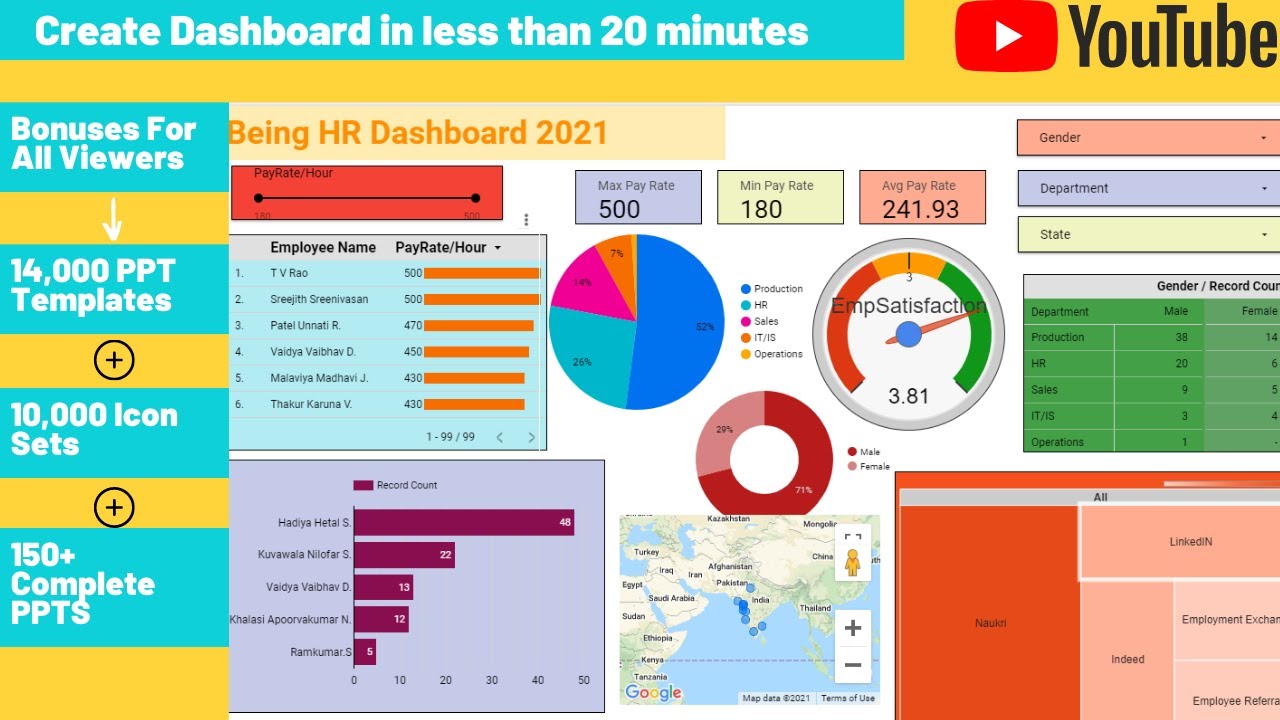
- Choose the right visualizations: Selecting the appropriate visualizations is crucial for effectively communicating your data. Data Studio provides a wide range of visualization options, including bar charts, line graphs, pie charts, maps, and more. Consider the type of data you have and choose visualizations that best represent and highlight the key insights.
- Use colors and fonts strategically: Colors and fonts play a vital role in the overall look and feel of your dashboard. Use colors to differentiate data points or highlight important information. Be consistent with your color palette and font choices to maintain a cohesive and professional appearance.
- Keep it simple and organized: While it’s tempting to pack your dashboard with as much information as possible, remember that simplicity is key. Avoid cluttering your dashboard with unnecessary elements or overwhelming visuals. Keep your design clean, organized, and focused on the most relevant data.
Remember, the design of your dashboard should be based on the preferences and needs of your audience. Consider their level of data literacy and tailor the design accordingly. Ultimately, the goal is to make your dashboard visually appealing, easy to navigate, and informative.
Once you have achieved a well-designed dashboard, you can move on to the next step – adding interactive charts and visuals to bring your data to life. So let’s dive into the exciting world of interactive data visualization in Google Data Studio.
Step 3: Add interactive charts and visuals
Now that you have connected your data sources and designed the layout of your Google Data Studio dashboard, it’s time to take it to the next level by adding interactive charts and visuals. This step is crucial as it brings life to your data and allows users to easily interpret the information presented.
Here are some tips and techniques to help you create compelling and engaging visualizations:
- Choose the right chart type: Consider the type of data you have and the message you want to convey. Google Data Studio offers various chart options such as bar charts, line charts, pie charts, and scatter plots. Select the chart type that effectively represents your data.
- Use color strategically: Color can be a powerful tool to highlight important data points or convey specific meanings. However, it’s important not to overdo it. Choose a color palette that is visually appealing and ensures clear readability.
- Add interactivity: One of the key advantages of using Google Data Studio is the ability to create interactive elements. Utilize filters, slicers, and interactive controls to allow users to explore the data on their own. This interactivity enhances user engagement and makes the dashboard more user-friendly.
- Create data comparisons: To provide a meaningful context, include visualizations that allow users to compare data over different dimensions or time periods. This could be achieved through stacked bar charts, line charts with multiple series, or side-by-side visualizations.
- Incorporate dynamic data: If your data sources are regularly updated, consider adding dynamic elements to your charts. This could include real-time data updates or automatically refreshing data at specific intervals. This ensures that the information on your dashboard is always up to date.
- Keep it simple and intuitive: While it may be tempting to include numerous charts and visuals, avoid cluttering your dashboard. Choose the most relevant and impactful visualizations that effectively communicate your data. Also, make sure the charts are easy to understand and navigate.
By following these guidelines, you can create interactive charts and visuals that not only showcase your data but also provide a seamless user experience. Remember to experiment with different chart types and styles to find the ones that best represent your data and convey your message effectively.
Step 4: Customize and format your dashboard
Once you have connected your data sources and designed your dashboard in Google Data Studio, the next step is to customize and format it to suit your specific needs and preferences. Customization allows you to tailor your dashboard to present the data in a visually appealing way and make it more user-friendly. Formatting, on the other hand, helps you apply consistent styling and ensure that your dashboard looks polished and professional.
Here are some key customization and formatting options in Google Data Studio that you can explore:
- Layout: You can adjust the layout of your dashboard by adding sections, rearranging charts and visuals, or resizing them. This allows you to prioritize the most important data and create a logical flow for your viewers.
- Colors and Themes: Google Data Studio offers a wide range of color palettes and themes to choose from. You can select colors that align with your brand identity or create a custom theme to give your dashboard a unique look and feel.
- Fonts and Typography: Customize the fonts and typography to enhance the readability and visual appeal of your dashboard. Experiment with different font styles, sizes, and alignments to find the optimal combination.
- Charts and Visual Styles: Data Studio provides various chart types and visualization options to present your data in the most effective way. You can choose from bar charts, line graphs, pie charts, and more. Additionally, you can customize the colors, labels, and other visual aspects of each chart to match your preferences.
- Interactions and Filters: Create interactive elements in your dashboard to allow viewers to explore the data on their own. This can be achieved by adding filters, drill-down options, or clickable elements that provide more detailed information when clicked.
It’s important to strike a balance between customization and simplicity. While it’s tempting to add numerous design elements, remember that cluttered dashboards can be overwhelming and confuse viewers. Aim for a clean and intuitive design that highlights the key insights without overwhelming the user.
Another aspect of customization is to make your dashboard responsive and accessible on different devices. Google Data Studio automatically adjusts the layout and formatting of your dashboard to ensure optimal viewing experience on desktops, tablets, and smartphones. However, it’s a good practice to preview and test your dashboard on various devices to confirm its responsiveness.
Formatting your dashboard also involves adding titles, labels, and annotations to provide context and guide viewers through the data. Use descriptive titles and concise labels to make it easier for users to understand the purpose of each chart or visual. Additionally, consider adding annotations or callouts to highlight important trends, insights, or anomalies in the data.
By customizing and formatting your dashboard in Google Data Studio, you can create a visually appealing and user-friendly interface for presenting your data. Experiment with different options, test the dashboard on different devices, and solicit feedback from potential users to ensure that your customization efforts enhance the overall experience.
Step 5: Share and collaborate on your dashboard
Once you have created a Google Data Studio dashboard, the next step is to share it with others and collaborate on it. Google Data Studio provides several options for sharing and collaborating, allowing you to work together with teammates or share your dashboard with clients or stakeholders. Let’s explore how you can easily share and collaborate on your dashboard:
1. Share your dashboard: Sharing your dashboard is as simple as clicking the “Share” button in the top-right corner of the Google Data Studio interface. This will open a sharing dialog where you can specify the email addresses of the individuals you want to share your dashboard with. You can choose to give them view-only access or allow them to edit the dashboard as well.
2. Access control and permissions: Google Data Studio provides granular access control and permissions, allowing you to control who can view or edit your dashboard. You can add individuals or groups, set their access levels, and even revoke access if needed. This ensures that only authorized individuals can access and work on your dashboard.
3. Real-time collaboration: Google Data Studio enables real-time collaboration, meaning that multiple users can simultaneously work on the same dashboard. This is particularly useful when you are working on a project with team members or sharing your dashboard with clients. Collaboration features such as comments, chat, and the ability to see changes in real-time enhance productivity and streamline the process.
4. Embed your dashboard: Google Data Studio allows you to embed your dashboard in other websites or applications. This is useful when you want to seamlessly integrate your dashboard into an existing web page or app. By embedding the dashboard, you can provide a dynamic and interactive experience for your users without requiring them to switch between different platforms.
5. Schedule and deliver reports: With Google Data Studio, you can schedule reports to be automatically generated and delivered to specific recipients via email. This feature is helpful when you need to provide regular updates or share insights with stakeholders or clients. You can set the frequency, format, and recipients of the scheduled reports, ensuring that the right people receive the right information at the right time.
6. Export and download: In addition to sharing and collaborating within Google Data Studio, you can also export and download your dashboard as PDFs or other file formats. This enables you to save a static version of your dashboard or share it with individuals who may not have access to Google Data Studio.
By leveraging these sharing and collaboration features in Google Data Studio, you can effectively work together with your team members, share insights with stakeholders, and provide a seamless and interactive dashboard experience for your audience.
Conclusion
In conclusion, creating a Google Data Studio dashboard is a powerful way to visualize and analyze your data in a user-friendly and customizable manner. By following the steps outlined in this article, you can easily connect your data sources, create visually appealing charts and graphs, and share your dashboard with others. This tool allows you to gain valuable insights, make data-driven decisions, and effectively communicate your findings to stakeholders. Whether you are a business owner, marketer, or analyst, Google Data Studio offers a seamless and intuitive solution for data visualization. So don’t wait any longer, start creating your own dashboard and unlock the full potential of your data today!
FAQs
1. What is Google Data Studio?
Google Data Studio is a web-based data visualization tool provided by Google. It allows users to create interactive and customizable dashboards and reports using data from various sources, such as Google Analytics, Google Sheets, and more.
2. How do I create a dashboard in Google Data Studio?
To create a dashboard in Google Data Studio, follow these steps:
- Login to your Google account and open Google Data Studio.
- Click on the “Create” button in the top left corner.
- Select a data source to connect to your dashboard, or create a new data source if needed.
- Choose a blank report or use a template as a starting point.
- Start adding components like charts, tables, and images to your dashboard.
- Customize the layout, styles, and data filters as per your requirement.
- Save and share your dashboard with others.
3. Can I use my own data in Google Data Studio?
Yes, Google Data Studio supports a wide range of data sources, including Google Analytics, Google Sheets, Firebase, BigQuery, MySQL, and more. You can connect to these data sources and use your own data to create custom dashboards and reports.
4. How can I share my Google Data Studio dashboard with others?
You can easily share your Google Data Studio dashboard with others by following these steps:
- Open your dashboard in Google Data Studio.
- Click on the “Share” button in the top right corner.
- Choose whether you want to share it with specific individuals or make it accessible to anyone with the link.
- Set the necessary permissions for viewing or editing the dashboard.
- Copy the shareable link and send it to the intended recipients.
5. Can I embed my Google Data Studio dashboard on a website?
Yes, Google Data Studio allows you to embed your dashboards on websites or web pages. To do this, follow these steps:
- Open your dashboard in Google Data Studio.
- Click on the “File” menu and select “Embed report.”
- Configure the settings for embedding, such as the size and access permissions.
- Copy the generated HTML code.
- Paste the code into the desired location on your website’s HTML source.