
Adding data to a chart in Google Sheets can be a powerful way to visualize and analyze your information. Whether you’re tracking sales figures, monitoring project progress, or simply creating a visual representation of data, Google Sheets offers a range of features to help you add and update your chart data seamlessly.
In this article, we’ll explore the step-by-step process of adding data to a chart in Google Sheets. We’ll cover everything from creating a basic chart to updating and modifying data as your needs evolve. Whether you’re a beginner or an experienced user, this guide will provide you with the knowledge and tools to effectively present your data in visually compelling ways.
Inside This Article
- The Basics of Google Sheets
- Creating a Chart in Google Sheets
- Adding Data to a Chart
- Editing and Updating Chart Data
- Conclusion
- FAQs
The Basics of Google Sheets
Google Sheets is a cloud-based spreadsheet program offered by Google as part of its suite of productivity tools. It provides individuals and businesses with a convenient way to create, edit, and analyze data in a structured and organized manner. With its collaborative features and easy accessibility, Google Sheets has become a popular choice for managing and manipulating data.
One of the key advantages of Google Sheets is its ability to store data securely in the cloud. This means that your spreadsheets are not limited to a single device or location; they can be accessed from any device with an internet connection. This flexibility allows for real-time collaboration, as multiple users can work on the same spreadsheet simultaneously.
Google Sheets offers a range of essential features that make it a powerful tool for data analysis. It supports a wide variety of functions, formulas, and formatting options that enable you to perform complex calculations, create visually appealing charts and graphs, and apply conditional formatting to highlight important data points.
Creating a new spreadsheet in Google Sheets is quick and easy. Simply navigate to Google Drive, click on the “+ New” button, and select “Google Sheets.” You can then start building your spreadsheet by entering data into the cells or importing data from other sources such as CSV files or Google Forms.
Google Sheets also allows you to import data directly from other Google products, such as Google Analytics or Google AdWords. This integration makes it easy to analyze and visualize data from different sources within the same spreadsheet, providing you with a comprehensive view of your data.
Furthermore, Google Sheets provides various collaboration features that streamline teamwork and simplify data sharing. You can invite others to view or edit your spreadsheet, control their level of access, and even leave comments on specific cells or ranges. This enhances productivity and promotes effective communication among team members.
Creating a Chart in Google Sheets
Google Sheets is a powerful tool for creating and analyzing data in spreadsheet format. One of its standout features is the ability to create visually appealing charts that help you visualize trends and patterns. Whether you want to track sales figures, analyze survey results, or display any other type of data, Google Sheets has got you covered.
To create a chart in Google Sheets, you need to have a spreadsheet with the data you want to visualize. Start by selecting the range of cells that you want to include in your chart. This could be a single column, multiple columns, or even a whole table of data.
Next, navigate to the “Insert” menu at the top of the screen and select “Chart” from the dropdown menu. This will open the Chart editor sidebar on the right-hand side of your screen.
In the Chart editor, you can choose from a variety of chart types, such as bar charts, line graphs, pie charts, and more. Select the chart type that best suits your data and click on it to insert it into your spreadsheet.
Once the chart is inserted, you can customize it further by editing the chart title, axis labels, legend, and colors. Simply click on any element of the chart to bring up the corresponding editing options in the Chart editor sidebar.
If you want to make advanced modifications, you can also use the “Advanced edit” option in the Chart editor sidebar. This allows you to fine-tune aspects like data ranges, series options, and chart style.
After you have finished customizing your chart, click outside of the Chart editor sidebar to exit the editor. Your chart will be saved within your Google Sheets document, and you can continue to edit or update it at any time.
Creating charts in Google Sheets is not only easy but also highly customizable. With a few simple steps, you can turn your data into visually compelling and informative charts that are sure to impress your audience.
Adding Data to a Chart
Once you’ve created a chart in Google Sheets, you’ll likely want to add data to it to reflect new information or make updates. Here’s how you can easily add data to a chart in Google Sheets:
- Select the chart: Start by selecting the chart you want to add data to. Click on the chart to activate it.
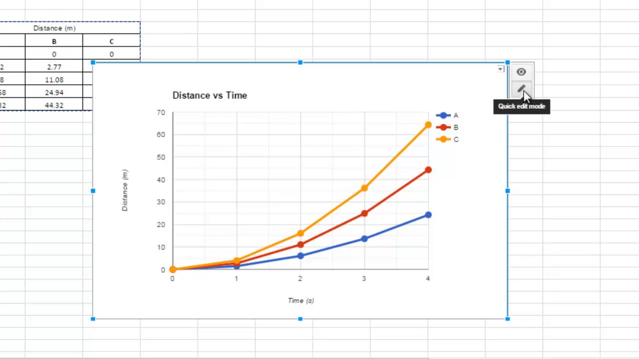
- Open the Chart Editor: In the top right corner of the chart, you’ll see a small icon that looks like a pencil. Click on this icon to open the Chart Editor.
- Navigate to the “Customize” tab: Within the Chart Editor, you’ll see multiple tabs. Select the “Customize” tab to access the options for customizing your chart.
- Add data series: Under the “Customize” tab, you’ll find options to add data to your chart. To add a new data series, click on the “Add Series” button.
- Specify the data range: A new window will appear, prompting you to define the data range for your new series. You can either manually enter the data range or use the dropdown menu to select the desired range from your spreadsheet.
- Format the data series: Once you’ve specified the data range, you’ll have the option to format the data series to your preference. This includes selecting the chart type, adjusting the axis labels, and modifying the series colors.
- Apply the changes: After formatting the data series, click the “Apply” button to add the new data to your chart.
That’s it! You’ve successfully added data to your chart in Google Sheets. The new data will now be reflected in your chart, allowing you to visualize and analyze the updated information.
Editing and Updating Chart Data
Once you have created a chart in Google Sheets, you may find the need to make changes to the data it represents. Editing and updating chart data in Google Sheets is a simple and straightforward process. Here are the steps to effectively modify your chart:
1. Open Google Sheets and locate your chart: Go to the sheet where your chart is located and click on it to select it. This will display the chart and its associated data in the sidebar or the chart editor window.
2. Access the chart editor: To make changes to the chart data, you’ll need to access the chart editor. Look for the “Edit chart” button or option, usually located near the chart itself or in the toolbar at the top of the Google Sheets window. Clicking on this button will open the chart editor.
3. Update the data range: In the chart editor, you’ll find various options to modify the chart’s appearance and data. To edit the data range, locate the “Data” tab or section. Here, you can adjust the range of cells that the chart is pulling data from. Click on the data range box and select the new range of cells that you want to include in the chart.
4. Add or remove data series: If you need to add or remove data series from your chart, the chart editor provides options to do so. Look for the “Series” or “Data series” tab or section in the chart editor. Here, you can add or delete data series by selecting the appropriate options. You can also modify the series names and their corresponding values.
5. Customize data labels and legends: In the chart editor, you have the flexibility to customize the data labels and legends to improve the clarity and understanding of your chart. Look for the “Labels” or “Legends” tab or section. Here, you can modify the display options, such as the position, font, size, and color of the data labels and legends.
6. Preview and save your changes: As you make adjustments to the chart data, the chart will dynamically update to reflect the modifications. Take advantage of the preview functionality in the chart editor to see how your changes impact the chart’s appearance and representation. If you are satisfied with the updates, click on the “Save” or “Apply” button to save your changes and close the chart editor.
7. Update linked charts: If you have linked or embedded the chart in other documents, such as Google Docs or Slides, the changes made to the chart’s data in Google Sheets may not automatically update elsewhere. To ensure the linked charts reflect the most recent changes, you may need to manually update or refresh them.
With these steps, you can easily edit and update chart data in Google Sheets. Whether you need to modify the data range, add or remove data series, or customize the labels and legends, Google Sheets provides the flexibility to make your charts more accurate and visually appealing.
Conclusion
In conclusion, learning how to add data to a chart in Google Sheets is a valuable skill that can greatly enhance your data visualization capabilities. By following the steps outlined in this guide, you can easily populate your charts with the relevant data points and create visually appealing representations of your information. Whether you need to showcase trends, compare different variables, or present data in a clear and concise manner, Google Sheets offers a user-friendly platform for creating and customizing charts. Remember to choose the appropriate chart type, organize your data correctly, and make use of the available customization options to create charts that effectively convey your message. So, start exploring the possibilities with Google Sheets and take your data visualization skills to the next level!
FAQs
1. How can I add data to a chart in Google Sheets?
To add data to a chart in Google Sheets, follow these steps:
– Select the chart that you want to edit or create a new chart.
– Click on the “Chart Editor” button, which looks like a small pencil icon.
– In the Chart Editor sidebar that appears on the right, click on the “Data” tab.
– Under the “Data range” section, you can either manually enter the cell range or use the “Select data range” button to choose the data range directly from your sheet.
– Once you have selected or entered the data range, click the “Apply” button to update the chart with the new data.
Note: Make sure to include the appropriate headers and organize your data in a logical way to visualize it effectively.
2. Can I add multiple sets of data to a chart in Google Sheets?
Yes, you can add multiple sets of data to a chart in Google Sheets. The process is similar to adding a single set of data.
– Select the chart and open the Chart Editor.
– Go to the “Data” tab in the Chart Editor sidebar.
– Click on the “+” button next to the “Data range” section to add an additional range of data.
– Enter or select the new data range, and click “Apply” to update the chart with multiple data sets.
This allows you to compare different sets of data or create multiple series within the chart for better analysis and visualization.
3. Can I edit the data range for an existing chart in Google Sheets?
Yes, you can edit the data range for an existing chart in Google Sheets.
– Select the chart and open the Chart Editor.
– In the Chart Editor sidebar, go to the “Data” tab.
– Edit the data range by either manually entering the new range or using the “Select data range” button to choose a different range from your sheet.
– Click “Apply” to update the chart with the new data range.
This allows you to modify the data being displayed in the chart without having to recreate it from scratch.
4. Can I update the data in my Google Sheets and have it automatically reflect in the chart?
Yes, any changes you make to the data in your Google Sheets will be automatically reflected in the chart.
– Simply update the data within the chosen data range for the chart on your sheet.
– The chart will automatically update to reflect the changes made to the data range.
This dynamic feature makes it easy to keep your chart up-to-date as you make changes to the underlying data.
5. Can I customize the appearance of the data in the chart?
Yes, you can customize the appearance of the data in the chart to suit your preferences and needs.
– Select the chart and open the Chart Editor.
– In the Chart Editor sidebar, go to the various tabs such as “Chart style,” “Chart & axis titles,” “Customize,” etc., to customize different aspects of the chart, including colors, fonts, labels, and more.
– Experiment with different options until you achieve the desired appearance for your chart.
This allows you to create visually appealing and informative charts that effectively communicate your data.