
Are you looking to flip your data in an Excel chart to present it in a different perspective? Not to worry, we’re here to help! Flipping data in an Excel chart can be a useful technique to highlight trends, compare categories, or simply provide a fresh visual representation of your data. By rearranging the axes or changing the orientation of the chart, you can transform the way your information is displayed. In this article, we’ll guide you step-by-step on how to flip data in an Excel chart, whether you’re using the latest version of Microsoft Excel or an earlier version. So grab your Excel spreadsheet and let’s dive in!
Inside This Article
- Opening an Excel Chart
- Flipping Data Horizontally in Excel Chart
- Flipping Data Vertically in Excel Chart
- Rearranging Data for Flipping in Excel Chart
- Conclusion
- FAQs
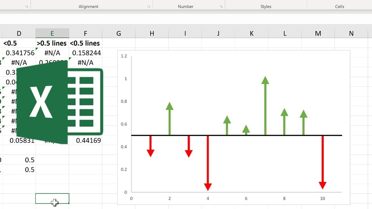
Opening an Excel Chart
Excel charts are powerful tools that allow you to visually represent data in a clear and concise manner. Whether you need to create a bar graph, line graph, or pie chart, Excel provides a user-friendly interface to accomplish these tasks.
To open an Excel chart, follow these steps:
- Launch Microsoft Excel on your computer.
- Open the Excel workbook that contains the data you want to visualize.
- Select the data range you wish to include in your chart. This can be a single column or row, multiple columns or rows, or even an entire table.
- In the Excel menu, navigate to the “Insert” tab.
- Click on the desired chart type from the available options. Excel provides a wide range of chart types to choose from, such as column charts, line charts, pie charts, and more.
- A new chart object will be inserted into your Excel worksheet.
- Resize and reposition the chart as desired by clicking and dragging the corners or edges of the chart box.
- To customize various elements of the chart, such as chart title, axis labels, and data series, simply click on the corresponding chart element and modify the properties using the Excel ribbon menu.
- You can also change the chart type or add additional data to the chart by right-clicking on the chart and selecting the desired options.
- On completion, you can save your Excel workbook to preserve your chart for future reference.
By following these steps, you can easily open an Excel chart and start visualizing your data in a meaningful way. Excel’s flexibility and features allow you to create stunning charts that effectively communicate your data insights.
Flipping Data Horizontally in Excel Chart
When working with an Excel chart, it’s sometimes necessary to flip the data horizontally to change the orientation of the chart. This can be useful when you want to present your data in a different way or when you want to compare data from left to right rather than top to bottom.
To flip data horizontally in an Excel chart, follow these simple steps:
- Select the data range for your chart.
- Right-click on the selected data and choose “Copy”.
- Right-click on a blank cell where you want to paste the flipped data and choose “Paste Special”.
- In the “Paste Special” dialog box, select “Transpose” and click “OK.
- The data will now be flipped horizontally, and you can create a new chart using this flipped data.
Flipping the data horizontally in an Excel chart can be especially useful when dealing with time-based data or when you want to compare data across different categories. By presenting the data in a different orientation, you can gain new insights and present your findings in a more intuitive way.
Remember that when flipping data horizontally, the chart type may need to be adjusted accordingly. Bar charts and line charts are typically the best choices for displaying horizontally flipped data, as they maintain the proper orientation of the data points.
Don’t be afraid to experiment with different chart types and data orientations to find the best way to present your information. Excel offers a wide range of chart options and customization features, allowing you to create visually appealing and informative charts for your data.
Flipping Data Vertically in Excel Chart
When working with data in Excel charts, it’s important to have the flexibility to present the information in the most effective way. One of the useful techniques is flipping the data vertically, which can help in better visual representation and analysis.
To flip data vertically in an Excel chart, follow these steps:
- Select the chart: Click on the chart to activate it. This will enable the Chart Tools menu in Excel.
- Access the ‘Select Data’ option: In the Chart Tools menu, click on the ‘Design’ tab. You will find the ‘Select Data’ button in the Data group. Click on it to open the ‘Select Data Source’ dialog box.
- Adjust the chart data range: In the ‘Select Data Source’ dialog box, you will see the ‘Legend Entries (Series)’ section and the ‘Horizontal (Category) Axis Labels’ section. You need to modify the ‘Horizontal (Category) Axis Labels’ section to flip the data vertically.
- Flip the data: To flip the data, select the range for the ‘Horizontal (Category) Axis Labels’ section by clicking on the range selection button. Then, press the ‘F4’ key on your keyboard to toggle the orientation from horizontal to vertical. This will flip the data vertically in the chart.
- Confirm and update the chart: Click ‘OK’ in the ‘Select Data Source’ dialog box to apply the changes. The chart will update with the vertically flipped data.
Now, your Excel chart will display the data vertically flipped, which can be especially useful when comparing values or analyzing trends. This technique allows you to present the information in a way that is more visually appealing and easier to interpret.
Remember, flipping data vertically in an Excel chart is a dynamic feature, which means that any changes you make to the corresponding data range will be reflected in the chart automatically. This makes it a convenient tool for data analysis and visualization.
By utilizing the capability to flip data vertically, you can enhance the impact of your Excel charts and make your data more engaging and meaningful.
Rearranging Data for Flipping in Excel Chart
When it comes to creating a visually appealing Excel chart, rearranging the data in the right format is key. Whether you want to flip the data horizontally or vertically, proper organization of the data is essential to achieve the desired chart layout.
To rearrange data for flipping in an Excel chart, follow these steps:
- Step 1: Identify the data range: Determine the range of data that you want to flip in the chart. This can include the labels along the horizontal axis and the corresponding values.
- Step 2: Copy the data: Select the entire range of data and copy it to the clipboard. You can use the keyboard shortcut Ctrl+C or right-click and choose “Copy” from the context menu.
- Step 3: Create a new sheet: Right-click on an empty tab at the bottom of the Excel window and choose “Insert” to create a new sheet. This will be where you rearrange the data.
- Step 4: Paste the data: In the new sheet, click on the cell where you want to start pasting the data. Then, use the keyboard shortcut Ctrl+V or right-click and choose “Paste” from the context menu to paste the data. Make sure to paste it as values, not formulas.
- Step 5: Flip the data: Depending on whether you want to flip the data horizontally or vertically, use the appropriate method:
- Flipping data horizontally: Select the range of data that you want to flip. Right-click and choose “Copy”. Then, right-click on another cell and choose “Paste Special”. In the “Paste Special” dialog box, check the “Transpose” option and click “OK”. This will flip the data horizontally.
- Flipping data vertically: Select the range of data that you want to flip. Right-click and choose “Copy”. Then, go to another cell or a different sheet and right-click and choose “Paste Special”. In the “Paste Special” dialog box, check the “Transpose” option and click “OK”. This will flip the data vertically.
- Step 6: Adjust the chart: Go back to the original sheet where you have the chart. Right-click on the chart and choose “Select Data” from the context menu. In the “Select Data Source” dialog box, click on the “Switch Row/Column” button to update the chart with the rearranged data. Make any additional formatting changes as needed.
By rearranging the data in Excel and flipping it horizontally or vertically, you can create powerful and visually captivating charts. Remember to save your work and experiment with different chart styles and formats to find the best representation of your data.
Conclusion
In conclusion, flipping data in an Excel chart is a valuable skill that can greatly enhance the visual presentation of your data. By simply rearranging the data series, you can transform a conventional chart into a more impactful and informative visualization.
Whether you want to highlight a specific data point, emphasize trends, or compare different sets of data, flipping the data in an Excel chart allows you to tell a more compelling story with your data.
With the step-by-step instructions provided in this article, you can easily flip data in an Excel chart, regardless of the chart type or dataset complexity. Remember to experiment with different chart layouts and styles to find the one that best suits your needs.
So, go ahead and start flipping your data in Excel charts. Take your charts to the next level and impress your audience with visually impactful and insightful data presentations.
FAQs
Q: What is data flipping in an Excel chart?
A: Data flipping is a process where you rearrange the axes of an Excel chart to display the data in a different orientation. Instead of the data series being plotted on the X-axis, they are plotted on the Y-axis or vice versa.
Q: Why would I need to flip data in an Excel chart?
A: Flipping data in an Excel chart can be useful in situations where you want to change the perspective or presentation of your data. It can help to highlight different aspects or make it easier to compare different data points within the chart.
Q: How do I flip data in an Excel chart?
A: To flip the data in an Excel chart, you need to adjust the axis settings. First, select the chart, then go to the “Format” tab in the Excel Ribbon. From there, choose the option to change the axis settings, and you can specify which axis to flip or change the orientation of the data.
Q: Can I flip the data in a specific series within the chart?
A: Yes, you can flip the data for a specific series within the Excel chart. To do this, right-click on the chart and select the “Select Data” option. In the dialog box that appears, choose the series you want to flip and click on the “Edit” button. From there, you can change the axis labels to flip the data orientation.
Q: Will flipping the data in an Excel chart affect the underlying data?
A: No, flipping the data in an Excel chart does not affect the actual data in your spreadsheet. It only changes the way the data is presented in the chart itself. The original data values will remain the same.