
Are you looking to create a visually appealing and informative graph from your data in Google Sheets? Look no further! In this article, we will guide you through the step-by-step process of making a graph that effectively presents your data in a clear and concise manner.
Graphs are powerful tools that help to visualize data trends and patterns, making it easier for viewers to understand and interpret the information. Whether you need to create a bar, line, pie, or scatter plot graph, Google Sheets provides a user-friendly interface and robust features that make graph creation a breeze.
So, grab your data and get ready to transform it into a compelling graph with the help of Google Sheets. By following our instructions and tips, you’ll be able to present your data in a visually appealing way, making it easy to communicate your findings and insights to others.
Inside This Article
- Selecting and Preparing Data
- Choosing the Right Graph Type: Understanding different types of graphs available in Google Sheets
- Creating a Graph in Google Sheets
- Adding Additional Elements to the Graph- Including titles, legends, and data labels- Adding trendlines, error bars, or other statistical elements- Enhancing the visualization with annotations and notes
- Modifying and Updating the Graph
- Tips and Best Practices: Avoiding Common Mistakes and Pitfalls when Creating Graphs
- Enhancing the Clarity and Readability of Your Graph
- Using Data Visualization Techniques Effectively to Convey Your Message
- Conclusion
- FAQs
Selecting and Preparing Data
When creating a graph in Google Sheets, selecting and preparing the data is a crucial first step. To ensure accuracy and meaningful visual representation, it’s important to choose the appropriate data for your graph.
Start by identifying the specific variables or factors that you want to analyze or compare. Consider what insights or patterns you want to uncover from the data. This will help you determine which data points are relevant and necessary for your graph.
Once you have identified the relevant data, it’s important to format it correctly to maintain accuracy and consistency. Ensure that the data is organized in a clear and logical manner. Use rows and columns to represent different categories or variables, and ensure that each data point is placed in the correct corresponding cell.
Make sure that the data is error-free and free from any inconsistencies. Check for any missing or duplicate values and rectify them before creating the graph. It’s crucial to have clean and reliable data to ensure that your graph accurately represents the information you want to convey.
Moreover, consider the relevance and reliability of the data. Ask yourself if the data is appropriate for the audience or purpose of your graph. Consider the source of the data and the methodology used to collect it. Ensuring that the data is reliable and trustworthy will add credibility to your graph.
Taking the time to carefully select and prepare your data will significantly impact the accuracy and effectiveness of your graph. By choosing the appropriate data, formatting it correctly, and considering its relevance and reliability, you can create informative and visually appealing graphs in Google Sheets.
Choosing the Right Graph Type: Understanding different types of graphs available in Google Sheets
Data visualization plays a crucial role in presenting complex information in a clear and concise manner. When it comes to displaying data in Google Sheets, you have various graph types at your disposal. Understanding the different options available and selecting the most suitable graph type for your data is essential for effective communication.
Google Sheets offers a range of graph types, each with its own strengths and purposes. The most commonly used graph types include bar graphs, line graphs, pie charts, scatter plots, and area charts. Let’s explore these options to understand how they can best represent your data.
A bar graph is ideal for comparing categorical data or showing changes over time. It uses rectangular bars of different lengths or heights to represent the values corresponding to each category. This type of graph is often used to display survey results, sales figures, or population statistics.
Line graphs, on the other hand, are effective for illustrating trends and demonstrating the relationship between variables. They use a line that connects data points to show how one variable changes in response to another. Line graphs are commonly used to track stock prices, analyze temperature fluctuations, or depict the progress of a project over time.
Pie charts are useful for representing the composition or distribution of parts within a whole. They display data as slices of a circle, with each slice representing a different category or proportion. Pie charts are frequently used to showcase market share, budget allocation, or demographic breakdowns.
Another commonly used graph type is a scatter plot, which is used to explore the relationship between two quantitative variables. It displays individual data points on a coordinate grid and helps identify patterns or correlations between variables. Scatter plots are often used in scientific research, analyzing experimental data, or studying the relationship between variables in social sciences.
Area charts are useful for illustrating cumulative data or comparing different series over time. They represent the data as filled areas under the line, highlighting the total value or proportion of each series at different time intervals. Area charts are often used to visualize cumulative revenue, population growth, or website traffic over time.
When selecting the most suitable graph type for your data, consider the nature of your data, the story you want to tell, and the audience you want to communicate with. Think about what type of information you want to convey and choose a graph that effectively presents that information.
It’s also worth exploring the customization options offered by Google Sheets to further enhance your graph. You can modify the colors, axes, labels, and legends to improve clarity and visual appeal. Experimenting with different graph types and customizations will help you find the most effective way to present your data.
Remember, the goal of choosing the right graph type is to make your data easily understandable and visually engaging. Take the time to analyze your data, understand its context, and select the graph type that best supports your message.
Creating a Graph in Google Sheets
Google Sheets is a powerful tool that not only allows you to store and organize data but also provides the capability to visualize this data through graphs and charts. Understanding how to create a graph in Google Sheets can help you effectively communicate your data analysis and make it easier for others to interpret the information.
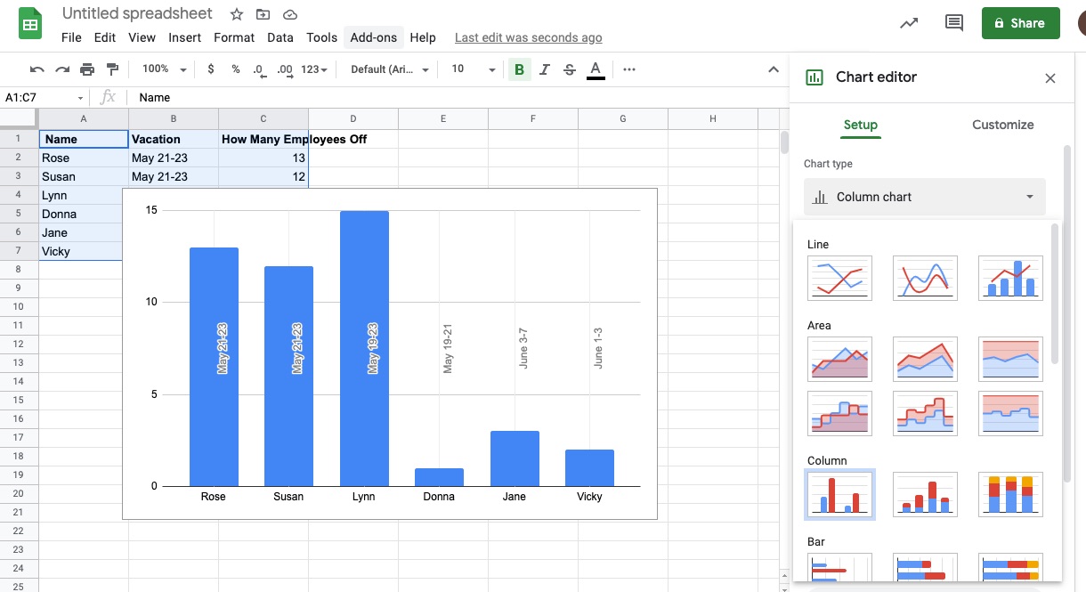
To get started, accessing the chart editor in Google Sheets is the first step. Once you have your data ready in a spreadsheet, select the data range that you want to include in your graph. This can be done by clicking and dragging your mouse to highlight the specific cells. You can also use keyboard shortcuts such as Shift + Arrow keys to select the desired range.
With the data range selected, navigate to the “Insert” menu and select “Chart.” This will open the chart editor panel, where you can choose the chart type that best suits your data. Google Sheets offers a wide range of chart options, including bar graphs, line graphs, pie charts, and more. Take your time to consider the nature of your data and the purpose of your graph before making a selection.
Once you’ve chosen the chart type, you can further customize the appearance of your graph. The chart editor in Google Sheets allows you to modify various elements, such as labels, colors, and axes. You can add titles and captions to provide context, change the color scheme to match your preferences or brand colors, and adjust the axes to display the data more accurately.
Labels play a crucial role in making your graph understandable. You can edit the labels for the x-axis, y-axis, and any other data points you’d like to highlight. This makes it easier to interpret the information and provides additional context for your audience. You can also modify the font style, size, and alignment to ensure readability.
In terms of colors, you have the freedom to choose a color scheme that best represents your data or aligns with your visual preferences. Google Sheets provides predefined color options, or you can create a custom color palette to match your brand or the theme of your presentation.
Moreover, customizing the axes allows you to control the scaling and intervals at which your data is displayed. You can set minimum and maximum values, adjust the intervals between tick marks, and choose whether to display gridlines. These adjustments can help you present your data in a more meaningful and visually appealing way.
Once you are satisfied with the customization of your graph, you can finalize the process by clicking the “Insert” button within the chart editor panel. Google Sheets will insert the graph into your spreadsheet, and you can further resize and reposition it as needed.
Remember, creating a graph is not a one-time task. You can always revisit the chart editor panel to make changes and updates to your graph based on new data or to reflect updated information. The flexibility and ease of use provided by Google Sheets make it a convenient tool for generating and maintaining dynamic graphs.
By mastering the process of creating a graph in Google Sheets, you can effectively communicate your data insights, highlight trends, and make informed decisions based on the visual representation of your information. So, start exploring the graphing capabilities of Google Sheets and unlock the potential of your data!
Adding Additional Elements to the Graph- Including titles, legends, and data labels- Adding trendlines, error bars, or other statistical elements- Enhancing the visualization with annotations and notes
Once you have created your graph in Google Sheets, you can enhance it further by adding additional elements that provide more context and insights. These elements include titles, legends, data labels, trendlines, error bars, and annotations.
Titles are essential for quickly identifying the purpose of your graph. You can add a title to your graph by selecting the chart and entering the text in the “Chart titles” section of the Chart editor. This helps viewers understand the main message of your graph at a glance.
Legends are used to identify the different data series represented in your graph. They are especially useful when you have multiple lines, bars, or pie slices. To add a legend to your graph, navigate to the “Legend” section in the Chart editor and choose the desired position and formatting.
Data labels provide specific values for each data point in your graph. They are useful when you want to highlight exact data points or display specific values. To add data labels, go to the “Data labels” section in the Chart editor and select the desired display option.
Trendlines can be added to show the general pattern or direction of the data in your graph. They are incredibly useful for analyzing trends or making predictions. To add a trendline, select the data series you want to add the trendline to, right-click, and choose “Add trendline” from the context menu.
Error bars can be utilized to show the variability or uncertainty associated with each data point in your graph. They can indicate the range of values or display confidence intervals. To add error bars, select the data series you want to add the error bars to, right-click, and select “Add error bars” from the menu.
Annotations and notes provide additional information or context to specific data points or sections of your graph. They can be used to highlight important events, explanations, or insights. To add annotations or notes to your graph, right-click on the data point or chart section and choose “Add annotation” or “Add note.
By adding these additional elements, you can enhance the overall visual appeal and clarity of your graph. They provide valuable information and insights that help viewers understand and interpret the data more effectively.
Modifying and Updating the Graph
When creating a graph in Google Sheets, it’s essential to have the flexibility to modify and update it as needed. This section will cover the necessary steps to adjust the data range, update the underlying data, modify chart elements and design options, as well as save, export, and share the graph.
Adjusting the Data Range or Updating the Underlying Data: Sometimes, you may need to include additional data or remove existing data from your graph. To do this, you can adjust the data range in Google Sheets. Simply select the graph, click on the three dots in the upper-right corner, and choose “Edit chart range.” From there, you can modify the range to include the desired data points or remove any unnecessary ones. Furthermore, if the underlying data in your Google Sheets spreadsheet gets updated, the graph will automatically reflect those changes, ensuring your graph is always up to date.
Modifying the Chart Elements and Design Options: Google Sheets provides a range of customization options to make your graph visually appealing and more informative. You can easily modify the chart title, axis labels, data labels, and even the colors and styles of the graph elements. To make changes, select the graph, click on the three dots, and select “Advanced edit” or “Customize” to access the chart editor. From there, you can explore various design options and experiment with different styles until you achieve the desired look and feel for your graph.
Saving, Exporting, and Sharing the Graph: Once you have created and customized your graph, it’s crucial to save and export it for future reference or to share it with others. In Google Sheets, you can save the graph directly to your Google Drive or download it as an image or PDF file. Additionally, you can share the graph with others by generating a shareable link or by granting specific access permissions. This way, you can collaborate with team members, present your findings to clients or colleagues, or embed the graph in a report or presentation.
Modifying and updating your graph in Google Sheets gives you the ability to refine your visualizations as your data changes or your needs evolve. By adjusting the data range, modifying chart elements and design options, and saving, exporting, and sharing the graph, you can ensure that your graphs are always accurate, visually appealing, and ready to communicate your insights effectively.
Tips and Best Practices: Avoiding Common Mistakes and Pitfalls when Creating Graphs
Creating graphs in Google Sheets can be a powerful way to visualize and analyze data. However, it’s important to be mindful of common mistakes and pitfalls that can hinder the effectiveness of your graphs. To help you create impactful and visually appealing graphs, here are some tips and best practices to keep in mind:
- Clarify your objective: Before you start creating a graph, clearly define the purpose and objective. Understand what message or insight you want to convey through the graph. This will help guide your choices in terms of the type of graph, data selection, and design elements.
- Choose the right graph type: Selecting the appropriate graph type is crucial for effectively presenting your data. Consider the nature of your data and the story you want to tell. Bar graphs work well for comparing categories, line graphs show trends over time, and pie charts are suitable for displaying proportions. Choose the graph type that best represents your data and supports your narrative.
- Keep it simple: While it may be tempting to add complex design elements or excessive data points, simplicity is key in graph design. Avoid cluttering the graph with unnecessary information. Stick to essential data points and labels that directly contribute to understanding the message you want to convey. Clean and uncluttered graphs are easier to interpret and communicate clearly.
- Pick appropriate colors: Color choice plays a vital role in graph readability. Use contrasting colors that are visually appealing and distinguishable. Avoid using too many colors that can cause confusion or distract from the main message. Additionally, take into consideration any color blindness issues by ensuring sufficient contrast between the colors used.
- Label clearly: Proper labeling is critical for clarity and understanding. Ensure that all axes, legends, and data points are clearly labeled. Use descriptive titles for the graph and axes. Avoid abbreviations or acronyms that might not be universally understood. The labels should provide sufficient context and make it easy for the audience to interpret the graph accurately.
- Use appropriate scales: Be mindful of the scale used on the axes. Ensure that the scale accurately reflects the range and distribution of the data. In some cases, adjusting the scale can create an impression of a significant change when the actual data might not support it. Misleading scales can distort the story the graph is meant to convey.
- Include data sources and context: To enhance the credibility and transparency of your graph, provide the source of the data used. This helps the audience understand the context and origin of the information. Additionally, if necessary, include a brief explanation or additional context to help interpret the graph correctly.
- Seek feedback and iterate: Don’t hesitate to seek feedback from others or test your graph with a sample audience. Obtaining different perspectives can help identify any flaws or areas for improvement. Iterate on your graph design and adjust accordingly to ensure that it effectively communicates the intended message.
Enhancing the Clarity and Readability of Your Graph
When creating a graph, visibility and clarity are crucial for effectively conveying your message. Follow these best practices to enhance the clarity and readability of your graph:
- Use appropriate font size: Ensure that the text on the graph, including labels, titles, and legends, is legible. Use a font size that is large enough to be read easily but not so large that it overwhelms the graph.
- Avoid excessive data points: Including too many data points on a graph can make it cluttered and difficult to interpret. Choose a reasonable number of data points that effectively represent the trends or comparisons you want to showcase.
- Highlight key data points: If there are specific data points or trends that are especially important, consider highlighting them using color, arrows, or annotations. This draws attention to the crucial information and helps guide the viewer’s interpretation of the graph.
- Ensure proper scaling: The scaling of the graph should be appropriate to the range and distribution of the data. Avoid using exaggerated scaling that might distort the representation of the data. Aim for a balanced and accurate scaling that maintains the integrity of the information being presented.
- Minimize chartjunk: Chartjunk refers to unnecessary visual elements that do not contribute to the understanding of the data and can clutter the graph. Remove any decorative or excessive elements that distract from the main story your graph is trying to tell.
- Use white space effectively: White space, also known as negative space, refers to the empty areas on the graph. Proper use of white space helps improve visual clarity and focus. Avoid overcrowding the graph and maintain an appropriate balance between data points and white space.
Using Data Visualization Techniques Effectively to Convey Your Message
Data visualization techniques are powerful tools for storytelling and conveying complex information in a concise and understandable manner. Here’s how you can use them effectively:
- Choose the right visualization techniques: Different visualization techniques work best for different types of data. Understand the strengths and limitations of each technique and choose the one that best represents your data and supports your message. Bar graphs, line graphs, scatter plots, heat maps, and infographics are just a few examples of the visualization techniques available.
- Emphasize key insights: Use design elements such as colors, annotations, or callouts to highlight key insights or trends in your data. This draws attention to the most important information and helps your audience grasp the main message quickly.
- Make use of interactivity: If possible, create interactive graphs that allow users to explore the data further. This can include features like hover-over tooltips, clickable elements, or drill-down options. Interactivity engages the audience and enables them to interact with the data, uncovering insights on their own.
- Consider the audience: Tailor your data visualization to the target audience. Understand their level of familiarity with the subject matter and choose appropriate language, terminology, and complexity level. Make sure the visualization is accessible to a broad range of viewers.
- Tell a compelling story: Use your graph as a tool to tell a story or convey a narrative. Structure your data visualization in a way that has a clear beginning, middle, and end. Guide the viewer through the information, presenting a coherent and convincing story behind the data.
- Continuously evaluate and improve: Regularly assess the effectiveness of your data visualization techniques. Seek feedback, analyze how well the graph conveys the intended message, and make adjustments as needed. Continuous evaluation and improvement ensure that your data visualization remains engaging and impactful.
Incorporating these tips and best practices will help you create visually compelling and informative graphs in Google Sheets. By avoiding common mistakes, enhancing clarity and readability, and using data visualization techniques effectively, you can effectively convey your message and make your data more understandable and memorable.
Conclusion
In conclusion, Google Sheets is a powerful and user-friendly tool for creating graphs from data. By leveraging its built-in features and functions, you can easily transform raw data into visually appealing visualizations that effectively convey your message. Whether you are a student, professional, or business owner, the ability to create graphs from data in Google Sheets is a valuable skill to have.
Throughout this article, we covered the step-by-step process of creating a graph in Google Sheets, from inputting the data to customizing the chart options. We explored different types of graphs, such as line graphs, bar graphs, and pie charts, and discussed their appropriate use cases.
Remember, when creating graphs in Google Sheets, it’s important to consider the purpose of your visualization and the audience you are targeting. By choosing the right graph type, customizing it to suit your needs, and effectively interpreting and presenting the data, you can create compelling and informative graphs that make your data come alive.
So, go ahead and explore the world of data visualization with Google Sheets. With its intuitive interface and powerful capabilities, you can take your data analysis to new heights and make an impact with your graphs.
FAQs
1. Can I create complex graphs in Google Sheets?
Yes, Google Sheets offers a range of graph types, including bar graphs, line graphs, pie charts, and more. You can customize the appearance of the graph and add multiple data series to create complex visualizations.
2. How do I create a graph in Google Sheets?
To create a graph in Google Sheets, you need to have your data entered into a spreadsheet first. Then, select the range of data you want to include in the graph, click on the “Insert” menu, and choose the desired graph type from the “Chart” option. A graph will automatically be generated based on your selected data range.
3. Can I update the graph automatically when new data is added?
Yes, if you have added a dynamic range for your data in the graph, any new data added to that range will be reflected automatically in the graph. This means you don’t have to manually update the graph every time you add new data.
4. How can I customize the appearance of my graph in Google Sheets?
Google Sheets offers various customization options for graphs. After creating the graph, click on it, and then use the “Chart editor” sidebar to modify the graph’s style, color, axis labels, legends, fonts, and more. You can also add titles and descriptions to make your graph more informative.
5. Can I share my graph created in Google Sheets with others?
Yes, Google Sheets allows you to share your graph with others, just like any other document or file. You can set specific sharing permissions and send the graph link to your desired recipients. This makes it easy to collaborate or present your data visualizations to colleagues, clients, or stakeholders.