
Welcome to our article on how to overlay data in Excel. Excel is a powerful tool for organizing and analyzing data, but sometimes you may need to visualize multiple sets of data on the same chart or graph. This is where overlaying data comes in handy. Overlaying data allows you to compare different datasets, spot trends, and make better-informed decisions.
In this article, we will guide you through the steps to overlay data in Excel, whether it be line charts, bar charts, or any other type of graph. We will also explore various techniques to ensure your overlayed data is clear, readable, and visually appealing. So, whether you’re a data analyst, business professional, or student, get ready to master the art of overlaying data in Excel!
Inside This Article
- What is Data Overlay in Excel?
- Benefits of Overlaying Data in Excel
- How to Overlay Data Using Excel’s Conditional Formatting
- Advanced Techniques for Overlaying Data in Excel
- Conclusion
- FAQs
What is Data Overlay in Excel?
Data overlay in Excel refers to the process of merging or superimposing additional data onto an existing dataset. It allows you to combine multiple sets of data into a single view, enabling you to analyze and compare different variables easily. By overlaying data in Excel, you can gain valuable insights, identify patterns, and make more informed decisions.
Data overlay is beneficial when you want to visualize the relationship between different datasets or when you need to track changes over time. It allows you to see correlations, trends, and anomalies in your data that may not be immediately apparent when looking at each dataset separately.
In Excel, data overlay can be achieved using various techniques such as conditional formatting, charting, or using specialized functions and formulas. These methods offer flexibility and customization options to suit your specific data analysis needs.
Data overlay is especially useful for business analysts, financial professionals, and researchers who frequently work with large datasets and need to compare and analyze different variables. It streamlines the data analysis process and provides a clearer picture of the underlying trends and patterns.
Benefits of Overlaying Data in Excel
Overlaying data in Excel provides a multitude of benefits that can greatly enhance your data analysis and decision-making processes. Here are some key advantages of using the overlaying data technique:
- Increased Data Visibility: By overlaying data in Excel, you can easily compare and analyze multiple datasets simultaneously. This allows you to identify patterns, trends, and outliers that may go unnoticed when viewing data in separate tables or charts.
- Enhanced Data Analysis: Overlaying data enables you to perform advanced analysis techniques, such as cross-referencing and trend analysis. This helps you discover insights and correlations between different data sets, leading to more informed business decisions.
- Saves Time and Effort: Instead of manually switching between multiple worksheets or files, overlaying data in Excel provides a convenient and time-saving approach. It allows you to compare data directly within a single sheet, reducing the need for manual data consolidation.
- Improved Data Accuracy: When overlaying data, any changes or updates made to the source data will automatically reflect in the overlaying data set. This ensures that you are always working with the most up-to-date and accurate information.
- Visual Representation: Overlaying data in Excel allows you to create visually appealing charts, graphs, or heatmaps, showcasing the relationships and comparisons between different data sets. This aids in better understanding and presenting data to stakeholders or clients.
- Facilitates What-If Analysis: When overlaying data, you can easily experiment with different scenarios by modifying one or more data sets. This enables you to conduct what-if analysis and assess the potential impact on your business metrics.
Overall, overlaying data in Excel offers a powerful tool for data analysis, visualization, and decision-making. It simplifies the process of comparing and analyzing multiple datasets and enables you to gain valuable insights that can drive your business forward.
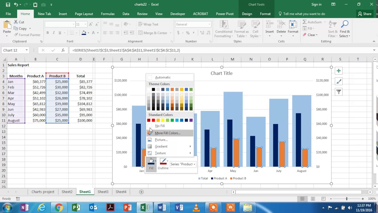
How to Overlay Data Using Excel’s Conditional Formatting
Excel’s conditional formatting feature is a powerful tool that allows you to overlay data in a visually appealing way. By applying conditional formatting rules, you can highlight specific values or cells based on predefined criteria. This not only makes your data easier to interpret but also opens up opportunities for data analysis and pattern recognition.
To overlay data using conditional formatting, follow these simple steps:
- Select the range of cells where you want to apply the overlay.
- Go to the “Home” tab in Excel’s ribbon menu and click on “Conditional Formatting.”
- Choose the desired formatting rule from the dropdown menu. Excel offers a variety of options such as highlighting cells with specific text, color scales, data bars, and icon sets.
- Customize the formatting rule based on your preferences and the data you want to overlay. For example, you can set a rule to highlight cells that contain values greater than a certain threshold.
- Click “OK” to apply the conditional formatting rule to the selected range of cells.
Once the conditional formatting rule is applied, Excel will automatically overlay the data based on the specified criteria. Cells that meet the rule’s conditions will be visually enhanced, making them stand out from the rest of the data. This overlay can be particularly useful for spotting trends, identifying outliers, or drawing attention to important data points.
Remember that conditional formatting is a dynamic feature, meaning it updates in real-time as your data changes. If you modify the values in the cells or add new data, the overlay will adjust accordingly, ensuring that your visuals are always up to date.
Furthermore, you can combine multiple conditional formatting rules to create complex overlays. For example, you can apply different formatting rules to different sets of data, allowing you to compare and contrast them easily.
In addition to the basic conditional formatting options, Excel also provides advanced techniques for overlaying data. These include the use of formulas, such as the IF function, to create custom rules based on complex criteria. By leveraging these advanced techniques, you can tailor the overlays to suit your specific needs and achieve more sophisticated data visualization.
Experiment with different formatting rules and explore the extensive capabilities of Excel’s conditional formatting feature. By overlaying your data effectively, you can unlock valuable insights and communicate information in a visually compelling manner.
Advanced Techniques for Overlaying Data in Excel
When it comes to overlaying data in Excel, there are several advanced techniques that can take your analysis to the next level. These techniques allow you to combine and compare multiple sets of data, providing a more comprehensive picture of your information. Let’s explore some of these advanced methods:
1. Using VLOOKUP or INDEX/MATCH: One of the most powerful techniques for overlaying data is using the VLOOKUP or INDEX/MATCH functions. These functions allow you to search for a specific value in one dataset and retrieve corresponding data from another dataset. By matching data points based on a common key, you can overlay additional information onto your existing dataset.
2. Conditional Formatting with Formulas: While conditional formatting is typically used to format cells based on their values, it can also be used to overlay data using formulas. With conditional formatting, you can apply formatting rules that dynamically update based on your data. For example, you can use a formula to highlight cells where the value exceeds a certain threshold, making it easier to identify patterns and outliers in your data.
3. Power Query: Power Query is a powerful data transformation and analysis tool in Excel. It allows you to connect to various data sources, combine multiple datasets, and perform complex data transformations. With Power Query, you can overlay data by merging tables, appending data, or creating custom calculations. This advanced technique provides a flexible and intuitive way to manipulate and overlay data in Excel.
4. Pivot Tables: Pivot tables are another invaluable tool for overlaying data in Excel. They allow you to summarize and aggregate large datasets, making it easier to compare and analyze information. With pivot tables, you can group data by different categories, add calculated fields, and apply filters to overlay and dissect your data from multiple angles.
5. Custom Visualizations and Add-ins: Excel offers a wide range of custom visualizations and add-ins that can enhance your ability to overlay data. From interactive charts and graphs to advanced statistical analysis tools, these add-ins allow you to visualize and analyze your data in new and dynamic ways. By incorporating these advanced techniques, you can create compelling overlays that highlight key insights and trends.
By leveraging these advanced techniques, you can take your data overlaying capabilities in Excel to new heights. Experiment with these methods, explore their possibilities, and uncover hidden patterns and relationships in your data. With the right tools and techniques, you’ll be able to make more informed decisions and gain a competitive edge in your data analysis endeavors.
Conclusion
In conclusion, learning how to overlay data in Excel can be extremely beneficial for data analysis and visualization. By overlaying multiple data sets, you can easily compare and contrast information, identify patterns, trends, and outliers, and make informed decisions based on the insights obtained.
Overlaying data in Excel allows you to create meaningful visualizations that enhance understanding and facilitate effective communication of complex information. Whether you are analyzing sales figures, market trends, or any other type of data, the ability to overlay data provides a powerful tool for gaining insights and making data-driven decisions.
With the techniques and tools discussed in this article, you can confidently navigate Excel and leverage the power of data overlays to enhance your analysis and reporting capabilities. So, don’t hesitate to explore this feature and take your data analysis skills to the next level.
FAQs
1. What is data overlay in Excel?
Data overlay in Excel refers to the process of merging or combining two different sets of data into a single worksheet or chart. It allows you to visualize the relationship between the two datasets by overlaying them on top of each other.
2. What are the benefits of data overlay?
Data overlay in Excel provides several benefits, including:
– Enhanced data analysis: By overlaying two datasets, you can compare and analyze the relationship between them more effectively.
– Improved visualization: Overlaying data allows you to create visual representations that highlight patterns, trends, or discrepancies between the datasets.
– Simplified reporting: When presenting data to stakeholders, overlaying data can make it easier to convey complex information in a concise and understandable manner.
3. How can I overlay data in Excel?
To overlay data in Excel, you can follow these steps:
– Open the Excel worksheet where you want to overlay the data.
– Select the range of data you want to overlay.
– Copy the selected data.
– Navigate to the location where you want to overlay the data.
– Right-click on the destination cell and choose the “Paste Special” option.
– In the “Paste Special” dialog box, select the desired options (e.g., values, formulas, formatting) and click “OK.”
4. Can I overlay data from multiple worksheets in Excel?
Yes, you can overlay data from multiple worksheets in Excel. To do this, you can use the “Consolidate” feature. Here’s how:
– Open a new worksheet where you want to consolidate the data.
– Go to the “Data” tab and click on the “Consolidate” button.
– In the “Consolidate” dialog box, select the data ranges from the different worksheets that you want to overlay.
– Choose the desired consolidation function (e.g., sum, average, count) and click “OK.”
5. Are there any limitations when overlaying data in Excel?
While overlaying data in Excel can be a powerful tool, it’s important to be aware of a few limitations:
– Data compatibility: The datasets you want to overlay should have a common identifier or matching values to ensure accurate alignment.
– Data size: Overlaying large datasets can result in slower performance and may require additional resources.
– Data formatting: Overlaying data may cause formatting conflicts, such as mismatched number formats or cell sizes.