
Are you looking for a way to effectively visualize the distribution of data in your Excel spreadsheets? Look no further! In this article, we will explore different methods to show the distribution of data in Excel, allowing you to gain valuable insights and make informed decisions.
Excel offers a wide range of options to represent data distribution, from simple histograms to advanced box plots. Whether you need to analyze sales figures, track student performance, or assess project timelines, understanding how to effectively present data distribution is crucial.
In this comprehensive guide, we will walk you through step-by-step instructions on how to create various data distribution charts in Excel. You’ll learn how to interpret these charts, customize them to suit your needs, and leverage the power of visual representation to communicate complex information in a clear and concise manner.
Dive into the world of data visualization with Excel and unlock the potential of your data to drive better decision-making. Let’s get started!
Inside This Article
Overview
In Excel, showing the distribution of data is an important feature for data analysis and visualization. It provides a visual representation of how data points are spread across different categories or groups. Excel offers several chart types that can be used to display the distribution of data effectively, including bar charts, pie charts, histograms, and box-and-whisker plots.
Each chart type has its own unique way of showcasing the distribution of data and can be chosen based on the specific requirements of your analysis. Whether you want to compare data across different categories, show the proportion of each category in the whole, analyze the frequency of values within a range, or display the spread of values along with outliers, Excel has the right chart type for you.
By utilizing the various chart options in Excel, you can easily transform your raw data into visually appealing and insightful representations that help you better understand the distribution patterns and make informed decisions based on the data at hand. Let’s explore these chart types further to understand how they can be used to showcase the distribution of data effectively in Excel.
Bar Chart
A bar chart is a graphical representation of data using rectangular bars of different heights or lengths. It is an effective way to display and compare data across different categories or groups.
The x-axis represents the categories or groups being compared, while the y-axis represents the values or quantities being measured. The bars can be either vertical or horizontal, depending on the orientation of the chart.
Bar charts are particularly useful for showing the distribution of data and identifying patterns or trends. They allow quick and easy comparisons between different categories, making it easy to spot outliers or variations in the data.
Creating a bar chart in Excel is simple. First, select the range of data you want to include in the chart. Then, go to the Insert tab and click on the Bar Chart option. From the dropdown menu, choose the type of bar chart you want to create, such as a clustered bar chart or a stacked bar chart.
Once the chart is inserted, you can customize it by adding labels, titles, and legends. You can also change the colors, styles, and formatting to make the chart more visually appealing and easier to interpret.
Bar charts can be used in various scenarios. For example, you can use a bar chart to compare sales data for different months, track the progress of a project over time, or analyze the distribution of population across different age groups.
Overall, bar charts are a powerful tool for visualizing and understanding data. They provide a clear and concise way to present information, making it easier for viewers to grasp the key insights and make informed decisions.
Pie Chart
A pie chart is a circular graph that represents the relative proportions of different categories or parts of a whole. It is a powerful visualization tool commonly used to show the distribution of data in Excel. The chart is divided into slices, where each slice represents a specific category and its size represents the proportion or percentage it contributes to the whole.
To create a pie chart in Excel, follow these steps:
- Select the data you want to represent in the chart.
- Click on the “Insert” tab in the Excel ribbon.
- Choose the “Pie” chart option from the chart types.
- Select the desired pie chart style from the available options.
- The pie chart will be inserted into your worksheet.
Excel provides various customization options to enhance the appearance and readability of your pie chart. You can modify the chart title, legend, colors, and labels to make the chart more visually appealing and informative.
One important feature of the pie chart is the ability to explode or emphasize specific slices. Exploding a slice means separating it from the rest of the chart to draw attention to that particular category. This can be done by selecting the slice and dragging it away from the center of the chart.
Pie charts are particularly useful when you want to showcase the proportion or distribution of data in a clear and concise manner. They are commonly used in business presentations, reports, and data analysis to visualize sales figures, market shares, survey results, and more.
However, it’s important to note that pie charts have limitations. They can become cluttered and difficult to interpret if there are too many slices or if the differences between the categories are small. In such cases, other chart types like bar charts or stacked column charts may be more suitable.
Overall, pie charts are a valuable tool for visually representing data distribution in Excel. They offer a quick and easy way to understand the proportions of different categories, making it easier to analyze and communicate data effectively.
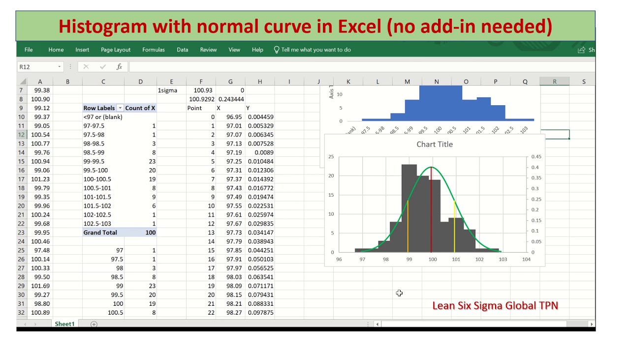
Histogram
A histogram is a graphical representation of the distribution of numerical data. It is an effective tool for visualizing the frequency or count of different data values in a dataset. Histograms provide a way to understand the shape and spread of the data, identifying patterns, outliers, and gaps in the distribution.
To create a histogram in Excel, you need to have the data organized in a single column or row. Here are the steps to create a histogram:
- Select the range of data you want to include in the histogram.
- Go to the ‘Insert’ tab in Excel and click on the ‘Histogram’ button.
- Choose the ‘Histogram’ chart type and click ‘OK’.
- Customize the chart by adding labels, titles, and adjusting the axes if needed.
- Your histogram will be generated and displayed on the worksheet.
By default, Excel automatically determines the number of bins or intervals in the histogram. However, you can also customize this setting to better suit your data. You can do this by right-clicking on the horizontal axis of the histogram, selecting ‘Format Axis’, and adjusting the ‘Bin Width’ or ‘Number of Bins’ options.
Histograms are particularly useful in analyzing large datasets, identifying the range and frequency of values, and identifying any unusual patterns or outliers. They are commonly used in various fields such as statistics, finance, and data analysis.
Excel offers a range of other features to enhance the visualization of histograms. You can add data labels to display the exact frequency or count for each bin, change the colors of the bars, modify the axis scales, or overlay multiple histograms for comparison purposes.
Overall, histograms in Excel provide a powerful tool for effectively visualizing and analyzing the distribution of numerical data. With a few simple steps, you can create insightful and visually appealing histograms that can help you gain valuable insights from your data.
Box and Whisker Plot
A box and whisker plot, also known as a box plot, is a graphical representation of the distribution of a dataset. It is commonly used to show the spread and skewness of data, as well as any potential outliers. The plot consists of a box, whiskers, and sometimes individual data points.
The box in the plot represents the interquartile range (IQR), which is the range between the first quartile (Q1) and the third quartile (Q3) of the data. The line inside the box represents the median. The whiskers extend from the box to the minimum and maximum values within a certain range, typically 1.5 times the IQR. Data points outside this range are considered outliers and are represented as individual dots.
A box and whisker plot provides a visual summary of the data distribution, allowing for quick comparison between different datasets or different categories within a dataset. It is particularly useful when dealing with large datasets or when there is a need to identify any extreme values.
To create a box and whisker plot in Excel, follow these steps:
- Select the data range that you want to plot.
- Click on the “Insert” tab in the Excel ribbon.
- Click on the “Insert Statistical Chart” button.
- Select “Box and Whisker” from the available chart types.
- A box and whisker plot will be inserted on your Excel worksheet.
Once the plot is created, you can customize it further by right-clicking on different elements of the chart, such as the box, whiskers, or data points, and selecting the desired formatting options.
Box and whisker plots are especially useful in scenarios where you want to compare the distribution of data across different categories or groups. For example, you can use a box and whisker plot to compare the salaries of employees in different departments or to analyze the test scores of students from different classrooms. The plot allows you to easily identify variations and outliers, providing valuable insights for decision-making.
Conclusion
In conclusion, learning how to show the distribution of data in Excel is an essential skill for anyone dealing with data analysis or visualization. Excel provides several powerful tools and techniques to help you understand and effectively communicate the patterns and trends within your data.
By using histograms, box plots, and other data visualization tools, you can gain valuable insights into the distribution of your data, identify outliers or anomalies, and make informed decisions based on the patterns you observe. With Excel’s user-friendly interface and wide range of features, you can create visually appealing and informative charts and graphs to present your findings.
Remember to choose the most appropriate visualization method based on your data type and research question. Experiment with different techniques, explore advanced Excel functionalities, and take advantage of the vast online resources and tutorials available to further enhance your Excel skills.
In conclusion, mastering the art of data distribution analysis in Excel will undoubtedly boost your analytical capabilities and provide you with a solid foundation for making evidence-based decisions in various fields.
FAQs
1. How can I show the distribution of data in Excel?
To show the distribution of data in Excel, you can use various methods such as creating histograms, box plots, or using conditional formatting. These techniques allow you to visualize the spread and frequency of data values in your Excel spreadsheet. By understanding the distribution, you can gain insights into the data patterns and make informed decisions based on the analysis.
2. What is a histogram in Excel?
A histogram in Excel is a graphical representation that displays the distribution of data values across different intervals or “bins.” It is an effective way to visualize the frequency or count of observations falling within each interval. Excel provides built-in tools and functions, such as the Histogram feature in the Data Analysis Toolpak or the FREQUENCY function, which allow you to create histograms and analyze the distribution of your data easily.
3. How do I create a histogram in Excel?
To create a histogram in Excel, follow these steps:
- Select the data range you want to analyze.
- Go to the “Data” tab and click on “Data Analysis” (Note: If you don’t see this option, you may need to enable the Data Analysis Toolpak add-in).
- Choose “Histogram” from the list of analysis tools and click “OK.”
- Specify the input range and the bin range in the Histogram dialog box.
- Choose an output option (such as a new worksheet or a chart) and click “OK.”
Excel will generate a histogram based on your data and display it in the selected output option.
4. What is a box plot in Excel?
A box plot, also known as a box-and-whisker plot, is a graphical representation of the distribution of data values that shows the minimum, first quartile, median, third quartile, and maximum values. It provides a visual summary of the data’s spread, skewness, and outliers. To create a box plot in Excel, you can use the built-in charting options or utilize specialized add-ins or templates available online.
5. How do I create a box plot in Excel?
To create a box plot in Excel, you can follow these steps:
- Select the data range you want to analyze.
- Go to the “Insert” tab and click on the “Recommended Charts” or “Insert Statistic Chart” option.
- Choose the “Box and Whisker” chart type from the available options.
- Map the data series to the appropriate box plot elements (minimum, first quartile, median, third quartile, and maximum).
- Customize the appearance and formatting of the chart as desired.
- Click “OK” to create the box plot in Excel.
You now have a box plot that represents the distribution of your data.