
Are you wondering how to view a website as it appears on a mobile device? Whether you're a website owner, developer, or simply curious about how a site looks on a smartphone or tablet, understanding how to view a website as mobile can be incredibly useful. In this article, we'll delve into the various methods and tools available for viewing websites as they appear on mobile devices. From browser settings to online emulators, we'll explore the techniques that allow you to experience a website from a mobile perspective. By the end of this article, you'll have a comprehensive understanding of how to view a website as mobile, empowering you to optimize your own site or simply satisfy your curiosity. So, let's dive in and discover the world of mobile website viewing!
Inside This Article
- Method 1: Using Developer Tools
- Method 2: Using Online Tools
- Method 3: Using Browser Extensions
- Method 4: Using Mobile Emulators
- Conclusion
- FAQs
**
Method 1: Using Developer Tools
**
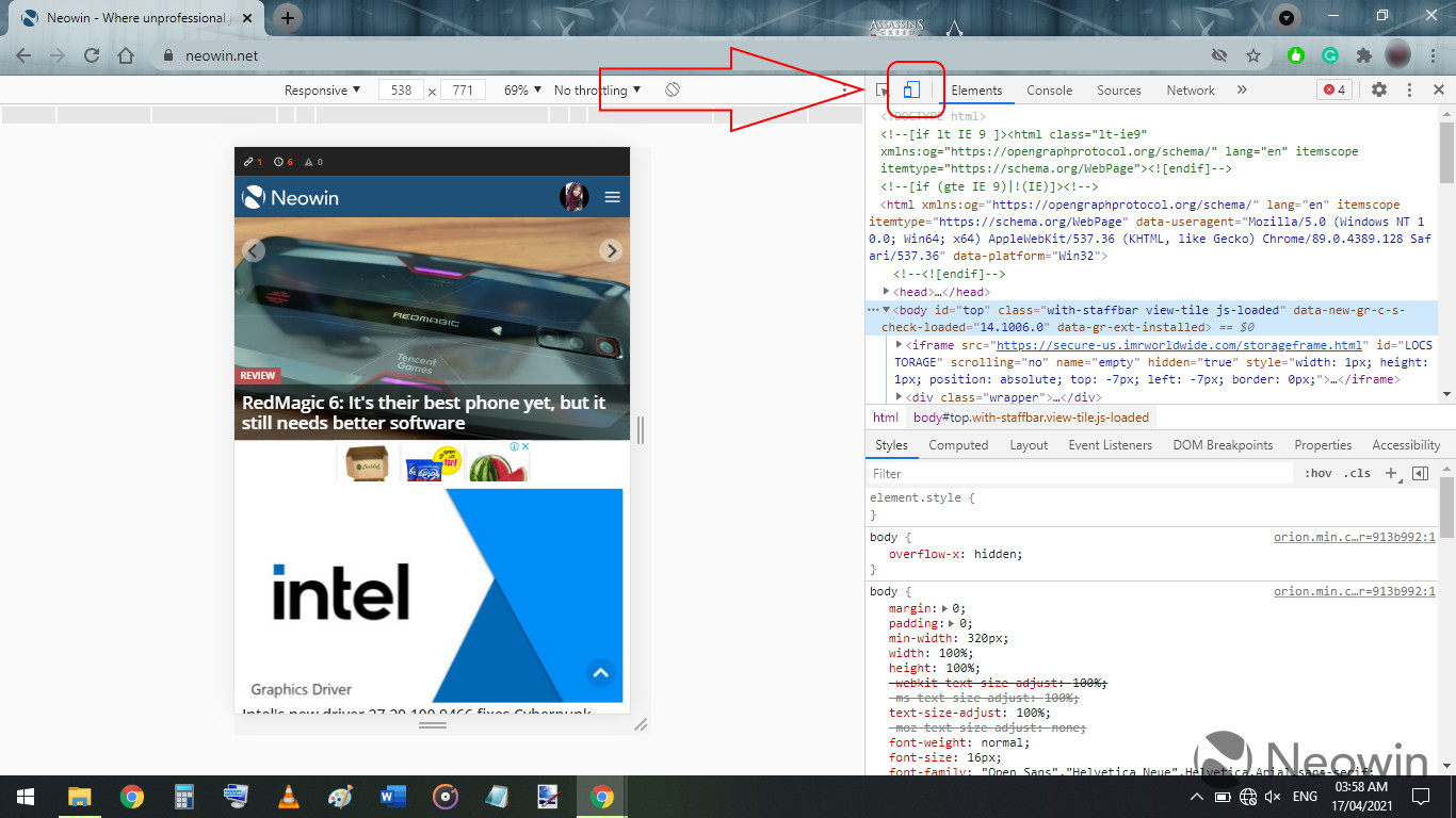
Using developer tools is a convenient way to view a website as it would appear on a mobile device. Most modern web browsers, such as Google Chrome and Mozilla Firefox, come equipped with built-in developer tools that allow you to simulate the mobile browsing experience. To access these tools, simply right-click on the web page and select “Inspect” from the context menu. This will open the developer tools panel at the bottom or side of the browser window.
Once the developer tools panel is open, you can toggle the device toolbar, which resembles a mobile or tablet device, to see how the website responds to different screen sizes. You can also choose specific device presets from a dropdown menu to emulate the exact dimensions and characteristics of popular mobile devices, such as the iPhone or Samsung Galaxy models. Additionally, you can customize the viewport dimensions to test how the website adapts to various screen resolutions.
Furthermore, the developer tools provide a range of features for inspecting and debugging the website’s elements, including the ability to modify CSS styles, analyze network activity, and simulate touch events. This allows you to assess the website’s responsiveness, layout, and performance from a mobile perspective, enabling you to identify and address any issues that may affect the user experience on mobile devices.
html
Method 2: Using Online Tools
Another convenient way to view a website as it would appear on a mobile device is by utilizing online tools designed specifically for this purpose. These tools allow you to enter a website URL and instantly see how it renders on various mobile devices, providing valuable insights into its mobile-friendliness and user experience.
One popular online tool for this task is Google’s Mobile-Friendly Test. By simply entering the website’s URL, this tool generates a mobile usability report, highlighting any issues that may affect the site’s performance on mobile devices. Additionally, it offers suggestions for improvement, empowering website owners to optimize their content for mobile users.
Furthermore, BrowserStack and Responsinator are other online tools that offer comprehensive previews of how a website appears across multiple devices and screen sizes. These tools simulate the mobile browsing experience, allowing users to identify any layout or functionality issues that may arise on different mobile platforms.
**
Method 3: Using Browser Extensions
**
If you prefer a more user-friendly approach to view a website as it appears on a mobile device, browser extensions can be your go-to solution. These extensions are designed to simulate the mobile browsing experience, allowing you to see how a website looks and functions on various mobile devices without leaving your desktop.
One popular browser extension for this purpose is “Mobile View Switcher,” available for browsers such as Chrome and Firefox. Once installed, this extension adds a simple button to your browser, enabling you to switch between different mobile device views with just a click. This seamless functionality provides a quick and convenient way to preview a website’s mobile version without the need for complex configurations or settings.
Another notable extension is “User-Agent Switcher,” which allows you to mimic the user-agent strings of different mobile devices. By changing the user-agent, you can effectively trick websites into displaying their mobile versions, offering a comprehensive way to assess a website’s mobile compatibility and responsiveness.
These browser extensions offer a hassle-free means of exploring how a website appears on various mobile devices, empowering you to evaluate its design, responsiveness, and overall user experience from a mobile perspective.
Method 4: Using Mobile Emulators
Mobile emulators are powerful tools that allow you to view a website as it would appear on various mobile devices. These emulators simulate the behavior of different mobile devices, enabling you to test the responsiveness and functionality of a website across a range of screen sizes and resolutions.
One popular mobile emulator is the Google Chrome Device Mode, which provides a simple yet effective way to emulate the display of a website on different mobile devices. By accessing the Developer Tools in Google Chrome, you can easily switch to the Device Mode and select from a wide range of mobile device presets to view the website as it would appear on specific smartphones and tablets.
Another option is the iOS Simulator, which is available for Mac users. This emulator allows you to simulate the display of a website on various iPhone and iPad models, providing a comprehensive testing environment for iOS devices.
Furthermore, there are online mobile emulators such as BrowserStack and CrossBrowserTesting, which offer a vast selection of real mobile devices for emulation. These platforms enable you to view a website on different smartphones and tablets, allowing for thorough testing and optimization.
Conclusion
Being able to view a website as it appears on a mobile device is crucial for ensuring a seamless user experience. Whether you are a website developer, digital marketer, or simply an individual who wants to ensure that their website looks great on all devices, understanding how to view a website as mobile is essential. By using the various methods outlined in this article, such as using browser developer tools, online emulators, or mobile testing platforms, you can gain valuable insights into how your website appears on different mobile devices. This knowledge empowers you to make necessary adjustments and optimizations, ultimately enhancing the usability and performance of your website across various mobile platforms. With the increasing prevalence of mobile browsing, ensuring a mobile-friendly website is no longer an option but a necessity for success in the digital landscape.
FAQs
Q: Can I view a website as it appears on a mobile phone from my desktop?
A: Yes, you can simulate a mobile view of a website on your desktop using various tools and browser settings. This allows you to see how the website appears and functions on a mobile device.
Q: Why is it important to view a website as it appears on a mobile device?
A: Viewing a website as it appears on a mobile device is crucial because it helps ensure that the site is optimized for mobile users. With the increasing number of people accessing the web via mobile devices, it's essential for websites to provide a seamless and user-friendly experience on smaller screens.
Q: What are some common methods to view a website as it appears on a mobile device?
A: Some common methods include using browser developer tools to simulate a mobile view, using online emulators and simulators, and adjusting the browser settings to mimic a mobile device's display.
Q: Are there any tools specifically designed for viewing websites in a mobile format?
A: Yes, there are several tools and browser extensions available that are specifically designed for viewing websites in a mobile format. These tools often provide a user-friendly interface for simulating various mobile devices and screen sizes.
Q: How can I ensure that my website is optimized for mobile users?
A: To ensure that your website is optimized for mobile users, it's important to use responsive web design, test the site on different mobile devices, optimize loading times, and prioritize mobile-friendly features and functionality.