
Have you ever visited a website on your mobile device only to find it difficult to navigate and read due to the desktop version of the site being displayed? It can be frustrating to constantly zoom in and out to view the content and click on the tiny links. Thankfully, there is a solution – accessing the mobile version of the website.
Many websites have a mobile version specifically designed for smaller screens, offering a user-friendly interface and easier navigation. In this article, we will guide you on how to view the mobile version of a website on your mobile phone. Whether you want to access it for a better browsing experience or due to compatibility issues, we have got you covered.
Inside This Article
- Methods to View Mobile Version of Website
- Benefits of Viewing the Mobile Version of a Website
- Considerations for Viewing Mobile Version of a Website – Limited Functionality or Features – Inconsistent Layouts or Formatting – Potential Compatibility Issues
- Conclusion
- FAQs
Methods to View Mobile Version of Website
There are several methods you can use to view the mobile version of a website. Each method has its own advantages and can be applied depending on your specific needs. Let’s explore these methods:
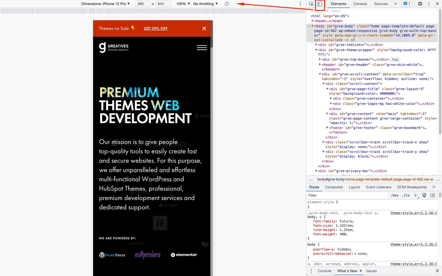
1. Using the Browser’s Developer Tools: Most modern web browsers come with built-in developer tools that allow you to emulate the mobile version of a website. By accessing these tools and selecting the mobile device option, you can view the website as it would appear on a mobile device.
2. Installing a Mobile Emulator Extension: Another option is to install a mobile emulator extension on your web browser. These extensions simulate the mobile browsing experience by emulating different mobile devices’ screen resolutions, user agents, and other parameters. This enables you to view websites as if you were accessing them from a mobile device.
3. Using the Website’s Mobile Version URL: Some websites have separate URLs for their mobile versions. They often have a subdomain or use a specific prefix, such as “m” or “mobile.” By accessing the mobile version URL directly, you can view the site in its mobile-optimized format.
4. Requesting the Mobile Version from the Website’s Menu: In some cases, websites offer a built-in feature to switch to the mobile version. This option is usually accessible through the website’s menu or settings. By selecting the mobile version option, the website will reload in its mobile-friendly layout.
Benefits of Viewing the Mobile Version of a Website
When it comes to browsing the internet on your mobile device, accessing the mobile version of a website can offer numerous benefits. Whether you’re using a smartphone or a tablet, here are some key advantages of viewing the mobile version:
Improved User Experience: Mobile versions of websites are specifically designed to provide a seamless experience on smaller screens. The layout, navigation, and content are optimized to fit the mobile interface, making it easier to browse and interact with the site.
Access to Mobile-Only Features: Some websites offer exclusive features or functionalities on their mobile versions. By accessing the mobile version, you can take advantage of these features, such as mobile-only discounts, location-based services, or specialized mobile apps.
Faster Loading Times: Mobile versions of websites often have optimized code and reduced file sizes, resulting in faster loading times. This is crucial for mobile users who may have limited data plans or slower internet connections. By accessing the mobile version, you can enjoy a faster and smoother browsing experience.
Compatibility with Different Devices: Mobile versions of websites are designed to be compatible with a wide range of mobile devices and operating systems. Whether you’re using an iPhone, an Android device, or a tablet, you can be confident that the mobile version will be accessible and properly displayed on your device.
Overall, accessing the mobile version of a website can enhance your browsing experience, provide access to exclusive features, and ensure compatibility with your mobile device. When browsing the internet on your mobile device, make sure to take advantage of the mobile version whenever available.
Considerations for Viewing Mobile Version of a Website – Limited Functionality or Features – Inconsistent Layouts or Formatting – Potential Compatibility Issues
While viewing the mobile version of a website can have many benefits, it is important to consider some potential limitations. These considerations can include limited functionality or features, inconsistent layouts or formatting, and potential compatibility issues.
One of the main considerations when viewing the mobile version of a website is the possibility of encountering limited functionality or features. Some websites may offer a stripped-down version for mobile devices, which means certain features available on the desktop version may be unavailable or scaled down on the mobile version. This can include features like interactive maps, complex animations, or advanced search functions. It’s important to be aware of these limitations and understand that not all website features may be accessible on the mobile version.
Inconsistent layouts or formatting can also be a concern when viewing a website’s mobile version. Websites are designed to be responsive, meaning they adapt to different screen sizes and resolutions. However, due to differences in browser rendering and mobile device capabilities, the layout of a website can sometimes appear differently on a mobile device compared to a desktop computer. This can result in elements being misplaced, text being cut off, or distorted images. It’s important to take note of these inconsistencies and be prepared for potential visual discrepancies when accessing the mobile version of a website.
Compatibility issues may arise when viewing the mobile version of a website, particularly if the website is not optimized for a specific mobile browser or operating system. Some websites may have compatibility constraints that make them less responsive or usable on certain devices. These compatibility issues can result in slow loading times, malfunctioning features, or even complete inaccessibility. It’s important to be aware of these potential compatibility issues and ensure that the website you are trying to access is optimized for the mobile device and browser you are using.
Overall, while viewing the mobile version of a website can be convenient and beneficial, it’s essential to consider the limitations that may come with it. Understanding the potential for limited functionality or features, inconsistent layouts or formatting, and compatibility issues will help you make an informed decision when accessing a website on a mobile device.
Conclusion
In today’s mobile-driven era, being able to view the mobile version of a website is essential. With the rising number of smartphone users, websites have become more responsive and adaptive to the different screen sizes and resolutions. By accessing the mobile version of a website, users can enjoy a seamless browsing experience, optimized for their handheld devices.
Whether you’re using an Android or iOS device, there are several ways to access the mobile version of a website. From using the browser’s settings to utilizing third-party apps and tools, you have the flexibility to choose the method that suits your preferences and needs. Remember to consider factors such as user experience, website performance, and compatibility before deciding which way to view the mobile version of a website.
So, the next time you want to access a website on your mobile device, make sure you follow these methods to enjoy a browsing experience that’s tailored for your smartphone or tablet. Stay connected on the go and explore the mobile versions of your favorite websites hassle-free!
FAQs
**1. What is the mobile version of a website?**
The mobile version of a website refers to a version of a website that is specifically designed and optimized for viewing on mobile devices such as smartphones and tablets. It is a responsive and mobile-friendly version that adapts to the smaller screens and touch interfaces of mobile devices.
**2. Why is it important to view the mobile version of a website?**
Viewing the mobile version of a website is crucial because it provides a better user experience on mobile devices. Websites that are not optimized for mobile can be difficult to navigate, read, and interact with on small screens, leading to frustration for users. By accessing the mobile version, users can enjoy a seamless and user-friendly browsing experience.
**3. How can I view the mobile version of a website on my smartphone?**
To view the mobile version of a website on your smartphone, you can simply open your mobile browser and enter the website’s URL. Most websites have responsive designs that automatically detect the device and display the appropriate version. Alternatively, some websites provide a “Switch to Mobile” option or a menu where you can choose the mobile version.
**4. Can I switch back to the desktop version of a website after viewing the mobile version?**
Yes, you can switch back to the desktop version of a website after viewing the mobile version. Typically, websites provide an option to switch between versions in the mobile menu, footer, or settings. You can select the “Desktop Version” or similar option to switch back to the desktop layout and design.
**5. Are there any limitations to viewing the mobile version of a website?**
While viewing the mobile version of a website offers a more optimal experience on mobile devices, it may have certain limitations compared to the desktop version. Some features, functionalities, or content may be scaled down or rearranged to fit the smaller screen, resulting in a slightly different layout and user interface. However, the core content should remain accessible and readable.