
Have you ever wondered how to create a frequency table in Excel when dealing with categorical data? Excel is a powerful tool that can help you visualize and analyze data, and creating a frequency table is an essential step in understanding the distribution of your data.
A frequency table provides a summary of how often each category appears in a dataset, allowing you to identify the most common and least common values. This information can be incredibly useful in various fields, such as marketing, research, and data analysis.
In this article, we will guide you through the process of making a frequency table in Excel with categorical data. We will cover both manual methods and Excel functions that can simplify the process. Whether you are new to Excel or seeking to enhance your data analysis skills, this guide will equip you with the knowledge you need to create accurate and informative frequency tables.
Inside This Article
- Understanding Frequency Tables
- Steps to Create a Frequency Table in Excel with Categorical Data
- Analyzing and Interpreting a Frequency Table
- Potential Limitations and Tips
- Conclusion
- FAQs
Understanding Frequency Tables
A frequency table is a statistical tool used to organize and summarize categorical data. It provides a clear and concise representation of the frequency or count of each unique category within the data set. In simpler terms, it tells us how many times each category appears in the data.
Frequency tables play a crucial role in analyzing categorical data. Unlike numerical data, which can be easily analyzed using measures like mean and standard deviation, categorical data lacks the same inherent numerical properties. By creating a frequency table, we can gain a deeper understanding of the categorical variables and identify any patterns or trends.
For example, let’s say we have a survey dataset with a categorical variable “Favorite Color”, where respondents were asked to choose their favorite color from a list of options. By creating a frequency table, we can determine which color received the highest number of votes or if there are any colors that were rarely chosen.
Frequency tables allow us to visually examine the distribution of categories within the dataset. This information can be used to make informed decisions, identify outliers, and provide insights for further analysis. They serve as a valuable tool in various fields such as market research, social sciences, and data analytics.
Steps to Create a Frequency Table in Excel with Categorical Data
Creating a frequency table in Excel is a useful way to analyze and present categorical data. By organizing the data into distinct categories and counting the occurrences of each category, you can gain valuable insights into the distribution and patterns within your data. Follow these steps to create a frequency table in Excel with categorical data:
Step 1: Prepare the data in Excel
The first step is to open Microsoft Excel and input your categorical data into a new worksheet. Each data entry should be contained within a single cell in a column. Ensure that your data is properly formatted and does not contain any errors or inconsistencies.
Step 2: Sort the data in ascending order
To create a frequency table, it is important to have the data sorted in ascending order. Select the column containing the categorical data, go to the “Data” tab, and click on the “Sort” button. Choose the appropriate sorting options to arrange the data in ascending order.
Step 3: Create unique categories in a new column
In order to count the occurrences of each category, you need to create a column containing unique categories. To do this, insert a new column next to the column with your categorical data. In each cell of the new column, enter a formula that will extract the unique categories from the original column. One way to do this is by using the “Remove Duplicates” function under the “Data” tab.
Step 4: Count the occurrences of each category using the COUNTIF function
Now that you have the unique categories in a separate column, you can use the COUNTIF function to count the occurrences of each category. In the first cell next to the first unique category, enter the formula “=COUNTIF(CategoryColumn, UniqueCategory)”. Replace “CategoryColumn” with the range of cells containing the categorical data, and “UniqueCategory” with the cell reference of the unique category. Then, copy the formula to the remaining cells next to the other unique categories.
Step 5: Organize the data in a tabular format using columns and rows
To create a visually appealing frequency table, organize the data in a tabular format using columns and rows. Label the first column as “Category” and the second column as “Frequency.” Fill in the respective categories and their corresponding frequency counts in the table. You can also format the table by adjusting the width of the columns and adding borders, shading, or other formatting styles.
By following these steps, you can easily create a frequency table in Excel with categorical data. This table will provide a clear overview of the distribution of your data and allow for further analysis and interpretation.
Analyzing and Interpreting a Frequency Table
Once you have created a frequency table in Excel with categorical data, the next step is to analyze and interpret the information it provides. Understanding the frequency distribution, identifying the most common and least common categories, and analyzing patterns or trends in the data can offer valuable insights. Let’s explore these concepts in more detail:
Understanding the frequency distribution: The frequency distribution in a table shows the number of occurrences of each category or value. It gives an overview of how the data is distributed across different categories. By examining the frequencies, you can get a sense of whether the data is evenly distributed or skewed towards certain categories.
Identifying the most common and least common categories: By looking at the frequencies in the table, you can easily identify the categories that appear most frequently. These are the most common categories or values in your data. On the other hand, you can also identify the categories with the lowest frequencies, which are the least common categories. This information can help you understand the dominant patterns or outliers in your data.
Analyzing patterns or trends in the data: A frequency table allows you to identify any patterns or trends in the data. By examining the frequencies across different categories, you can observe if there are any significant differences or similarities between certain groups. This analysis can provide valuable insights into the relationships or associations between variables in your dataset.
For example, if you have a frequency table displaying the number of phone models sold in different regions, you might observe that a certain phone model is more popular in urban areas compared to rural areas. This insight can help you tailor your marketing strategies accordingly.
Furthermore, you can use additional analysis techniques like calculating percentages, creating bar charts or pie charts based on the frequency table data to gain a more visual representation of the distribution and patterns in your categorical data.
By analyzing and interpreting the frequency table, you can gain a deeper understanding of your categorical data, identify key trends or patterns, and make informed decisions based on the insights obtained.
Potential Limitations and Tips
When working with frequency tables, it is important to be aware of potential limitations and consider helpful tips to optimize your analysis. Here are some key considerations:
Dealing with missing or incomplete data
One potential limitation when creating a frequency table is dealing with missing or incomplete data. In Excel, missing data is often represented as blank cells. When counting the occurrences of each category, it is crucial to handle these missing values appropriately.
One approach is to exclude missing data from the frequency table altogether. This can be done by filtering out blank cells or applying specific criteria to exclude incomplete data points. Another option is to assign a placeholder category, such as “N/A” or “Unknown,” to represent the missing data in the frequency table.
Handling large datasets effectively
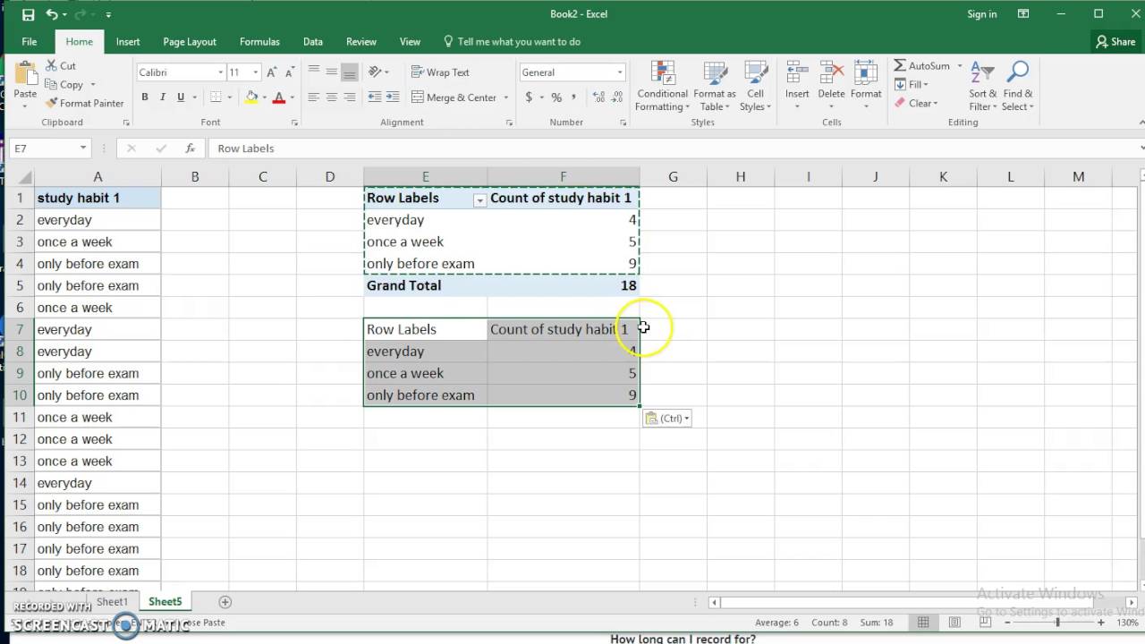
Working with large datasets can present challenges when creating frequency tables. Excel has a limit on the number of rows and columns it can handle. To effectively analyze large datasets, consider using pivot tables instead of manual frequency calculations. Pivot tables allow you to summarize data and generate dynamic frequency tables with a few clicks, making it easier to comprehend and manipulate large amounts of data.
To create a pivot table, select your dataset, go to the “Insert” tab, and click on “PivotTable.” Choose the range of data and the location for the pivot table, and select the desired variables to analyze. With pivot tables, you can easily group data, filter categories, and visualize the frequency distribution.
Tips for improving the visual representation of the frequency table
While frequency tables provide valuable insights into the distribution of categorical data, visually representing the data can enhance its impact. Here are some tips for improving the visual representation of your frequency table:
- Use appropriate charts: Consider using bar charts or pie charts to visually represent the frequency distribution. These charts allow for a clear comparison of different categories and make it easier to identify the most common and least common categories.
- Color coding: Assigning different colors to categories can make the frequency table more visually appealing and help highlight patterns or trends in the data.
- Add titles and labels: Ensure your frequency table has a clear title and axis labels that accurately describe the variables being analyzed. This helps the audience understand the context and interpretation of the data.
- Provide context: Include a brief description or explanation of the frequency table to provide context and make the data more meaningful to the audience. This can be done through a caption or a separate section.
By following these tips, you can create visually appealing frequency tables that effectively communicate the distribution and patterns in your categorical data.
Conclusion
In conclusion, creating a frequency table in Excel with categorical data is a straightforward process that can provide valuable insights into the distribution of your data. By following the steps outlined in this article, you can easily organize and summarize your categorical data, allowing you to analyze and interpret it more effectively. The frequency table enables you to see the frequency and percentage of each category, helping you identify patterns, trends, and outliers within your data set.
Excel offers a range of powerful tools for data analysis, and the frequency table is just one of them. By utilizing features like filtering, sorting, and pivot tables, you can further explore and visualize your data. With the ability to customize and manipulate your frequency table, Excel provides a flexible and versatile platform for gaining valuable insights and making informed decisions based on your categorical data.
FAQs
1. How do I create a frequency table in Excel with categorical data?
To create a frequency table in Excel, follow these steps:
- Select the range of data that represents the categorical variable you want to analyze.
- Go to the “Data” tab in the Excel ribbon.
- Click on the “Data Analysis” button in the “Analysis” group.
- Choose “Descriptive Statistics” from the list of analysis tools and click “OK”.
- In the “Descriptive Statistics” dialog box, select the range of input data and choose the “Summary statistics” option.
- Select a location for the output table and click “OK”.
- The frequency table will now be generated in the specified location, displaying the count of each category.
2. Can I create a frequency table in Excel with numerical data?
No, a frequency table is specifically used to analyze categorical data. If you have numerical data, you can create a histogram or use other statistical methods to analyze the data. The frequency table is useful when you want to summarize and count the occurrences of each category in a dataset.
3. How can I customize the appearance of a frequency table in Excel?
Once you have created the frequency table in Excel, you can customize its appearance using the formatting options available in Excel. You can change the font style, size, and color, adjust the cell borders and shading, and apply conditional formatting to highlight specific categories based on certain conditions.
4. Can I sort the frequency table in Excel to display the categories in a specific order?
Yes, you can sort the frequency table in Excel to display the categories in a specific order. To do this, select the entire frequency table or the column containing the categories, and then use the “Sort” feature in Excel. You can sort the data in ascending or descending order based on the category names or the frequency counts.
5. How can I export the frequency table from Excel to another application?
To export the frequency table from Excel to another application, you can simply copy the table and paste it into the desired application. Select the range of cells containing the frequency table, right-click and choose the “Copy” option or press Ctrl+C. Then, navigate to the other application and right-click in the desired location and choose the “Paste” option or press Ctrl+V. The frequency table will be pasted as a table or text, depending on the formatting capabilities of the application.