
Changing the data range in an Excel graph is a crucial skill that allows you to modify and update the information displayed in your visualizations. Whether you want to add more data points, remove or replace existing ones, or simply adjust the range of values on the x or y-axis, knowing how to change the data range in Excel will help you create more accurate and meaningful graphs.
By adjusting the data range, you can effectively communicate trends, patterns, and relationships between variables in your data set. This flexibility allows you to tailor your graphs to highlight specific insights or showcase different data subsets. Whether you’re a student working on a project, a business professional analyzing sales data, or a data analyst presenting findings to stakeholders, understanding how to change the data range in an Excel graph is a valuable skill to have.
Inside This Article
- Overview
- Step 1: Select the Data Range
- Step 2: Edit the Data Range
- Step 3: Update the Graph with the New Data Range
- Additional Considerations
- Conclusion
- FAQs
Overview
Changing the data range in an Excel graph can be a useful technique when you want to update the information being displayed. By adjusting the data range, you can include or exclude specific data points, add new data, or modify the existing data to create a more accurate and meaningful representation.
Excel provides a user-friendly interface that allows you to easily modify the data range in a graph. In just a few simple steps, you can select the desired data range, edit it as needed, and update the graph to reflect the changes. This flexibility makes it possible to customize your graph to meet your specific needs and showcase the information in the most effective way.
In this article, we will walk you through the process of changing the data range in an Excel graph, providing step-by-step instructions along with additional considerations to keep in mind. By the end, you’ll have the knowledge and confidence to make adjustments to your graphs effortlessly.
Step 1: Select the Data Range
When working with Excel graphs, it is essential to select the correct data range to ensure accurate and meaningful visual representations. Follow these steps to select the data range for your graph:
- Open your Excel spreadsheet containing the data you want to include in your graph.
- Click and drag your cursor to select the cells that make up the data range you want to graph. Be sure to include the necessary headers and any additional data columns or rows. The selected cells will be highlighted.
- For more complex data ranges, you can hold the Ctrl key while selecting individual non-contiguous cells or ranges.
By carefully selecting the data range, you are setting the foundation for an accurate and meaningful graph. It is important to include all the relevant data and exclude any unnecessary information.
Once you have selected the data range, you can move on to the next step of editing the data range to refine your graph and make it more visually appealing.
Step 2: Edit the Data Range
Once you have selected the data range for your Excel graph, you may need to edit it to include additional data points or exclude certain values. Editing the data range is a straightforward process that allows you to customize your graph to suit your needs.
To edit the data range in Excel, follow these steps:
- First, open the Excel worksheet containing the graph you want to edit.
- Next, select the graph by clicking on it.
- Once the graph is selected, you will see a border around it indicating that it is active.
- At the top of the Excel window, you will find the “Design” tab. Click on it.
- Within the “Design” tab, locate the “Data” group.
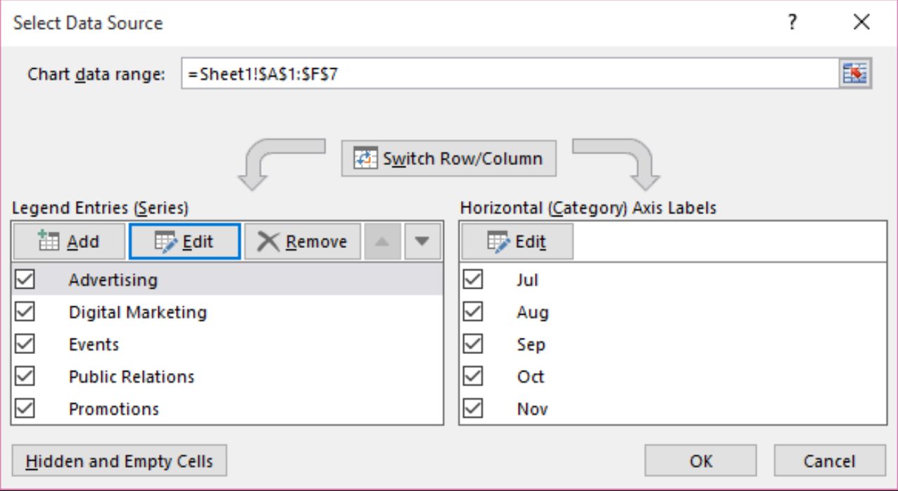
- In the “Data” group, click on the “Select Data” option. A dialog box will appear.
- In the dialog box, you will see two sections: “Legend Entries (Series)” and “Horizontal (Category) Axis Labels.”
- To edit the data range, click on the “Edit” button next to the section you want to modify.
- A new dialog box will open, allowing you to change the data range.
- Enter the new data range by selecting the appropriate cells in your worksheet.
- After selecting the new data range, click “OK.”
By following these steps, you can easily edit the data range for your Excel graph. Whether you need to add or remove data points, this simple process allows you to customize your graph and present the information accurately.
Step 3: Update the Graph with the New Data Range
Once you have edited and finalized the data range for your graph in Excel, the next step is to update the graph to reflect the changes. Follow these simple steps to update your graph with the new data range:
- Click on the graph to select it. This will activate the Chart Tools contextual tab.
- On the Chart Tools contextual tab, navigate to the Data group and click on the “Select Data” button.
- The “Select Data Source” dialog box will appear. In this dialog box, you will find two sections: “Legend Entries (Series)” and “Horizontal (Category) Axis Labels”.
- In the “Legend Entries (Series)” section, you will see the existing data series for your graph. Click on the “Edit” button.
- The “Edit Series” dialog box will appear. In this dialog box, you will find two input boxes: “Series name” and “Series values”.
- In the “Series values” input box, click on the small icon at the end. This will activate the “Edit Series” dialog box.
- In the “Edit Series” dialog box, you will find an input box labeled “Series values”. Click on the small icon at the end of this input box to select the new data range for your graph.
- A new dialog box, “Edit Series”, will appear. Here you can specify the new data range by selecting the cells in the worksheet or by manually typing the range into the input box.
- After selecting or inputting the new data range, click on the “OK” button in the “Edit Series” dialog box.
- Click on the “OK” button in the “Select Data Source” dialog box to apply the new data range to your graph.
- Your graph will now be updated with the new data range. You can verify the changes by checking the data points and labels on the graph.
By following these steps, you can easily update the graph with a new data range in Excel. Whether you need to add or remove data points, adjust the axis labels, or change the data series, Excel provides a user-friendly interface to make these modifications. With the flexibility to update and customize your graphs, you can effectively present your data in a visually appealing and informative way.
Additional Considerations
When changing the data range in an Excel graph, there are a few additional considerations to keep in mind to ensure the accuracy and effectiveness of your visual representation. Here are some important factors to consider:
1. Data Consistency: Before modifying the data range, double-check that the new data range maintains the same consistency as the original range. This means ensuring that the data points align correctly with the corresponding labels, and that there are no missing or duplicate entries.
2. Label Updates: If the labels for your graph’s data categories or axis titles are based on the original data range, you may need to update them manually after modifying the range. This will help maintain the clarity and relevance of your graph’s information, ensuring that viewers can easily interpret the data.
3. Range Expansion: If you decide to increase the size of the data range, consider whether your graph has enough space to accommodate the additional data points. Adjusting the size of your graph may be necessary to prevent overcrowding and maintain visual clarity.
4. Data Validation: It’s crucial to ensure the accuracy and integrity of your data when modifying the range. Check for any errors, inconsistencies, or outliers that may impact the overall representation of your graph. Use built-in data validation tools in Excel to easily identify and correct any issues.
5. Refreshing Data: If your graph is linked to an external data source, such as a live feed or a database, changing the data range may require refreshing or updating the connection. This will ensure that the most up-to-date information is reflected in your graph and prevent any discrepancies between the displayed data and the actual dataset.
By considering these additional factors when changing the data range in an Excel graph, you can ensure the accuracy, clarity, and relevance of your visual representation. Taking the time to double-check your data, update labels, adjust graph size if necessary, validate data, and refresh external connections will help you create impactful and informative graphs in Excel.
The ability to change the data range in an Excel graph is a powerful tool that allows you to customize and modify your visualizations. By adjusting the data range, you can refine the information displayed, highlight specific trends or patterns, and create more meaningful presentations.
Whether you need to update the range to include new data or focus on specific data points, Excel offers simple and effective methods to modify your graph. From adjusting the selection manually to using dynamic ranges or named ranges, you have the flexibility to tailor your graph to suit your needs.
With the step-by-step instructions provided in this article, you can easily change the data range in your Excel graph and gain more control over your visualizations. Experiment with different ranges, analyze the impact on your graphs, and present your data in a more meaningful and impactful way.
By mastering this skill, you can unlock the full potential of your Excel graphs and transform them into powerful tools for data analysis and communication.
FAQs
1. How do I change the data range in an Excel graph?
To change the data range in an Excel graph, follow these steps:
- Select the graph you want to modify.
- Click on the “Design” tab in the Excel ribbon.
- Click on the “Select Data” button.
- In the “Select Data Source” dialog box, you will see two sections: “Legend Entries (Series)” and “Horizontal (Category) Axis Labels.”
- Under the “Legend Entries (Series)” section, click on the series you want to modify and then click on the “Edit” button.
- In the “Edit Series” dialog box, you will see a field labeled “Series values.” This field contains the current data range for the series.
- Select the new data range by dragging your cursor over the cells in your worksheet, or manually enter the new cell range in the “Series values” field.
- Click “OK” to apply the changes.
Your graph will now display the updated data range.
2. Can I change the data range for multiple series in an Excel graph simultaneously?
Yes, you can change the data range for multiple series in an Excel graph simultaneously.
- Follow the steps mentioned above to access the “Edit Series” dialog box.
- Instead of clicking on the “Edit” button for each series individually, select multiple series by holding down the Ctrl key while clicking on the desired series.
- In the “Edit Series” dialog box, update the data range for all selected series either by dragging your cursor over the new range or by entering the new range manually in the “Series values” field.
- Click “OK” to apply the changes.
This will update the data range for all selected series in the graph simultaneously.
3. Can I change the data range in an Excel graph without modifying the original data?
Yes, you can change the data range in an Excel graph without modifying the original data.
- Follow the same steps mentioned above to access the “Edit Series” dialog box.
- Instead of selecting a new range of cells in your worksheet, manually enter the new cell range in the “Series values” field without deleting or modifying the existing values.
- Click “OK” to apply the changes.
This will update the data range in the graph without affecting the original data.
4. What happens if the new data range I enter in the graph exceeds the original range?
If the new data range you enter in the graph exceeds the original range, the graph may display empty or incorrect data points for the extended range.
It is important to ensure that the new range accurately captures the data you want to display on the graph. If the extended range is incorrect or empty, consider adjusting the range to include the appropriate data or modifying the input in the worksheet itself.
5. Can I use formulas to dynamically update the data range in an Excel graph?
Yes, you can use formulas to dynamically update the data range in an Excel graph. By referencing the cells containing your data in a formula, any changes made to those cells will automatically reflect in the graph.
To do this:
- Select the graph you want to modify.
- Click on the “Design” tab in the Excel ribbon.
- Click on the “Select Data” button.
- In the “Select Data Source” dialog box, navigate to the “Legend Entries (Series)” section.
- Select the series you want to modify and then click on the “Edit” button.
- In the “Edit Series” dialog box, delete the existing data range in the “Series values” field.
- Instead of manually entering a cell range, enter a formula that references the cells containing your data. For example, “=Sheet1!A1:A10” will dynamically update the range if values are added or removed from cells A1 to A10 in Sheet1.
- Click “OK” to apply the changes.
Your graph will now dynamically update based on changes in the referenced cells.