
Excel is a powerful tool that allows you to present data in a visually appealing and easily understandable format. One of the most effective ways to represent data is by using pie charts. A pie chart is a circular graph divided into slices, with each slice representing a specific category or data point. It provides a quick and intuitive way to analyze and compare different data sets.
In this article, we will explore how to create a pie chart in Excel with multiple data points. Whether you need to showcase sales figures, survey results, or any other type of data, Excel provides a simple and efficient method to generate informative and visually appealing pie charts. By following the step-by-step instructions and utilizing Excel’s powerful features, you can create stunning and dynamic visual representations of your data.
Inside This Article
- Overview
- Step 1: Prepare your data
- Step 2: Insert a pie chart
- Step 3: Customize your pie chart
- Step 4: Add multiple data to your pie chart
- Step 5: Format and finalize your pie chart
- Conclusion
- FAQs
Overview
Creating a pie chart in Excel is a great way to visually represent data and gain insights at a glance. Pie charts are effective in displaying relative proportions of different categories or data points. While Excel provides a user-friendly interface for creating and customizing pie charts, adding multiple data points to a single chart may seem challenging at first. In this tutorial, we will walk you through the step-by-step process of creating a pie chart in Excel with multiple data, allowing you to effectively communicate complex information in a clear and engaging way.
By following this tutorial, you will learn how to:
- Prepare your data
- Insert a pie chart
- Customize your pie chart
- Add multiple data to your pie chart
- Format and finalize your pie chart
So let’s dive in and discover how you can create captivating pie charts in Excel.
Step 1: Prepare your data
Before creating a pie chart in Excel with multiple data, it’s important to prepare your data properly. Follow these steps to ensure your data is organized and ready to be visualized:
1. Open Microsoft Excel and create a new worksheet or open an existing one where you want to create the pie chart.
2. Enter your data into the worksheet. Each piece of data should correspond to a specific category that you want to represent in the pie chart. For example, if you want to create a pie chart showing the distribution of sales by product category, you would enter the product categories in one column and the corresponding sales figures in another column.
3. Make sure your data is accurate and complete. Check for any missing values or errors that could affect the accuracy of your pie chart.
4. Optionally, you can sort your data in ascending or descending order to make it easier to analyze and visualize later on. To do this, highlight the data range and use the “Sort” function under the “Data” tab.
5. Consider adding a title to your data set. This will make it easier to identify and reference the data when creating the chart.
By following these steps and properly preparing your data, you’ll have a solid foundation for creating a pie chart in Excel with multiple data sets. Now, let’s move on to the next step and learn how to insert a pie chart into your worksheet.
Step 2: Insert a pie chart
After preparing your data in Excel, the next step is to insert a pie chart. A pie chart is a great way to visualize data and understand the composition of different categories.
To insert a pie chart, follow these steps:
- Select the range of cells that contain the data you want to include in the pie chart.
- Go to the “Insert” tab in the Excel ribbon.
- Click on the “Pie” chart button in the “Charts” group.
- Choose the desired pie chart style from the drop-down menu.
After clicking on the desired pie chart style, Excel will automatically insert a pie chart into your worksheet, using the selected data range as the basis for the chart.
At this point, you will see a basic pie chart on your worksheet, representing the data you selected. However, the default chart might not be visually appealing or easy to interpret. That’s where customization comes into play.
Step 3: Customize your pie chart
Now that you’ve inserted a pie chart in Excel with your data, it’s time to customize it to suit your needs. Here are some ways to personalize your pie chart:
1. Change the chart type: If you decide that a different chart type would better represent your data, you can easily switch from a pie chart to a different chart type. Simply right-click on the chart, select “Change Chart Type,” and choose the desired chart type from the options.
2. Modify the chart layout: Excel offers various chart layouts to choose from, allowing you to change the overall appearance of your pie chart. You can experiment with different layouts by selecting “Chart Layouts” from the Chart Design tab in the toolbar.
3. Adjust the chart colors: Colors play a crucial role in making your pie chart visually appealing. Excel provides different color schemes to choose from, or you can manually change the colors by selecting individual portions of the pie chart and formatting them using the “Fill” or “Shape Fill” options.
4. Add data labels: Data labels provide additional information about each segment of the pie chart. You can add data labels by right-clicking on the chart, selecting “Add Data Labels,” and choosing the desired label position.
5. Customize the legend: The legend in a pie chart helps identify what each color represents. You can modify the legend by right-clicking on it, selecting “Format Legend,” and making changes to the appearance, position, or alignment.
6. Apply chart styles: Excel offers a range of pre-designed chart styles to choose from. These styles include different combinations of color, font, and effects. You can apply a chart style by selecting the chart and choosing your preferred style from the Chart Styles group in the Chart Design tab.
7. Add a title and axis labels: To provide context for your pie chart, it’s essential to add a title and axis labels. You can do this by selecting the chart and editing the text boxes that appear above and below the chart.
8. Resize and position the chart: To ensure optimal visibility and alignment within your worksheet, you can resize and reposition the pie chart. Simply click on the chart, and drag the corner handles to resize it. You can also click and drag the chart to move it to a desired location.
By customizing your pie chart in Excel, you can make it more visually appealing and effectively convey your data to your audience. Experiment with different customization options to find the perfect look and feel for your chart.
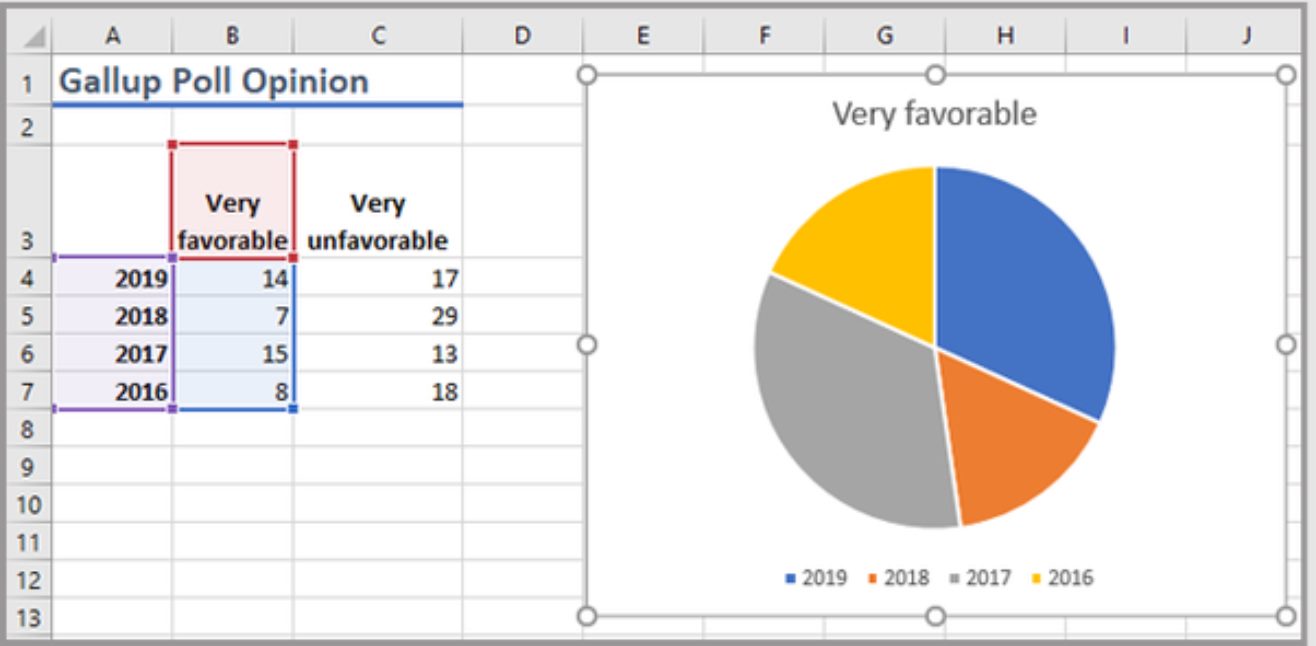
Step 4: Add multiple data to your pie chart
Now that you have created a basic pie chart in Excel, it’s time to take it up a notch by adding multiple data sets. Adding multiple data sets to your chart allows you to compare and visualize different categories or groups within your data.
To add multiple data to your pie chart, follow these steps:
- Select your pie chart by clicking on it. This will activate the Chart Tools tab on the Excel ribbon.
- Click on the “Design” tab in the Chart Tools menu. This will display the design options for your chart.
- Under the “Data” section, click on the “Select Data” button. This will open the “Select Data Source” dialog box.
- In the “Select Data Source” dialog box, you will see the “Legend Entries (Series)” section. This is where you can add and edit your data sets.
- Click on the “Add” button to add a new data set. In the “Edit Series” dialog box, you can specify the name of the data set and the range of cells that contain the data values. You can also choose which axis to assign the data set to if you have multiple axes.
- You can repeat steps 5 and 6 to add as many data sets as you need. Each data set will be represented as a separate slice in the pie chart.
- Click “OK” to close the “Edit Series” dialog box.
- Click “OK” again to close the “Select Data Source” dialog box.
Your pie chart will now display the added data sets as separate slices. You can further customize and format these slices using the options available in the Chart Tools menu.
Adding multiple data sets to your pie chart can help you visualize the distribution and proportions of different categories or groups within your data. It provides a clear and concise way to compare the values and see the relationship between different data points.
By adding multiple data sets to your pie chart, you can enhance the visual impact of your data and make it more engaging and meaningful to your audience.
Step 5: Format and finalize your pie chart
Once you have inserted and added multiple data to your pie chart, you are now ready to format and finalize it. Formatting your pie chart can help make it visually appealing and effectively convey the information you want to present. Here are some essential formatting tips to consider:
1. Change the chart style: Excel offers a variety of preset chart styles to choose from. Experiment with different styles to find the one that best suits your needs. You can access these styles through the “Chart Styles” option in the Chart Design tab.
2. Customize colors: You can change the colors of the slices in your pie chart to highlight specific data or create a cohesive visual theme. To do this, select the chart and go to the “Format” tab. From there, you can choose different colors for each slice or use a gradient effect.
3. Adjust the chart layout: Excel allows you to customize the layout of your pie chart. You can move the chart title, legend, and data labels to optimize the presentation. Simply select the element you want to modify and use the options provided in the “Format” tab to make the necessary adjustments.
4. Add data labels: Data labels provide additional information about the numeric values represented in each slice of the pie chart. You can choose to display these labels inside or outside the slices, or even customize them to display specific data points. Use the “Data Labels” option in the “Format” tab to customize this feature.
5. Apply 3D effects (optional): If you want to add some visual depth to your pie chart, you can apply 3D effects. Excel provides various 3D effects that you can experiment with, such as perspective, rotation, and depth. These effects can be accessed through the “Format” tab under the “3D Rotation” option.
6. Enable chart animations (optional): Adding animations to your chart can help draw attention to specific data points and make your presentation more engaging. Excel provides a range of animation options, such as fading, scaling, and flying in. To enable chart animations, go to the “Animation” tab, select your preferred animation style, and adjust the settings as needed.
Remember, formatting your pie chart is not only about aesthetics, but also about effectively communicating your data. Make sure to choose a style and layout that enhances the readability and clarity of your information.
Once you have finalized the formatting of your pie chart, review it to ensure that it accurately represents the data you want to convey. Double-check the labels, values, and overall presentation to avoid any potential mistakes or misleading information.
With the final touches applied, your pie chart is now ready to be shared or incorporated into your reports, presentations, or any other visual representations of data that you may require.
Conclusion
In conclusion, creating a pie chart in Excel with multiple data sets is a valuable skill that can greatly enhance data visualization and analysis. By carefully organizing and formatting the data, selecting the appropriate chart type, and customizing the design, you can effectively convey complex information in a clear and visually appealing manner.
Excel provides a user-friendly interface and a wide range of tools and features to help you create professional-looking pie charts. Whether you are presenting data in a business report, a school project, or a personal analysis, mastering the art of creating pie charts in Excel can significantly improve your ability to communicate insights and make informed decisions.
Remember to choose contrasting colors, add data labels and percentages, and include a clear chart title and legend for better comprehension. With practice and experimentation, you can unlock the full potential of Excel’s charting capabilities and create compelling pie charts that effectively communicate your data.
FAQs
Q: Can I make a pie chart in Excel with multiple data?
A: Yes, you can make a pie chart in Excel with multiple data by selecting all the data you want to include in the chart. The pie chart will display each data point as a slice, proportionate to its value.
Q: How do I select the data for my pie chart in Excel?
A: To select the data for your pie chart in Excel, you need to first highlight the cells that contain the data you want to include in the chart. This can be done by clicking and dragging the cursor over the desired cells.
Q: Can I customize the appearance of my pie chart in Excel?
A: Yes, Excel offers various options to customize the appearance of your pie chart. You can change the colors of the chart slices, add data labels, adjust the size of the chart, and much more. These options can be found in the “Chart Design” and “Format” tabs in Excel.
Q: Is it possible to update my pie chart in Excel with new data?
A: Yes, you can easily update your pie chart in Excel with new data. Simply select the cells containing the new data, right-click on the chart, and choose “Select Data”. From there, you can add or remove data series, adjust the range of cells, and apply any necessary changes.
Q: Can I create a pie chart with percentages in Excel?
A: Yes, you can display the percentages of each data point in your pie chart in Excel. To do this, select the chart and go to the “Chart Elements” option. From there, check the “Data Labels” box and choose the desired label format, which can include percentage values.