
Are you looking to create a histogram with categorical data in R? Look no further! In this article, we will explore the step-by-step process of creating a histogram using R programming language, specifically tailored for handling categorical data.
Histograms are powerful visualizations that provide insights into the distribution and frequency of data. While histograms are traditionally used for numerical or continuous data, in R, we can also create visually appealing histograms for categorical variables.
Whether you are analyzing survey data, customer preferences, or any other type of categorical data, understanding how to create a histogram can add depth and clarity to your analysis. So, let’s dive in and learn the ins and outs of making a histogram with categorical data in R!
Inside This Article
- Overview
- Installing Required Packages
- Importing Data
- Exploring the Data
- Creating a Frequency Table
- Creating a Bar Plot
- Customizing the Bar Plot
- Creating a Stacked Bar Plot
- Creating a Grouped Bar Plot
- Conclusion
- FAQs
Overview
Creating a histogram is a great way to visually represent the distribution of numerical data. However, what if you have categorical data instead? Can you still make a histogram? The answer is yes, and in this article, we will explore how to create a histogram with categorical data using the powerful programming language R.
R is a widely used language for statistical programming and data analysis. It provides various packages and functions to handle different types of data, including categorical data. By leveraging these packages, you can easily generate histograms that effectively display the frequencies of categories.
In this tutorial, we will walk through the process of creating a histogram with categorical data in R and provide step-by-step instructions along with code examples. Additionally, we will cover how to customize the appearance of the histogram to make it more visually appealing and informative.
Whether you are a beginner or an experienced R user, this article will guide you in creating compelling histograms that unveil important insights hidden within your categorical data.
Installing Required Packages
Before we can start creating a histogram with categorical data in R, we need to make sure that we have the necessary packages installed. The main package we will be using is ggplot2, which is a powerful data visualization library in R.
To install ggplot2, we can use the install.packages() function in R. Open your R console and execute the following command:
install.packages("ggplot2")
This will download and install the ggplot2 package from the Comprehensive R Archive Network (CRAN).
In addition to the ggplot2 package, we may need to install other packages depending on the specific features we want to include in our histogram. For example, if we want to customize the appearance of the plot, we may need to install the scales package. To install the scales package, execute the following command:
install.packages("scales")
Similarly, if we want to create a stacked bar plot or a grouped bar plot, we may need to install additional packages like tidyverse or reshape2.
Once all the required packages are installed, we can proceed with importing our data and creating the histogram in R.
Importing Data
Before we can start creating a histogram with categorical data in R, we first need to import the required data into our R environment. Importing data in R is a crucial first step as it allows us to access and analyze the information we need.
To import data into R, we can make use of the `read.csv()` function if our data is in CSV format. This function reads a CSV file and converts it into a data frame, which is a common data structure in R.
Here is an example of how to import a CSV file named ‘data.csv’ using the `read.csv()` function:
R
data <- read.csv("data.csv")
Alternatively, if our data is stored in a different format such as Excel or text files, we can use specific functions tailored for those formats. For example, we can use the `read_excel()` function from the ‘readxl’ package to import Excel files, or the `readLines()` function to import text files.
Once the data is imported into R, it is stored in a data frame, which is a tabular data structure consisting of rows and columns. Each column in the data frame represents a variable, and each row represents an observation or data point.
It is important to ensure that the imported data is clean and properly formatted. This includes checking for missing values, ensuring correct data types, and addressing any data inconsistencies. We can use functions like `table()` or `summary()` to get an overview of the imported data and identify any issues.
By successfully importing the required data into R, we can now proceed to the next steps of exploring and visualizing the data using a histogram.
Exploring the Data
Before creating a histogram with categorical data in R, it is essential to explore the data to understand its distribution and gain insights. Exploring the data allows us to identify any patterns, outliers, or inconsistencies that may impact the analysis.
One of the first steps in exploring the data is to check the unique categories or levels present in the dataset. This can be done using the unique() function in R. The unique function returns all the distinct values in a vector or column of a dataframe.
For example, if we have a dataset with a column named “Category,” we can use the following code to find the unique categories:
R
unique(df$Category)
This will display all the unique categories present in the “Category” column of the dataframe “df.”
Once we know the unique categories, we can count the frequency of each category using the table() function. The table function computes a frequency table of the categorical variables, allowing us to observe the distribution of the data.
To create a frequency table, we can use the following code:
R
table(df$Category)
This will display the frequency count for each category in the “Category” column.
In addition to counting the frequency, it is important to visualize the distribution of categorical data. This can be easily achieved using a bar plot. A bar plot uses bars to represent the frequency or proportion of each category.
In R, we can create a basic bar plot using the barplot() function. We can pass the frequency table obtained from the previous step as the input to the barplot() function.
Here is an example of creating a simple bar plot:
R
barplot(table(df$Category))
This will generate a bar plot with the frequency of each category represented by bars.
Once we have a basic bar plot, we can customize it further to enhance its visual appeal and convey the desired information effectively. We can add labels, titles, change colors, adjust the bar widths, and more to make the plot more informative and engaging.
Understanding and exploring the data before creating a histogram with categorical data in R is crucial for a comprehensive analysis. It helps us gain insights, identify any anomalies, and make informed decisions in the subsequent steps of the analysis.
Creating a Frequency Table
Before we dive into creating a frequency table, let’s first understand what it is. A frequency table is a statistical tool that summarizes categorical data by listing the categories along with the corresponding frequencies or counts. It provides valuable insights into the distribution of data and can help identify patterns and trends.
In R, creating a frequency table is straightforward. We can use the table() function to generate a table that displays the frequency counts for each category in the data. Here’s an example:
R
# Create a vector of categorical data
categories <- c("Red", "Blue", "Green", "Red", "Yellow", "Green", "Blue", "Blue")
# Generate the frequency table
frequency_table <- table(categories)
# Print the frequency table
print(frequency_table)
In this example, we have a vector `categories` that contains different color values. By applying the `table()` function to this vector, we obtain a frequency table that shows the counts for each category. Running the code will produce the following output:
categories
Blue Green Red Yellow
3 2 2 1
The frequency table above tells us that the category “Blue” appears 3 times, “Green” appears 2 times, “Red” appears 2 times, and “Yellow” appears 1 time in the data.
It’s important to note that the `table()` function can handle not only single vectors like in our example but also multiple vectors or data frames. This allows us to create frequency tables for more complex datasets.
Now that we know how to create a frequency table in R, let’s move on to visualizing the data using bar plots in the next section.
Creating a Bar Plot
A bar plot, also known as a bar chart, is a common way to visualize categorical data. It represents the frequency or count of each category by displaying rectangular bars of different heights. In R, creating a bar plot is straightforward using the barplot() function.
To create a basic bar plot, you need to pass the categorical data as input to the barplot() function. Let’s assume you have a dataset that contains information about the sales of different products in a store. You want to visualize the number of sales for each product category.
First, you need to import your dataset into R. Make sure that the categorical variable you want to plot is in a suitable format, such as a factor or character variable. Once the data is imported, you can create a bar plot by simply calling the barplot() function, passing your categorical variable as the parameter.
For example, let’s say your dataset includes a variable called “product_category” that contains the names of different product categories. You can create a bar plot to visualize the frequency of each category using the following code:
# Assuming your dataset is stored in a variable called "data"
barplot(table(data$product_category))
The above code will generate a simple bar plot displaying the frequency of each product category as rectangular bars. By default, the barplot() function will use horizontal bars, but you can customize the orientation and other aspects of the plot.
If you want to customize your bar plot further, you can modify various parameters of the barplot() function. For example, you can change the color of the bars using the col parameter, add axis labels using the xlab and ylab parameters, or adjust the bar width using the width parameter.
Here’s an example of a customized bar plot:
# Assuming your dataset is stored in a variable called "data"
barplot(table(data$product_category),
        col = "blue",
        xlab = "Product Category",
        ylab = "Frequency",
        main = "Sales by Product Category")
In the above code, the bar plot is customized with a blue color for the bars, labeled x-axis and y-axis, and a title indicating the purpose of the plot.
Creating a bar plot is a simple and effective way to visualize categorical data in R. By understanding the basic syntax and customization options of the barplot() function, you can create informative and visually appealing visualizations for your data.
Customizing the Bar Plot
Once you have created a basic bar plot to visualize your categorical data in R, you may want to customize it to make it more visually appealing and informative. Here are some ways to customize your bar plot:
Changing the Bar Color: By default, the bars in a bar plot are displayed with a default color. However, you can change the color of the bars to make them stand out or match your brand’s color scheme. You can use the fill parameter to specify a different color for the bars. For example, you can set fill = "blue" to make the bars blue.
Adjusting the Bar Width: You can control the width of the bars in the bar plot by using the width parameter. By default, the width is set to 1, but you can increase or decrease it to change the appearance of the bars. For example, setting width = 0.8 will make the bars narrower, while width = 1.2 will make them wider.
Adding Labels: To provide additional information about the bars, you can add labels to the bar plot. You can use the geom_text() function to add labels to the bars. You can customize the position, font size, and color of the labels to suit your needs.
Changing the Axis Labels: The x-axis and y-axis labels in the bar plot are usually set to the default labels based on the data. However, you can change the axis labels to more descriptive or meaningful labels by using the xlab and ylab parameters. For example, you can set xlab = "Categories" to change the x-axis label to “Categories”.
Adding a Title: To provide a clear and concise description of the bar plot, you can add a title to it. You can use the ggtitle() function to set the title for the plot. For example, you can set ggtitle("Categorical Data Analysis") to add the title “Categorical Data Analysis” to the plot.
Adjusting the Axis Limits: If you want to change the range of values displayed on the x-axis or y-axis, you can use the xlim and ylim parameters. This allows you to focus on specific ranges of values in the data.
Modifying the Legend: If your bar plot includes a legend, you can customize its appearance. You can change the position, title, and labels of the legend using functions such as theme() and labs().
By customizing the bar plot, you can create a visually appealing and informative visualization of your categorical data in R. Experiment with different customization options to find the style that best suits your needs and effectively communicates your data.
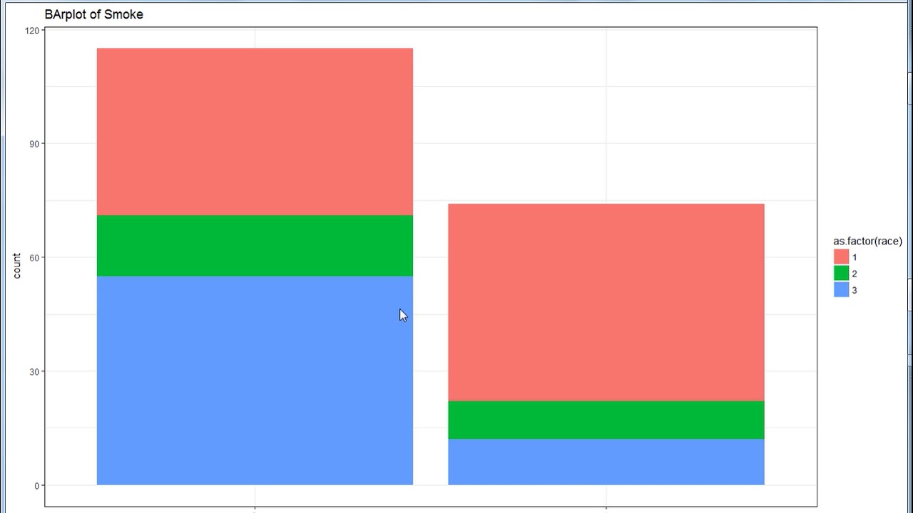
Creating a Stacked Bar Plot
Stacked bar plots are useful when you want to compare the composition of different categories within a single bar. This type of plot allows you to visualize the total value of each category, as well as the contribution of each sub-category.
To create a stacked bar plot in R, you can use the barplot() function with the beside = FALSE option. This will stack the bars on top of each other instead of placing them side by side.
Let’s say we have a dataset that contains information about the sales of different products in different regions. We want to compare the total sales of each product and the contribution of each region to those sales.
We can first create a frequency table using the table() function, which will count the number of occurrences of each combination of product and region. Then, we can use this table to create the stacked bar plot.
Here’s an example:
# Create frequency table

sales_data <- table(df$product, df$region)

# Create stacked bar plot
barplot(sales_data, beside = FALSE, xlab = "Products", ylab = "Sales", main = "Sales by Product and Region")
The above code will generate a stacked bar plot with the products on the x-axis and the total sales on the y-axis. Each bar will be divided into segments, representing the contribution of each region to the total sales of the corresponding product.
You can further customize the plot by adding a legend, changing the color palette, or adjusting the labels. The barplot() function provides various options to control the appearance of the plot.
By creating a stacked bar plot, you can easily compare the total sales of different products and see the relative contribution of each region. This can help you identify patterns and make informed decisions based on the distribution of sales across categories.
Remember to choose appropriate colors and labels to ensure the plot is clear and easy to interpret. Experiment with different options and explore the possibilities of the barplot() function to create visually appealing stacked bar plots in R.
Creating a Grouped Bar Plot
In some cases, you may want to compare multiple groups of categorical data using a bar plot in R. This is where a grouped bar plot can be quite useful. It allows you to visually represent the frequency or count of different categories within each group.
To create a grouped bar plot, you need to have a dataset that contains both the categorical variables and the groups. You can use the table() function to calculate the frequencies for each combination of categories and groups.
Let's say we have a dataset that contains information about the preferred phone brands (categories) for different age groups (groups). We can calculate the frequencies using the table() function:
R
# Creating a frequency table for phone brands and age groups
frequency_table <- table(data$phone_brand, data$age_group)
Once we have the frequency table, we can create a grouped bar plot using the barplot() function. We need to specify the frequency table as the input data and set the beside parameter to TRUE to create grouped bars.
R
# Creating a grouped bar plot
barplot(frequency_table, beside = TRUE, legend = TRUE)
This will generate a grouped bar plot with each group represented by a set of bars. The height of the bars corresponds to the frequency or count of each category within each group.
You can customize the grouped bar plot by adding labels, changing colors, adjusting the axis, and enhancing the overall look and feel of the plot. Just like with the other bar plots, you can use various functions and parameters to achieve the desired customization.
Grouped bar plots are useful when you want to compare the distribution of different categories within each group. It allows for easy visualization of the differences and similarities between the groups.
Advantages of Grouped Bar Plots
- Allows for easy comparison of different categories within each group
- Provides a visual representation of the distribution of categories across groups
- Can accommodate multiple groups and categories
- Can be customized to enhance visual appeal
By creating a grouped bar plot, you can gain valuable insights and easily communicate the findings to others.
Conclusion
Creating a histogram with categorical data in R is a valuable skill for data analysis and visualization. By utilizing the `ggplot2` package, you can transform your categorical data into a meaningful and informative histogram. This allows you to explore the distribution, frequency, and patterns within your data.
In this article, we have learned how to generate a histogram using R, even when dealing with categorical variables. By using the `geom_histogram()` function with appropriate aesthetics and options, we can create visually appealing histograms that effectively represent the distribution of our categorical data.
Remember, understanding your data is crucial for making informed decisions and drawing meaningful insights. Histograms provide a clear and concise overview of the distribution of your categorical data, enabling you to identify trends, patterns, and outliers.
So, go ahead and try it out for yourself! Start exploring your categorical data by creating histograms in R, and unlock new ways to understand the underlying patterns and uncover valuable insights.
FAQs
FAQ 1: Can I make a histogram with categorical data in R?
Yes, you can make a histogram with categorical data in R. However, instead of using the traditional histogram, you would create a bar plot to visualize the distribution of the categorical variables. This will provide a clear representation of the frequency count of each category.
FAQ 2: How do I create a bar plot for categorical data in R?
To create a bar plot for categorical data in R, you can use the barplot() function. This function takes the counts of each category as input and generates a bar plot with the appropriate labels and axis. You can customize the appearance of the plot using the various arguments available in the barplot() function.
FAQ 3: Can I customize the colors of the bars in the bar plot?
Yes, you can customize the colors of the bars in the bar plot. By default, R assigns different colors to each category. However, if you want to use specific colors or modify the default color palette, you can specify the colors using the col argument in the barplot() function. You can provide a vector of colors or use pre-defined color palettes in R.
FAQ 4: Is it possible to add labels to the bars in the bar plot?
Yes, you can add labels to the bars in the bar plot. To do this, you can utilize the text() function in R. You would need to provide the x and y coordinates for each label along with the text you want to display. Additionally, you can customize the appearance of the labels by specifying the font size, color, and alignment.
FAQ 5: What are some other visualizations I can use for categorical data?
Besides bar plots, there are several other visualizations you can use to represent categorical data in R. Some popular options include pie charts, stacked bar plots, and mosaic plots. Each of these visualizations has its own unique way of displaying the categorical information and can provide valuable insights depending on the context of your data.