
Are you looking to create a scatter plot in Excel with two sets of data? Scatter plots are a powerful tool for visualizing the relationship between two variables. Whether you’re analyzing sales data, studying the correlation between temperature and ice cream consumption, or exploring any other dataset, Excel provides a user-friendly and efficient way to create scatter plots.
In this article, we’ll guide you through the process of making a scatter plot in Excel with two sets of data. We’ll walk you through each step, from organizing your data to formatting the plot and adding labels and titles. Whether you’re an Excel beginner or have some experience with the software, you’ll find this guide helpful and easy to follow.
Inside This Article
- Gathering the Data
- Creating a Scatter Plot in Excel
- Adding Two Sets of Data to the Scatter Plot
- Customizing the Scatter Plot
- Analyzing the Scatter Plot
- Conclusion
- FAQs
Gathering the Data
Gathering the data is the first crucial step in creating a scatter plot in Excel with two sets of data. The accuracy and reliability of the plot depend on the quality of the data collected. Here’s how you can gather the necessary data:
1. Identify the variables: Determine the two variables that you want to analyze and plot on the scatter plot. These variables should have a clear relationship, such as temperature and ice cream sales or study hours and test scores.
2. Determine the range: Decide on the range or values you want to collect for each variable. Ensure that you have a diverse range of values to represent different scenarios and outcomes.
3. Collect the data: Start collecting data for each variable. Depending on the nature of your variables, you can gather data through surveys, experiments, observations, or any other suitable method.
4. Organize the data: Once you have collected the data, organize it in a spreadsheet or table format. Make sure to label each variable and its corresponding values accurately.
5. Check for errors: Carefully review the collected data for any errors or inconsistencies. Double-check the entries and ensure that they are accurate and complete. Any mistakes in the data can lead to inaccurate results in the scatter plot.
By following these steps, you can gather the necessary data to create a meaningful and insightful scatter plot in Excel. Remember, the quality of your data is crucial in obtaining accurate and valuable insights from the scatter plot.
Creating a Scatter Plot in Excel
Excel is a versatile tool that allows you to visually represent data in various formats, including scatter plots. A scatter plot is a graph that displays the relationship between two variables, depicting how they are related to each other. This type of plot is commonly used in data analysis, helping us identify patterns, trends, and correlations.
To create a scatter plot in Excel, follow these simple steps:
-
Open Microsoft Excel and input your data into two columns. The X-axis values (independent variable) should be in one column, and the Y-axis values (dependent variable) should be in another.
-
Select the range of cells containing your data.
-
Go to the “Insert” tab at the top of the Excel interface and click on the “Scatter” chart button. This will display a drop-down menu with various scatter plot options.
-
Choose the type of scatter plot you prefer. Excel offers options like “Scatter with Only Markers,” “Scatter with Straight Lines,” or “Scatter with Smooth Lines.”
-
Click on the specific scatter plot type you want to create, and Excel will generate the scatter plot chart based on your data.
And there you have it – a scatter plot is now created in Excel! You can further customize the plot by adding titles, labels, gridlines, and changing the color schemes. This will help enhance the visual appeal and make the plot more comprehensible to your audience.
Scatter plots are instrumental in data analysis as they allow you to identify patterns and relationships between variables. By visually representing your data, you can gain valuable insights and make informed decisions based on the trends and correlations you observe.
Now that you know how to create a scatter plot in Excel, you can leverage this powerful tool to analyze and display your data in a visually appealing and informative way.
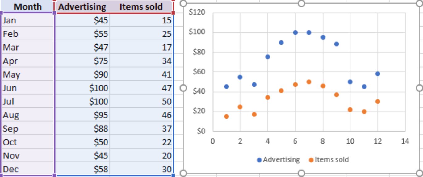
Adding Two Sets of Data to the Scatter Plot
Once you have created a scatter plot in Excel with one set of data, you may want to add another set of data to further analyze the relationship between different variables. Here is how you can add two sets of data to a scatter plot in Excel:
1. Select the existing scatter plot in Excel by clicking on it.
2. Right-click on the chart and choose the “Select Data” option from the context menu.
3. In the “Select Data Source” dialog box, click on the “Add” button to add a new series.
4. In the “Edit Series” dialog box, enter the range of the x-values and y-values for the second set of data. You can either manually enter the range or select it by clicking on the worksheet.
5. Click “OK” to close the “Edit Series” dialog box.
6. Now you will see the second set of data plotted on the scatter plot. By default, Excel will use a different color and marker shape to distinguish the two sets of data.
7. If you want to customize the appearance of the second set of data, you can right-click on the data points and choose the “Format Data Series” option from the context menu. From here, you can change the color, marker shape, line style, and other visual attributes of the data series.
8. Repeat the above steps if you have more than two sets of data that you want to add to the scatter plot.
By adding multiple sets of data to the scatter plot, you can compare the relationships between different variables more easily. This can help you visualize any patterns or trends that may exist and make informed decisions based on the analysis.
Customizing the Scatter Plot
Once you have created a scatter plot in Excel with your two sets of data, you can customize the plot to further enhance its appearance and make it more insightful. Here are some ways to customize your scatter plot:
1. Changing the Data Series Marker: You can modify the marker shape, size, and color to visually distinguish between the data series. To do this, right-click on a data point, select “Format Data Series,” and navigate to the “Marker Options” tab. From here, you can make the desired changes.
2. Adding Data Labels: Data labels can be added to each data point to display the exact values on the scatter plot. To do this, right-click on a data point, select “Add Data Labels,” and choose the suitable option based on your preference.
3. Adjusting the Axis Labels and Title: You can customize the labels and title of the x and y-axes to provide context to your scatter plot. Right-click on the axis or axis title, select “Format Axis,” and make any desired changes in the options provided.
4. Changing the Chart Title: The title of your scatter plot can be modified to accurately represent the data being displayed. Simply double-click on the chart title, and you can edit it directly.
5. Formatting the Gridlines: Gridlines can be added or removed to improve the visibility of the data within the scatter plot. Right-click on any gridline, select “Format Gridlines,” and adjust the gridline properties to your liking.
6. Adding a Trendline: A trendline can be added to your scatter plot to illustrate the general direction of the data points. Right-click on a data series, select “Add Trendline,” choose the desired trendline type, and customize it based on your requirements.
7. Changing the Chart Colors: Excel provides several predefined color schemes for chart elements. To change the colors used in your scatter plot, right-click on any element, such as the plot area or data series, select “Format,” and navigate to the “Fill & Line” options to make your desired changes.
8. Exploring Additional Chart Elements: Excel offers various other chart elements that can be added to further enhance your scatter plot. These elements include data tables, error bars, and trendline equations. You can access these options by right-clicking on the chart and selecting “Add Chart Element.”
By customizing your scatter plot in Excel, you can make it visually appealing and deliver a clear representation of your data. Experiment with different customization options to find the best way to present your insights.
Analyzing the Scatter Plot
Once you have created a scatter plot with two sets of data in Excel, it is time to analyze the plot and derive meaningful insights from it. The scatter plot provides visual representation of the relationship between the two variables and can reveal patterns, trends, and outliers.
Here are some key points to consider when analyzing a scatter plot:
- Relationship: Look at the overall pattern of the data points on the scatter plot. Is there a clear relationship between the two variables? If the points form a distinct pattern, such as a straight line, it indicates a strong correlation between the variables. However, if the points are scattered randomly, it suggests a weak or no correlation.
- Direction: Identify the direction of the relationship between the variables. Is it positive (increasing) or negative (decreasing)? This can be determined by examining the general slope of the points on the scatter plot.
- Strength: Assess the strength of the relationship by observing how closely the points cluster around the trend line or line of best fit. If the points are tightly clustered, it indicates a strong correlation. On the other hand, if the points are spread out, it suggests a weak correlation.
- Outliers: Look for any data points that deviate significantly from the general pattern. These are called outliers and they can have a significant impact on the overall analysis. Outliers may be caused by measurement errors or other factors and should be examined closely to determine their influence.
- Patterns: Identify any specific patterns within the scatter plot. For example, you may notice clusters or groups of points that share similar characteristics. These patterns can provide valuable insights and help in understanding the relationship between the variables.
- Additional Analysis: Depending on the nature of your data and the purpose of your analysis, you may need to perform additional calculations or statistical tests to gain further insights. These could include calculating correlation coefficients, performing regression analysis, or conducting hypothesis tests.
By carefully analyzing the scatter plot and considering the points mentioned above, you can gain a deeper understanding of the relationship between the two variables and make more informed decisions based on the insights derived from the plot.
Conclusion
Creating a scatter plot in Excel with two sets of data is a powerful tool that allows you to visualize and analyze the relationship between variables. By following the step-by-step guide provided in this article, you can easily create a scatter plot and gain insights from your data. Remember to select the appropriate chart type, label your axes, and customize the appearance to enhance the clarity and impact of your scatter plot.
Whether you are interpreting trends, identifying correlations, or making predictions, leveraging the scatter plot feature in Excel can greatly facilitate your data analysis process. So, go ahead and start plotting your data points to unlock meaningful patterns and valuable insights that will guide your decision making and improve your understanding of the data.
FAQs
Q: What is a scatter plot?
A: A scatter plot is a graphical representation of data points plotted on a Cartesian coordinate system. It is used to visualize the relationship between two sets of data and determine if there is any correlation between them.
Q: Why should I use a scatter plot in Excel?
A: Excel provides a user-friendly interface and powerful tools for creating scatter plots. Using a scatter plot in Excel allows you to easily analyze and interpret your data, identify trends or patterns, and make informed decisions based on the relationship between the two variables.
Q: How do I create a scatter plot in Excel?
A: To create a scatter plot in Excel, you need two sets of data that you want to analyze. Select your data and go to the “Insert” tab, click on “Scatter” under the “Charts” section, and choose the type of scatter plot you want to create. Excel will plot the data points on the chart, and you can customize the appearance and add labels or titles according to your preference.
Q: How can I add a trendline to my scatter plot in Excel?
A: Adding a trendline to your scatter plot in Excel helps you visualize the overall pattern or trend in the data points. Right-click on any data point on the scatter plot, select “Add Trendline” from the context menu, and choose the type of trendline you want to display. You can also customize the trendline by adjusting its properties, such as the line color or thickness.
Q: Can I customize the axes and labels in a scatter plot in Excel?
A: Yes, you can customize the axes and labels in a scatter plot in Excel. Double-click on the axes to open the “Format Axis” pane, where you can modify various properties like the axis scale, tick marks, and labels. Similarly, you can double-click on the data labels to edit or format them, such as changing the font size, color, or position.