
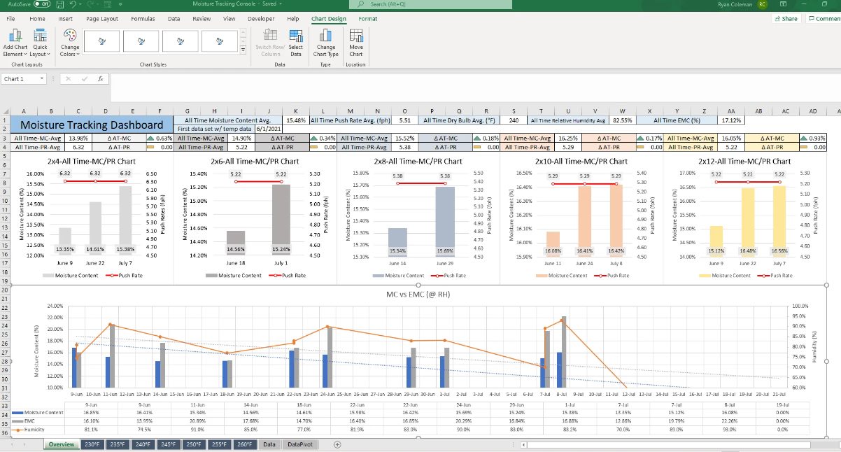
When it comes to analyzing data and presenting it in a visually appealing format, Excel is the go-to tool for many professionals. One of the common requirements in data analysis is graphing multiple sets of data. Whether you’re analyzing sales figures, tracking project milestones, or comparing different variables, Excel provides a powerful platform to create comprehensive and insightful graphs.
In this article, we will dive into the techniques and best practices for graphing multiple sets of data in Excel. You will learn how to organize your data, choose the right graph type, customize your graphs, and make them visually engaging. By the end of this article, you will have a solid understanding of how to create professional-looking graphs that effectively convey your data analysis.
Inside This Article
- Understanding Multiple Sets of Data in Excel
- Methods for Graphing Multiple Sets of Data in Excel
- Scenario 1: Creating a Line Graph with Multiple Data Sets in Excel
- Scenario 2: Creating a Bar Chart with Multiple Data Sets in Excel
- Scenario 3: Creating a Scatter Plot with Multiple Data Sets in Excel
- Tips for Enhancing Multiple Sets of Data Graphs in Excel
- Conclusion
- FAQs
Understanding Multiple Sets of Data in Excel
When working with data in Excel, it is common to have multiple sets of data that need to be analyzed and presented together. Understanding how to handle and graph multiple sets of data in Excel is essential for effectively visualizing and interpreting your data.
Multiple sets of data can refer to different variables, such as sales figures for different products, monthly revenue for multiple departments, or survey responses from different groups. By graphing these data sets, you can easily identify trends, compare values, and communicate your findings to others.
In Excel, each data set typically consists of a column or row of values. These values represent the different data points that you want to graph. It is important to ensure that each data set is organized and labeled appropriately, making it easier to work with and interpret the data.
When graphing multiple sets of data, it is crucial to understand the relationship between the variables. Are you comparing the same variable over different time periods, different variables over the same time period, or a combination of both? This will determine the type of graph you should create and the Excel features you will utilize.
By graphing multiple sets of data in Excel, you can visualize the patterns, trends, and relationships that may exist between the variables. This can help you make informed business decisions, identify areas for improvement, or showcase the findings of your research.
Next, we will explore different methods for graphing multiple sets of data in Excel, including line graphs, bar charts, and scatter plots. Stay tuned!
Methods for Graphing Multiple Sets of Data in Excel
When working with multiple sets of data in Excel, there are several methods you can use to graph and visualize the information. These methods allow you to compare and analyze data from different sources or variables, providing a comprehensive picture of your data. Let’s explore three common ways to graph multiple sets of data in Excel.
1. Creating a Line Graph: One of the most popular methods for graphing multiple sets of data is by creating a line graph. A line graph is ideal for showing trends and changes over time. To create a line graph in Excel, you can follow these steps:
- Select the data range that includes all the sets of data you want to graph.
- Go to the “Insert” tab and click on “Recommended Charts.”
- Choose the “Line” chart type and select the desired sub-type that best suits your data.
- Click “OK” to create the line graph.
2. Creating a Bar Chart: Another effective method for graphing multiple sets of data is by creating a bar chart. Bar charts are great for comparing data across different categories or groups. Here’s how you can create a bar chart in Excel:
- Select the data range that includes all the sets of data.
- Navigate to the “Insert” tab, click on “Recommended Charts.”
- Select the “Bar” chart type and choose the specific sub-type that suits your data visualization needs.
- Click “OK” to create the bar chart.
3. Creating a Scatter Plot: If you want to visualize the relationship between two or more variables, creating a scatter plot is an excellent choice. Scatter plots are commonly used in scientific research, analyzing correlations, and trend analysis. Here’s how you can create a scatter plot in Excel:
- Select the data range that includes all the sets of data.
- Go to the “Insert” tab and click on “Recommended Charts.”
- Choose the “Scatter” chart type and select the desired sub-type that best fits your data.
- Click “OK” to create the scatter plot.
These are just some of the methods you can use to graph multiple sets of data in Excel. Each method offers different insights into your data, allowing you to present information in a visually appealing and easily understandable manner. Experiment with these methods and choose the one that best suits your data analysis needs.
Scenario 1: Creating a Line Graph with Multiple Data Sets in Excel
When working with multiple sets of data in Excel, creating a line graph can be a powerful way to visualize trends and patterns. With Excel’s built-in charting tools, you can easily plot multiple data series on a single graph, making it easier to compare and analyze the data.
To create a line graph with multiple data sets, follow these steps:
- Open your Excel spreadsheet and select the data sets you want to graph.
- Click on the “Insert” tab at the top of the Excel window.
- In the “Charts” group, click on the “Line” button to see a dropdown menu of line graph options.
- Select the type of line graph that best suits your needs. Excel provides options such as 2D line graphs, stacked line graphs, and more.
- Once you’ve chosen the desired line graph type, click on it to insert a blank graph onto your Excel spreadsheet.
- Now, it’s time to add your data sets to the graph. Right-click on the blank graph and select “Select Data” from the dropdown menu.
- In the “Select Data Source” window, click on the “Add” button under the “Legend Entries (Series)” section.
- In the “Edit Series” window, specify the range of cells that contain the data for the first data set by clicking on the icon at the end of the “Series X values” and “Series Y values” text boxes, and then selecting the appropriate cells on your spreadsheet.
- Repeat step 8 for each additional data set you want to add to the line graph.
- Click “OK” to close the “Edit Series” window and return to the “Select Data Source” window.
- Make any additional customizations to your line graph, such as adding axis labels, titles, or adjusting formatting options, by clicking on the appropriate tabs in the “Format Chart Area” pane.
- When you’re satisfied with your line graph, click “OK” to close the “Select Data Source” window.
Your line graph with multiple data sets is now complete! You can further analyze and interpret the data by exploring the trends and patterns displayed on the graph. Excel allows you to easily update the graph if you add or modify the data sets, making it a flexible tool for visualizing dynamic data.
Scenario 2: Creating a Bar Chart with Multiple Data Sets in Excel
Bar charts are a popular and effective way to visualize and compare data sets in Excel. They are especially useful when you have multiple sets of data that you want to compare side by side. In this scenario, we will explore the steps to create a bar chart with multiple data sets in Excel.
Here’s a step-by-step guide:
- Open Excel and enter your data sets into separate columns. Each data set should be in a different column, with labels in the first row and values in the subsequent rows.
- Select the range of data you want to include in your bar chart. Make sure to include the labels and values for all the data sets.
- Go to the “Insert” tab in the Excel ribbon and click on the “Bar” chart icon. A dropdown menu will appear with various bar chart options.
- Select the specific bar chart style that suits your needs. You can choose from options such as clustered bar charts, stacked bar charts, or 100% stacked bar charts. Each style displays the data sets in a different way.
- Once you’ve selected the desired bar chart style, a chart will be inserted into your Excel sheet. You can customize the chart further by right-clicking on it and selecting “Format Chart Area.” From here, you can adjust the colors, labels, axes, and other chart elements to meet your preferences.
- Add a chart title and axis labels to make the bar chart more informative and understandable. To do this, click on the chart and go to the “Chart Tools” section on the Excel ribbon. Then, click on the “Chart Title” and “Axis Titles” buttons to add the desired labels.
- To include additional data sets, simply add the new data to the existing columns or insert new columns. The bar chart will automatically update to include the new data sets.
- Finally, you can save and share your bar chart by going to the “File” tab in the Excel ribbon and selecting “Save As” or “Share.” This way, you can distribute the chart as a separate file or embed it in other documents such as Word or PowerPoint.
By following these steps, you can create a bar chart with multiple data sets in Excel. Remember to choose the appropriate chart style and customize it to effectively present and compare your data. Bar charts offer a clear visual representation of data, making it easier to draw insights and analyze trends.
Scenario 3: Creating a Scatter Plot with Multiple Data Sets in Excel
Creating a scatter plot with multiple data sets in Excel allows you to visualize the relationships and patterns between different variables. This type of graph is especially useful when you want to examine how two or more sets of data are related to each other.
To create a scatter plot with multiple data sets in Excel, follow these steps:
- Open Microsoft Excel and input your data into separate columns. Each data set should be in a separate column.
- Select all the data sets you want to include in the scatter plot.
- Click on the “Insert” tab in the Excel ribbon.
- Choose the “Scatter” chart type from the “Charts” section.
- Select the scatter plot sub-type that best suits your data. You can choose from options like “Scatter with Straight Lines” or “Scatter with Smooth Lines.”
- A blank scatter plot chart will appear on your Excel worksheet.
- Right-click on the chart and select “Select Data” from the drop-down menu.
- In the “Select Data Source” dialog box, click on the “Add” button.
- Enter a series name for the data set and select the range of data for the x-axis and y-axis values.
- Click “OK” to add the data set to the scatter plot.
- Repeat steps 8-10 for each additional data set you want to include in the scatter plot.
- Format the scatter plot as desired by adding labels, titles, gridlines, and adjusting the scales of the axes.
- Once you are satisfied with the appearance of the scatter plot, save your Excel file.
By creating a scatter plot with multiple data sets in Excel, you can easily compare and analyze the relationships between different variables. This type of graph allows you to identify any trends, outliers, or correlations that may exist within your data.
Tips for Enhancing Multiple Sets of Data Graphs in Excel
Creating a graph with multiple sets of data in Excel is just the first step. To truly make your graphs impactful and visually appealing, consider the following tips for enhancing multiple sets of data graphs in Excel:
1. Use a consistent color scheme: Choose a cohesive color palette to represent each data set in your graph. This will make it easier for viewers to understand and differentiate between the different sets of data.
2. Include a legend: A legend is essential for providing a clear explanation of which data set corresponds to each color or symbol used in the graph. Make sure to position the legend in a visible and unobtrusive location.
3. Add data labels: Labeling each data point directly on the graph can provide valuable insights and clarity. Use Excel’s data label feature to display numeric values or customize labels with specific information.
4. Choose appropriate chart types: Consider the nature of your data and select the most suitable chart type for your multiple sets of data. Line graphs are useful for showing trends over time, bar charts are great for comparing different categories, and scatter plots are ideal for analyzing relationships between variables.
5. Optimize axis labels: Ensure that the axis labels on your graph are readable and informative. Use clear and concise labels that describe the units or categories being represented.
6. Incorporate gridlines: Gridlines can assist in visually aligning data points and aid in interpreting the graphs. Adjust the gridline settings in Excel to suit your preferences and the readability of your graph.
7. Add a title and subtitles: Provide a clear and descriptive title for your graph, summarizing the main message or purpose of the data. Additionally, consider adding subtitles to provide more context or highlight key insights.
8. Customize chart elements: Excel offers various customization options for chart elements. Experiment with formatting, such as adjusting the line thickness, marker size, or bar width, to enhance the aesthetics of your graph.
9. Include a trendline: If your graph displays a trend or pattern, consider adding a trendline to further visualize and analyze the data. Excel provides different types of trendlines, including linear, exponential, and polynomial.
10. Keep it simple: Avoid overcrowding your graph with too many data sets or excessive details. A cluttered graph can make it difficult to interpret the information. Maintain a clean and concise presentation of your data.
By following these tips, you can take your multiple sets of data graphs in Excel to the next level. Use these enhancements to produce visually striking and insightful graphs that effectively communicate your data’s story.
In conclusion, learning how to graph multiple sets of data in Excel is a valuable skill that can greatly enhance your data analysis capabilities. By utilizing the various graphing tools and features available in Excel, you can visually represent complex data sets and uncover meaningful insights. Whether you need to compare trends, track multiple variables, or present data to stakeholders, Excel offers a versatile and user-friendly platform to create professional-looking graphs.
Remember to consider the type of data you have and choose the appropriate graph type that best showcases the relationships and patterns you want to highlight. Experiment with different formatting options and visualization techniques to create visually appealing and informative graphs.
With practice, you can become proficient at graphing multiple sets of data in Excel, enabling you to make data-driven decisions and communicate your findings effectively. So, embrace the power of Excel graphs and take your data analysis to the next level.
FAQs
Q: Can I graph multiple sets of data in Excel?
A: Yes, Excel offers powerful charting capabilities that allow you to graph multiple sets of data on a single chart. By selecting the data ranges and choosing the appropriate chart type, you can easily visualize and compare multiple data sets.
Q: How do I select multiple data sets in Excel?
A: To select multiple data sets in Excel, you can use the Ctrl or Shift key. By holding down the Ctrl key, you can select individual cells or ranges of data. Holding down the Shift key allows you to select a continuous range of cells or data sets. Once selected, you can use this data to create a chart.
Q: What chart types are suitable for graphing multiple data sets?
A: Excel offers a variety of chart types that can effectively display multiple data sets. Some popular chart types include line charts, bar charts, and scatter plots. Each chart type has its own strengths and is suitable for different types of data and visualization purposes. Experiment with different chart types to find the one that best suits your needs.
Q: Can I customize the appearance of the charts in Excel?
A: Yes, Excel provides a range of customization options to help you personalize the appearance of your charts. You can change the chart title, axis labels, colors, fonts, and much more. Additionally, you can add data labels, gridlines, and legends to enhance the clarity and insightfulness of your charts.
Q: How can I update the chart if my data changes?
A: Excel makes it easy to update your chart when your data changes. Simply edit the data directly in the spreadsheet, and the chart will automatically reflect the updates. If you have added and formatted data as a table, your chart will dynamically adjust to any changes in the table’s size or content, ensuring that your visualizations are always up to date.