
Are you looking to create meaningful visual representations of your data using MATLAB? Whether you’re a beginner or an experienced programmer, knowing how to plot graphs in MATLAB can be incredibly useful. MATLAB is a powerful programming language and software environment commonly used in scientific and engineering fields to analyze and visualize data.
In this article, we will explore the process of plotting graphs in MATLAB using data. We’ll cover the basics of creating different types of plots, customizing their appearance, and adding useful annotations. By the end of this article, you’ll have a solid understanding of how to plot graphs in MATLAB and will be able to effectively present your data in a visual format.
Inside This Article
Overview
Plotting a graph is an essential tool for visualizing data in Matlab. Whether you are analyzing trends, comparing data points, or simply exploring your dataset, the ability to plot graphs is invaluable. Matlab offers powerful built-in functions and tools that make graph plotting a breeze. In this article, we will take a closer look at how to plot a graph in Matlab using data.
Importing the data is the first step in plotting a graph in Matlab. You can import data from various sources, such as Excel spreadsheets, text files, or even generate random data within Matlab. Once the data is imported, you can manipulate and analyze it as needed.
After importing the data, you can start plotting a graph in Matlab. Matlab provides a wide range of options for creating different types of graphs, including line plots, scatter plots, bar graphs, and more. You can customize the appearance of your graph by adding labels, legends, colors, and markers.
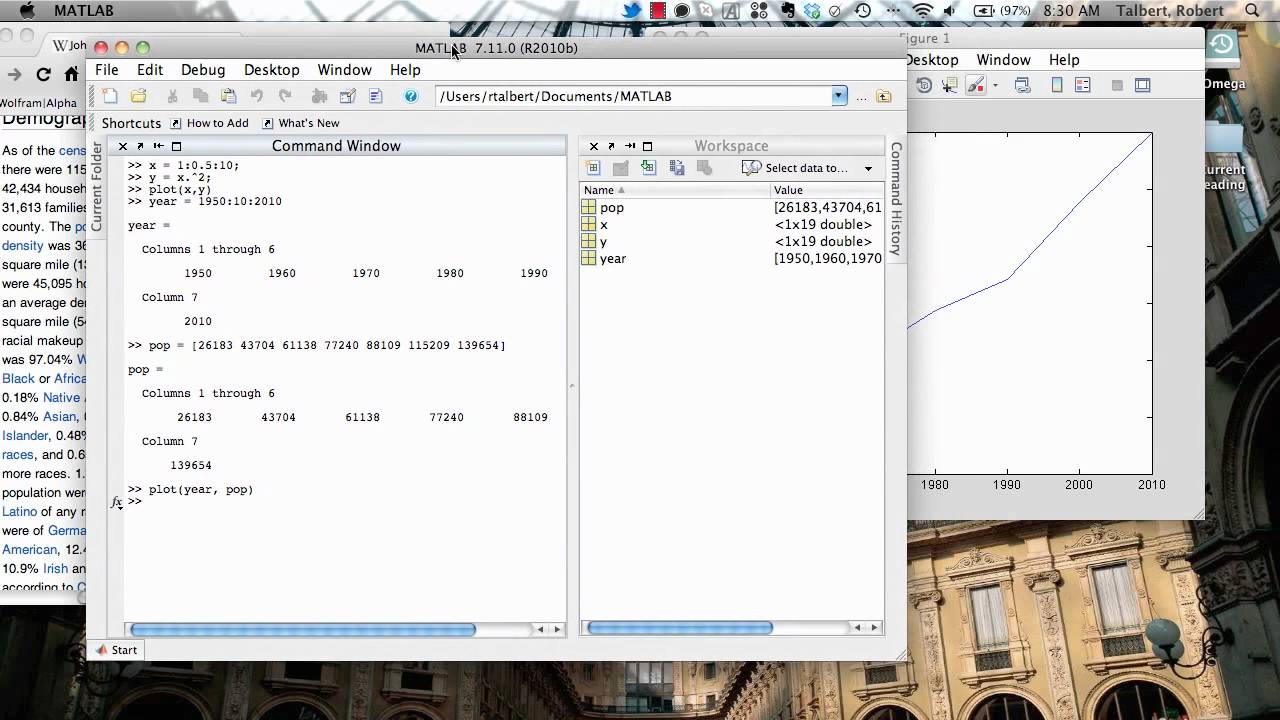
Plotting a 2D graph in Matlab is straightforward. You can use the `plot` function to create a line plot, which connects the data points with a line. Additionally, you can use the `scatter` function to create a scatter plot, where each data point is represented by a marker on the graph.
On the other hand, if you want to visualize your data in three dimensions, you can plot a 3D graph using Matlab’s `plot3` function. This allows you to explore relationships between three variables and gain insights from your data from different perspectives.
By plotting a graph in Matlab, you can easily identify patterns, trends, and outliers in your data. This visual representation helps in making data-driven decisions, identifying correlations, and presenting your findings effectively.
Now that we have an overview of the process, let’s dive into the details of importing data and plotting different types of graphs in Matlab.
Importing Data
When working with data in MATLAB, the first step is to import the data into the MATLAB environment. MATLAB provides several functions and methods to import data from different file formats such as text files, spreadsheets, databases, and more.
One common method to import data is by using the `readtable` function. This function allows you to import tabular data from a text file, Excel spreadsheet, or other supported formats. The imported data is stored in a table format, which is a convenient data structure in MATLAB.
To import a text file using `readtable`, you need to specify the file name along with optional parameters, such as the delimiter used in the file. For example, if the data is in a CSV file with comma-separated values, you can import it using the following code:
matlab
data = readtable(‘data.csv’);
Similarly, you can import data from an Excel file using the `readtable` function by specifying the sheet name or index.
Alternatively, if your data is in a different file format or if you need more flexibility in importing the data, MATLAB provides functions like `importdata` and `xlsread`, which can handle a wider range of file formats and import options.
Once you have imported the data into MATLAB, you can access and manipulate the data using the table’s properties and functions. For example, you can access specific columns or rows, perform calculations, filter the data, and more.
Importing data is an essential step in plotting graphs in MATLAB. By importing the relevant data, you ensure that you have the necessary information for creating meaningful visualizations.
Plotting a 2D Graph
When working with data, one of the most common tasks is to plot a graph to visualize the data effectively. MATLAB provides extensive functionality to create 2D graphs with ease. In this section, we will explore the steps to plot a 2D graph using MATLAB.
The first step is to import or generate the data that we want to plot. You can either import data from external files or manually define your data using MATLAB’s built-in functions. Once you have your data ready, you can proceed to plot the graph.
To begin, let’s say we have two sets of data: the x-coordinates and the corresponding y-coordinates. We can start by defining these arrays in MATLAB:
matlab
x = [1, 2, 3, 4, 5]; % x-coordinates
y = [2, 4, 6, 8, 10]; % y-coordinates
Once we have our data defined, we can use the `plot()` function in MATLAB to create the graph. The `plot()` function takes the x-coordinates and the corresponding y-coordinates as inputs and plots the data points in a coordinate system.
Here’s how we can use the `plot()` function to create a basic 2D graph:
matlab
plot(x, y);
Executing the above code will display a plot window showing the data points connected by lines.
To enhance the visualization of the graph, we can customize various aspects such as the line style, marker style, axis labels, and title. MATLAB provides a wide range of options to customize the appearance of the graph according to your preferences.
For example, we can add a title to the graph using the `title()` function and label the x-axis and y-axis using the `xlabel()` and `ylabel()` functions respectively:
matlab
title(‘2D Graph Example’);
xlabel(‘X-axis’);
ylabel(‘Y-axis’);
You can experiment with different customization options to make your graph more informative and visually appealing.
Additionally, MATLAB has various functions for adding grid lines, legends, annotations, and more advanced features to your graph. These features can help to provide more context and make your graph more comprehensive.
Once you have customized the graph according to your requirements, you can save it as an image file or export it to other formats for further analysis or presentation purposes.
Plotting a 3D Graph
Matlab provides powerful tools for visualizing data in three dimensions. With just a few lines of code, you can create stunning 3D graphs to illustrate complex relationships in your data. In this section, we will explore how to plot a 3D graph using Matlab.
To begin, make sure that you have imported your data into Matlab. Once you have your data ready, you can use the ‘plot3’ function to create a 3D graph. The ‘plot3’ function takes three input arguments: the x-coordinates, the y-coordinates, and the z-coordinates of your data points.
Here’s an example of how to use the ‘plot3’ function:
x = [1, 2, 3, 4, 5];
y = [10, 20, 30, 40, 50];
z = [5, 10, 15, 20, 25];
plot3(x, y, z);
This code will create a 3D graph with the x-coordinates, y-coordinates, and z-coordinates as specified in the arrays ‘x’, ‘y’, and ‘z’ respectively. The resulting graph will have data points plotted in three dimensions.
Matlab provides various customizable options for 3D graphs. You can add titles, labels, legends, and adjust the appearance of the graph using different colors and markers. The ‘xlabel’, ‘ylabel’, and ‘zlabel’ functions allow you to specify labels for the x-axis, y-axis, and z-axis respectively.
Additionally, you can customize the appearance of the plotted data points by specifying various arguments in the ‘plot3’ function. For example, you can change the color and style of the line connecting the data points using the ‘LineStyle’ and ‘Color’ arguments.
Furthermore, you can add a grid to the graph using the ‘grid’ function, which can help in visualizing the spacing and relationships between data points.
Once you have customized your 3D graph to your liking, you can export it as an image or save it as a figure for later use. Matlab offers options to save your graph in various formats, such as PNG, JPEG, PDF, and more.
By using Matlab’s powerful plotting functions, you can create highly informative and visually appealing 3D graphs to effectively communicate your data’s patterns and trends. Experiment with different options and settings to find the best representation of your data.
Conclusion
In conclusion, plotting graphs in MATLAB using data is a fundamental skill that can greatly enhance data analysis and visualization. By leveraging the powerful capabilities of MATLAB’s plotting functions, users can effectively display and interpret their data in a visually appealing manner. Whether you need to analyze trends, compare multiple datasets, or illustrate relationships between variables, MATLAB offers a wide range of tools and options to help you create meaningful and informative graphs.
Throughout this article, we have explored the process of plotting graphs in MATLAB step-by-step. We have covered the basics of creating line plots, scatter plots, bar plots, and more. Additionally, we have discussed how to customize various aspects of the graph, such as the axes, labels, and legends, to improve clarity and understanding.
By following the guidelines and utilizing the techniques outlined in this article, you can leverage MATLAB’s plotting capabilities to gain valuable insights from your data and effectively communicate your findings to others. So go ahead and start experimenting with MATLAB’s plotting functions to unlock the full potential of your data visualization.
FAQs
Here are some frequently asked questions about plotting graphs in Matlab:
1. How can I plot a simple graph in Matlab?
To plot a simple graph in Matlab, you can use the plot function. This function takes input in the form of x and y values and generates a line plot. Here’s an example:
x = [1 2 3 4 5];
y = [10 15 12 7 9];
plot(x, y);
2. How can I customize the appearance of a graph in Matlab?
Matlab provides various options to customize the appearance of a graph. You can use functions like xlabel, ylabel, and title to add labels to the x-axis, y-axis, and the graph title respectively. Additionally, you can use grid to add a grid to the plot, legend to add a legend, and axis to set the limits of the axes.
3. How can I plot multiple lines on the same graph in Matlab?
To plot multiple lines on the same graph in Matlab, you can simply call the plot function multiple times with different sets of x and y values. Each call will generate a new line on the plot. For example:
x = [1 2 3 4 5];
y1 = [10 15 12 7 9];
y2 = [5 8 11 14 17];
plot(x, y1, x, y2);
4. Can I plot different types of graphs in Matlab?
Yes, Matlab allows you to plot different types of graphs apart from line plots. Some commonly used graph types include scatter plots, bar graphs, and pie charts. For example, to create a scatter plot, you can use the scatter function, and for a bar graph, you can use the bar function.
5. How can I save a graph as an image file in Matlab?
To save a graph as an image file in Matlab, you can use the saveas function. This function takes the figure handle and the filename with the desired file extension as arguments. Here’s an example:
x = [1 2 3 4 5];
y = [10 15 12 7 9];
plot(x, y);
saveas(gcf, "mygraph.png");
These are just a few of the most commonly asked questions about plotting graphs in Matlab. If you have any additional questions, feel free to ask!