
In the ever-evolving world of technology, operating systems like iOS are constantly undergoing updates to enhance user experience. One significant change that iPhone users encountered with the introduction of iOS 15 was the relocation of the search bar, placing it at the bottom of the screen. This departure from the traditional top placement sparked curiosity and discussion among users.
But why did Apple make this seemingly unconventional shift? In this article, we will explore the reasons behind the decision to place the search bar at the bottom in iOS 15. We will delve into the potential benefits it brings to users and how it aligns with the current trends in mobile UX design. So if you’ve been wondering why the search bar in iOS 15 is now located at the bottom, this article will shed light on this change and its implications.
Inside This Article
- Design philosophy behind the search bar placement
- Enhanced one-handed usability
- Consistency with other UI elements
- Design Philosophy Behind the Search Bar Placement
- Enhanced One-Handed Usability
- Consistency with Other UI Elements
- Streamlined Navigation and Content Consumption
- Conclusion
- FAQs
Design philosophy behind the search bar placement
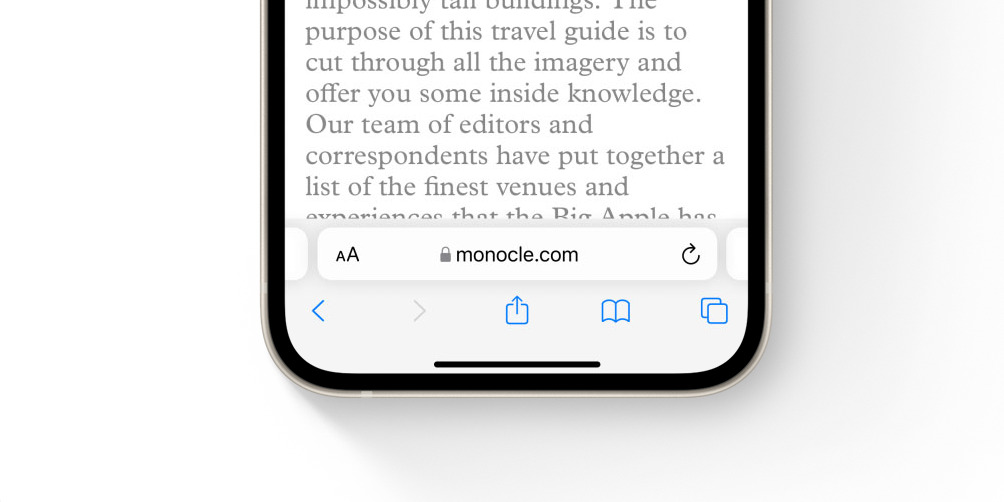
In the ever-evolving landscape of mobile phone design, every detail matters. One such detail that has caught the attention of users and designers alike is the placement of the search bar in iOS 15. Unlike its previous iterations, iOS 15 has introduced a significant change by relocating the search bar to the bottom of the screen. This seemingly subtle alteration carries with it a deep-rooted design philosophy that aims to enhance the user experience in several key ways.
The primary objective behind placing the search bar at the bottom of the screen is to improve one-handed usability. As smartphones continue to grow in size, reaching the top of the screen with a single hand can become a challenge. By moving the search bar closer to the user’s thumb, it becomes more accessible and effortless to interact with. This adjustment is particularly beneficial for users with larger devices or those who prefer to operate their phone with one hand, providing a significantly improved experience for them.
Furthermore, the decision to place the search bar at the bottom of the screen in iOS 15 aligns with Apple’s commitment to consistency in their UI design. The bottom placement of the search bar mirrors the positioning of other commonly used elements such as the tab bar and navigation controls. This consistency across the user interface creates a cohesive and intuitive user experience, allowing users to navigate seamlessly between different sections of the application.
Additionally, the relocation of the search bar to the bottom of the screen streamlines the overall navigation and content consumption process. Placing the search bar at the top of the screen often requires users to scroll upward to access it, interrupting the flow of browsing or searching for information. By positioning it at the bottom, users can effortlessly toggle between search and content without any interruptions, ensuring a smoother and more efficient user journey.
It’s important to note that the design choices made by Apple in iOS 15 are not arbitrary but rather a result of extensive research and user testing. The bottom placement of the search bar has been carefully crafted to address usability concerns and improve overall user satisfaction.
In summary, the design philosophy behind placing the search bar at the bottom of the screen in iOS 15 revolves around enhancing one-handed usability, maintaining consistency with other UI elements, and streamlining navigation and content consumption. By incorporating these design principles, Apple aims to provide users with a more seamless and intuitive mobile experience. So the next time you find yourself effortlessly using the search bar at the bottom of your iOS 15 device, you can appreciate the thoughtful design decisions that have gone into making your mobile experience more enjoyable.
Enhanced one-handed usability
One of the key reasons behind the decision to place the search bar on the bottom in iOS 15 is to enhance one-handed usability. As smartphones continue to grow in size, it can be challenging for users to reach the top of the screen with one hand, particularly for users with smaller hands. By placing the search bar at the bottom, it becomes easily accessible with the thumb, allowing users to perform searches without having to adjust their grip or stretch their fingers.
This design decision is especially beneficial for users who multitask and use their phones while on the go. Whether it’s sending a quick message, browsing the web, or looking up information, having the search bar at the bottom ensures that users can perform these actions effortlessly without risking dropping their phone.
In addition to the physical benefits, the placement of the search bar on the bottom also aligns with the natural way we interact with mobile devices. When using a smartphone, our thumbs are often positioned near the bottom of the screen, making it more intuitive to have the search bar within reach. This results in a smoother and more seamless user experience, reducing the need for unnecessary hand movements and increasing overall efficiency.
Consistency with other UI elements
In addition to the design philosophy behind the search bar placement and enhanced one-handed usability, another key reason for the search bar being on the bottom in iOS 15 is consistency with other UI elements. Apple has always emphasized the importance of consistency throughout their operating systems, and iOS 15 is no exception.
By placing the search bar at the bottom of the screen, Apple ensures that it aligns with other common navigation elements found in iOS. The bottom portion of the screen is typically reserved for actions and controls that are easily accessible with one hand. Placing the search bar here makes it more intuitive and familiar to users, as they are accustomed to interacting with similar elements in this area.
Consistency also extends to other apps and features within iOS. For example, the placement of the search bar at the bottom is consistent with the Dock, which houses frequently used apps on the Home Screen. This unified approach creates a cohesive user experience across different parts of the operating system.
Moreover, by maintaining consistency in the placement of UI elements, Apple ensures that users can quickly adapt to new features and functionalities. This reduces the learning curve and allows users to navigate the interface with ease, regardless of their familiarity with previous versions of iOS.
Consistency with other UI elements is crucial for maintaining a sense of familiarity and usability. It helps users feel confident in their interactions and fosters a seamless user experience. By placing the search bar at the bottom of the screen, iOS 15 ensures that users can easily locate and utilize this essential feature in a way that feels natural and consistent with other elements of the interface.
Design Philosophy Behind the Search Bar Placement
In iOS 15, one notable change is the relocation of the search bar to the bottom of the screen. This design decision was made with careful consideration of enhancing user experience and improving accessibility. Let’s explore the design philosophy behind this search bar placement:
The primary goal of placing the search bar at the bottom is to make it more accessible and convenient for users, especially for those with larger smartphones. With the increasing screen sizes of modern smartphones, it can be challenging for users to reach the top of the screen comfortably using just one hand. By moving the search bar to the bottom, users can effortlessly interact with it using their thumb, enhancing one-handed usability.
Enhanced One-Handed Usability
The placement of the search bar at the bottom of the screen greatly enhances one-handed usability. Users can now easily access the search function without having to stretch their fingers or adjust their grip. This is particularly helpful for tasks that require frequent searching, such as browsing through a list of contacts, searching for apps, or looking up information within an app.
Not only does this improve the overall user experience, but it also reduces the likelihood of accidental drops or mishaps while trying to reach the search bar at the top of the screen with one hand. By placing the search bar within thumb’s reach, it significantly reduces the strain on the user’s hand and thumb, making interactions more comfortable and efficient.
Consistency with Other UI Elements
Another key consideration in relocating the search bar to the bottom is to maintain consistency with other user interface elements. In iOS 15, various UI elements, such as the tab bar and navigation controls, have already been positioned at the bottom. By aligning the search bar with these other elements, Apple aims to create a cohesive and intuitive user interface.
Consistency in UI design helps users develop a mental model of how the interface works, allowing for more seamless navigation and reducing cognitive load. By placing the search bar at the bottom, users can easily associate it with other familiar elements, creating a unified and predictable user experience across the entire system.
Streamlined Navigation and Content Consumption
The placement of the search bar at the bottom also contributes to streamlined navigation and content consumption. By having the search bar easily accessible and consistently positioned, users can quickly search for specific content without interrupting their workflow or losing focus on the current screen.
This placement also enhances the browsing experience for apps with extensive content. Users can effortlessly search for specific items within long lists or scrollable views while keeping their thumb within easy reach of the search bar. This seamless integration of search functionality encourages users to explore and interact with content more efficiently.
In summary, the relocation of the search bar to the bottom in iOS 15 is driven by a design philosophy that emphasizes enhanced one-handed usability, consistency with other UI elements, and streamlined navigation and content consumption. This change ultimately aims to provide users with a more accessible, convenient, and intuitive search experience.
Conclusion
In conclusion, the decision to move the search bar to the bottom in iOS 15 is a strategic move by Apple to enhance user experience and accessibility on their devices. By placing the search bar within easy reach of users’ thumbs, it simplifies the navigation process and allows for quicker access to search functionality.
The shift to a bottom-oriented search bar also aligns with the trend of larger smartphone screens, making it more comfortable for users to reach the bottom of the display. This change not only caters to users with smaller hands but also provides a more user-friendly experience for everyone.
Additionally, by moving the search bar to the bottom, Apple is making better use of the available screen space. It allows for a more streamlined and visually appealing interface, maximizing the usability and efficiency of the device.
Overall, this design update in iOS 15 demonstrates Apple’s commitment to constant improvement and innovation. By prioritizing user needs, they continue to refine their operating system to deliver a seamless and intuitive mobile experience.
FAQs
1. Why is the search bar placed at the bottom in iOS 15?
In iOS 15, Apple introduced a new design philosophy called “Reachability”. The placement of the search bar at the bottom of the screen is a deliberate decision to improve user experience and make it easier for users to access and interact with the search feature using just one hand. Apple believes that this placement makes it more convenient and comfortable for users to navigate and perform searches on their iPhones.
2. Does the position of the search bar affect the usability of iOS 15?
No, the position of the search bar does not impact the usability of iOS 15. In fact, many users find it more intuitive and user-friendly as it allows for easy access to the search feature without having to stretch or adjust their grip on the device. It enhances the overall user experience by making search functionality more accessible and efficient.
3. Can I change the position of the search bar in iOS 15?
No, currently there is no built-in option to change the position of the search bar in iOS 15. It is placed at the bottom of the screen by default and cannot be customized or moved to a different location. This decision was made by Apple as part of their design philosophy to prioritize one-handed usability and convenience.
4. Are there any advantages to having the search bar at the bottom?
Yes, having the search bar at the bottom in iOS 15 offers several advantages. First, it allows for easy one-handed access and operation, especially for users with larger screen devices. Second, it makes it more ergonomic and comfortable to interact with the search feature, reducing the strain on the user’s hand and fingers. Lastly, it improves overall navigation efficiency by minimizing the need for finger stretches and ensuring quick access to search functionality.
5. Will other smartphone manufacturers adopt the bottom placement for search bars?
While it’s difficult to predict the future decisions of smartphone manufacturers, the bottom placement of the search bar in iOS 15 has received positive feedback from users. It is possible that other manufacturers may consider adopting a similar design approach to enhance usability and one-handed operation. However, each manufacturer has its own design philosophy, so it’s ultimately up to them to decide what works best for their users and devices.