
Excel is a powerful tool for data analysis and visualization, allowing users to present information in a clear and organized manner. One effective way to add visual appeal to your data is by using gradient data bars in Excel. Gradient data bars are a dynamic and eye-catching way to represent the magnitude of values in a range or dataset. By color-coding the data bars based on their values, you can quickly identify patterns, trends, and outliers. This not only enhances the visual aesthetics of your Excel spreadsheet but also makes it easier to interpret and analyze complex data. In this article, we will explore how to add gradient data bars in Excel, step by step, and discover the numerous benefits they can bring to your data analysis toolkit.
Inside This Article
- Understanding Gradient Data Bars
- Step 1: Prepare Your Data
- Step 2: Create a Data Bar
- Step 3: Customize the Data Bar
- Step 4: Apply the Data Bar to Other Cells
- Conclusion
- FAQs
Understanding Gradient Data Bars
Gradient data bars in Excel are a powerful visualization tool that allows you to quickly understand and analyze your data. They provide a visual representation of the values within a range, with longer bars indicating higher values and shorter bars indicating lower values. This enables you to easily identify trends and patterns in your data, making it easier to make informed decisions.
When applying gradient data bars to your Excel spreadsheet, you can choose from a variety of options, including different color schemes and bar styles. By customizing the appearance of the data bars, you can make your data more visually appealing and easier to interpret.
One key benefit of using gradient data bars is that they provide a quick and intuitive way to compare values within a dataset. Instead of having to manually look at the numbers and make comparisons, the length and color of the data bars give you an instant visual representation of how each value relates to the others.
Another advantage of gradient data bars is that they are dynamic and update automatically when the underlying data changes. This means that if you edit or modify the values in your spreadsheet, the data bars will adjust accordingly, ensuring that your visualizations remain accurate and up to date.
Gradient data bars can be used in a wide range of scenarios. Whether you are analyzing sales figures, tracking project progress, or comparing survey responses, gradient data bars can help you gain valuable insights from your data quickly and easily.
Step 1: Prepare Your Data
Before you can add gradient data bars in Excel, you need to ensure that your data is properly prepared. Here are a few steps to follow:
-
Organize your data: Make sure your data is organized in a logical manner, with each piece of information in its own cell. This will make it easier to apply the data bars later on.
-
Determine the range: Decide on the range of your data that you want to apply the gradient data bars to. It could be a single column, a row, or a range of cells across multiple columns and rows.
-
Assign values: Assign numerical values to represent the data you want to emphasize with the data bars. These values will determine the length of the data bars and their gradient color.
-
Keep it consistent: Ensure that the formatting of your data is consistent throughout the range you want to apply the data bars to. For example, if you’re using percentages, make sure all the cells in the range are formatted as percentages.
-
Consider data types: Take into account the nature of your data when assigning values. For example, if you’re working with sales data, higher values may indicate better performance, so you may want to assign higher numerical values to cells with higher sales figures.
-
Account for missing data: If you have any missing data within your range, you need to decide how you want to handle it. You can either leave those cells blank or assign a neutral value to them.
By following these steps, you’ll ensure that your data is properly organized and ready to be transformed into visually appealing gradient data bars. Now, let’s move on to creating the data bars.
Step 2: Create a Data Bar
After preparing your data in Excel, you’re ready to create a data bar to visually represent the values in a selected range. Follow these steps:
1. Select the range of cells where you want to add the data bar. This can be a single column of values or multiple columns.
2. Once the range is selected, go to the “Conditional Formatting” tab in the Excel ribbon. This tab is located in the Home tab for most versions of Excel.
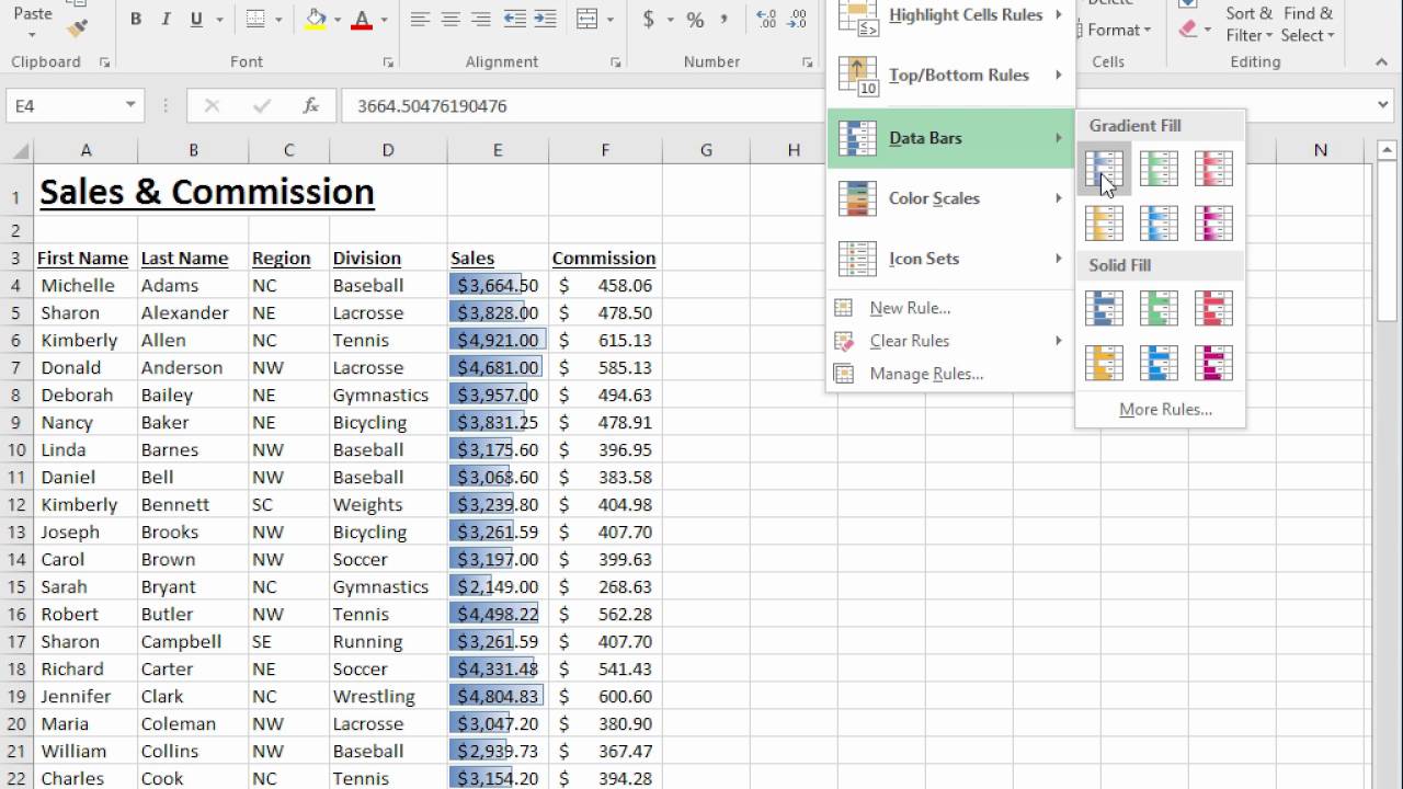
3. In the “Conditional Formatting” tab, click on the “Data Bars” option in the “Styles” group. A drop-down menu will appear with different options.
4. Choose the type of data bar you want to apply to your selected range. Excel offers several options, such as solid fill, gradient fill, and more. Select the option that best suits your needs.
5. As soon as you select a data bar style, you will see the data bar applied to the selected range of cells. The length of the data bar is proportional to the values in each cell, with longer bars representing higher values and shorter bars representing lower values.
6. Customize the appearance of the data bar by right-clicking on any cell in the selected range and choosing “Conditional Formatting” from the context menu. You can modify the color, the minimum and maximum length, and other visual properties of the data bar.
7. If you want to remove the data bar, select the range of cells and go to the “Conditional Formatting” tab. Click on the “Clear Rules” option and choose “Clear Rules from Selected Cells” from the drop-down menu.
By following these steps, you can easily create a data bar in Excel to visually represent your data and gain a better understanding of the relative values within a range of cells.
Step 3: Customize the Data Bar
After creating a data bar in Excel, you have the option to customize it to suit your preferences and enhance data visualization. Customizing the data bar allows you to make it more visually appealing and easy to interpret. Here are a few ways you can customize your data bar:
- Changing the color: By default, the data bar is displayed in a gradient color that represents the range of values. However, you can change the color of the data bar to a single color or choose a different gradient scheme. To do this, select the data bar and go to the “Format” tab in the Excel ribbon. From there, you can experiment with different color options until you find the one that best suits your needs.
- Adjusting the bar thickness: The thickness of the data bar represents the relative value of the cell compared to other cells in the range. You can change the thickness of the data bar to make it more prominent or subtle. To adjust the thickness, select the data bar and use the formatting options available in the “Format” tab. Increase or decrease the bar width until you achieve the desired effect.
- Adding borders: If you want to add a border around the data bar to make it stand out, you can easily do so. Select the data bar, go to the “Format” tab, and click on the “Borders” option. From there, you can choose the type of border, its color, and its thickness. This can help in differentiating the data bar from the surrounding cells.
- Changing the direction: By default, the data bar is horizontally oriented, extending from left to right. However, you can change the direction of the data bar to vertical, extending from top to bottom. To change the direction, select the data bar, go to the “Format” tab, and choose the orientation option that suits your needs.
These are just a few examples of how you can customize the data bar in Excel. Experiment with different options to find the look and feel that works best for your data. Remember, the goal is to make the data visually appealing and easy to interpret for yourself and others who view the spreadsheet.
Step 4: Apply the Data Bar to Other Cells
Once you have created and customized your data bar in Excel, you can easily apply it to other cells in your worksheet. This allows you to visualize the data and easily identify patterns and trends. To apply the data bar to other cells, follow the steps below:
1. Select the cell or range of cells that you want to apply the data bar to.
2. Go to the “Home” tab in the Excel ribbon and click on the “Conditional Formatting” button in the “Styles” group. Then, select “Data Bars” from the drop-down menu.
3. In the sub-menu that appears, choose the desired data bar style that you want to apply to the selected cells. You can choose from different colors, gradients, and bar lengths to suit your preferences.
4. Excel will automatically apply the data bar to the selected cells. The length of the data bar will correspond to the value in each cell, providing a visual representation of the data.
5. If you want to modify the data bar after applying it, right-click on any of the data bar cells and select “Conditional Formatting” from the context menu. Then, choose “Manage Rules” to edit or delete the data bar rule.
By applying the data bar to other cells, you can easily compare and contrast different values in your Excel worksheet. This can be particularly useful when analyzing large datasets or when presenting data to others.
Remember, you can always remove or modify the data bar by selecting the cells and choosing the “Conditional Formatting” option in the “Home” tab. This allows you to experiment with different visualizations and find the right data bar style that best suits your needs.
With Excel’s data bar feature, you can enhance the readability and visual representation of your data. Take advantage of this powerful tool to make your worksheets more informative and visually appealing.
Conclusion
Adding gradient data bars in Excel is a powerful way to visually represent and analyze data. It provides a clear and intuitive display that allows users to quickly identify trends, patterns, and variations in their data.
By following the steps outlined in this guide, you can easily apply gradient data bars to your Excel worksheets. Whether you’re working with financial data, sales figures, or any other type of data, using gradient data bars can enhance your understanding and communication of that data.
Remember to experiment with different color combinations and formatting options to create visual representations that best suit your needs. With gradient data bars, you can transform mundane tables of numbers into impactful visualizations that make data analysis easier and more engaging.
So, start harnessing the power of gradient data bars in Excel today and unlock new insights into your data.
FAQs
1. Can I add gradient data bars in Excel?
Yes, you can add gradient data bars in Excel to visualize data in a more visually appealing way. Gradient data bars provide a gradient fill effect to the cells based on the values in the range, allowing for better data interpretation at a glance.
2. How can I add gradient data bars to my Excel worksheet?
To add gradient data bars in Excel, follow these steps:
– Select the range of cells where you want to apply the gradient data bars.
– Go to the “Home” tab and click on the “Conditional Formatting” dropdown.
– Choose the “Data Bars” option and select “Gradient Fill.”
3. Can I customize the colors and appearance of gradient data bars in Excel?
Yes, you can customize the colors and appearance of gradient data bars in Excel. After selecting the “Gradient Fill” option, you can choose different color schemes and adjust the gradient settings to match your preferences.
4. Can I apply gradient data bars to specific cells?
Yes, you can apply gradient data bars to specific cells in Excel. Simply select the cells where you want to add the gradient data bars, and follow the same steps mentioned above to create and customize the data bars.
5. Are gradient data bars available in all versions of Excel?
Gradient data bars are available in most versions of Excel, including Excel 2010, 2013, 2016, and the latest Excel 2019/Office 365. However, it’s always recommended to check the specific version of Excel you are using to ensure the availability of this feature.