
Are you struggling to create a seamless and professional look in your Procreate artwork? One of the key aspects of achieving a polished final product is mastering the art of color matching. With Procreate’s wide array of color options and features, it can be overwhelming to know where to start.
In this article, we will guide you through the process of color matching in Procreate, helping you create harmonious color schemes and ensure your artwork looks cohesive and visually appealing. We will explore various techniques and tools available in Procreate that will assist you in selecting and matching colors accurately.
Whether you are a professional artist, graphic designer, or simply a hobbyist, learning how to effectively color match in Procreate will elevate your artwork to a whole new level. So, let’s dive in and unravel the secrets of color matching in this powerful digital art tool.
Inside This Article
- Understanding Color Theory
- Utilizing the Eyedropper Tool
- Using the Color Picker
- Adjusting Hue, Saturation, and Brightness
- Creating Custom Color Palettes
- Incorporating Gradient Maps
- Experimenting with Blend Modes
- Fine-tuning with Layer Adjustments
- Conclusion
- FAQs
Understanding Color Theory
Color theory is a fundamental concept in art and design that helps us understand how colors work together harmoniously. By exploring color theory, you can enhance your ability to color match in Procreate, ensuring that your digital artwork is visually stunning and engaging.
At its core, color theory is based on the color wheel, which is a visual representation of the primary, secondary, and tertiary colors. Primary colors, such as red, blue, and yellow, cannot be made by mixing any other colors together. Secondary colors, like orange, green, and violet, are created by mixing two primary colors. Tertiary colors, such as yellow-green or blue-violet, are made by mixing a primary color with a secondary color.
One important concept in color theory is color harmony. Color harmony refers to the pleasing combination of colors in a design. There are several color harmonies to consider, including complementary colors, analogous colors, and triadic colors. Complementary colors, like red and green, are opposite each other on the color wheel and create high contrast when paired together. Analogous colors, such as blue and purple, are adjacent to each other on the color wheel and create a harmonious and soothing effect. Triadic colors, like red, blue, and yellow, are evenly spaced on the color wheel and create a vibrant and balanced composition.
When it comes to color matching in Procreate, having a solid understanding of color theory can greatly benefit your artwork. By using various color harmonies and considering the emotional impact of different colors, you can create visually appealing and engaging designs.
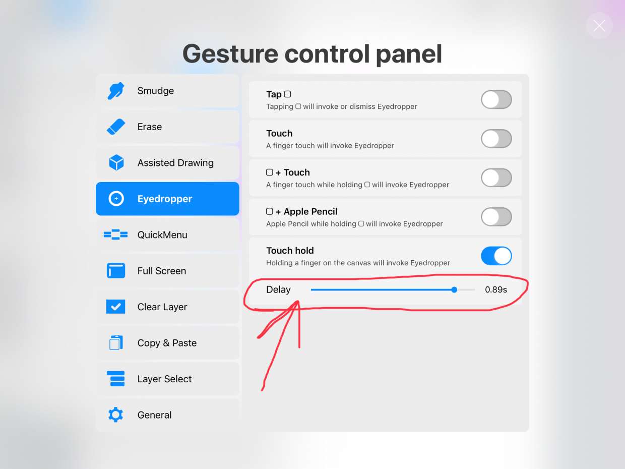
Utilizing the Eyedropper Tool
The Eyedropper Tool is an indispensable feature in Procreate that allows users to effortlessly capture colors from their artwork or any other image on their device. Whether you’re trying to match a specific hue or create a cohesive color scheme, the Eyedropper Tool is your go-to tool for achieving precise color accuracy.
To use the Eyedropper Tool, simply select it from the toolbar located on the left side of the screen. Once activated, you can move the tool over the desired area of your artwork or image and click on it to capture the color. Procreate will automatically sample that color and make it available for you to use in your project.
One of the key advantages of the Eyedropper Tool is its ability to sample colors from within your artwork. This means you can easily extract a specific shade from an existing illustration or painting and incorporate it into another part of your design. This feature is especially valuable when you’re aiming for consistency and harmony in your artwork.
The Eyedropper Tool also allows you to sample colors from outside of the Procreate app. Simply open another image or photo on your device, and while the Eyedropper Tool is active, tap on the area you’d like to sample. Procreate will instantly capture the color, giving you the flexibility to match it precisely within your artwork.
Once you’ve captured a color using the Eyedropper Tool, it will be added to your current color palette, making it easily accessible for future use. This is particularly useful when you need to create a consistent color palette for an entire project, as you can quickly gather all the colors you need without having to manually input their values.
Additionally, Procreate allows you to adjust the size and opacity of the Eyedropper Tool, giving you even more control and precision over the colors you capture. This is particularly helpful when you’re working on detailed artwork and need to sample small or intricate areas.
By utilizing the Eyedropper Tool in Procreate, you can streamline your color matching process and ensure that your artwork is visually cohesive. Whether you’re replicating existing colors or creating color schemes from scratch, this powerful tool will save you time and effort, allowing you to focus on bringing your creative vision to life.
Using the Color Picker
When working with Procreate, one of the essential tools for color matching is the Color Picker. The Color Picker allows you to select any color from your artwork and use it for your current project. It is a powerful feature that helps maintain consistency and harmony in your designs.
To access the Color Picker, simply tap on the color swatch icon located on the top toolbar of the Procreate interface. This will bring up the Color Picker menu, where you can explore a range of color options to choose from.
By default, the Color Picker displays a spectrum of colors arranged in a circular fashion. You can drag your finger across the circle to select a specific hue. As you move towards the center of the circle, the color becomes less saturated. Conversely, as you move towards the outer edge, the color becomes more vibrant.
Beneath the circular spectrum, you’ll find a vertical slider that allows you to adjust the brightness of the selected color. Sliding the marker up will increase the brightness, while sliding it down will darken the color.
Additionally, the Color Picker provides a horizontal slider that controls the opacity of the chosen color. By default, the opacity is set to 100%, but you can adjust it to achieve a more transparent effect if desired.
Once you’ve selected the desired color, simply tap anywhere outside the Color Picker menu to apply it. The selected color will now replace the current color swatch, allowing you to paint or fill your artwork with the chosen color.
The Color Picker also offers the option to save colors to a custom palette for future use. This is especially handy if you have a specific color scheme that you often work with or want to match the colors in different parts of your artwork effortlessly. To save a color, press and hold the selected color swatch in the Color Picker menu, then choose “Add to Palette” from the context menu.
Using the Color Picker in Procreate is a convenient and efficient way to maintain color consistency in your artwork. Whether you’re working on a digital painting, illustration, or graphic design project, mastering the Color Picker will greatly enhance your creative process and ensure visually appealing results.
Adjusting Hue, Saturation, and Brightness
When it comes to digital art and design, adjusting the hue, saturation, and brightness of colors can make a significant difference in the overall look and feel of your artwork. Understanding how to manipulate these color properties in Procreate can open up a world of possibilities and allow you to create stunning and dynamic visuals. Whether you want to enhance the vibrancy of your colors or create a more muted and subtle palette, Procreate provides several tools and features to help you achieve your desired effect.
One of the most effective ways to adjust the hue, saturation, and brightness in Procreate is through the use of the Adjustments menu. This menu can be accessed by tapping on the wrench icon located at the top right corner of the screen. From there, you can select the Hue, Saturation, or Brightness adjustment.
The Hue adjustment allows you to shift the overall color of your artwork along the color spectrum. By dragging the slider left or right, you can change the hue from warm tones to cool tones, or vice versa. This is a great tool to experiment with when you want to change the mood or temperature of your artwork.
The Saturation adjustment controls the intensity or purity of the colors in your artwork. By sliding the saturation bar to the left, you can desaturate the colors, creating a more muted or grayscale effect. On the other hand, sliding it to the right will increase the saturation, making the colors more vibrant and vivid. This adjustment is perfect for adding depth and richness to your artwork.
The Brightness adjustment allows you to control the overall lightness or darkness of your artwork. By moving the brightness slider to the left, you can darken the colors, creating a more dramatic and moody atmosphere. Conversely, sliding it to the right will lighten the colors, resulting in a brighter and more uplifting effect. This adjustment can be particularly useful when you want to set the tone or ambiance of your artwork.
In addition to the Adjustments menu, Procreate offers other tools and features that allow you to adjust hue, saturation, and brightness. The Color Balance and Color Tint options, for example, provide additional control over these color properties, allowing you to fine-tune your artwork even further.
Mastering the art of adjusting hue, saturation, and brightness in Procreate will give you the power to create visually stunning and impactful artwork. By understanding these color properties and how to manipulate them, you can bring your creative vision to life and make your artwork truly stand out.
So take the time to experiment with the hue, saturation, and brightness settings in Procreate. Play around with different combinations and see how they affect the overall look and feel of your artwork. You’ll be amazed at the endless possibilities that await you.
Creating Custom Color Palettes
When it comes to digital art and design, having a well-curated color palette can greatly enhance the visual impact of your creations. Luckily, in Procreate, you have the flexibility to create your own custom color palettes, allowing you to unleash your creativity and make your artwork truly unique.
Here are a few steps to help you create stunning custom color palettes in Procreate:
- Start with inspiration: Before diving into creating your palette, it’s helpful to gather some inspiration. Look for images, photographs, or even nature scenes that evoke the mood or theme you want to convey in your artwork. Take note of the colors that catch your eye and use them as a starting point for your palette.
- Access the color palette: In Procreate, open the color picker by tapping on the color icon located at the top right corner of the screen. This will bring up the color picker menu, where you can access the color palettes and create new ones.
- Create a new color palette: To create a new color palette, tap on the “+” icon on the top left corner of the color picker menu. Give your palette a name that reflects its theme or purpose.
- Add colors: To add colors to your palette, you have several options. You can manually select colors using the color wheel or input specific color values. Alternatively, you can use the eyedropper tool to pick colors from an existing artwork or image. Simply tap and hold on the area you want to sample, and the color will be added to your palette.
- Organize your palette: To organize your palette, you can rearrange the color swatches by dragging and dropping them into the desired order. This allows you to group similar colors together or arrange them in a way that suits your workflow.
- Save your palette: Once you are satisfied with your custom color palette, make sure to save it for future use. To do this, tap on the palette button at the top right corner of the color picker menu, then select “Save Palette.” Your palette will be saved and accessible in the “Palettes” section of the color picker.
By creating custom color palettes in Procreate, you have the power to infuse your artwork with your own personal style and vision. Whether you’re working on illustrations, digital paintings, or graphic designs, having a well-crafted color palette can take your creations to the next level.
Incorporating Gradient Maps
Gradient maps are a powerful tool in Procreate that allow you to apply a smooth transition of colors to your artwork. By using gradient maps, you can create stunning visual effects, enhance the mood of your piece, and add depth and dimension to your artwork. Here’s how to incorporate gradient maps in your Procreate workflow:
1. Understanding Gradient Maps: Gradient maps are essentially a mapping of colors to tones in your artwork. They consist of a range of colors that transition smoothly from one shade to another. The gradient map takes the existing range of tones in your artwork and replaces them with the colors from the gradient map.
2. Applying Gradient Maps: To apply a gradient map in Procreate, start by selecting the layer you want to add the effect to. Then, go to the “Adjustments” menu and choose “Gradient Map.” Procreate provides you with a range of default gradient maps to choose from, or you can create your own custom gradient map.
3. Customizing Gradient Maps: If you want to create a custom gradient map, Procreate allows you to do so. You can adjust the color stops, add or remove colors, and modify the overall look of the gradient map. This gives you full control over the colors and tones in your artwork.
4. Blending Modes and Opacity: To further enhance the effect of the gradient map, you can experiment with different blending modes and opacity settings. This allows you to blend the colors of the gradient map with the underlying layers, creating interesting and unique combinations.
5. Creating Depth and Mood: Gradient maps are a great tool for creating depth and setting the mood of your artwork. By using gradients that transition from dark to light or vice versa, you can create realistic shading and lighting effects. Additionally, by choosing specific color combinations, you can evoke different emotions and create a specific atmosphere in your piece.
6. Experimenting and Fine-tuning: Don’t be afraid to experiment with different gradient maps and combinations of colors. By adjusting the color stops, opacity, and blending modes, you can fine-tune the effect to your liking. Take the time to play around and see how different gradient maps transform your artwork.
Incorporating gradient maps in Procreate opens up a whole new world of possibilities for your artwork. It allows you to add depth, dimension, and unique color combinations that can take your illustrations to the next level. So, don’t hesitate to experiment and get creative with gradient maps in Procreate.
Experimenting with Blend Modes
Blend modes in Procreate are a powerful tool that allows you to creatively combine and modify the appearance of different layers. They offer a wide range of effects, from subtle enhancements to dramatic transformations. By altering the way colors interact with each other, blend modes can completely change the mood and visual impact of your artwork.
When using blend modes, it’s important to understand how each mode functions and what results it can achieve. Procreate offers more than 20 blend modes, each with its own unique characteristics. For example, the ‘Multiply’ blend mode darkens the colors of the top layer while preserving its textures and details. On the other hand, the ‘Screen’ blend mode lightens the colors of the top layer, creating a bright and airy effect.
One of the best ways to learn and explore blend modes is through experimentation. Start by duplicating a layer and applying different blend modes to the duplicate. Observe how the colors interact and how they affect the overall appearance of your artwork. Don’t be afraid to try out different combinations and see how they can enhance your piece.
Blend modes can also be used to create interesting and unique effects. For example, the ‘Overlay’ blend mode can add a dynamic and vibrant look by intensifying the contrast between layers. The ‘Soft Light’ blend mode can create a subtle glow or gentle shadows, providing a soft and dreamy atmosphere.
Remember that blend modes can be applied to not only layers but also to specific brushes or selection areas. This allows you to have precise control over where the blend mode is applied, giving you even more creative possibilities.
As you experiment with blend modes, it’s essential to consider the overall composition and desired outcome of your artwork. Some blend modes work better for certain types of images or color schemes. Take the time to test different options and find the blend modes that enhance your artwork the most.
With practice and experimentation, you’ll develop a deeper understanding of blend modes and how they can be used to elevate your artwork. It’s an exciting journey of discovery, as you uncover new techniques and create visually stunning effects.
So go ahead, dive into the world of blend modes in Procreate, and let your creativity soar!
Fine-tuning with Layer Adjustments
Layer adjustments are a powerful feature in Procreate that allow for precise control over the color and tonal values of your artwork. With layer adjustments, you can make targeted changes to specific layers without affecting the rest of your artwork. Let’s explore how you can use layer adjustments to fine-tune the colors in your Procreate creations.
One of the most commonly used layer adjustments is the “Hue, Saturation, Brightness” (HSB) adjustment. This adjustment allows you to tweak the overall hue, saturation, and brightness of a layer. By adjusting these parameters, you can make subtle or drastic changes to the colors in your artwork. For example, you can increase the saturation to make the colors more vibrant or decrease the brightness to create a more muted look.
Another powerful layer adjustment is “Selective Color.” This adjustment gives you precise control over individual color channels such as red, green, blue, cyan, magenta, yellow, and black. You can make targeted adjustments to these color channels to enhance or tone down specific colors in your artwork. For instance, you can increase the intensity of the red channel to make red elements in your artwork pop.
The “Curves” adjustment is another handy tool for fine-tuning colors in Procreate. With curves, you can adjust the tonal values of your artwork by manipulating the brightness and contrast. This adjustment allows you to create custom contrast curves, giving you complete control over the overall look and feel of your artwork. You can make your colors more vibrant or create a moody atmosphere by playing with the curves.
Layer adjustments can also be combined with blending modes to achieve unique effects. Blending modes control how each layer interacts with the layers below it. By experimenting with different blending modes, you can create interesting color and texture combinations. For example, using the “Overlay” blending mode can intensify the colors and add a vibrant look to your artwork.
Lastly, layer adjustments can be applied to specific layers or groups of layers. This allows you to make adjustments to only certain parts of your artwork while leaving the rest untouched. By creating layer masks, you can control where the adjustments are applied, giving you even more precision in fine-tuning your colors.
With layer adjustments in Procreate, you have a wide range of tools at your disposal to fine-tune the colors in your artwork. Whether you want to make subtle tweaks or dramatic changes, layer adjustments offer the flexibility and control to achieve the desired result. Take some time to experiment with different adjustments and blending modes to discover new creative possibilities in your Procreate workflow.
Conclusion
Color matching in Procreate is a powerful tool that allows artists and designers to create harmonious and cohesive artworks. By understanding the color wheel, exploring different color schemes, and utilizing Procreate’s color tools and features, users can quickly and effectively achieve color harmony in their digital creations.
Whether you’re a beginner or an experienced artist, Procreate provides a user-friendly and intuitive interface that makes color matching accessible to all. So, unleash your creativity and experiment with colors, shades, and tones to elevate your artwork to the next level.
Remember, color matching is not limited to just digital art; it is a fundamental skill that can be applied to various design disciplines, such as graphic design, illustration, and even web design. So, embrace the power of color and let it add depth, emotion, and visual impact to your artistic endeavors.
With the knowledge and techniques outlined in this article, you are well-equipped to embark on your color-matching journey in Procreate. Don’t hesitate to explore, experiment, and push the boundaries of your creativity – the possibilities are endless!
FAQs
1. What is color matching in Procreate?
Color matching in Procreate is the process of ensuring that the colors you use in your artwork accurately match the reference or desired colors. It involves analyzing colors in an image or from a reference and recreating them using Procreate’s color tools and palettes.
2. Why is color matching important in Procreate?
Color matching is important in Procreate because it allows you to maintain visual consistency and accuracy in your artwork. Whether you’re creating digital illustrations, paintings, or designs, accurate color reproduction is essential to achieve the desired results and convey the intended mood or atmosphere.
3. How can I color match in Procreate?
To color match in Procreate, you can use various techniques. One common method is to sample colors from a reference image using the Eyedropper tool and then apply them to your artwork. Procreate also offers color adjustment tools, such as the Color Balance and Hue, Saturation, and Brightness (HSB) sliders, which allow you to fine-tune and match colors.
4. Are there any additional tools or plugins for color matching in Procreate?
While Procreate itself provides robust color matching capabilities, there are several third-party tools and plugins available that can further enhance your color matching workflow. Some popular options include Color Harmony, which helps you create harmonious color palettes, and ColorLab, which offers advanced color grading and matching functionalities.
5. Can I save and reuse color matches in Procreate?
Absolutely! Procreate allows you to save color matches and create custom color palettes for future use. You can store your favorite color combinations, swatches, or even import color palettes from external sources. This feature enables you to maintain consistency in your artwork and easily apply previously matched colors across different projects.