
Are you struggling to make sense of the vast amounts of data in your Excel spreadsheets? If so, you’re not alone. With the increasing reliance on data for analysis and decision-making, organizing and structuring data in Excel has become a crucial skill.
Being able to organize data efficiently allows you to extract meaningful insights, identify patterns, and make informed decisions. Whether you are analyzing sales data, tracking inventory, or conducting a financial analysis, having a well-organized Excel spreadsheet is essential.
In this article, we will guide you through the step-by-step process of organizing data in Excel for analysis. We will explore techniques to clean up messy data, organize data into tables, sort and filter data, and create pivot tables. By the end, you will have the knowledge and tools to transform your Excel spreadsheets into a valuable source of information.
Inside This Article
- Overview
- Step 1: Sorting Data
- Step 2: Filtering Data
- Step 3: Using PivotTables
- Step 4: Creating Charts and Graphs
- Conclusion
- FAQs
Overview
When it comes to organizing data in Excel for analysis, having a systematic approach can save you time and effort. Excel offers a wide range of powerful tools and features that allow you to sort, filter, and analyze data efficiently. In this article, we will guide you through the process of organizing your data in Excel and preparing it for analysis.
By following the steps outlined below, you will be able to gain valuable insights from your data and make informed decisions:
- Step 1: Sorting Data: Sorting your data allows you to arrange it in a logical order based on specific criteria, such as alphabetical order or numerical values. This helps identify patterns and trends more easily.
- Step 2: Filtering Data: Filtering enables you to focus on specific subsets of your data by applying criteria or conditions. This allows you to narrow down your analysis and extract the information that is most relevant to your needs.
- Step 3: Using PivotTables: PivotTables are a powerful tool in Excel that helps summarize and analyze large amounts of data. They allow you to group, summarize, and slice your data in various ways, providing a clear and concise overview of your information.
- Step 4: Creating Charts and Graphs: Excel offers a variety of chart types, such as bar graphs, line graphs, and pie charts, that visually represent your data. These visualizations make it easier to understand and communicate your analysis findings.
By implementing these steps, you can transform raw data into meaningful insights. Whether you’re analyzing sales figures, tracking project progress, or conducting research, Excel provides you with the tools to organize and analyze your data effectively.
So let’s dive into each step in more detail and discover how to leverage Excel’s capabilities to organize and analyze your data efficiently.
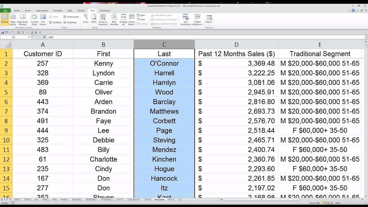
Step 1: Sorting Data
Sorting data in Excel is an essential step in organizing and analyzing your information effectively. By arranging your data in a logical order, you can easily identify patterns, trends, and outliers.
To sort data in Excel, follow these simple steps:
- Select the range of cells that you want to sort.
- Go to the “Data” tab in the Excel ribbon.
- Click on the “Sort” button in the “Sort & Filter” group.
- In the Sort dialog box, specify your sorting preferences. You can choose to sort by one or multiple columns, in ascending or descending order.
- Click the “OK” button to apply the sorting to your selected data range.
Excel also allows you to sort data alphabetically, numerically, by dates, or even by custom lists. With these sorting options, you can easily bring order to your data and make it more manageable for further analysis.
Sorting data in Excel not only helps in organizing information but also enables you to perform various calculations, such as finding the minimum and maximum values or calculating subtotals based on sorted groups.
Keep in mind that sorting data in Excel is a non-destructive operation. This means that the original data remains intact, and only the order in which it is displayed changes. You can always revert back to the original order by simply reapplying the sorting or using the “Undo” function.
By mastering the art of sorting data in Excel, you gain the ability to quickly gain insights from your datasets and unlock the full potential of your analysis.
Step 2: Filtering Data
Filtering data in Excel is a powerful technique that allows you to view only the data that meets specific criteria. By applying filters, you can easily extract the information you need and eliminate unnecessary clutter from your dataset. Here’s how you can effectively filter data in Excel:
1. Select your data range: Begin by selecting the range of cells containing the data you want to filter. Make sure to include the column headers to ensure accurate filtering.
2. Enable the Filter tool: Go to the “Data” tab in the Excel ribbon and click on the “Filter” button. This will add drop-down arrows next to each column header in your selected range.
3. Choose a filter criterion: Click on the drop-down arrow next to the column you want to filter. You will see a list of unique values in that column. You can either select specific values or use the search box to find the information you’re looking for.
4. Apply the filter: After selecting your filter criteria, click on the checkbox next to the value(s) you want to include in the filtered view. Excel will instantly update the data to display only the selected values.
5. Refine your filter: To further refine your filter, you can apply additional criteria to other columns. This allows you to create complex filters by combining multiple conditions.
6. Clear the filter: If you want to remove the filter and display all the data again, simply go back to the “Data” tab and click on the “Clear” button in the “Sort & Filter” group.
Filtering data in Excel is a dynamic process, meaning you can easily modify or remove the filter criteria at any time to adjust your view. This feature is especially useful when dealing with large datasets that require frequent analysis and exploration. Whether you’re working with financial data, customer records, or any other type of information, filtering data in Excel can help you streamline your analysis and focus on the relevant information.
Step 3: Using PivotTables
PivotTables are powerful tools in Excel that allow you to summarize and analyze large amounts of data. They provide a flexible way to organize, manipulate, and gain insights from your data with just a few clicks. In this step, we will explore how to use PivotTables effectively.
To create a PivotTable, start by selecting your data range. This can be a single table or multiple tables. Once you have selected the data, go to the Insert tab in the Excel ribbon and click on PivotTable. A dialog box will appear, allowing you to choose where you want to place the PivotTable.
Next, you need to define the fields that will be used in the PivotTable. Drag and drop the desired fields into the Rows, Columns, and Values areas in the PivotTable Field List. The Rows and Columns areas determine how the data will be organized, while the Values area specifies the data that will be summarized.
Once you have set up your PivotTable layout, Excel will automatically calculate the aggregate functions such as Sum, Count, Average, etc. based on the selected data. You can customize these calculations by right-clicking on a value in the PivotTable and selecting Value Field Settings. This will allow you to change the summary function or apply additional calculations.
One of the great features of PivotTables is the ability to easily filter and drill down into the data. You can use the Report Filter, Column Labels, Row Labels, and Values areas to filter and slice your data in various ways. For example, you can filter by specific dates, products, or regions to focus on specific subsets of your data.
PivotTables also offer grouping and sorting options to further organize and refine your data. You can group dates into months, quarters, or years, and sort values in ascending or descending order. These features make it easy to get a comprehensive view of your data and identify trends or patterns.
It is important to refresh your PivotTable data whenever your source data changes. Excel provides an automatic refresh feature, but you can also manually refresh by right-clicking on the PivotTable and selecting Refresh. This ensures that your PivotTable reflects the latest updates and maintains its accuracy.
Lastly, you can enhance the visual representation of your data by applying various formatting options to the PivotTable. Excel offers a range of customization tools to modify the layout, styles, and colors to match your preferences or suit your presentation needs.
Using PivotTables in Excel allows you to transform raw data into meaningful insights. By arranging and summarizing your data in a flexible and interactive way, you can quickly analyze large datasets and make informed decisions based on trends and patterns.
Step 4: Creating Charts and Graphs
After sorting and filtering your data in Excel, the next step is to visualize it using charts and graphs. Data visualization is an essential tool for gaining insights and presenting information in a more intuitive and digestible format.
To create charts and graphs in Excel, follow these simple steps:
- Select the data range: Choose the dataset you want to visualize by selecting the appropriate cells. This should include both the x-axis (category) and the y-axis (values).
- Navigate to the “Insert” tab: Click on the “Insert” tab in the Excel ribbon located at the top of the screen.
- Choose a chart type: Excel offers various chart types, such as column, line, pie, bar, and scatter plots. Select the chart type that best suits your data and purpose.
- Click on the desired chart type: Once you’ve chosen the chart type, click on it to insert it into your worksheet.
- Customize the chart: Excel provides numerous options to customize your chart’s appearance. You can modify the chart title, axis labels, legend, colors, and more. Simply right-click on the chart and select the appropriate options.
- Update the data range: If you make any changes to your dataset, you can easily update the chart by right-clicking on it and choosing “Select Data.” Then, update the data range accordingly.
- Format the chart: Excel allows you to format the chart elements to make it more visually appealing. You can change the font, add data labels, adjust the axis scale, and apply various styles and effects.
- Create additional charts: If you have multiple sets of data, you can create additional charts on the same worksheet or use different sheets to compare and analyze them side by side.
- Save and share the chart: Once you’re satisfied with your chart, save your Excel file to preserve the visualization. You can also share the chart directly by copying and pasting, or by exporting it as an image or PDF file.
Creating charts and graphs in Excel not only adds visual interest to your data but also helps to identify patterns, trends, and correlations that may not be readily apparent in a table format. This visual representation can aid in making data-driven decisions, communicating findings to others, and effectively conveying complex information.
Whether you’re analyzing sales figures, tracking project progress, or comparing survey responses, using charts and graphs in Excel is a powerful way to present your data and gain valuable insights.
Conclusion
Organizing data in Excel is essential for effective analysis and decision-making. By following the best practices highlighted in this article, you can ensure that your data is structured, clean, and easily accessible. Remember to carefully plan the layout of your spreadsheet, use appropriate formatting and formulas, and leverage Excel’s powerful features like sorting and filtering. Additionally, consider using pivot tables to summarize and analyze large datasets.
By taking the time to organize your data properly, you can save valuable time and avoid errors when conducting analysis. Whether you’re a business professional, a student, or simply someone who frequently works with data, mastering the art of data organization in Excel will greatly benefit you. So, start implementing these tips today and unlock the full potential of your data!
FAQs
1.
Why is it important to organize data in Excel for analysis?
Organizing data in Excel is crucial for analysis because it allows you to efficiently manage and make sense of large sets of information. By organizing your data into logical structures, such as tables or charts, you can easily identify patterns, trends, and insights that can inform your decision-making process.
2.
What are some techniques for organizing data in Excel?
There are several techniques you can use to organize data in Excel. Some popular ones include:
- Creating tables: Using Excel’s table feature to structure your data with headers and formatted cells.
- Sorting and filtering: Rearranging data based on specific criteria or conditions.
- Pivot tables: Summarizing data and generating reports by grouping and analyzing information.
- Conditional formatting: Applying formatting rules to highlight specific data based on predefined conditions.
3.
How can I arrange data in Excel to facilitate analysis?
To arrange data in Excel for analysis, you can:
- Ensure data is organized in a consistent manner, with each column representing a specific attribute or variable.
- Cleanse and format data by removing any duplicates, errors, or inconsistencies.
- Use headers to label each column and provide a clear indication of the data it contains.
- Group related data together and consider using color-coding or cell borders to visually distinguish different sections.
4.
Are there any Excel features that can help me analyze data?
Yes, Excel offers various features that can assist in data analysis. Some of these include:
- Formulas and functions: Excel provides a wide range of mathematical and statistical functions that can be used to analyze data and perform calculations.
- Charts and graphs: Visual representations of data can help identify trends, patterns, and outliers quickly.
- Data analysis add-ins: Excel offers supplemental tools like the Data Analysis ToolPak, which provides additional statistical analysis capabilities.
5.
Is it possible to automate data organization and analysis in Excel?
Yes, Excel allows for automation of data organization and analysis through the use of macros and Visual Basic for Applications (VBA). By recording and running macros, you can automate repetitive tasks and create customized procedures to handle specific data analysis needs.