
Are you a designer or artist looking to create your own font? Look no further than Procreate! Procreate is a powerful digital illustration app that allows you to turn your artistic vision into reality. With its intuitive interface and advanced features, Procreate provides the tools you need to design and customize fonts with ease.
In this article, we will guide you through the process of creating a font in Procreate. From sketching your letterforms to exporting a finalized font file, we will cover all the steps necessary to bring your font design to life. Whether you’re a seasoned designer or just starting out, Procreate offers a user-friendly platform that makes font creation accessible to everyone.
So get ready to unleash your creativity and take your font design skills to the next level with Procreate!
Inside This Article
- Overview
- Getting Started
- Sketching the Design
- Digitizing the Letters
- Refining the Details
- Adding Variations
- Fine-tuning the Font
- Exporting the Font Files
- Conclusion
- FAQs
Overview
Welcome to this comprehensive guide on how to create a font in Procreate. Fonts play a crucial role in design and can greatly impact the overall aesthetic of your work. With Procreate, a powerful and versatile digital art app, you have the tools and flexibility to bring your font ideas to life.
In this article, we will take you through the step-by-step process of creating a font in Procreate. We’ll cover everything from sketching the design to digitizing the letters, refining the details, and adding variations. By the end, you’ll have a unique and customized font that you can use in your design projects.
Creating a font in Procreate allows you to have complete control over the style, shape, and character of your letters. Whether you’re a graphic designer, illustrator, or simply someone who loves experimenting with different fonts, this guide will provide you with the knowledge and tools to unleash your creative potential.
So, without further ado, let’s dive into the fascinating world of font creation in Procreate!
Getting Started
Creating your own font can be an exciting and rewarding endeavor. Whether you want to design a unique typeface for a personal project or explore a career in typography, Procreate is a versatile tool that can help you bring your font ideas to life. In this guide, we will walk you through the process of getting started with creating a font using Procreate.
The first step in creating a font in Procreate is to have a clear vision of the style and characteristics you want your font to embody. Are you aiming for a smooth and elegant script font or a bold and edgy display font? Establishing a concept will provide a solid foundation for your design journey.
Once you have your idea in mind, it’s time to gather some inspiration. Browse through different fonts, explore various typography styles, and look for elements that resonate with your concept. This research phase will help you refine your design direction and spark your creativity.
Next, it’s essential to sketch out your initial ideas. Grab a pen and paper or use Procreate’s sketching tools to explore different letterforms and experiment with various shapes and strokes. Don’t worry about perfection at this stage; the goal is to generate a range of rough sketches that capture the essence of your font.
As you progress with your sketching, start defining the basic structure of your letters. Consider the proportions, ascenders, descenders, and x-height to ensure consistency throughout your font. These foundational elements will lay the groundwork for a well-balanced and harmonious typeface.
Once your letterforms have taken shape, it’s time to digitize them in Procreate. Use the app’s intuitive tools, such as the pen, brush, and eraser, to recreate your sketched letters digitally. Pay attention to refining the curves, angles, and corners to achieve crisp and clean outlines for your characters.
When digitizing the letters, it’s a good idea to work with layers. This way, you can easily make adjustments without affecting the entire composition. Try experimenting with different variations and explore different styles within your font, such as bold, italic, or condensed versions.
After you have digitized the basic letterforms, it’s crucial to refine the details. Zoom in and focus on each individual letter, paying close attention to the details like serifs, curves, and terminals. This meticulous refinement process will elevate the quality and professionalism of your font.
Adding variations to your font can provide versatility and flexibility for different design projects. Consider creating alternative versions of certain letters, ligatures, or stylistic alternates. This will give your font a unique touch and allow designers to play with different styles within a cohesive typeface.
As you near the final stages of creating your font, take the time to fine-tune every aspect. Adjust spacing between letters, kerning pairs, and overall readability. Test your font in different sizes and contexts to ensure it looks great across various applications, from digital platforms to print materials.
Finally, when you are satisfied with your font, it’s time to export the font files. Procreate allows you to export your font as a .TTF or .OTF file, which can be installed and used in various graphic design and word processing applications. With your font files in hand, you now have a custom typeface ready to elevate your design projects.
Sketching the Design
When it comes to creating a font in Procreate, sketching the design is a crucial first step. It allows you to experiment with different letterforms, styles, and characters before committing to the digital process.
Start by brainstorming ideas for your font. Think about the overall aesthetic you want to achieve – whether it’s elegant, playful, minimalist, or bold. Consider the target audience and the purpose of the font, as this will influence the design choices you make.
With a clear vision in mind, it’s time to grab your Procreate digital canvas and stylus. Begin by sketching the basic letterforms using a pencil brush or a brush with organic textures. Focus on the overall shape and proportions of the characters.
Don’t be afraid to experiment and iterate. Sketch different variations of each letter, exploring different styles and flourishes. Play with different stroke weights, serifs, and curves to add your unique touch to the font.
Remember, sketching is a fluid and creative process. Allow yourself to make mistakes and explore unconventional ideas. This is the time to push the boundaries and let your imagination run wild.
When sketching, pay attention to the consistency and legibility of your letters. Ensure that each character is distinct yet harmonious with the overall font design. Take note of any difficult or problematic letter combinations that may need further refinement later in the process.
As you sketch, keep in mind that the ultimate goal is to have a complete set of characters that work well together. Think about not only the individual letter designs but also the spacing and alignment between the letters.
Once you are satisfied with your sketched designs, it’s time to move on to the next phase of the font creation process: digitizing the letters. But don’t rush – take the time to truly refine your sketches and ensure they reflect your desired font style.
Digitizing the Letters
Now that you have sketched out your font designs on paper, it’s time to digitize them using Procreate. This process involves tracing and refining your sketches to create clean, digital versions of each letter.
Here’s how you can digitize the letters in Procreate:
- Import your sketches: Start by importing the sketch of each letter into Procreate. You can either take a photo or scan your sketches and import them as separate layers.
- Create a new layer: On top of your sketch layer, create a new layer to trace the outlines of the letter. This will be your working layer where you’ll refine the letterform.
- Choose the right brush: Select a brush that suits the style of your font. Procreate offers a variety of brushes to choose from, including smooth, calligraphy-style brushes or more textured brushes for a hand-drawn look.
- Trace the letter: Use the brush tool to carefully trace the outlines of your letter, adjusting the curves and angles as needed. Pay close attention to the details and proportions to ensure your digitized version matches your original sketch.
- Refine the shapes: Once you have traced the basic outlines, go back and refine the shapes of the letterforms. Clean up any messy lines, smooth out curves, and make necessary adjustments to achieve the desired look.
- Add details: Depending on the style of your font, you may want to add decorative elements or unique flourishes to certain letters. Use additional layers to experiment with these details and make them stand out.
- Adjust the opacity: Lower the opacity of your sketch layer to make it less visible, allowing you to focus on the clean, digital version of the letter. This will help you spot any imperfections and make further adjustments.
- Create the remaining letters: Repeat the tracing and refining process for each letter of your font. This may be time-consuming, but it’s crucial to maintain consistency in style and proportion across all characters.
By digitizing your sketches in Procreate, you can bring your font designs to life and refine them with precision and creativity. Take your time with each letter, ensuring that it aligns with your original concept and fits seamlessly into the overall font.
Refining the Details
Once you have digitized the letters in Procreate and have a basic skeleton of your font, it’s time to refine the details to make it polished and professional. This step is crucial in ensuring that your font looks clean and consistent across all characters.
1. Adjust Stroke Weight: Pay attention to the stroke weight of your letters. You may notice that some letters appear thicker or thinner than others. Use Procreate’s editing tools to adjust the stroke weight and make it uniform throughout the font.
2. Smooth Out Curves: Take a closer look at the curves in your letters and make sure they are smooth and seamless. Use the eraser tool or the smudge tool to gently refine the curves and remove any rough edges.
3. Fine-tune Spacing: Proper spacing between letters can greatly impact the legibility of your font. Make sure there is enough space between each character, and adjust the kerning where necessary to ensure a balanced and visually pleasing result.
4. Clean Up Imperfections: Zoom in on your letters and carefully examine them for any imperfections or extraneous marks. Use the brush tool or the eraser tool to clean up any stray lines or blemishes, creating a clean and polished appearance.
5. Consistency is Key: Ensure that all the elements of your font are consistent. Pay close attention to the height of lowercase and uppercase letters, the placement of serifs or accents, and the overall style of your font. Consistency will make your font visually cohesive and professional.
6. Test and Revise: It’s essential to test your font in various contexts to ensure its usability. Write sample texts, test different sizes, and evaluate how the font looks in different applications. Take note of any areas that need further refinements and make the necessary revisions to perfect your font.
By meticulously refining the details of your font, you can elevate its overall quality and ensure a visually appealing result. This step requires attention to detail, patience, and a keen eye for design. However, the effort will be well worth it when you see your finished font in use.
Adding Variations
Creating variations in your font can add depth and personality to your design. It allows you to explore different styles and interpretations, making your font more versatile. Here are some tips on how to add variations to your font:
1. Play with Different Weights: One way to add variation is by adjusting the weight of your letters. Experiment with bold, regular, and light weights to give your font different levels of thickness. This can help create contrast and make your font more visually interesting.
2. Experiment with Different Styles: Try adding different styles to your font, such as italics, obliques, or even a decorative version. This can give your font a unique and distinct look, suitable for various design projects.
3. Explore Alternative Characters: Consider including alternative characters or glyphs in your font. These can be variations of certain letters or stylistic alternates that can provide different design options. Including ligatures or swashes can also add a touch of elegance or playfulness to your font.
4. Adjust Letter Spacing: Experiment with the spacing between letters to create different effects. Increasing or decreasing the letter spacing can give your font a more condensed or airy feel, altering the overall texture of your design.
5. Incorporate Stylistic Sets: Some software programs, like Adobe Illustrator, allow you to create stylistic sets within your font. These sets contain alternative characters or letterforms that users can easily access. This feature provides even more flexibility for designers to utilize different variations of your font.
6. Consider Contextual Alternates: Contextual alternates are a set of characters that change depending on their surrounding context. This feature can ensure that certain letter combinations flow smoothly and look aesthetically pleasing.
7. Get Feedback: It is always beneficial to get feedback from others. Share your variations with fellow designers or trusted individuals and gather their opinions. This can help you refine your font design and make informed decisions about which variations to include.
Remember, the key to adding variations to your font is to maintain consistency while allowing room for creativity. It is important to strike a balance between uniqueness and usability.
Fine-tuning the Font
Once you have digitized your letters and refined the details of your font design, it’s time to focus on fine-tuning the font to ensure it looks and performs its best. This step involves adjusting various aspects of the font, such as spacing, kerning, and hinting.
Spacing refers to the amount of white space between each letter. Proper spacing is crucial for a visually pleasing and legible font. You can adjust the spacing by adjusting the side bearings of each glyph, which determines the space between one letter and the next.
Kerning, on the other hand, focuses on the specific space between two individual letters. Some letter pairs may require adjustments to improve their visual balance. For example, the combination of a capital “A” and lowercase “v” might need a slight adjustment to avoid an awkward gap.
Hinting is a technical process that improves the font’s appearance on different screen resolutions. It involves defining specific instructions for how the font should be displayed at various sizes and resolutions. Hinting ensures that the font remains crisp and clear, regardless of the medium or device it’s being used on.
When fine-tuning your font, it’s important to consider its intended use and target audience. Different font styles may require different adjustments. For example, a display font with large letterforms may require looser spacing and more exaggerated letterforms, while a small-sized font needs tighter spacing and more restrained details.
Test your font in various contexts to evaluate its legibility and visual appeal. Experiment with different words, phrases, and sentences to ensure that the font looks consistent and readable across different combinations of letters.
Make sure to take breaks and step back to gain a fresh perspective. Sometimes, a small tweak or adjustment can make a significant difference in the overall appearance and performance of your font.
Remember, fine-tuning your font is an iterative process. Don’t be afraid to go back and make adjustments as needed. Your goal is to create a font that stands out, communicates effectively, and enhances the overall design of projects it’s used in.
Once you are satisfied with the fine-tuning process, you can move on to the next step of exporting your font files.
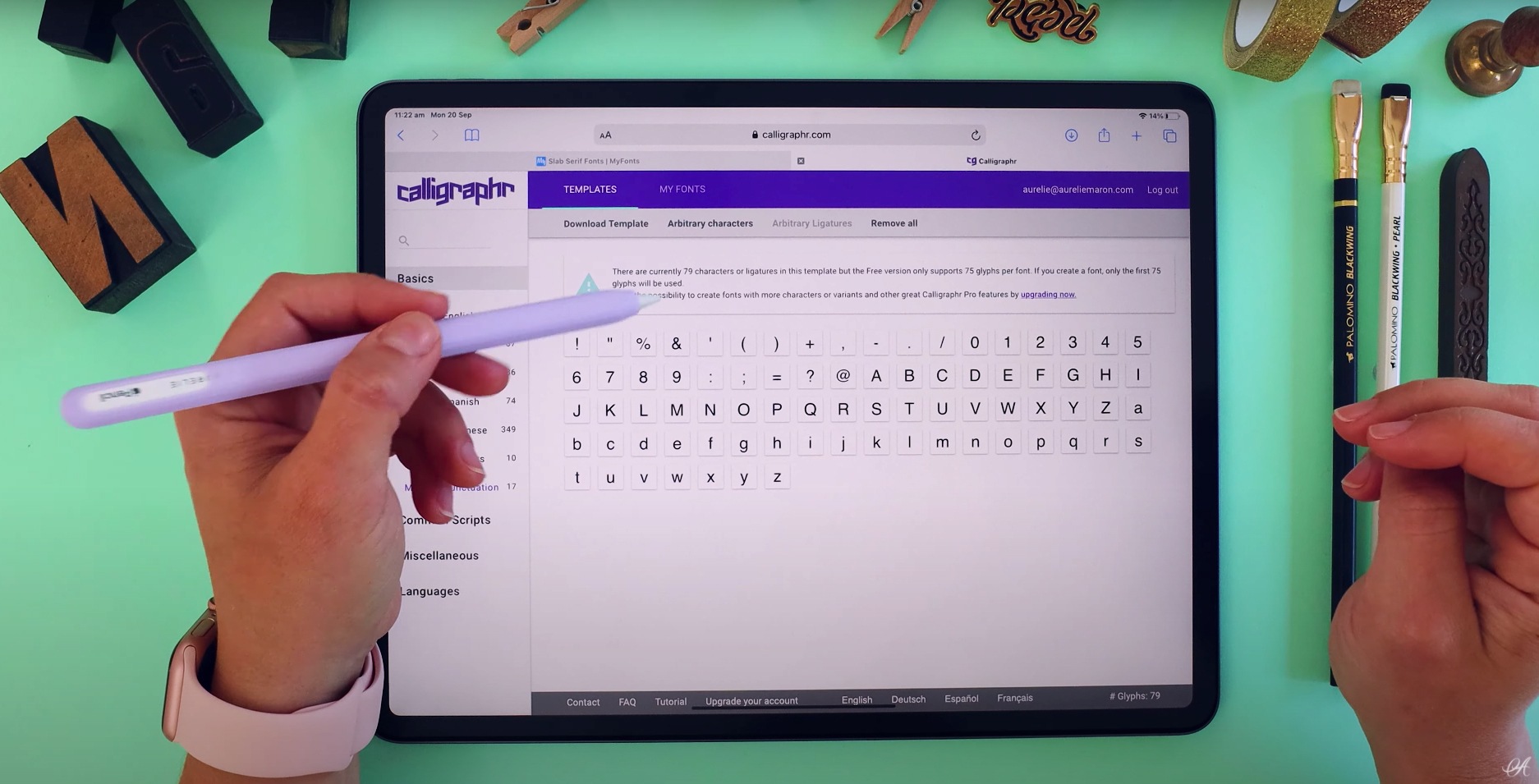
Exporting the Font Files
Once you have completed the process of designing and fine-tuning your font in Procreate, it’s time to export the font files. This step will allow you to use your custom font in various applications, such as word processors, graphic design software, or even on your website. Exporting your font files ensures that your font is accessible and usable beyond the Procreate app.
To export your font files, follow these simple steps:
- Prepare for Export: Before exporting, make sure your font is selected and all necessary adjustments have been made. It’s crucial to double-check any spacing, kerning, or other details to ensure the font looks as desired.
- Open Export Menu: In Procreate, go to the top-right corner of the screen and tap on the wrench icon to open the Actions menu. From the actions menu, tap on “Share” or “Export Font.”
- Select Export Format: In the Export menu, you will find various file formats to choose from, such as OTF (OpenType Font) or TTF (TrueType Font). Select the format that best suits your requirements and the platforms on which you intend to use the font.
- Choose Export Location: After selecting the font format, tap on the location where you want to save the exported font file. You can save it to your device’s local storage or a cloud storage service for easy access.
- Export the Font: Once the export location is selected, tap on the “Export” button to initiate the export process. Procreate will generate the font files based on your design and save them in the chosen location.
- Verify the Font Files: After the export process is complete, navigate to the chosen export location and verify that the font files (OTF or TTF) have been generated successfully.
Now that you have successfully exported your font files, you can install them on your computer or device and start using your custom font in various applications. Simply follow the platform-specific instructions to install the font, and you’ll be able to select and use it alongside other installed fonts.
Remember to keep a backup of your exported font files in a safe location, as they can serve as a valuable asset for future use or installation on other devices.
With your custom font exported and ready to use, you can unleash your creativity in various projects, adding a personal touch to your designs, documents, and digital creations.
In conclusion, creating a font in Procreate can be a fun and rewarding experience for designers and artists alike. With the versatility and intuitive features of Procreate, you have the power to bring your creative visions to life in the form of a unique and personal font.
By following the step-by-step process outlined in this article, you can unlock your potential as a font creator and add a personal touch to your design projects. Whether you’re looking to create a custom font for branding, typography, or simply for your own artistic expression, Procreate offers the tools and flexibility to make it happen.
So, don’t hesitate to grab your iPad, open up Procreate, and embark on your font creation journey. With practice and experimentation, you’ll be able to refine your skills and produce fonts that are truly one-of-a-kind. Let your creativity soar and enjoy the satisfaction of seeing your handcrafted font come to life!
FAQs
Q: Can I create a font in Procreate?
Yes, you can create a font in Procreate. Procreate is primarily a digital art app, but with the right techniques and resources, you can use it to design your own font.
Q: Where do I start when creating a font in Procreate?
To start creating a font in Procreate, you should first gather inspiration, sketch out your ideas on paper, and then transfer your design to Procreate using a scanner or by taking a high-quality photo.
Q: Are there any specific brushes or tools I should use in Procreate for font creation?
There are various brushes and tools available in Procreate that can be used for font creation. You can experiment with calligraphy brushes, pencil brushes, or custom brushes to achieve the desired style and effects for your font.
Q: How can I turn my hand-drawn letters into digital font characters?
Once you have your hand-drawn letters in Procreate, you can use the selection tool to isolate each character. Then, using Procreate’s transform and copy functions, you can arrange and duplicate the characters to create a full alphabet. Finally, export the individual characters as PNG files or as a single image file to use in font creation software.
Q: What software should I use to turn my Procreate font into a digital font file?
Although Procreate is not designed specifically for font creation, you can use other software programs such as Glyphs, FontLab, or Adobe Illustrator to turn your Procreate font into a digital font file. These programs provide tools and capabilities for refining, spacing, and generating font files in various formats, such as OpenType (.otf) or TrueType (.ttf).