
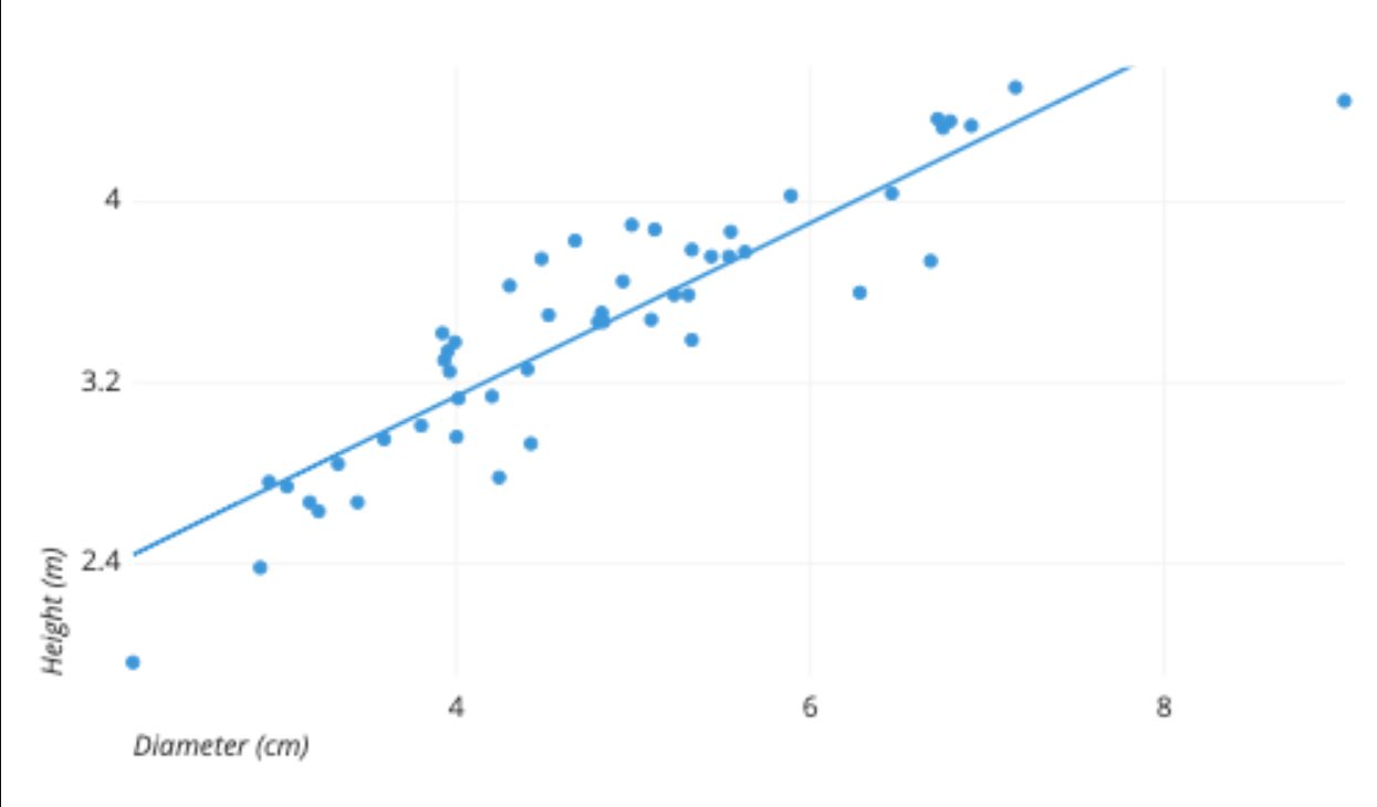
A scatterplot is a visual representation of the relationship between two numerical variables. It is used to determine if there is a correlation or pattern between the variables being analyzed. To create a scatterplot, you need at least two columns of data: one for the x-axis variable and one for the y-axis variable.
The x-axis represents the independent variable, while the y-axis represents the dependent variable. Each data point on the scatterplot corresponds to a specific value for both variables. By plotting these points and analyzing their distribution on the graph, you can identify any trends or relationships between the variables.
In some cases, additional columns of data can be included to add more dimensions to the scatterplot. For example, you might use a third column to represent the size of the data points or a fourth column to represent a categorical variable. However, the minimum requirement to create a basic scatterplot is two columns of numerical data.
Inside This Article
Title: How Many Columns Of Data Are Required To Create A Scatterplot?
Scatterplots are powerful visual representations that help us understand the relationship between two variables. They can reveal patterns, trends, and correlations in the data. But how many columns of data are actually required to create a scatterplot?
To answer this question, let’s first understand what a scatterplot is and how it works. A scatterplot uses a grid to plot two variables on the X and Y axes, with each data point represented by a dot. The X-axis represents the independent variable, while the Y-axis represents the dependent variable. By plotting these points, we can see how the values of the variables relate to each other.
The minimum number of columns required to create a scatterplot is two. One column of data is needed for the X-axis variable and another column for the Y-axis variable. These two columns provide the necessary information to plot the data points on the scatterplot. This basic scatterplot can give us a preliminary understanding of the relationship between the two variables.
However, scatterplots can become more informative and complex by adding additional columns of data. For example, we can use a third column to represent a third variable and add a dimension to the scatterplot. This can help us explore how three variables are related to each other simultaneously.
There are several factors that can influence the number of columns of data required for a scatterplot:
1. Number of Variables: The more variables you want to analyze, the more columns of data you will need. Each variable will require its own column to plot on the scatterplot.
2. Data Distribution: If your data is distributed across different categories or groups, you may need additional columns to represent these groups on the scatterplot. This can help identify any patterns or differences between the groups.
3. Data Relationships: If you want to explore complex relationships between multiple variables, you may need more columns of data to capture all the relevant information. This can be particularly useful in research or data analysis where understanding intricate connections is crucial.
So, next time you’re creating a scatterplot, consider how many columns of data you need to effectively represent your variables and explore the relationships within your data.
Conclusion
In conclusion, when creating a scatterplot, the number of columns of data required will depend on the specific data being analyzed and the goal of the visualization. Typically, a scatterplot requires at least two columns of numeric data, one for the x-axis variables and the other for the corresponding y-axis variables. This allows for the comparison and visual representation of the relationship between the two variables.
However, more complex scatterplots can be created with additional columns of data. For example, you can add a third variable by using different colors or sizes for the scatterplot markers. This can provide more insight into the relationships between the variables and allow for deeper analysis.
Overall, the number of columns required for a scatterplot will vary depending on the dataset and the desired level of complexity. By understanding the purpose of the scatterplot and the relationships between the variables, you can determine the appropriate number of columns needed to create an insightful and informative visualization.
FAQs
1. What is a scatterplot?
A scatterplot is a graphical representation that shows the relationship between two variables. It is created by plotting individual data points on a two-dimensional plane, with one variable represented on the x-axis and the other variable represented on the y-axis. Each data point on the scatterplot represents the values of both variables for a particular observation.
2. How many columns of data are required to create a scatterplot?
To create a scatterplot, you need at least two columns of data – one for the x-axis variable and one for the y-axis variable. Each row in the dataset will correspond to a data point on the scatterplot.
3. Can I add more than two variables to a scatterplot?
While a traditional scatterplot typically represents the relationship between two variables, it is possible to add additional variables to the visualization. One common approach is to use color or shape to represent a third categorical variable, adding more depth to the plot.
4. What is the purpose of creating a scatterplot?
The primary purpose of creating a scatterplot is to visually examine and analyze the relationship between two variables. It helps in identifying patterns, trends, and potential correlations between the variables. Scatterplots are commonly used in various fields, including statistics, economics, social sciences, and data analytics.
5. Can a scatterplot help in predicting future outcomes?
While a scatterplot can provide valuable insights into the relationship between two variables, it is not designed to predict future outcomes. It serves as a descriptive tool for understanding patterns in existing data. To make predictions, more advanced statistical techniques and models are typically required.