
When it comes to representing data in a visually appealing and easy-to-understand manner, Excel’s graphing capabilities are unbeatable. However, what happens when you need to add more data to an existing graph? Whether you have updated information or want to include additional variables, knowing how to add more data to a graph in Excel is crucial. In this article, we will guide you through the step-by-step process of expanding your graph’s dataset without starting from scratch. You’ll learn how to seamlessly incorporate new data points, update axis labels, and adjust the graph’s appearance. So, if you’re ready to level up your Excel graphing skills and create more comprehensive visuals, let’s dive in!
Inside This Article
- Formatting the Data in Excel
- Selecting the Graph Type in Excel
- Adding Data to an Existing Excel Graph
- Modifying Data Range in Excel Graph
- Conclusion
- FAQs
Formatting the Data in Excel
When it comes to creating a graph in Excel, it’s important to start with well-formatted data. This not only makes the graph visually appealing but also ensures accurate representation of the information. Here are some tips for formatting the data in Excel:
1. Organize your data: Before creating a graph, make sure your data is organized in a logical manner. Use columns for different categories or variables, and rows for individual data points. This will make it easier to select and highlight the data when creating your graph.
2. Remove any unnecessary data: If your data contains any unnecessary information or outliers, consider removing them before creating the graph. This will help focus on the main trends and patterns in the data.
3. Sort and categorize your data: For categorical data, such as names or labels, make sure to sort them in a meaningful order. This will ensure that the graph displays the data in the intended sequence.
4. Use consistent formatting: To maintain consistency and clarity, apply the same formatting to similar data points. For example, if you’re using colors to represent different categories, make sure that the same color is used consistently throughout the data.
5. Apply number formatting: If your data includes numbers, consider applying number formatting to enhance readability. You can choose to display decimals, add currency symbols, or use percentage formatting based on your specific needs.
6. Add data labels and titles: To provide additional context to your graph, consider adding data labels and titles. This will help readers understand the information presented in the graph without referring to the raw data.
7. Use clear and descriptive axis labels: The axis labels are crucial for interpreting the graph. Make sure to use clear and descriptive labels for both the x-axis and y-axis, indicating what each axis represents.
8. Adjust the scale: If the default scale in Excel does not adequately represent the range of your data, consider adjusting the scale manually. This will help highlight any small variations or significant differences in the data.
By following these formatting guidelines, you can create a well-organized and visually appealing graph in Excel that effectively communicates your data. Remember, the better your data is formatted, the easier it will be for others to understand the insights and trends in your graph.
Selecting the Graph Type in Excel
When it comes to visualizing data in Excel, selecting the right graph type is crucial for effectively communicating your message. Excel offers a wide range of graph types, each catering to different data sets and analytical requirements. Here are some key steps to follow when selecting the graph type in Excel.
1. Identify the nature of your data: Before choosing a graph type, it’s essential to understand the nature of your data. Is it categorical, numerical, or a combination? This will help in determining the most suitable graph type for your data.
2. Consider the message you want to convey: What story are you trying to tell with your data? Different graph types emphasize different aspects of your data, such as trends, comparisons, or distributions. Understanding your message will guide you in selecting the appropriate graph type.
3. Evaluate the available graph options: Excel provides a range of graph types, including bar graphs, line graphs, pie charts, scatter plots, and more. Take the time to explore the available options and compare their strengths and weaknesses. This will allow you to choose a graph type that best represents your data.
4. Think about data complexity: Some graph types are better suited for simple data sets, while others can handle more complex data with multiple variables. Consider the complexity of your data and choose a graph type that can effectively display the desired information.
5. Consider audience preference and familiarity: Your choice of graph type should also consider your target audience. Familiarity with certain graph types can make it easier for your audience to interpret and understand the data. Additionally, considering audience preferences can help ensure that your graphs are visually appealing and engaging.
By following these steps, you can confidently select the most suitable graph type in Excel to effectively present your data and convey your message. Remember, the goal is to choose a graph type that allows your audience to quickly and accurately understand the information you are providing.
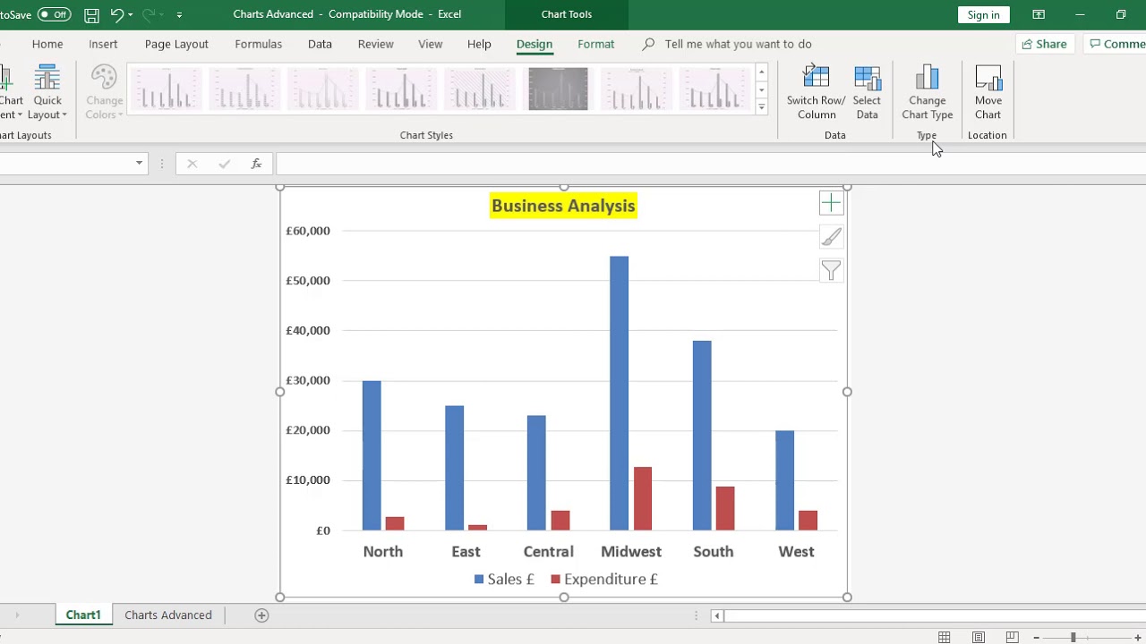
Adding Data to an Existing Excel Graph
Excel is a powerful tool that allows you to create and modify graphs with ease. Once you have created a graph in Excel, you may find the need to add additional data to it. Fortunately, Excel provides a simple and straightforward method for adding data to an existing graph.
To add more data to a graph in Excel, follow these steps:
- Select the graph that you want to add data to. You can do this by clicking on the graph to activate it.
- Click on the “Chart Tools” tab that appears at the top of the Excel window. This tab contains various options and tools for modifying and formatting the graph.
- In the “Data” group of options, click on the “Select Data” button. This will open the “Select Data Source” dialog box.
- In the “Select Data Source” dialog box, you will see two sections: “Legend Entries (Series)” and “Horizontal (Category) Axis Labels.” The “Legend Entries (Series)” section displays the existing data series in your graph.
- To add a new data series to your graph, click on the “Add” button in the “Legend Entries (Series)” section. This will open the “Edit Series” dialog box.
- In the “Edit Series” dialog box, you can specify the “Series name” and the “Series values” for the new data series. You can either enter the values manually or select a range of cells in your Excel worksheet.
- Click on the “OK” button to close the “Edit Series” dialog box.
- Back in the “Select Data Source” dialog box, you will now see the new data series listed in the “Legend Entries (Series)” section.
- To add more data to the existing data series, click on the “Edit” button next to the data series in the “Legend Entries (Series)” section. This will open the “Edit Series” dialog box again, where you can modify the series values.
- Click on the “OK” button to close the “Edit Series” dialog box.
- Click on the “OK” button in the “Select Data Source” dialog box to apply the changes and add the new data to your graph.
By following these steps, you can easily add more data to an existing graph in Excel. This flexibility allows you to keep your graphs up-to-date and relevant as your data changes over time.
Modifying Data Range in Excel Graph
When working with Excel graphs, it is common to need to modify the data range in order to include additional data. This can be especially useful when you want to update your graph with new information or when you realize that you need to include more data points for a comprehensive analysis.
To modify the data range in an existing Excel graph, follow these steps:
- Select the graph by clicking on it. This will activate the “Chart Tools” options in the Excel ribbon.
- In the “Chart Tools” tab, click on the “Design” tab.
- In the “Data” group, click on the “Select Data” option.
- A dialog box will appear with two sections: “Legend Entries (Series)” and “Horizontal (Category) Axis Labels.” In the “Legend Entries (Series)” section, you will see a list of the data series included in your graph.
- To modify the data range for a specific series, select the series name from the list.
- Click on the “Edit” button.
- An “Edit Series” dialog box will appear. In the “Series values” field, you will see the current data range for that series.
- To modify the data range, click on the “Collapse Dialog” button (represented by a small arrow) next to the “Series values” field.
- Select the new data range you want to include in your graph by clicking and dragging your cursor over the cells in Excel.
- Click on the “Expand Dialog” button to see the updated data range in the “Series values” field.
- Click “OK” to apply the changes.
By following these steps, you can easily modify the data range in an Excel graph. This allows you to incorporate new data or expand the analysis by including additional data points. Keep in mind that modifying the data range may also require adjusting the axis labels or other formatting options to ensure that your graph accurately represents the data.
Adding more data to a graph in Excel is a simple and effective way to enhance your visualizations and communicate your data more effectively. By following the steps outlined in this article, you can easily expand your existing graph and provide a clearer, more comprehensive representation of your data.
Whether you need to include additional data points, create new series, or update the axis labels, Excel offers a range of features and customization options to help you achieve the desired result. With a few clicks, you can transform your graph into a powerful tool for analysis and presentation.
Remember to consider the purpose of your graph and the story you want to tell with your data. By carefully selecting the additional data to include and choosing the right visualization options, you can create graphs that not only visually appeal but also provide valuable insights to your audience.
So, the next time you need to add more data to a graph in Excel, refer back to this article as your guide and unlock the full potential of your data visualizations.
FAQs
Q: Can I add more data to a graph in Excel?
A: Yes, you can easily add more data to an existing graph in Excel. Simply select the graph and go to the “Design” tab in the Excel ribbon. Then, click on the “Select Data” button, which will open a dialog box allowing you to add or edit the data series within the graph.
Q: How do I add a new data series to an Excel graph?
A: To add a new data series to an Excel graph, first, select the graph. Then, go to the “Design” tab in the Excel ribbon and click on the “Select Data” button. In the dialog box that appears, click on the “Add” button. Here, you can enter the range of cells that contain the data for the new series, as well as specify the series name and axis labels.
Q: Can I edit the data range for an existing data series in an Excel graph?
A: Yes, you can easily edit the data range for an existing data series in an Excel graph. Select the graph and go to the “Design” tab in the Excel ribbon. Click on the “Select Data” button and in the dialog box, select the data series you want to edit. Then, click on the “Edit” button to change the range of cells that contain the data for the series.
Q: Is it possible to remove a data series from an Excel graph?
A: Certainly! To remove a data series from an Excel graph, select the graph and go to the “Design” tab in the Excel ribbon. Click on the “Select Data” button and in the dialog box, select the data series you want to delete. Then, click on the “Remove” button, and the selected data series will be removed from the graph.
Q: Can I change the type of graph for a data series in Excel?
A: Absolutely! You can change the type of graph for a data series in Excel. Select the graph and go to the “Design” tab in the Excel ribbon. Click on the “Change Chart Type” button, which will open a dialog box displaying various chart types. From there, you can select the desired chart type for the data series and customize the chart accordingly.