
Excel is a powerful tool for data analysis, allowing you to visualize your data in various charts and graphs. One useful feature in Excel is the ability to add data labels to your charts. Data labels provide additional information about the data points in your chart, making it easier to interpret and understand the information presented.
Whether you want to display the precise values of each data point or add category names to your chart, Excel gives you the flexibility to customize your data labels to meet your specific needs. In this article, we will guide you through the process of adding data labels in Excel, so you can enhance the clarity and impact of your charts and make your data-driven insights even more compelling.
Inside This Article
- How To Add Data Labels In Excel
- Overview
- Method 1: Adding Data Labels to a Single Data Series
- Method 2: Adding Data Labels to Multiple Data Series
- Method 3: Formatting Data Labels
- Method 4: Customizing Data Labels Placement
- Conclusion
- FAQs
How To Add Data Labels In Excel
If you want to enhance the visual representation of your data in Excel, adding data labels to your charts can provide valuable insights. Data labels are used to display the actual values or the category names associated with each data point in a chart. In this article, we will explore three different methods to add data labels in Excel.
Method 1: Adding Data Labels using the Chart Elements option
The first method to add data labels is by using the Chart Elements option in Excel. Here’s how you can do it:
- Select the chart you want to add data labels to.
- Click on the “+” button that appears when you hover over the chart. This will open the Chart Elements menu.
- Tick the “Data Labels” option to add data labels to your chart.
By default, the data labels will display the values of the data points. If you want to display the category names instead, you can customize the data labels using the Format Data Labels option.
Method 2: Adding Data Labels using the Format Data Labels option
The second method allows you to add and customize data labels using the Format Data Labels option. Follow these steps:
- Select the chart you want to add data labels to.
- Right-click on any data point in the chart and choose “Add Data Labels” from the context menu. This will add data labels to all data points in the chart.
- Right-click on any data label and select “Format Data Labels” from the context menu.
- In the Format Data Labels pane, you can customize various aspects of the data labels, including the label position, label options, label fill, and font style.
- Make the desired changes and click “Close” to apply the modifications.
Using this method, you have more control over the appearance and placement of the data labels in your chart.
Method 3: Adding Data Labels using the Label Options dialog box
The third method involves using the Label Options dialog box to add and manipulate data labels. Here’s how you can do it:
- Select the chart you want to add data labels to.
- Go to the “Chart Design” tab in the Excel ribbon.
- Click on the “Add Chart Element” button and select “Data Labels” from the dropdown menu.
- From the submenu that appears, choose the location where you want to place the data labels on your chart.
Once you have added the data labels, you can further customize their appearance by using options available in the Label Options dialog box.
By following these three methods, you can easily add and customize data labels in your Excel charts. Data labels can make your data presentation more informative and visually appealing, allowing your audience to understand and interpret the information effortlessly.
Overview
Adding data labels to your Excel charts can help to enhance the understanding and presentation of your data. Data labels provide valuable information about the numeric values represented in the chart, such as the exact values of data points or the category names. By labeling your data points, you can create more informative and visually appealing charts.
Excel offers multiple methods for adding data labels to your charts, each providing different levels of control and customization. In this article, we will explore three main methods: using the Chart Elements option, using the Format Data Labels option, and utilizing the Label Options dialog box.
Whether you are working with a simple bar chart or a complex combination chart, adding data labels can give your audience better insight into the information you are conveying. This feature is particularly useful when presenting data to colleagues, clients, or stakeholders, as it eliminates the need for them to manually interpret the values from the chart.
Let’s dive deeper into each method to learn how you can add data labels in Excel and make your charts more informative and visually appealing.
Method 1: Adding Data Labels to a Single Data Series
Adding data labels to your chart in Excel is a great way to provide additional information about the data points. This can be especially useful when you have a lot of data or when you want to make your chart more visually appealing.
Here is a step-by-step guide on how to add data labels to a single data series in Excel:
- Select the chart that you want to add data labels to. Click on the chart to activate it.
- Click on the “Chart Elements” button, which is located on the right-hand side of the chart. This will open a drop-down menu.
- In the drop-down menu, hover your mouse over the “Data Labels” option. This will open a sub-menu.
- From the sub-menu, select the “Center” or “Outside End” option, depending on where you want the data labels to appear.
- The data labels will now be added to your chart. You can format them by right-clicking on any of the data labels and selecting the “Format Data Labels” option.
- In the “Format Data Labels” pane, you can customize the appearance of the data labels by changing the font, font size, color, and other formatting options.
- If you want to remove the data labels, you can simply click on the “Chart Elements” button again, hover over the “Data Labels” option, and then select the “None” option.
By following these steps, you can easily add data labels to a single data series in Excel and customize their appearance to fit your needs. Adding data labels can make your charts more informative and visually appealing, helping you communicate your data more effectively.
Method 2: Adding Data Labels to Multiple Data Series
Adding data labels to multiple data series in Excel is a powerful and efficient way to make your charts more informative and visually appealing. By displaying labels next to each data point, you can easily identify and interpret the values represented by each series.
To add data labels to multiple data series in Excel, follow these simple steps:
- Select the chart that contains the data series you want to add labels to. This will activate the Chart Tools tab in the Excel ribbon.
- Navigate to the Design tab in the Chart Tools section of the ribbon.
- Click on the Add Chart Element button. A drop-down menu will appear.
- From the drop-down menu, select Data Labels. Another menu will pop up giving you different options for data label placement.
- Choose the desired data label option. You can customize the appearance and placement of the labels to suit your preference.
- Excel will add the data labels to each data series in your chart. The labels will now be displayed next to each data point, making it easy to interpret the values.
Adding data labels to multiple data series is a great way to enhance the understanding and clarity of your charts. Whether you are working with bar charts, line graphs, or any other type of chart, adding data labels can greatly improve the visual representation of your data.
Remember, data labels can be customized further by adjusting their size, font, color, and alignment. Excel provides various options to tweak the appearance of the labels and make them visually appealing.
By using Method 2: Adding Data Labels to Multiple Data Series, you can effectively communicate information and insights derived from your chart, making it easier for your audience to understand the data at a glance.
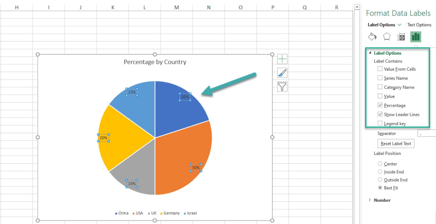
Method 3: Formatting Data Labels
If you want more control over the appearance of your data labels in Excel, you can use the Label Options dialog box to format them. This method allows you to customize various aspects such as font style, size, color, and positioning of the data labels.
To format data labels in Excel using the Label Options dialog box:
- Select the chart that contains the data labels you want to format.
- Right-click on any of the data labels. A context menu will appear.
- Click on “Format Data Labels” in the context menu. The Format Data Labels pane will open on the right side of the Excel window.
- In the Format Data Labels pane, you can make changes to the appearance of the data labels. You can modify the font style, size, and color using the options available.
- Additionally, you can customize the label position by selecting one of the alignment options, such as “Inside End” or “Outside End”.
- You can also choose to display the series name or category name along with the data label by checking the respective boxes.
- Once you have made all the desired changes, close the Format Data Labels pane.
By using the Label Options dialog box, you can have complete control over how your data labels look in Excel, making it easier to emphasize important information and enhance the overall visual appeal of your charts.
Method 4: Customizing Data Labels Placement
When adding data labels in Excel, it’s important to ensure they are placed in the most effective and visually appealing way. Fortunately, Excel offers a variety of options for customizing data label placement. Follow these steps to customize the placement of your data labels:
- Select the chart that contains the data labels you want to modify.
- Click on the “Layout” tab in the Excel ribbon.
- In the “Labels” group, click on the “Data Labels” button.
- A dropdown menu will appear with various options for data label placement. Select the desired placement option.
- If you choose the “More Options” option, a dialog box will appear with even more customization options.
- In the “Label Options” dialog box, go to the “Label Position” section.
- Specify the exact position where you want the data labels to appear by entering values in the “X Offset” and “Y Offset” boxes.
- You can also choose to have the data labels displayed inside or outside of the data markers.
- Once you have customized the data label placement to your satisfaction, click “OK” to apply the changes.
By customizing the placement of your data labels, you can ensure that they are positioned exactly where you want them in relation to the data markers. This can help to enhance the readability and clarity of your chart, making it easier for your audience to interpret the information being presented.
Conclusion
Adding data labels in Excel is a powerful way to enhance the visual representation of your data. By providing clear and concise information directly on your charts and graphs, data labels help readers understand the key insights and trends at a glance. Whether you want to display the values, percentages, or other relevant information, Excel offers a range of options to customize and format data labels to suit your needs.
Remember to use the Data Labels feature strategically to avoid cluttering your charts and overwhelming your audience. Experiment with different placement options, font sizes, and formatting styles to find the most effective way to present your data. With a little practice and experimentation, you can create professional-looking charts and graphs that communicate your data more effectively and make a lasting impression.
FAQs
1. Why should I add data labels in Excel?
Adding data labels in Excel allows you to display additional information on your charts or graphs. This can help make your data more accessible and easier to understand for your audience.
2. How can I add data labels to my chart in Excel?
To add data labels to your chart in Excel, follow these steps:
- Select your chart.
- Go to the “Chart Elements” button (represented by a plus symbol) that appears when you hover over your chart.
- Check the “Data Labels” box. This will add default data labels to your chart.
- To customize your data labels, right-click on them and select “Format Data Labels.” From there, you can modify the label options to suit your needs.
3. Can I change the format of my data labels in Excel?
Yes, you can change the format of your data labels in Excel. After adding data labels to your chart, you can modify their appearance by following these steps:
- Right-click on a data label and select “Format Data Labels.”
- In the Format Data Labels pane that appears, you can make various changes, such as modifying the label text, font, color, and position.
- Experiment with different options until you achieve the desired format for your data labels.
4. How can I remove data labels from my chart in Excel?
To remove data labels from your chart in Excel, follow these steps:
- Select your chart.
- Go to the “Chart Elements” button (represented by a plus symbol) that appears when you hover over your chart.
- Uncheck the “Data Labels” box. This will remove the default data labels from your chart.
5. Can I add data labels to specific data points in Excel?
Yes, you can add data labels to specific data points in Excel. To do this, follow these steps:
- Select your chart.
- Right-click on the data point you want to add a data label to and select “Add Data Labels.”
- A data label will be added to the selected data point.
- To customize the data label further, right-click on it and select “Format Data Labels.”