
Data labeling is a crucial step in data analysis and visualization, especially when working with large datasets in Excel. The ability to label data points provides context and clarity, allowing viewers to easily interpret and understand the information presented. Whether you are creating charts, graphs, or scatter plots, labeling data points in Excel can greatly enhance the effectiveness of your visualizations. In this article, we will explore different methods and techniques for labeling data points in Excel, providing you with the knowledge and skills needed to effectively communicate your data findings. From manually labeling individual points to using automated labeling features, we will cover various approaches to help you label your data points in Excel efficiently and accurately.
Inside This Article
- Labeling Data Points in Excel
- Adding Data Point Labels
- Customizing Data Point Labels
- Using Data Labels to Show Additional Information
- Removing or Editing Data Point Labels
- Conclusion
- FAQs
Labeling Data Points in Excel
When working with data in Excel, it is often necessary to visually represent the information using charts and graphs. One important aspect of creating effective visualizations is labeling the data points. Labeling data points in Excel allows you to identify and interpret the values directly on the chart, making the information more accessible and meaningful. In this article, we will explore how to label data points in Excel and customize the labels to suit your needs.
Selecting the Data Points
The first step in labeling data points is to select the specific data points or series that you want to label. To do this, simply click on the chart to activate it. You will notice that the data points or series become highlighted. You can select multiple data points or series by holding down the Ctrl key while clicking.
Adding Data Labels
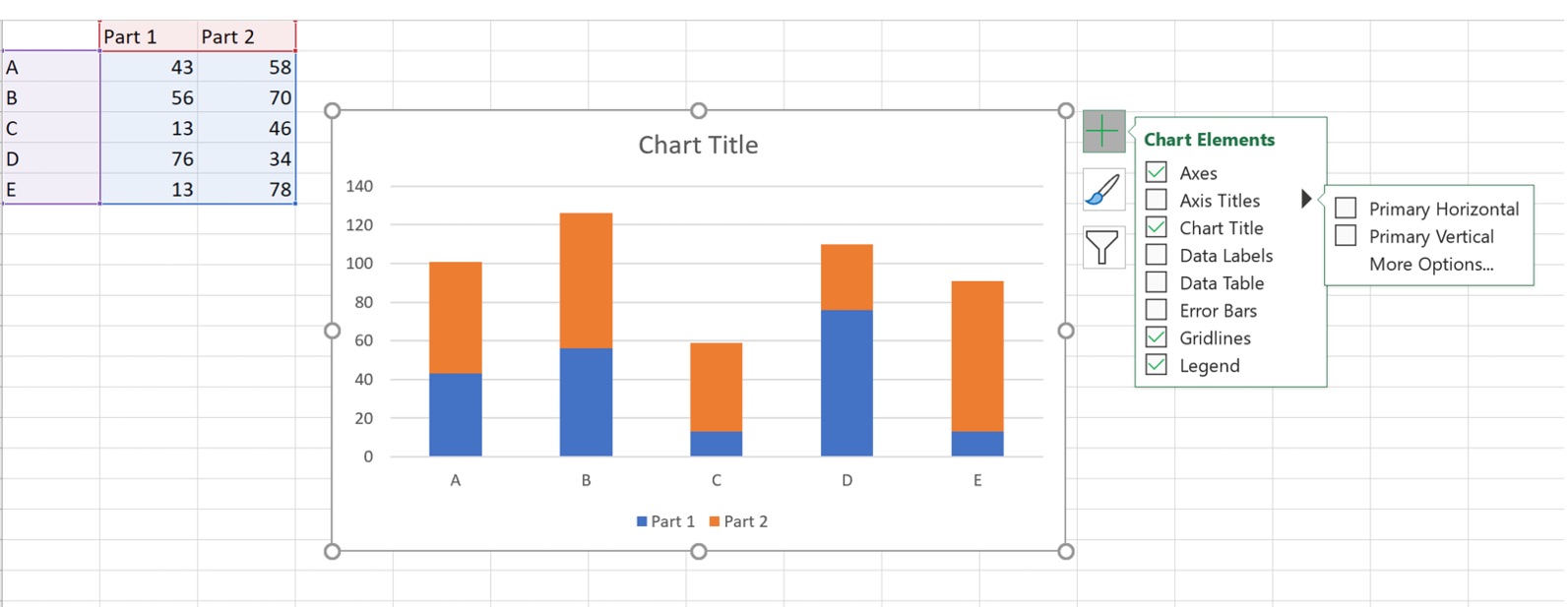
Once you have selected the data points or series, you can add data labels to them. In Excel, data labels can be added through the Chart Elements option. To access this option, click on the Plus icon (+) located near the chart. A drop-down menu will appear, and you can select “Data Labels” from the list. Excel will automatically add the default data labels to the selected data points or series.
Customizing Data Labels
Excel provides several customization options for data labels, allowing you to personalize them according to your preferences. To customize the data labels, right-click on any data label in the chart. A context menu will appear, and you can select the “Format Data Labels” option. This will open a sidebar on the right side of the Excel window, where you can access various formatting options.
In the formatting sidebar, you can modify the appearance of the data labels, such as changing the font style, size, and color. You can also adjust the positioning of the data labels relative to the data points, choose to display additional information like category names or values, and even add a leader line to connect the label with its corresponding data point.
Removing Data Labels
If you decide that you no longer need the data labels or want to remove them temporarily, you can easily do so in Excel. To remove data labels, select the chart and click on the Minus icon (-) located near the chart. A drop-down menu will appear, and you can deselect the “Data Labels” option. This will remove the data labels from the chart.
Labeling data points in Excel is a crucial part of presenting and understanding your data. By following the steps outlined in this article, you can add, customize, and remove data labels to create clear and informative visualizations in your Excel charts. Experiment with different label options to find the style that best fits your data and enhances its impact.
Adding Data Point Labels
In Excel, data point labels are used to provide additional information about each data point in a chart. They can be helpful in clarifying the data and making the chart more visually appealing. Here’s how you can add data point labels in Excel:
1. Select the chart that you want to add data point labels to. Click on the chart to activate it.
2. In the Chart Tools ribbon, navigate to the Layout tab and click on the “Data Labels” button. This will open a dropdown menu with various options.
3. Select the type of data labels you want to add. Excel offers options such as “None”, “Center”, “Inside End”, and “Outside End”. Choose the one that suits your needs.
4. Excel will automatically add the default data labels to the chart based on the selected option. The labels will appear next to each data point in the chart.
5. If you want to customize the appearance of the data labels, right-click on any data label and select “Format Data Labels” from the context menu.
6. In the Format Data Labels pane that appears on the right side of the Excel window, you can modify various aspects of the data labels, such as font size, color, and position.
7. Additionally, you can choose to display specific data values, category names, or series names as data labels. To do this, check the corresponding options in the Format Data Labels pane.
8. Once you have customized the data labels to your satisfaction, simply close the Format Data Labels pane.
That’s it! You have successfully added data point labels to your Excel chart. These labels will provide valuable information and improve the overall clarity and understanding of your data.
Customizing Data Point Labels
After adding data labels to your Excel chart, you may want to customize them to enhance the visual appeal and clarity of your data presentation. Excel offers several customization options for data point labels, allowing you to format the text, adjust the placement, and highlight specific data points. Here are some ways to customize your data point labels:
1. Formatting the Text: Excel provides various formatting options to style the text in your data point labels. You can change the font, size, color, and style of the label text to make it more visually appealing and easy to read. Additionally, you can add effects such as bold, italic, or underline to emphasize specific data points.
2. Adjusting Placement: By default, Excel positions the data labels near the data points. However, you can manually adjust the placement of the labels to better align with your chart design. You can drag and drop the labels to reposition them, or you can right-click on a label and choose “Format Data Labels” to access more advanced placement options.
3. Highlighting Specific Data Points: Sometimes, you may want to emphasize certain data points in your chart. Excel allows you to highlight individual data points by changing the color, font, or style of their corresponding labels. This can draw attention to important information or make specific data stand out in the chart.
4. Using Leader Lines: In cases where the data labels overlap or become congested, you can use leader lines to enhance readability. Leader lines are lines that connect the data points to their labels, making it easier for viewers to identify which label corresponds to which data point. Excel provides an option to enable leader lines in the formatting settings for data labels.
With these customization options, you can tailor your data point labels to suit your specific chart requirements and enhance the overall visual impact of your Excel presentation.
Using Data Labels to Show Additional Information
Data labels in Excel are a powerful tool that allows you to display additional information directly on your data points. This can be helpful when you need to show specific values, labels, or even percentages for each data point in your chart.
To use data labels in Excel, you first need to select the data points you want to label. Simply click on the chart to activate it, then click on the specific data series or data point you want to label. You can select multiple data points by holding down the Ctrl key while clicking.
Once you have selected the data points, go to the “Chart Elements” option in the “Chart Design” tab. From there, click on the “Data Labels” option and choose your desired label position, such as “Above,” “Below,” “Inside End,” or “Outside End.”
Excel will automatically add the default data labels to the selected data points. These labels will display the values of the data points by default, such as the numerical values of the data or the category names.
If you want to customize the data labels further, you can do so by right-clicking on any of the data labels and selecting “Format Data Labels.” This will open up a formatting pane on the right side of the Excel window, where you can make changes to the appearance and content of the data labels.
Within the formatting pane, you have a wide range of customization options. You can choose to display different values, such as percentages or custom text labels. You can also format the font style, size, color, and background color of the data labels to match your chart’s theme.
In addition to customizing individual data labels, you can also apply the changes to all data labels in the chart by selecting the “Apply to All” option within the formatting pane.
If you decide that you no longer want to display data labels on your chart, you can easily remove them. To do so, select the chart, go to the “Chart Design” tab, click on “Data Labels,” and choose the “None” option.
Using data labels in Excel is a simple and effective way to enhance the readability and interpretation of your charts. Whether you need to display values, labels, or percentages, data labels offer a versatile solution that can be customized to meet your specific needs.
Removing or Editing Data Point Labels
Once you have added data point labels to your chart in Excel, there may be instances where you need to remove or edit them. Whether you want to make changes to the label text, relocate the labels, or completely remove them, Excel provides simple methods to accomplish these tasks.
To remove a data point label from your chart, follow these steps:
- Select the chart that contains the data labels you wish to remove.
- Click on the “Chart Elements” button, which is represented by a plus sign (+) icon located on the top-right corner of the chart.
- From the drop-down menu, hover over the “Data Labels” option.
- A submenu will appear, displaying various label options. Click on the option that corresponds to the type of label you want to remove. For example, if you want to remove only the data point labels, click on “Data Point” in the submenu.
- The selected data point labels will be instantly removed from the chart.
If you only want to edit the text of a data point label, you can do so by following these steps:
- Double-click on the data point label you want to edit. Alternatively, you can right-click on the label and select the “Edit Text” option.
- The label text will become editable. Type in the new text or make the desired changes.
- Press the “Enter” key or click outside the label to apply the changes. The edited label text will be updated in the chart.
Excel also allows you to customize other aspects of your data point labels, such as their font size, color, and position on the chart. To customize data labels, follow these steps:
- Select the chart that contains the data labels you want to customize.
- Click on the “Chart Elements” button located on the top-right corner of the chart.
- Hover over the “Data Labels” option in the drop-down menu.
- From the submenu, click on the label type you wish to customize, such as “Data Point” or “Series Name.”
- A formatting task pane will appear on the right side of the Excel window. Use the options in the task pane to customize the appearance of the data labels, such as font size, font color, alignment, and position.
- As you make changes, the data labels in the chart will update in real-time, allowing you to preview and fine-tune the customization.
By following the steps outlined above, you can easily remove, edit, and customize data point labels in Excel. These options give you the flexibility to present your data in a meaningful and visually appealing way, making it easier for your audience to interpret and understand your charts. So go ahead and unleash the full potential of your Excel charts by using data point labels effectively!
Conclusion
Labeling data points in Excel is a crucial step in visualizing and analyzing data. By assigning clear and informative labels to data points, you can easily interpret and communicate the insights from your charts and graphs.
In this article, we explored different methods to label data points in Excel, including using data labels, custom labels, and adding a data point labeler. We also discussed the importance of choosing appropriate labels and formatting options to enhance the readability and clarity of your visuals.
Remember, choosing the right labels and formatting techniques can greatly enhance the understanding of your data and support effective data-driven decision-making. So, take your time to experiment with different labeling options in Excel and find the method that works best for your specific needs.
Start labelling your data points in Excel today and unlock the power of data visualization to gain valuable insights and make informed decisions.
FAQs
Q: How do I label data points in Excel?
A: To label data points in Excel, you can use the data labels feature. This allows you to add labels that display the values or text associated with each data point in your chart. Simply click on the chart, go to the “Chart Elements” button, and choose “Data Labels” from the drop-down menu. You can customize the appearance and position of the labels as per your preference.
Q: Can I customize the appearance of data labels in Excel?
A: Yes, Excel provides various customization options for data labels. You can change the font, size, color, and style of the labels to make them more visually appealing or to match your chart’s theme. Additionally, you can choose to display different types of labels, such as value, category, or series name, and even add data callouts with additional information.
Q: How can I remove data labels from an Excel chart?
A: If you want to remove data labels from your Excel chart, you can simply select the chart, go to the “Chart Elements” button, and uncheck the “Data Labels” option. This will remove all the labels from the chart. Alternatively, you can select individual labels and press the Delete key to remove them one by one.
Q: Is it possible to add custom labels to specific data points in Excel?
A: Yes, Excel allows you to add custom labels to specific data points in a chart. After enabling data labels for the chart, you can select individual data points and manually edit the labels to display your custom text or values. This feature is particularly useful when you want to highlight specific data points or provide additional information for clarity.
Q: Can I use data labels to show both X and Y values in Excel?
A: Yes, you can display both the X and Y values of data points in Excel using data labels. By selecting the appropriate data label options, you can choose to display category (X) values, series (Y) values, or both. This feature is beneficial when working with scatter plots or other chart types that require both X and Y values to be labeled.