
When it comes to organizing and analyzing data, Google Sheets is the go-to tool for many individuals and businesses. This powerful spreadsheet program offers a wide range of functionalities, including the ability to graph multiple data sets. Graphing multiple data sets in Google Sheets can visually represent relationships, trends, and patterns within your data, making it easier to draw insights and make informed decisions.
In this article, we will guide you through the process of graphing multiple data sets in Google Sheets. Whether you need to compare sales figures, track progress over time, or display multiple variables on a single graph, we’ve got you covered. From selecting the data to choosing the right graph type, we will provide you with step-by-step instructions and tips to ensure your graphs are clear, informative, and visually appealing. So let’s dive in and unlock the full potential of your data with Google Sheets!
Inside This Article
Overview
Graphing multiple data sets in Google Sheets can be an effective way to visually analyze and compare different sets of data. Whether you are analyzing sales data, tracking progress over time, or comparing different variables, creating graphs can help you identify trends, patterns, and correlations.
Google Sheets offers a user-friendly interface and powerful graphing tools that allow you to create professional-looking graphs with just a few clicks. In this article, we will guide you through the process of setting up the data and creating custom graphs in Google Sheets.
With Google Sheets’ graphing capabilities, you can present your data in various formats, including line graphs, bar graphs, pie charts, and more. You can also add labels, titles, and customize the appearance of your graphs to make them more visually appealing and informative.
Whether you’re a data analyst, a business professional, or a student, having the ability to create and interpret graphs is a valuable skill. It not only helps you present data in a digestible format but also enables you to draw meaningful insights and communicate your findings effectively.
Setting up the Data
Before you can graph multiple data sets in Google Sheets, you need to make sure your data is organized in a logical and coherent manner. Here are some steps to help you set up your data effectively:
1. Define the variables: Start by identifying the variables you want to analyze and graph. For example, if you want to compare sales data for different products across different time periods, your variables would be the product names and the respective sales figures.
2. Create a table: In Google Sheets, create a table with columns representing the variables and rows representing the data points. Enter the data in the appropriate cells, making sure the data is accurate and consistent.
3. Label the columns: Provide clear and descriptive labels for each column to indicate the type of data it contains. This will help you easily identify and reference the data when creating the graph.
4. Sort the data: If necessary, arrange the data in a specific order to highlight patterns or trends. For example, you may want to sort the data by time period, product name, or any other relevant factor. To do this, select the column you want to sort by, go to the “Data” menu, choose “Sort range,” and follow the prompts.
5. Include headers: Ensure that your table includes headers for each column. These headers provide context for the data and are essential for accurately representing the different data sets in the graph.
6. Enter multiple data sets: If you have multiple data sets to compare, include them as separate columns in your table. Each column should represent a different data set, such as sales data for different months or different regions.
7. Check for consistency: Double-check your data to ensure consistency in formatting, units of measurement, and any other relevant factors. Inconsistencies can lead to inaccurate and misleading graphs.
By following these steps, you will have a well-organized and structured data set ready to be graphed in Google Sheets. Now that you have set up your data, you can move on to creating the graph.
Creating the Graph
Once you have your data set up in Google Sheets, it’s time to create a graph to visualize your data. Here’s a step-by-step guide on how to do it:
1. Select the range of data you want to include in your graph. This can be done by clicking and dragging to highlight the cells containing the data. Make sure to include the column and row labels if applicable.
2. With the data selected, click on the “Insert” tab at the top of the Google Sheets interface.
3. From the drop-down menu, choose the type of graph you want to create. Google Sheets offers a variety of options, including line graphs, bar graphs, pie charts, and more. Select the one that best suits your data.
4. Once you’ve selected the graph type, a new chart editor window will appear on the right side of the screen. This editor allows you to customize various elements of your graph, such as titles, axes labels, colors, and more.
5. Start by giving your graph a title. This should be concise and descriptive, capturing the main theme or purpose of your data.
6. Next, you can customize the axes labels. These labels identify the categories or variables being represented on each axis. Make sure the labels are clear and informative.
7. You can also adjust the appearance of your graph by changing the colors, fonts, and background. Experiment with different combinations to find the one that best complements your data.
8. If you want to add additional data sets to your graph, click on the “Add Series” button within the chart editor. This allows you to include multiple data sets and compare them visually.
9. Once you’re satisfied with the customization settings, click on the “Insert” button in the chart editor to add the graph to your Google Sheets.
10. Your graph will now be inserted into your spreadsheet, and you can resize and reposition it as needed. You can also update the graph if you make any changes to the underlying data.
Creating a graph in Google Sheets is a straightforward process that allows you to visually analyze and present your data. Experiment with different chart types and customization options to create a graph that effectively communicates your insights.
Customizing the Graph
Once you have created your graph in Google Sheets, you have the option to customize it further to suit your needs. Here are some ways you can customize the graph:
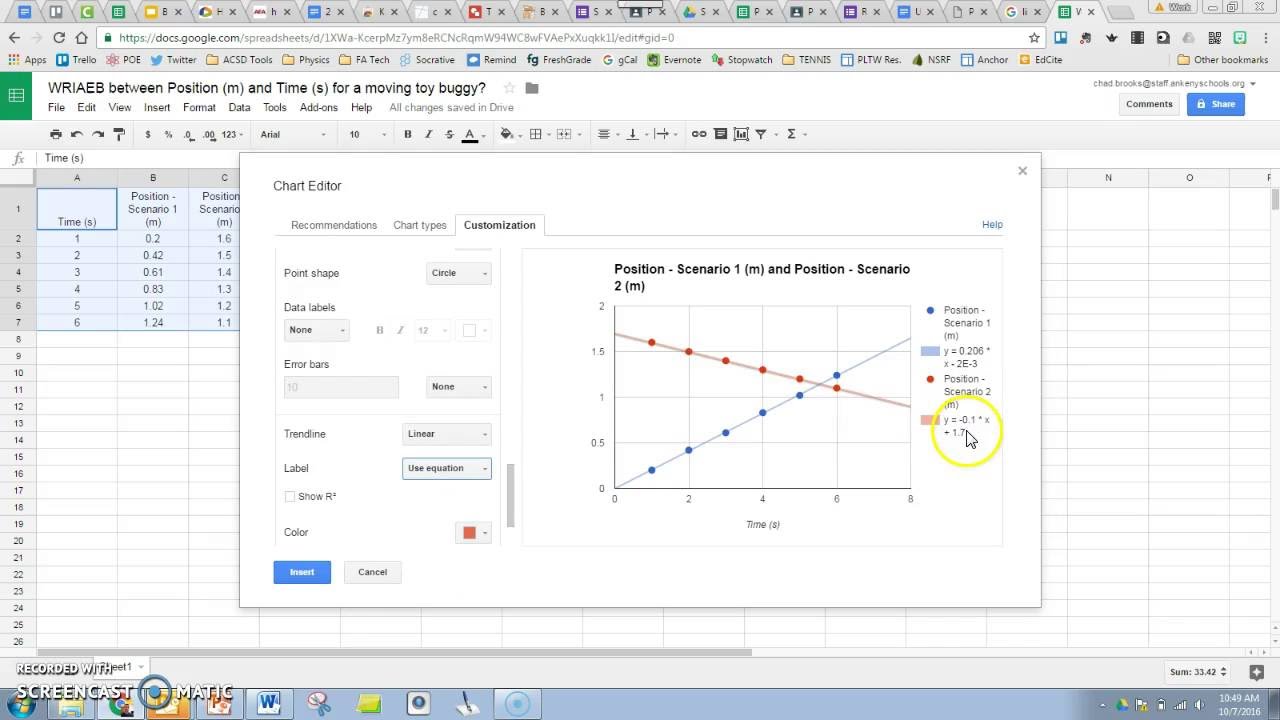
1. Change the chart type: If you are not satisfied with the default chart type, you can easily change it. Google Sheets offers a variety of chart types such as column, bar, line, pie, and more. Simply click on the “Chart type” option in the Chart editor menu to select your desired chart type.
2. Adjust the axis labels: The axis labels on your graph provide valuable information about the data being represented. You can modify the axis labels to make them clearer and more descriptive. In the Chart editor menu, click on the “Customize” tab and explore the options to modify the axis labels according to your preference.
3. Customize the colors: By default, Google Sheets assigns colors automatically to each data series in your graph. However, you can customize these colors to match your branding or personal preference. In the Chart editor menu, navigate to the “Customize” tab and click on the “Series” options. From there, you can select a different color or even apply a gradient color scheme.
4. Add a title and axis titles: Titles can provide context and make your graph more informative. In the Chart editor menu, under the “Customize” tab, you can add a title to your graph and axis titles to specify what each axis represents. This helps viewers understand the data more easily.
5. Adjust the gridlines: Gridlines can help readers interpret the values on the graph more accurately. In the Chart editor menu, go to the “Customize” tab and find the “Gridlines” options. Here, you can choose to show or hide gridlines and adjust their appearance by specifying line thickness and style.
6. Apply data labels: Data labels can enhance the readability of your graph by displaying the actual values of each data point. In the Chart editor menu, under the “Customize” tab, you can enable data labels and choose the position and formatting options that best suit your needs.
7. Edit the legend: The legend helps viewers identify different data series in your graph. You can modify the appearance and position of the legend in the Chart editor menu under the “Customize” tab. This allows you to present the information in a way that is most effective for your audience.
By customizing your graph in Google Sheets, you can create visually appealing and informative charts that effectively communicate your data. Take advantage of these customization options to present your information in the most effective way possible.
Conclusion
Graphing multiple data sets in Google Sheets is a valuable skill that allows you to visualize complex information and draw meaningful insights. Whether you’re analyzing sales data, tracking trends, or comparing different variables, the ability to create clear and informative graphs is essential.
By following these steps, you can easily graph multiple data sets in Google Sheets. Start by arranging your data in columns or rows, select the data range, and choose the appropriate graph type. Apply customization options such as labels, colors, and titles to make your graph visually appealing and easy to interpret. Take advantage of features like adding a trendline, annotations, and data labels to further enhance your analysis.
Remember, practice makes perfect. Experiment with different graph types and formatting options to find the best representation for your data. With a little creativity and attention to detail, you’ll be able to create professional-looking graphs that impress your colleagues and stakeholders.
Now that you have a solid understanding of how to graph multiple data sets in Google Sheets, go ahead and start visualizing your data in a powerful and meaningful way!
FAQs
Q: Can I graph multiple data sets in Google Sheets?
Yes, you can graph multiple data sets in Google Sheets. Using the built-in charting capabilities, you can easily create graphs that display multiple sets of data on a single graph.
Q: How do I graph multiple data sets in Google Sheets?
To graph multiple data sets in Google Sheets, you can follow these steps:
- Select the data sets you want to include in the graph by clicking and dragging to highlight the cells.
- Go to the “Insert” menu and click on “Chart.”
- In the “Chart Editor” window that opens, select the chart type that you want to use, such as a bar graph or line graph.
- Adjust the settings and formatting options as needed to customize your graph.
- Click “Insert” to add the graph to your Google Sheets document.
Q: Can I customize the appearance of the graph in Google Sheets?
Yes, you can customize the appearance of the graph in Google Sheets to fit your preferences. The “Chart Editor” window provides various options for changing the colors, labels, axes, and other visual elements of the graph. You can also choose from different chart styles and layouts to create a visually appealing and informative graph.
Q: Can I add a trendline to my graph in Google Sheets?
Yes, you can add a trendline to your graph in Google Sheets. A trendline can help you analyze the overall trend or pattern in your data. To add a trendline, select the graph and then click on the “Chart Editor” button. In the “Trendline” section of the options, you can choose the type of trendline, such as linear or exponential, and customize its appearance.
Q: Can I update the graph automatically when I change the data in Google Sheets?
Yes, when you change the data in Google Sheets, the graph can update automatically. As long as the graph is linked to the correct range of cells, any changes made to the data will be reflected in the graph. This allows you to easily keep your graph up-to-date without having to manually adjust it every time the data changes.