
Are you looking to enhance your Excel charts with additional data? Want to know how to add data to an Excel chart effortlessly? Well, you’ve come to the right place! In this article, we’ll walk you through the step-by-step process of adding data to an Excel chart with ease. With this knowledge, you’ll be able to create informative and visually appealing charts that effectively convey your information. Whether you’re working on a business presentation, a school project, or any other data analysis task, understanding how to add data to Excel charts will undoubtedly come in handy. So, let’s dive right in and learn how to make your charts shine with added data!
Inside This Article
- Adding Data to Excel Chart
- Manually entering data
- Copying data from a different worksheet
- Importing data from an external source
- Linking data from another Excel file
- Conclusion
- FAQs
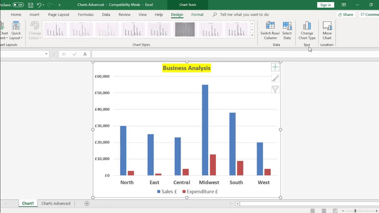
Adding Data to Excel Chart
Excel is a powerful tool that allows you to create visually appealing charts and graphs to represent your data. To make your charts more informative and meaningful, you need to add data to them. Here are four different methods to add data to an Excel chart:
1. Manually entering data
The most basic way to add data to an Excel chart is by manually entering the values. This method is suitable when you have a small dataset or need to input specific values. To do this, simply select the chart and click on the “Select Data” button. Then, click on “Add” to manually enter the data points. You can type the values directly into the form or select a range of cells from your worksheet.
2. Copying data from a different worksheet
If your data is already organized in a separate worksheet, you can easily copy and paste it into the chart. First, select the chart and click on the “Select Data” button. Then, select the series you want to add data to and click on the “Edit” button. In the “Edit Series” window, click on the “Series values” box and navigate to the worksheet that contains your data. Select the range of cells you want to copy and click “OK.” The data will be added to your chart.
3. Importing data from an external source
Excel allows you to import data from various external sources such as text files, databases, or other Excel files. This method is useful when you have large datasets or need to update your chart regularly. To import data, select the chart and click on the “Select Data” button. Then, click on the “Edit” button and select the series you want to add data to. In the “Edit Series” window, click on the “Series values” box and choose the “Import” option. Follow the prompts to import your data from the external source.
4. Linking data from another Excel file
If your data is stored in a different Excel file, you can link it to your chart. This method allows you to update the chart automatically whenever the linked data changes. To link data, select the chart and click on the “Select Data” button. Then, click on the “Edit” button and select the series you want to add data to. In the “Edit Series” window, click on the “Series values” box and choose the “Browse” option. Navigate to the Excel file containing your data, select the range of cells, and click “OK.” The data will be linked to your chart.
These are the four main methods for adding data to an Excel chart. Depending on your dataset and requirements, you can choose the most suitable method to ensure that your charts accurately reflect your data. Experiment with different methods and explore the various features of Excel to create visually stunning and informative charts.
Manually entering data
One of the simplest ways to add data to an Excel chart is by manually entering it. This method allows you to have complete control over the data you want to include in your chart.
To manually enter data, follow these steps:
- Open your Excel spreadsheet and select the worksheet where you want to create your chart.
- In the first column, enter the category labels or the X-axis values corresponding to your data. For example, if you are creating a chart to track sales by month, you could enter the months (January, February, March, etc.) in column A.
- In the second column and subsequent columns, enter the data points or the Y-axis values corresponding to each category. For instance, if you are tracking sales, you would enter the sales figures for each month in the second column, next to the respective month.
- Select the range of data you have entered (including the category labels and data points), and click on the “Insert” tab in the Excel toolbar.
- Choose the type of chart you want to create from the available chart options. Excel provides a wide range of chart types, such as column charts, line charts, pie charts, and more.
- Once you select the chart type, Excel will generate the chart based on the manually entered data.
By manually entering data, you have the flexibility to adjust and update your chart as needed. You can easily modify or add new data points by typing them directly into the spreadsheet. This method allows you to have real-time control over the data displayed in your chart.
Copying data from a different worksheet
If you have data in another worksheet within the same Excel file that you want to add to your chart, you can easily copy and paste it into the desired location. Here are the steps to follow:
1. Open the worksheet that contains the data you want to copy.
2. Select the range of cells that contain the data. You can click and drag to select multiple cells, or you can use the keyboard shortcuts Ctrl + Shift + Right Arrow to select a row or Ctrl + Shift + Down Arrow to select a column.
3. Once the data is selected, right-click on the selected range and choose “Copy” from the context menu, or use the keyboard shortcut Ctrl + C.
4. Go to the worksheet where you want to add the data to your chart.
5. Select the cell where you want the data to start and right-click on it. Choose “Paste” from the context menu, or use the keyboard shortcut Ctrl + V. The copied data will now be pasted into the new location.
6. If needed, you can adjust the data range by dragging and resizing the cell borders.
7. Now, you can use the data you copied from the other worksheet to create or modify your chart. Select the chart and click on the “Select Data” button in the Chart Tools menu. In the data source dialog box, click on the “Add” button and select the range of cells containing the copied data.
8. Finally, click “OK” to apply the changes and update your chart with the new data.
Copying data from a different worksheet is a convenient method when you have data in separate sheets that you want to combine or visualize in a chart. It allows you to easily transfer the data without the need to re-enter it manually, saving you time and effort.
Importing data from an external source
If you have data stored in an external source, such as a CSV file or a database, you can easily import it into your Excel chart. Importing data allows you to keep your chart updated with the latest information from your external source.
To import data from an external source, follow these steps:
- Open your Excel chart and click on the “Data” tab at the top of the screen.
- Click on the “From Text” button in the “Get External Data” section. This will open a file explorer window.
- Navigate to the location of your external data source and select it. Click on the “Import” button.
- A Text Import Wizard will appear, guiding you through the process of importing the data. Choose the appropriate options for delimiters (such as commas or tabs) and column data formats.
- Click “Finish” to import the data into your Excel chart.
Once the data is imported, it will be displayed in your Excel chart. You can now use this data to create or update your chart.
Importing data from an external source is a convenient way to incorporate information from different sources into your Excel chart. It ensures that your chart reflects the most up-to-date data without the need for manual data entry.
Keep in mind that if the external data source is updated, you may need to refresh the imported data in your Excel chart to reflect the changes. This can be done by selecting the data range and clicking on the “Refresh” button in the “Data” tab.
Linking data from another Excel file
If you have data in another Excel file that you want to include in your chart, you can easily link that data to your current worksheet. This allows you to update the chart automatically whenever the linked data changes in the source file.
To link data from another Excel file, follow these steps:
- Open both the source Excel file and the destination Excel file.
- In the destination Excel file, go to the worksheet where you want to add the linked data to your chart.
- Select the cell or range of cells that will hold the linked data.
- Copy the selected cells by pressing Ctrl+C.
- Switch to the source Excel file.
- In the source Excel file, select the cell or range of cells that you want to link to the destination file.
- Right-click on the selected cells and choose ‘Copy’ or press Ctrl+C.
- Switch back to the destination Excel file.
- In the destination Excel file, right-click on the cell where you want to link the data and choose ‘Paste Special’ from the context menu.
- In the ‘Paste Special’ dialog box, select the option ‘Link’ and click on the ‘OK’ button.
Once the data is linked, any changes made to the source Excel file will automatically update the linked data in the destination file. This includes any modifications to the values, formatting, or structure of the data.
The linked data can now be used in your chart in the destination Excel file. Simply select the chart and use the linked data as you would any other data within the file.
Linking data from another Excel file offers the advantage of keeping your chart up-to-date with the latest information. It eliminates the need to manually enter or copy data, saving you time and effort.
Remember, if the source Excel file is moved or renamed, you may need to update the link in the destination file to ensure the data continues to be linked correctly.
Conclusion
In conclusion, adding data to an Excel chart is a simple and straightforward process that can greatly enhance the visual presentation and analysis of your data. By following the steps outlined in this article, you can easily input data into your Excel chart and customize it to fit your specific needs. Remember to ensure the accuracy and consistency of your data by double-checking and verifying the information before adding it to the chart.
Excel provides a wide range of tools and options to help you create visually appealing and informative charts. By exploring and experimenting with the various features available, you can unlock the full potential of your data visualization and make your presentations impactful.
So, whether you are creating a chart for a business report, a school project, or any other purpose, now you have the knowledge and skills to add and manipulate data in Excel charts efficiently. Start utilizing this powerful tool to visually represent your data and unlock valuable insights.
FAQs
1. Can I add data to an Excel chart?
Yes, you can easily add data to an existing Excel chart. Simply go to the worksheet that contains the chart and enter the new data in the appropriate cells. The chart will automatically update to include the new data.
2. How do I add a new data series to an Excel chart?
To add a new data series to an Excel chart, follow these steps:
- Select the chart.
- Go to the Design tab on the Excel ribbon.
- Click on the “Select Data” button.
- In the “Select Data Source” dialog box, click on the “Add” button under the “Legend Entries (Series)” section.
- In the “Edit Series” dialog box, specify the series name and select the range for the series data. Click on the “OK” button to add the new data series to the chart.
3. Can I edit the data range for an existing data series in an Excel chart?
Yes, you can edit the data range for an existing data series in an Excel chart. Here’s how:
- Select the chart.
- Go to the Design tab on the Excel ribbon.
- Click on the “Select Data” button.
- In the “Select Data Source” dialog box, select the data series you want to edit in the “Legend Entries (Series)” section.
- Click on the “Edit” button.
- In the “Edit Series” dialog box, update the range for the series data. Click on the “OK” button to apply the changes.
4. Can I delete a data series from an Excel chart?
Yes, you can delete a data series from an Excel chart. Follow these steps:
- Select the chart.
- Go to the Design tab on the Excel ribbon.
- Click on the “Select Data” button.
- In the “Select Data Source” dialog box, select the data series you want to delete in the “Legend Entries (Series)” section.
- Click on the “Remove” button.
- Click on the “OK” button to confirm the deletion of the data series.
5. How do I add labels to data points in an Excel chart?
To add labels to data points in an Excel chart, follow these steps:
- Select the chart.
- Go to the Design tab on the Excel ribbon.
- Click on the “Add Chart Element” button.
- Select “Data Labels” from the dropdown menu.
- Choose where you want the labels to appear (e.g., above, below, or inside the data points).