
Are you looking to create a visually appealing pie chart to represent your data in Excel? Look no further, as we have got you covered! Pie charts are a fantastic way to showcase proportions and distributions, making it easier for viewers to understand complex data at a glance. Whether you are presenting sales figures, survey results, or project budgets, a pie chart can be a valuable tool.
In this article, we will guide you step-by-step on how to make a pie chart with data in Excel. We will explore various techniques to input your data, customize your chart, and bring it to life with eye-catching colors and labels. Whether you are a beginner or an experienced Excel user, this tutorial will provide you with all the information you need to create stunning and informative pie charts that will impress your audience.
Inside This Article
- Step 1: Prepare Your Data
- Step 2: Select and Highlight the Data
- Step 3: Insert a Pie Chart
- Step 4: Format and Customize Your Pie Chart
- Step 5: Add Data Labels and Legends
- Step 6: Explode Slices for Emphasis
- Step 7: Adjust Chart Title and Labels
- Step 8: Save and Export Your Pie Chart
- Conclusion
- FAQs
Step 1: Prepare Your Data
Pie charts are a great way to represent data visually and make it easier to understand. Before creating a pie chart in Excel, it is essential to prepare your data properly. Here are some steps to help you with this process:
1. Identify the data: Determine what kind of data you want to showcase in your pie chart. It could be sales figures, survey results, or any other data category that you wish to analyze visually.
2. Organize the data: Organize your data in a clear and structured manner. Make sure each category or data point has a corresponding value or percentage associated with it. This will ensure accurate representation in the pie chart.
3. Verify data accuracy: Double-check your data to ensure accuracy. Look for any missing or incorrect values that may affect the integrity of your pie chart. It is crucial to have reliable and accurate data to make informed decisions based on your chart.
4. Sort and limit data points: If you have a large dataset with numerous categories, you may consider sorting and limiting the number of data points you want to include in your pie chart. This will make the chart clearer and more focused on the relevant information.
5. Calculate percentages or values: If your data is not already in the form of percentages or values, you may need to calculate them. Pie charts represent proportions, so ensure that each data point’s percentage or value accurately reflects its portion of the whole.
By following these steps to prepare your data, you will have a solid foundation for creating an accurate and visually appealing pie chart in Excel. Once your data is ready, you can move on to the next step of selecting and highlighting the data to generate the pie chart.
Step 2: Select and Highlight the Data
After gathering the necessary data for your pie chart, the next step is to select and highlight the specific data range that you want to include in your chart.
To do this, open your Excel spreadsheet and navigate to the worksheet containing the data. Click and drag your cursor over the cells that represent the data you want to include in the chart. Make sure to include the labels or categories and the corresponding values.
An easy way to select the entire range of data is by clicking on the first cell of the range, holding down the Shift key, and then clicking on the last cell. This will select all the cells in between as well.
If your data is in a non-contiguous range, meaning it is scattered across different cells or columns, you can select each section separately while holding down the Ctrl key.
Once you have highlighted the data, you are ready to move on to the next step of creating your pie chart.
Step 3: Insert a Pie Chart
Now that we have our data prepared and selected, we can move on to the exciting part – inserting a pie chart! Follow these simple steps:
- With your data still highlighted, navigate to the “Insert” tab in the Excel toolbar.
- Look for the “Charts” section and click on the “Pie” chart icon. A drop-down menu will appear with various pie chart options.
- Select the type of pie chart you want to create. Excel offers different variations, such as 2D, 3D, exploded, or donut charts. Choose the one that suits your data visualization needs.
- Click on your preferred pie chart design, and Excel will automatically generate a basic pie chart based on your selected data.
Voila! You now have a pie chart inserted into your Excel worksheet. But don’t worry, we’re not done yet! The default chart may not be visually appealing or effectively communicate your data insights. Let’s move on to the next step to format and customize your pie chart to perfection.
Step 4: Format and Customize Your Pie Chart
Once you have inserted a pie chart in Excel, you may want to format and customize it to enhance its visual appeal and make it more informative. This step allows you to add a personal touch to your chart and make it stand out.
Here are some formatting and customization options you can explore:
- Chart Styles: Excel offers a variety of pre-defined chart styles that you can choose from. Simply click on your chart, navigate to the “Chart Styles” tab in the toolbar, and select a style that suits your preferences.
- Color Scheme: To change the color scheme of your pie chart, select the chart and navigate to the “Chart Tools” tab. Under the “Change Colors” option, you can pick from a range of color palettes or create your own custom color scheme.
- Data Labels: Adding data labels to your chart can enhance its readability. To do this, select the chart, go to the “Chart Tools” tab, and click on the “Data Labels” option. You can choose to display the values, percentages, or both.
- Chart Title and Axis Titles: Giving your pie chart a title and labeling its axes can provide additional context. To add a chart title, click on the chart, go to the “Chart Tools” tab, and enter a title in the “Chart Title” field. Similarly, you can label the x and y-axes by clicking on the chart and selecting “Axis Titles.”
- Chart Layout: Excel offers various chart layout options to help you organize the elements of your pie chart. You can adjust the position and size of the legend, modify the position of the chart title, and customize other elements such as the data table and gridlines. Simply right-click on the chart and select “Format Chart Area” to access these options.
- Effects and 3D Rotation: If you want to add visual flair to your chart, you can experiment with effects and 3D rotation. Excel allows you to apply shadow, glow, and other effects to your chart elements, as well as adjust the angle and perspective of the 3D rotation. Look for the “Chart Tools” tab and click on “Format” to find these options.
Remember, the formatting and customization options discussed above are just a starting point. You can further explore Excel’s features and experiment with different styles and settings to create a personalized and visually appealing pie chart that effectively communicates your data.
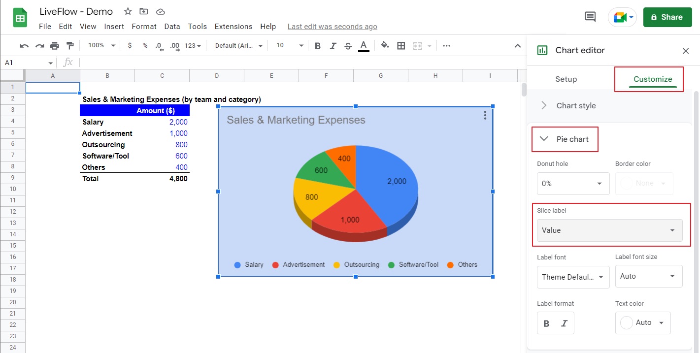
Step 5: Add Data Labels and Legends
Once you have created a basic pie chart in Excel, you may want to add data labels and legends to enhance the understanding of your chart. Data labels allow you to identify each slice of the pie with its corresponding value, while legends provide a key to understanding the different data categories represented in the chart.
To add data labels to your pie chart, follow these steps:
- Click on the pie chart to select it. A series of small squares, called handles, will appear around the perimeter of the chart.
- Right-click on the chart and select “Add Data Labels” from the context menu. The data labels will now appear on each slice of the pie.
- You can customize the appearance of the data labels by right-clicking on a data label and selecting the “Format Data Labels” option. In the Format Data Labels pane, you can choose to display the labels inside or outside the slices, change the font and size, and adjust the label options as needed.
In addition to data labels, you can also add a legend to your pie chart to provide further clarity. To add a legend, follow these steps:
- Click on the pie chart to select it.
- In the Chart Design tab, click on the “Add Chart Element” button.
- Select “Legend” from the drop-down menu. The legend will now appear on your chart, typically positioned to the right or below the chart.
- You can customize the appearance of the legend by right-clicking on it and selecting the “Format Legend” option. In the Format Legend pane, you can adjust the position, style, and other formatting options of the legend.
Adding data labels and legends to your pie chart can greatly enhance its visual appeal and make it easier for viewers to interpret. By following these simple steps, you can create a professional and informative pie chart in Excel.
Step 6: Explode Slices for Emphasis
Exploding slices in a pie chart can be a great way to highlight a specific data point or category. By moving a slice away from the center of the chart, you draw attention to it and make it stand out.
To explode a slice in Excel, follow these steps:
- Click on the pie chart to select it.
- Right-click on the slice you want to explode.
- Select the “Format Data Point” option.
- In the Format Data Point pane, navigate to the “Slice Options” section.
- Adjust the “Explosion” slider to increase or decrease the distance of the slice from the center of the chart.
- Preview the changes as you adjust the slider to find the desired level of explosion.
- Click “Close” when you are satisfied with the explosion effect.
Remember that exploding slices should be used sparingly and only when it adds value to your chart. Overusing the explosion effect can make your chart look cluttered and confusing. Evaluate your data and decide which slices need to be highlighted for emphasis.
Experiment with different levels of explosion to find the best visual impact. A subtle explosion might be enough to draw attention, while a drastic explosion could make a particular slice really stand out.
Step 7: Adjust Chart Title and Labels
After creating a pie chart in Excel, it’s important to adjust the chart title and labels for clarity and readability. This step allows you to provide a brief description or title that summarizes the data represented in the chart. It also helps users understand the key takeaways from the chart at a glance.
To adjust the chart title, simply click on it and begin typing your desired title. You can also format the text by changing the font style, size, and color. This allows you to personalize the chart and make it visually appealing.
Moreover, you can also adjust the labels in your pie chart. This can be done by selecting the chart and clicking on any data label you want to modify. You can then customize the label text, position, and font properties to make it more visually appealing and descriptive.
Excel also provides options to rotate the labels if needed. This can help enhance the readability of the chart by ensuring that the labels are clearly visible and don’t overlap with each other.
Furthermore, you can customize the legend, which provides a key to understanding the different categories represented in the chart. To adjust the legend, simply click on it and format the text or position as desired.
Remember, clear and concise chart titles and labels are essential for effectively communicating the data visualized in your pie chart. Take some time to carefully adjust these elements to ensure that your chart is informative and visually appealing.
Step 8: Save and Export Your Pie Chart
Now that you have created and customized your pie chart in Excel, it’s time to save and export your masterpiece. Here are the steps to follow:
1. After you have finished formatting and customizing your pie chart to your satisfaction, click on the “File” tab located on the top-left corner of the Excel window.
2. From the drop-down menu, select the “Save As” option. This will open the “Save As” dialog box.
3. In the “Save As” dialog box, choose the folder location where you want to save your pie chart. You can select an existing folder or create a new one.
4. Type in a name for your pie chart in the “File name” field. Make sure to choose a descriptive and recognizable name that reflects the content and purpose of your chart.
5. Select the desired file format for your pie chart. Excel offers various file formats, including Excel Workbook (.xlsx), PDF, JPEG, PNG, and more. Choose the format that best suits your needs.
6. If you want to adjust any additional settings or options related to the file format you selected, click on the “Options” button located next to the “Save” button. This will open a new dialog box where you can modify the settings according to your preferences.
7. Once you have selected the file format and adjusted any necessary settings, click on the “Save” button. Excel will save your pie chart in the chosen format and location.
8. After the file is saved, you can choose to close the chart file or continue working on it in Excel.
9. If you need to export your pie chart outside of Excel, such as embedding it in a Word document or PowerPoint presentation, open the desired application and insert the chart file using the “Insert” or “Import” options. Each application may have slightly different steps for importing the chart.
10. Congratulations! You have successfully saved and exported your pie chart from Excel. Now you can share it with others or use it in your reports, presentations, or other projects.
Remember to regularly save your files to avoid losing any changes or data. Additionally, consider saving multiple versions of your pie chart if you want to keep track of different iterations or variations.
Conclusion
In conclusion, creating a pie chart with data in Excel is a simple and effective way to visually represent data. By following the step-by-step process outlined in this article, you can easily transform your data into a clear and informative pie chart. Excel offers a wide range of customization options, allowing you to tweak the appearance and style of your chart to better suit your needs. Whether you’re analyzing sales figures, survey responses, or any other type of data, a pie chart can provide valuable insights at a glance. So, next time you need to present your data in a visually compelling manner, remember to turn to Excel and its powerful charting capabilities.
FAQs
1. Can I make a pie chart with data in Excel?
Yes, Excel is a powerful tool that allows you to create various types of charts, including pie charts. With just a few clicks, you can transform your data into a visually appealing pie chart that provides a clear representation of proportions or percentages.
2. How do I create a pie chart with my data in Excel?
To create a pie chart in Excel, you need to follow these steps:
- Select the data you want to include in the pie chart.
- Click on the “Insert” tab in the Excel ribbon.
- Click on the “Pie” chart button and choose the desired pie chart type.
- Your pie chart will be automatically generated, and you can further customize it according to your preferences.
3. Can I customize the appearance of my pie chart in Excel?
Absolutely! Excel provides a variety of customization options for your pie charts. You can change the chart’s colors, add data labels, adjust the chart title and axis labels, and even explode or rotate specific sections of the pie. By experimenting with these customization features, you can create a pie chart that suits your needs and visual preferences.
4. Can I update my pie chart if my data changes?
Yes, one of the advantages of using Excel for chart creation is its ability to automatically update your charts when data changes. If you have created a pie chart based on a specific range of data, any modifications or additions to that data range will be reflected in the chart. This dynamic feature saves you time and ensures that your chart is always up to date.
5. Are there any limitations to creating pie charts in Excel?
While Excel is a versatile tool for chart creation, it does have a few limitations. One limitation is that pie charts work best when you have a limited number of categories or data points. If your data has too many categories, the pie slices can become crowded and hard to read. In such cases, it may be more suitable to use other types of charts, like bar or column charts, to accurately represent your data.