
Are you struggling to add data series to a chart in Excel? Don’t worry, you’re not alone! Excel is a powerful tool for data analysis and visualization, but it can be a bit tricky to manipulate charts and graphs. Adding data series to a chart allows you to include more data points and enhance the visual representation of your data.
In this article, we will explore step-by-step instructions on how to add data series to a chart in Excel. Whether you’re a beginner or an experienced Excel user, this guide will help you master the art of charting in Excel and take your data analysis to the next level. So, let’s get started and unlock the secrets of creating compelling and informative charts in Excel!
Inside This Article
- Adding a Data Series to a Chart in Excel
- # 1. Selecting the Chart
- Opening the Chart Data Source
- Adding a New Data Series
- Modifying the Data Series Properties
- Adding a Data Series to a Chart in Excel
- Conclusion
- FAQs
Adding a Data Series to a Chart in Excel
Excel is a powerful tool for creating and manipulating charts. Adding a data series to a chart allows you to visualize additional data alongside existing data in your chart. This can provide valuable insights and help you communicate complex information effectively.
Here are four simple steps to add a data series to a chart in Excel:
1. Selecting the Chart
The first step is to select the chart where you want to add the data series. Click on the chart to activate it. You will see handles around the chart indicating that it is selected.
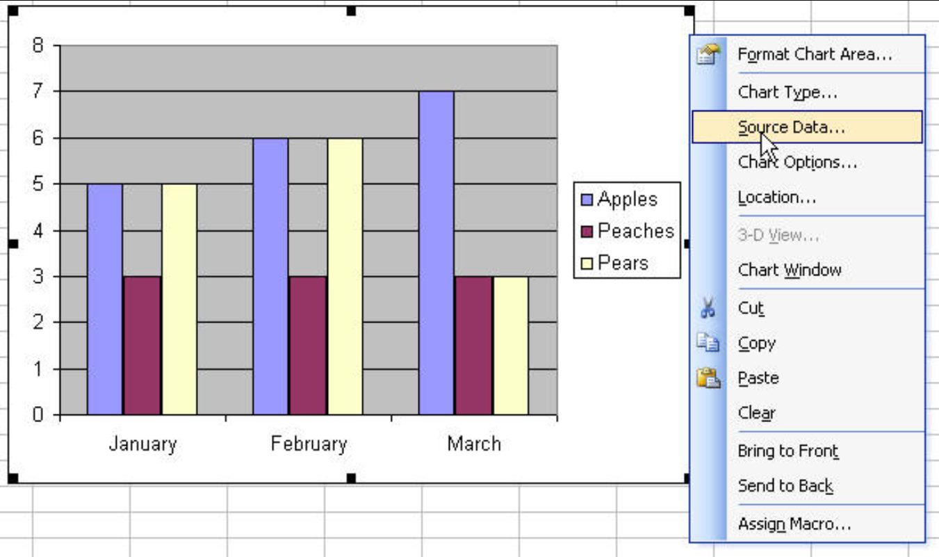
2. Opening the Chart Data Source
To open the chart data source, you can right-click on the chart and select “Edit Data” or click on the “Select Data” button in the Chart Tools ribbon. This will open the “Select Data Source” dialog box.
3. Adding a New Data Series
In the “Select Data Source” dialog box, click on the “Add” button under the “Legend Entries (Series)” section. This will open the “Edit Series” dialog box.
In the “Edit Series” dialog box, you can specify the Name and the Series values. The Name is the label for the data series, and the Series values are the actual data points for the series. You can manually enter the values or select a range of cells that contain the data.
Once you have entered the Name and the Series values, click on the “OK” button to add the new data series to your chart.
4. Modifying the Data Series Properties
After adding the data series, you can modify its properties to customize its appearance. Right-click on the data series in the chart and select “Format Data Series” to open the formatting options. Here, you can change the chart type, adjust the series colors, add data labels, and more.
By following these four steps, you can easily add a data series to a chart in Excel and enhance your data visualization capabilities. Experiment with different data series and formatting options to create compelling charts that effectively convey your data insights.
# 1. Selecting the Chart
When it comes to adding a data series to a chart in Excel, the first step is selecting the chart itself. This is crucial because it determines where the new data series will be added and how it will be visualized. To select a chart, simply click on any part of it. This will activate the chart and enable the necessary tools and options for editing the data.
Once you have selected the chart, you will see the Chart Tools menu appear at the top of the Excel window. This menu contains a series of tabs, including Design, Layout, and Format. These tabs provide access to various chart customization options.
In addition to the Chart Tools menu, you will also notice that the chart itself is surrounded by a border and handles. These handles can be used to resize the chart, while the border represents the selected area. This visual feedback helps ensure that you have indeed selected the chart before proceeding to the next steps.
It’s important to note that you can have multiple charts in an Excel worksheet. In such cases, make sure to select the specific chart where you want to add the data series. If you do not select the correct chart, you may end up modifying a different chart unintentionally.
Once you have successfully selected the chart, you are ready to move on to the next step of adding a data series. This involves opening the chart data source, where you can manage and manipulate the data that will be displayed in the chart.
Opening the Chart Data Source
Once you have selected the chart you want to modify, the next step is to open the chart data source. This will allow you to access and manage the data series within the chart.
To open the chart data source, you can follow these simple steps:
- Right-click on the chart and select “Edit Data” or “Select Data” from the drop-down menu. Alternatively, you can also double-click on the chart to open the data source.
- The Excel window will split into two sections. The main section will display the chart itself, while the other section will show the data source.
- The data source will typically appear as a separate worksheet or dialog box, depending on your Excel version.
Once the chart data source is open, you will have a clear view of the existing data series within the chart. This will enable you to add, remove, or modify the data series as needed.
It’s important to note that opening the chart data source does not alter the chart itself. Rather, it provides you with a dedicated area to manage the data series associated with the chart.
This step is crucial, as it enables you to make precise adjustments to the chart’s data without impacting its overall design or appearance.
Now that you have opened the chart data source, you are ready to add a new data series to the chart. The next section will guide you through the process.
Adding a New Data Series
Adding a new data series to a chart in Excel allows you to display additional data alongside your existing chart data. Whether you want to compare different sets of data or include a new variable in your analysis, adding a data series is a straightforward process. Here’s how to do it:
- Start by selecting the chart where you want to add the new data series. You can do this by clicking on the chart to activate it. If you’re unsure, you can always refer to the chart title or axis labels to help you identify the correct chart.
- Next, open the chart data source. This can be done by right-clicking on the chart and selecting “Edit Data” or by using the keyboard shortcut “Ctrl + Shift + Enter”. This action will open the Excel spreadsheet that contains the data used to create the chart.
- Once inside the data source, locate the section where your existing data series are listed. This is usually found in rows or columns adjacent to the chart. To add a new data series, you will need to insert a new row or column, depending on whether your data is arranged horizontally or vertically.
- After inserting the new row or column, enter the values for your new data series. Make sure to align the values with their corresponding categories or data points. This ensures that the new series is accurately represented in the chart.
- Finally, modify the data series properties to customize the appearance and behavior of the new data series. This can include changing the series name, adjusting the color or style of the series, and specifying different formatting options such as data labels or markers.
By following these steps, you can easily add a new data series to your chart in Excel, allowing you to enhance your data visualization and provide a more comprehensive analysis of your data.
Modifying the Data Series Properties
After adding a new data series to your chart in Excel, you may want to customize its properties to meet your specific requirements. Modifying the data series properties allows you to enhance the visual representation of your data and make the chart more insightful. Here are some ways you can modify the data series properties:
Changing the Series Name: By default, Excel assigns a generic name to the data series. To make it more meaningful, you can change the series name to accurately describe the data it represents. To do this, select the chart, then click on the desired data series, and edit the name in the formula bar at the top of the Excel window.
Adjusting the Series Values Range: If you need to update or modify the data range associated with the data series, you can easily do so by adjusting the series values range. Select the chart, then right-click on the data series, and choose “Select Data” from the context menu. In the “Select Data Source” dialog box, you can modify the range by manually entering the new values or selecting a new range from the worksheet.
Changing the Chart Type: Excel offers a variety of chart types that enable you to visualize data in different ways. If you want to change the chart type for a specific data series, select the chart, and then select the data series you want to modify. Right-click on the data series, choose “Change Series Chart Type,” and select the desired chart type from the available options.
Formatting the Series Data Points: To emphasize specific data points in your chart, you can apply formatting options to the data series. For example, you can change the color, marker style, and size of the data points to make them more prominent. Simply select the data series, right-click on it, and choose “Format Data Series” from the context menu. From there, you can explore various formatting options to enhance the visual appearance of the data series.
Adding Data Labels: Data labels provide additional information about the data points in the chart and help with data interpretation. To add data labels to a data series, select the chart, then click on the data series to which you want to add labels. Right-click and choose “Add Data Labels” from the context menu. You can further customize the data labels by right-clicking on them and accessing the label options.
By modifying the data series properties, you have the flexibility to customize your chart and effectively present your data. Experiment with different options to find the best visualization that serves your purpose and communicates your message clearly. Remember, Excel provides a wide range of tools to create visually appealing and informative charts.
Adding a Data Series to a Chart in Excel
Whether you’re creating a chart from scratch or editing an existing one, adding a data series can help you visualize and analyze your data more effectively in Microsoft Excel. In this guide, we will walk you through the step-by-step process of adding a data series to a chart in Excel.
1. Selecting the Chart
The first step is to select the chart you want to add a data series to. Click on the chart to activate it. You should see the Chart Tools appear in the Excel Ribbon at the top of the screen.
2. Opening the Chart Data Source
To open the data source for the chart, click on the “Select Data” button in the Data group of the Chart Tools. This will bring up the “Select Data Source” dialog box.
3. Adding a New Data Series
In the “Select Data Source” dialog box, click on the “Add” button under the “Legend Entries (Series)” section. This will open the “Edit Series” dialog box.
In the “Edit Series” dialog box, you will need to provide the following information:
- Series name: Enter a name for the data series. This will be displayed in the chart legend.
- Series values: Click the button next to the “Series values” field and select the range of cells that contains the data you want to add to the chart.
- Series X values (optional): If your data includes a second set of values for the X-axis, you can specify those here.
Once you have entered the necessary information, click “OK” to add the new data series to the chart.
4. Modifying the Data Series Properties
After adding a data series to the chart, you may want to modify its properties such as the color, line style, or marker style. To do this, select the data series in the chart and right-click on it. From the context menu, choose “Format Data Series”. This will open the “Format Data Series” pane on the right side of the Excel window, where you can make the desired changes.
You can also modify the data series properties using the options available in the Format tab of the Chart Tools. Experiment with different formatting settings to customize the appearance of your data series.
By following these simple steps, you can easily add a data series to a chart in Excel and customize it to suit your needs. Use this feature to enhance the clarity and visual impact of your data presentations.
Conclusion
In conclusion, adding data series to a chart in Excel is a simple and powerful tool that allows you to visualize your data in a meaningful way. By following the step-by-step process outlined in this article, you can easily select and add data series to your charts, giving you the flexibility to customize and analyze your data effectively.
Whether you are a business professional, a student, or anyone who works with data, mastering this skill will enhance your ability to present information in a visually appealing and impactful manner.
Remember to experiment with different chart types and formatting options to find the best representation for your data. With practice and creativity, you can create stunning charts that convey your data’s story and make a lasting impression on your audience.
So, don’t hesitate to explore the world of charting in Excel and unlock new insights from your data!
FAQs
Q: Can I add multiple data series to a chart in Excel?
A: Absolutely! Excel allows you to add multiple data series to a chart, which can be really useful when you want to compare different sets of data against each other.
Q: How do I add a data series to a chart in Excel?
A: Adding a data series to a chart in Excel is quite simple. First, select the chart you want to modify. Then, right-click on the chart and choose “Select Data” from the context menu. In the “Select Data Source” dialog box, click on the “Add” button in the “Legend Entries (Series)” section. Finally, enter the name and values of the data series in the “Edit Series” dialog box, and click “OK” to add it to the chart.
Q: Can I customize the appearance of each data series in Excel?
A: Yes, Excel provides various options to customize the appearance of each data series in a chart. You can adjust the color, line style, marker style, and other visual properties of each series individually. To do this, select the chart, right-click on the data series you want to modify, and select “Format Data Series” from the context menu. In the “Format Data Series” pane, you can explore the different customization options available.
Q: Is it possible to add trendlines to individual data series in Excel?
A: Absolutely! Excel allows you to add trendlines to individual data series in a chart. Trendlines can help you visualize and analyze trends in your data. To add a trendline to a specific data series, select the chart, right-click on the data series, and choose “Add Trendline” from the context menu. In the “Add Trendline” pane, you can choose from various types of trendlines and customize their appearance.
Q: Can I remove a data series from a chart in Excel?
A: Yes, you can remove a data series from a chart in Excel. To do this, select the chart, right-click on the data series you want to remove, and choose “Delete” from the context menu. The data series will be removed from the chart. Alternatively, you can go to the “Select Data” dialog box, select the data series you want to remove, and click on the “Remove” button.