
If you’re looking to enhance the clarity and visual impact of your bar chart, one effective way is to change the data labels to percentages. This simple adjustment can provide valuable insights and make it easier for viewers to understand the relative proportions of the different data points. Whether you’re creating a bar chart for business presentations, academic reports, or data visualizations, changing data labels to percentages can be a powerful tool in communicating your message effectively. In this article, we will explore the step-by-step process of converting data labels to percentages in a bar chart. By following these instructions, you’ll be able to transform your bar chart into a more intuitive and informative visual representation of your data.
Inside This Article
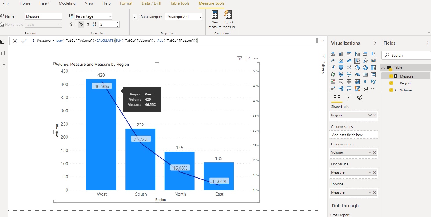
Steps to Change Data Label to Percentage in Bar Chart
To effectively illustrate data in a bar chart, it can be helpful to display the data labels as percentages rather than raw numbers. This helps to provide a clearer understanding of the data and makes it easier to compare different values within the chart. Here are the steps to change the data label to percentage in a bar chart:
- Enable data labels in the bar chart: The first step is to ensure that the data labels are enabled in the bar chart. This can usually be done by right-clicking on the chart and selecting the “Add Data Labels” option. This will display the values on top of each bar.
- Convert data labels to percentage format: Once the data labels are visible on the chart, you can proceed to convert them to percentage format. This is typically done by selecting the data labels and changing the number format to “Percentage.” This will automatically convert the values to percentages in the chart.
- Adjust data label position and style: Depending on the size and layout of your chart, you may need to adjust the position of the data labels to ensure they are easily readable and do not overlap with other elements. You can typically do this by selecting the data labels and dragging them to the desired position. Additionally, you can customize the font style and color of the labels to enhance their visibility.
- Customize chart axis labels and title: To provide further clarity and context to your bar chart, you can customize the axis labels and chart title. This can be done by double-clicking on the axis labels and title, and then editing the text accordingly. You can also choose to format the text style, size, and color to match the overall design of your chart.
By following these steps, you can easily change the data label to percentage in a bar chart, making it more informative and visually appealing. Remember to save your changes and consider adjusting other elements of the chart, such as colors and legends, to optimize the overall presentation.
Conclusion
In conclusion, changing the data label to percentage in a bar chart is a simple and effective way to enhance the readability and understanding of your data visualization. By presenting data in percentage format, you can provide a clearer picture of the relative proportions and make it easier for your audience to grasp the insights at a glance.
Whether you are analyzing sales figures, survey responses, or any other type of data, using percentages in your bar chart can highlight the key trends and patterns more effectively. It allows you to compare different categories and see the distribution of values more intuitively.
With the right software or tools, you can easily change the data label to percentage in your bar chart and customize it to suit your specific needs. By implementing this simple technique, you can create visually appealing and informative bar charts that effectively convey your data and insights.
So, remember to consider using percentages in your bar charts to improve the clarity and impact of your data visualizations. It’s a powerful way to communicate your findings and engage your audience.
FAQs
Q: How do I change the data label to a percentage in a bar chart?
A: To change the data label to a percentage in a bar chart, you can follow these steps:
- Select the bar chart by clicking on it.
- Right-click on the chart and select “Format Data Labels”.
- In the Format Data Labels pane, check the box next to “Percentage”.
- Adjust the formatting options as desired, such as font size, color, and position of the data labels.
- Click “Close” to apply the changes and see the data labels displayed as percentages in your bar chart.
Q: Can I change the data label format to a decimal instead of a percentage?
A: Yes, you can change the data label format to a decimal instead of a percentage. To do this, follow the same steps mentioned above, but instead of checking the box next to “Percentage” in the Format Data Labels pane, select the option for “Number” and choose the desired decimal format.
Q: Is it possible to customize the appearance of the data labels in a bar chart?
A: Absolutely! You can customize the appearance of the data labels in a bar chart to suit your preferences. In the “Format Data Labels” pane, you can modify various formatting options such as font size, font color, font style, data label position, and more. Explore these options to create a visually appealing and informative bar chart.
Q: Can I display both the data values and percentages in the data labels?
A: Yes, you can display both the data values and percentages in the data labels of a bar chart. Instead of selecting either “Percentage” or “Number” in the “Format Data Labels” pane, you can choose the option for “Value From Cells”. This allows you to reference a separate column of data that contains the desired values or percentages to display alongside the bars in your chart.
Q: Will changing the data label format affect the underlying data in the chart?
A: No, changing the data label format in a bar chart does not impact the underlying data. The format change only affects the visual representation of the data labels in the chart itself. The original values or percentages in your dataset remain unchanged.