
If you’re a digital artist or graphic designer, chances are you’ve heard of Procreate. This powerful app has become a go-to tool for creating stunning artwork on iPads and iPhones. One of the key features of Procreate is its ability to pick and use colors effectively. Choosing the right color palette can greatly impact the overall look and feel of your artwork. In this article, we will explore various techniques and tips on how to pick colors on Procreate like a pro. Whether you’re a beginner or an advanced user, this guide will help you navigate the color selection process and unleash your creativity. So, let’s dive in and discover the art of selecting perfect colors on Procreate.
Inside This Article
- Understanding Color Palette in Procreate
- Choosing a Color Scheme for Your Procreate Art
- Utilizing the Color Picker Tool in Procreate
- Exploring Advanced Color Selection Techniques in Procreate
- Conclusion
- FAQs
Understanding Color Palette in Procreate
When it comes to digital art creation, understanding the color palette is essential. In Procreate, a popular digital art application, the color palette serves as the foundation for your artwork. It consists of a range of colors that you can choose from to bring your creations to life.
The color palette in Procreate typically consists of a collection of pre-defined colors, often organized into various categories, such as basic colors, pastels, and gradients. These pre-defined colors provide a starting point for artists to explore and experiment with different color combinations.
As an artist, you have the freedom and flexibility to customize the color palette in Procreate according to your preferences. You can add or remove colors, rearrange their order, and even create your own color swatches. This level of control allows you to have a personalized color palette that suits your artistic style.
Understanding the color palette in Procreate goes beyond just selecting colors. It involves becoming familiar with various color models, such as RGB (Red, Green, Blue) and HSB (Hue, Saturation, Brightness), which determine how colors are represented in digital art.
The RGB color model is based on the additive color theory, where different levels of red, green, and blue light are combined to create a wide range of colors. The HSB color model, on the other hand, focuses on the perceptual attributes of color, such as hue, saturation, and brightness.
In Procreate, you can easily access and switch between these color models to find the perfect shade or tone for your artwork. This flexibility allows you to experiment with different color variations and create depth and dimension in your digital creations.
Furthermore, Procreate offers additional features, such as color harmony and color history, which further enhance your color selection process. Color harmony helps you create color combinations that are visually pleasing and cohesive, while the color history allows you to revisit previously selected colors, making it easier to maintain consistency throughout your artwork.
Mastering the understanding of the color palette in Procreate is a crucial step in unlocking your artistic potential. It not only allows you to express your creativity but also empowers you to create artwork that is visually impactful.
Choosing a Color Scheme for Your Procreate Art
When it comes to creating art in Procreate, choosing the right color scheme can greatly impact the overall look and feel of your artwork. Whether you’re working on a digital painting, illustration, or design project, selecting the perfect colors can elevate your artwork to a new level. Here are a few tips to help you choose a color scheme for your Procreate art:
1. Consider the Mood: Think about the mood or emotion you want to convey with your art. Are you going for a serene and peaceful vibe or a bold and energetic one? Understanding the mood you want to create will guide your color choices.
2. Start with a Base Color: Begin by selecting a base color that will serve as the foundation for your color scheme. This could be your main character’s color palette, a dominant color in your background, or any other element you want to highlight.
3. Explore Color Harmonies: Procreate offers various color harmony options, such as complementary, analogous, and triadic. Take advantage of these harmonies to create visually pleasing and harmonious color combinations.
4. Use Color Theory Principles: Familiarize yourself with basic color theory principles like hue, saturation, and brightness. Understanding these concepts will give you more control over your color choices and help you create balanced and cohesive artwork.
5. Get Inspired: Look for inspiration in your surroundings or other artworks. Nature, photographs, and even fashion can provide you with interesting color combinations that you can adapt to your Procreate art.
6. Experiment and Refine: Don’t be afraid to experiment with different color combinations and variations. Procreate allows you to easily adjust and refine your colors, so take advantage of this flexibility to fine-tune your color scheme until you achieve the desired result.
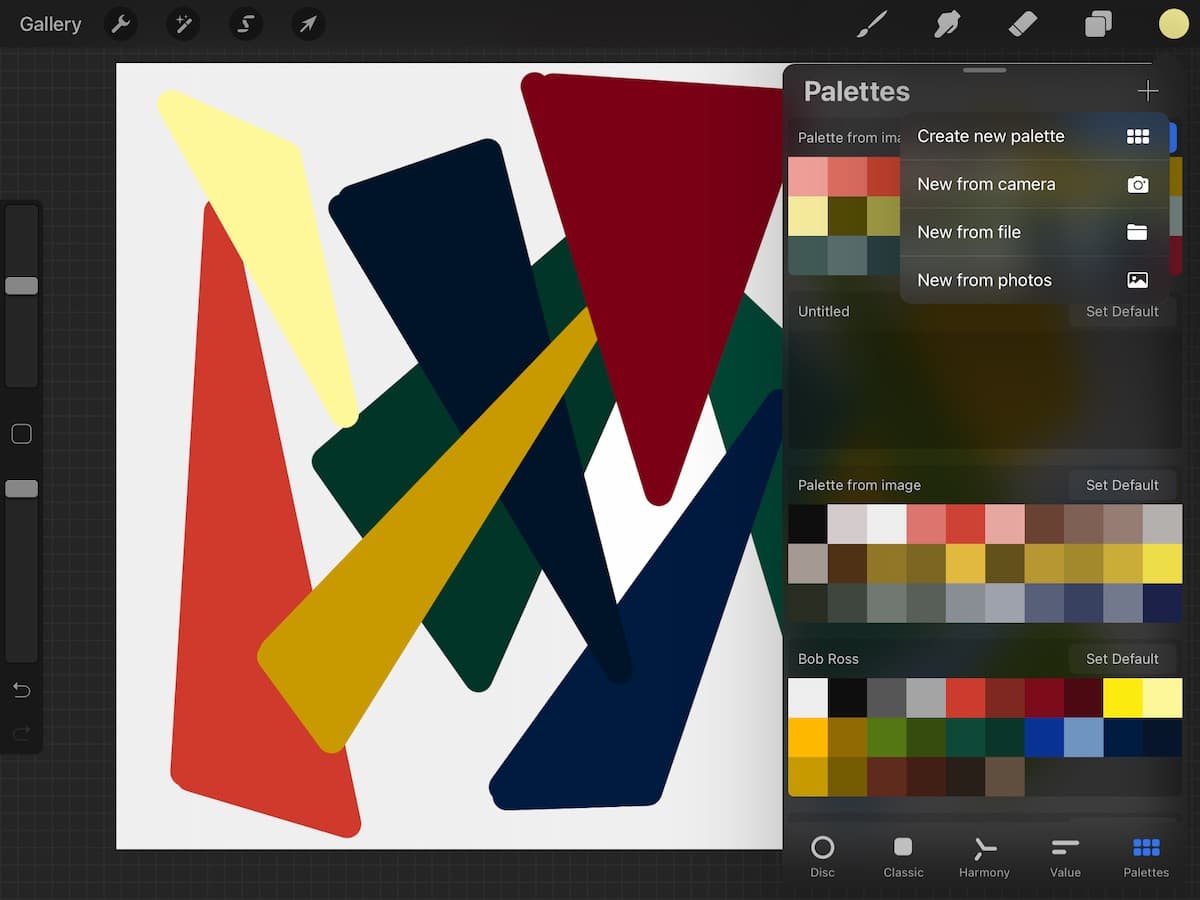
7. Use Color Palettes: Procreate offers the option to create and save your own custom color palettes. You can also import color palettes from other sources or use pre-existing palettes created by other artists. Having a well-curated color palette can save you time and make the color selection process easier.
8. Consider the Medium: Keep in mind the medium in which your artwork will be displayed. Colors may appear differently on different devices, so it’s essential to consider the final output when selecting your color scheme.
9. Seek Feedback: Don’t hesitate to seek feedback from fellow artists or even your audience. Others may provide valuable insights and suggestions that can help you improve your color choices and overall artwork.
By following these tips and allowing your creativity to flow, you can choose a color scheme for your Procreate art that enhances its visual impact and resonates with your audience. Happy creating!
Utilizing the Color Picker Tool in Procreate
One of the most powerful features in Procreate is the Color Picker Tool, which allows you to easily select and utilize colors in your artwork. Whether you’re a beginner or an experienced artist, mastering this tool is essential for creating captivating and visually stunning pieces. In this article, we will explore how to effectively use the Color Picker Tool in Procreate to enhance your creative process.
When you open Procreate, you will find the Color Picker Tool located on the left-hand side of the screen. It resembles an eyedropper and can be easily accessed with a single tap. Once selected, the Color Picker allows you to sample any color already present in your artwork.
To use the Color Picker Tool, simply tap and hold on the area of the canvas that contains the color you want to sample. Procreate will instantly capture the color and display it in the color swatch at the top of the screen. This gives you the ability to use the exact color in other parts of your artwork without the need for manual color picking.
Another useful feature of the Color Picker Tool is the ability to sample colors from external sources. If you have an image or a reference photo, you can import it into Procreate and use the Color Picker Tool to capture colors directly from the image. This is incredibly helpful when you want to match colors or create a consistent color palette.
When you tap and hold on an area of the imported image with the Color Picker Tool selected, Procreate will sample the color and add it to your color swatch. You can then use this color in your artwork, ensuring accurate color representation and seamless integration.
The Color Picker Tool in Procreate also comes with adjustable settings, allowing you to fine-tune your color selection. By accessing the brush settings panel, you can adjust various parameters such as opacity, size, and blending mode. Experimenting with these settings can help you achieve the desired color effect and create stunning visual elements in your artwork.
It’s worth noting that the Color Picker Tool in Procreate is not limited to sampling colors from your current artwork or external sources. You also have the option to sample colors from the Procreate color palette itself. Simply tap and hold on the color you want to sample, and it will be added to your swatch for immediate use.
Utilizing the Color Picker Tool in Procreate opens up a world of possibilities for color exploration and experimentation. Whether you’re working on illustrations, digital paintings, or graphic designs, this tool will elevate your creative process and enhance your artwork’s visual impact.
Exploring Advanced Color Selection Techniques in Procreate
In Procreate, the possibilities for color selection are virtually limitless. While the basic color picker tool is handy for simple color choices, there are advanced techniques that can take your artwork to the next level. In this article, we will explore some of these techniques and how to use them effectively in Procreate.
1. HSB Color Wheel: One of the powerful features in Procreate is the ability to use the HSB (Hue, Saturation, Brightness) color wheel. This color wheel allows you to precisely control each aspect of color. You can adjust the hue to select different colors, saturation to control the intensity, and brightness to determine the lightness or darkness of the color. Experimenting with these sliders can lead to unique and captivating color combinations.
2. Color Harmony: Creating harmonious color combinations is essential in any artwork. Procreate offers various color harmony options like complementary, analogous, triadic, and more. These options help you select colors that work well together, enhancing the overall visual impact of your artwork. By utilizing these color harmonies, you can create aesthetically pleasing and balanced compositions.
3. Custom Color Palettes: Procreate allows you to create custom color palettes that you can save and reuse in your artwork. This feature is particularly useful when you want to maintain consistency in your color scheme. You can gather colors from different sources, such as images or websites, and import them into Procreate to create your own personalized color palette. Having a curated color palette makes it easier to work on multiple projects with cohesive color schemes.
4. Sampling Colors: Another valuable technique in Procreate is the ability to sample colors directly from your reference images or existing artwork. By activating the Eyedropper tool, you can sample colors from different parts of an image or even from your own artwork. This makes it easy to maintain color consistency and accuracy when working on complex illustrations or colorizing sketches.
5. Gradient Mapping: Gradient mapping is a technique where you map a gradient of colors onto an image or artwork. This technique allows you to easily change the entire color scheme of your artwork while preserving its value and tonal range. Procreate offers a variety of gradient maps that you can apply to your artwork, giving you endless possibilities for color experimentation and transformation.
6. Color Drop and Fill: Procreate’s color drop and fill tools are incredibly handy when you need to quickly change the color of specific elements within your artwork. By choosing a color and then using the color drop tool to select an area, you can instantly change the color of that area. This feature is useful when you want to experiment with different color combinations or make quick adjustments to your artwork.
Exploring these advanced color selection techniques in Procreate will not only expand your creative possibilities but also allow you to create artwork with depth and sophistication. So, dive into Procreate’s color options and discover the amazing world of color in digital art!
Conclusion
Choosing the right colors in Procreate can be a fun and rewarding process. By following the tips and techniques mentioned in this article, you can enhance your digital art and make your creations truly stand out. Remember to consider the mood and message you want to convey, take advantage of Procreate’s powerful color tools and resources, and experiment with different combinations to find what works best for your artwork.
Whether you’re a beginner or a seasoned Procreate user, mastering the art of color selection can take your digital creations to the next level. So go ahead and start exploring the vast world of colors in Procreate, unleash your creativity, and let your imagination run wild!
FAQs
1. Can I change the color on Procreate?
Yes, you can change the color on Procreate. Procreate offers a wide range of color options and tools that allow you to easily select and modify colors to suit your artistic needs.
2. How do I pick a color on Procreate?
To pick a color on Procreate, you can use the color picker tool. Simply tap on the color palette icon in the top right corner of the screen, and then select the color picker tool from the options that appear. You can then tap on any area of your canvas to sample the color from that point.
3. Can I create custom color palettes on Procreate?
Absolutely! Procreate allows you to create custom color palettes to make it easier to access and use your favorite colors. To create a custom color palette, tap on the color palette icon, and then select the “+” icon. From there, you can choose individual colors or import an image for Procreate to extract colors from.
4. Are there any advanced color features on Procreate?
Yes, Procreate offers advanced color features that can help you create stunning and intricate artwork. These features include color harmony, which allows you to maintain color balance and coordination in your artwork, as well as color drop and fill, which makes it quick and easy to fill large areas with color.
5. Can I import color swatches into Procreate?
Yes, you can import color swatches into Procreate. This is a great feature if you have existing color palettes or if you want to use specific color schemes in your artwork. To import color swatches, tap on the color palette icon, select the “+” icon, and then choose “Import.” From there, you can select the file containing your color swatches and import them into Procreate.