
Pivot tables are a powerful tool in data analysis, allowing you to quickly summarize and organize large amounts of data. Whether you’re working with financial data, sales figures, or any other type of data, pivot tables can help make sense of it all. But how do you add data to a pivot table? In this article, we’ll guide you through the process of adding data to a pivot table, step by step. Whether you’re a beginner or have some experience with pivot tables, by the end of this article, you’ll be equipped with the knowledge and skills to confidently add data to a pivot table and unleash the full potential of your data analysis.
Inside This Article
- Overview
- Step 1: Open the Pivot Table
- Step 2: Select the Data Source
- Step 3: Add Data Fields to Rows or Columns
- Step 4: Add Data Values to the Pivot Table
- Step 5: Customize the Pivot Table Layout
- Step 6: Refresh the Pivot Table Data
- Step 7: Modify the Pivot Table Calculation
- Step 8: Analyze and Interpret the Pivot Table Results
- Conclusion
- FAQs
Overview
Adding data to a pivot table is a crucial skill for anyone seeking to analyze and interpret large datasets. Pivot tables offer a dynamic and flexible way of summarizing and organizing data, providing useful insights and facilitating decision-making processes. In this article, we will walk you through the step-by-step process of adding data to a pivot table, allowing you to become a master of data analysis.
By following these simple steps, you will be able to transform your raw data into a well-structured and insightful pivot table. Whether you are a business professional, a data analyst, or simply someone interested in gaining a deeper understanding of your data, this guide will equip you with the necessary skills to harness the power of pivot tables.
In the following sections, we will cover everything from opening the pivot table to customizing the layout, refreshing the data, and analyzing the results. So, let’s get started and unlock the full potential of your data!
Step 1: Open the Pivot Table
Before you can add data to a pivot table, you need to open the pivot table in your preferred spreadsheet software. Whether you’re using Microsoft Excel, Google Sheets, or any other tool, the process is generally the same.
To open a pivot table, follow these simple steps:
- Launch the spreadsheet application on your computer.
- Locate the file that contains the pivot table you want to work with.
- Open the file by double-clicking on it or using the “Open” option in the application’s menu.
- Once the file is open, navigate to the worksheet or tab where the pivot table is located.
- Click on the pivot table to select it.
- The pivot table should now be open and ready for you to add data to it.
Remember, the specific steps may vary slightly depending on the spreadsheet software you are using. However, the overall process remains the same across different applications.
By opening the pivot table, you gain access to its functionality and can begin adding and manipulating data to create meaningful insights. Now that you have opened the pivot table, let’s move on to the next step: selecting the data source.
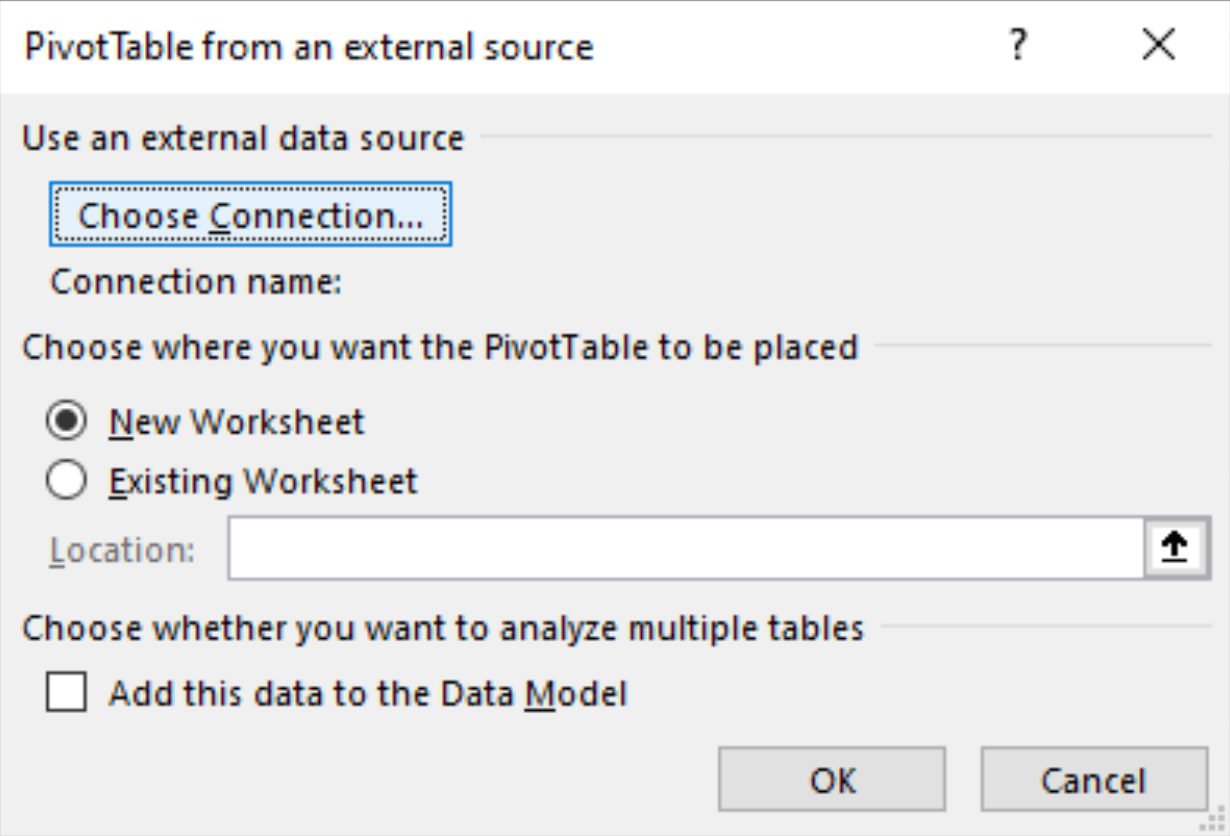
Step 2: Select the Data Source
Once you have opened the Pivot Table tool in your desired software, the next step is to select the data source. The data source is the range or table from which the Pivot Table will gather the data for analysis. It could be an Excel spreadsheet, a database table, or any other structured data source.
To select the data source, you can follow these steps:
- Click on the “Select Data Source” option or a similar button in the Pivot Table menu.
- A dialog box will appear, prompting you to choose the range or table that contains your data.
- Use your mouse or keyboard to select the desired range or table. You can click and drag to select a range or use the arrow keys to navigate through table cells.
- Once you have selected the data source, click on the “OK” or “Select” button to confirm your selection.
It’s important to ensure that the data source you choose contains all the relevant data for your analysis. If your data is scattered across multiple worksheets or tables, you can select multiple ranges or tables to include all the necessary data.
Additionally, make sure that your data is in the proper format, with consistent column headings and no empty rows or columns. This will ensure accurate results when creating the Pivot Table.
By selecting the right data source for your Pivot Table, you lay the foundation for effective data analysis and insightful decision-making. With the data source in place, you can move on to the next step of adding data fields to the rows or columns of your Pivot Table.
Step 3: Add Data Fields to Rows or Columns
Once you have your pivot table set up and the data source selected, it’s time to add data fields to the rows or columns. Adding data fields will determine how your data is organized and analyzed.
To add data fields to rows or columns, follow these steps:
- Click on the Pivot table and go to the “PivotTable Field List”.
- You will see a list of available fields from your data source. These fields represent the columns in your original data.
- Drag and drop the desired fields into the “Rows” or “Columns” section of the PivotTable Field List. Alternatively, you can also click on the checkbox next to the field name to add it to the rows or columns.
- The selected field will now appear in the rows or columns of your pivot table.
By adding data fields to either the rows or columns, you can segment and group your data in a way that makes it easier to analyze. For example, if you have a sales data set, you might add the “Product” field to the columns to see how different products are performing in different time periods.
Similarly, adding a field to the rows can help you identify patterns and trends based on specific categories. For instance, adding the “Region” field to the rows can allow you to compare sales performance across different regions.
Remember, you can add multiple fields to the rows or columns to further refine your analysis. You can also reorder the fields by simply dragging and dropping them within the rows or columns section of the PivotTable Field List.
Lastly, don’t forget to refresh your pivot table after making any changes to the fields to ensure that your data is up to date and accurately reflected in the analysis.
Adding data fields to the rows or columns is an essential step in creating a meaningful pivot table. It helps you organize and analyze your data in a way that brings out valuable insights and trends. So, take the time to carefully choose and arrange your data fields to make the most out of your pivot table analysis.
Step 4: Add Data Values to the Pivot Table
Once you have set up the rows and columns in your pivot table, the next step is to add the data values that you want to analyze. These data values can be numbers, such as sales figures or quantities, or they can be text values, such as product names or customer names.
To add data values to your pivot table, you need to select the appropriate field or fields from your data source. This can be done by dragging and dropping the field into the “Values” area of the pivot table, or by right-clicking on the field and choosing “Add to Values” from the context menu.
Once you have added a data value to your pivot table, it will automatically perform a default summarization function, such as sum, count, average, or max/min. This function calculates the value for each combination of row and column in your pivot table.
If you want to change the summarization function for a particular data value, you can do so by clicking on the drop-down arrow next to the data value in the “Values” area. This will open a menu where you can choose a different aggregation function, such as sum, count, average, max/min, or even a custom calculation.
In addition to the aggregation function, you can also customize the format of the data values in your pivot table. This includes options such as number formatting, decimal places, currency symbols, and percentage display. To access these formatting options, right-click on the data value in the pivot table and choose “Value Field Settings” from the context menu.
Furthermore, you can add multiple data values to your pivot table if you want to compare and analyze different aspects of your data. Simply repeat the process of adding data values as described above, selecting the appropriate field or fields for each data value.
Once you have added the necessary data values to your pivot table, you can proceed to customize the layout, apply filters, and perform further analysis to gain valuable insights from your data.
Step 5: Customize the Pivot Table Layout
Once you have added data values to your pivot table in Step 4, you can further enhance the presentation and analysis of your data by customizing the pivot table layout. By rearranging and adjusting the fields, columns, and rows, you can tailor the pivot table to meet your specific needs.
Here are some key customization options you can explore:
- Switching Rows and Columns: By default, the pivot table will display data with the fields in the rows and columns based on your selection. However, you can easily switch the positions of the rows and columns to gain a different perspective on your data.
- Grouping Data: If you have a large dataset with multiple values, you may find it useful to group certain data points together. For example, you can group sales data by month or quarter to analyze trends over time. Grouping data can provide a more structured view of your information.
- Adding Filters: Filters allow you to focus on specific subsets of your data. By applying filters to your pivot table, you can easily isolate and analyze specific segments or categories. This can be particularly helpful when dealing with large datasets or when looking to compare different groups within your data.
- Formatting and Styling: To make your pivot table visually appealing and easy to read, you can apply formatting and styling options. You can change the font, color, and alignment of your data, as well as add borders or conditional formatting to highlight certain values or patterns. These customization options help improve the overall look and feel of your pivot table.
- Adding Calculated Fields: Pivot tables offer the flexibility to include calculated fields, which are formulas that perform calculations on existing data. This allows you to create new columns or calculations based on the existing data in your pivot table. Calculated fields can provide additional insights or perform complex calculations on your data.
By exploring and implementing these customization options, you can create a pivot table that effectively presents and analyzes your data in a way that suits your needs. Remember, the goal is to make your data more meaningful and actionable, and customizing the pivot table layout is an important step in achieving that.
Step 6: Refresh the Pivot Table Data
After creating a pivot table and adding data values, it’s essential to keep the table up-to-date with the latest information. As new data is added or existing data is modified, refreshing the pivot table ensures accurate and relevant insights. Here’s how to refresh the pivot table data:
1. Select the Pivot Table: Click on any cell within the pivot table to activate it. This step is crucial as refreshing the data only applies to the selected table.
2. Refresh the Pivot Table: There are several ways to refresh the data:
- Refresh Button: Look for the “Refresh” button on the PivotTable Tools tab in the Excel Ribbon. Click on it, and the pivot table will update with fresh data.
- Right-Click Menu: Right-click on the pivot table and choose the “Refresh” option from the context menu. This method provides a quick and easy way to refresh the data.
- Keyboard Shortcut: Press the keyboard shortcut “Alt + F5” to refresh the pivot table. This method is handy when you prefer using shortcuts for efficient navigation.
- Automatic Refresh: In some cases, Excel can be configured to automatically refresh the pivot table when changes occur in the data source. To enable this feature, go to the PivotTable Options menu, select the “Data” tab, and check the “Refresh data when opening the file” option. This ensures that the pivot table stays updated without manual intervention.
3. Verify the Refreshed Data: After refreshing the pivot table, double-check if the data has been updated correctly. You can examine the changes in the values, rows, columns, or any applied calculations. If the refresh process was successful, the pivot table will display the most recent information from the data source.
By regularly refreshing the pivot table data, you can rely on accurate insights and make informed decisions based on the latest information. Whether you choose to manually refresh or configure automatic updates, keeping your pivot table updated is crucial for effective data analysis.
Step 7: Modify the Pivot Table Calculation
Modifying the pivot table calculation allows you to customize how your data is summarized and presented. This step is crucial for gaining deeper insights and making more informed decisions based on your data. Here’s how you can modify the pivot table calculation:
1. Select the pivot table that you want to modify.
2. Navigate to the “PivotTable Tools” tab on the Excel ribbon and click on the “Options” tab.
3. In the “Calculations” group, you’ll find various options to modify the calculation of your pivot table.
4. To change the formula calculation, click on the “Fields, Items & Sets” dropdown menu and select “Calculations” or “Calculate Field”.
5. In the “Calculate Field” dialog box, you can create a custom formula by selecting the input fields, operators, and functions needed for your calculation.
6. Once you’ve entered your formula, click on the “Add” button and the calculated field will be added to your pivot table.
7. You can also modify the summary function applied to a specific value field. To do this, right-click on the value field you want to modify and select “Value Field Settings”.
8. In the “Value Field Settings” dialog box, you can choose from a range of summary functions such as sum, average, count, max, min, and more.
9. Once you’ve customized your calculation or summary function, click “OK” to apply the changes to your pivot table.
By modifying the pivot table calculation, you can create more meaningful and tailored visualizations of your data. Whether you need to calculate percentages, perform complex calculations, or change the way your data is summarized, this step empowers you to analyze your data in the most effective way.
Remember, modifying the calculation is a powerful tool, so make sure to test and validate your results to ensure accuracy and reliability.
Step 8: Analyze and Interpret the Pivot Table Results
Once you have created and populated your pivot table with the necessary data fields and values, the final step is to analyze and interpret the results it provides. This step is crucial as it allows you to gain meaningful insights and make informed decisions based on the data presented in the pivot table.
Here are some key points to consider when analyzing and interpreting the pivot table results:
- Identify patterns and trends: Look for recurring patterns or trends in the data. Are there any particular categories, products, or time periods that stand out? Identifying these patterns can help you understand the factors that influence your business performance.
- Compare data: Compare different data fields within the pivot table to gain a comprehensive understanding of the relationships between variables. For example, you can compare sales figures with customer demographics to identify target markets or assess the impact of marketing campaigns.
- Apply filters: Use filters to narrow down the data and focus on specific subsets. You can filter by date, category, or any other relevant criteria to analyze specific segments of your business or identify outliers that require further investigation.
- Utilize calculated fields: Take advantage of calculated fields to perform additional calculations or derive insights from the existing data. For example, you can calculate profit margins by dividing total sales by total costs and analyze the profitability of different product lines or customer segments.
- Create visual representations: Visualize the data in the pivot table using charts or graphs to facilitate easier understanding and comparison. Visual representations can help identify patterns and outliers more quickly and present the data in a more engaging and compelling manner.
Remember that interpreting the pivot table results is an iterative process. You may need to refine your analysis, adjust filters, or experiment with different combinations of data fields to gain deeper insights or answer specific business questions. The goal is to extract actionable information from the pivot table that can drive decision-making and improve business performance.
By effectively analyzing and interpreting the results, you can harness the power of the pivot table to unlock valuable insights, identify opportunities, and make data-driven decisions for the success of your business.
Conclusion
Adding data to a pivot table is a simple and powerful way to organize and analyze your data in a clear and meaningful manner. By utilizing the features and functions of pivot tables, you can transform large and complex datasets into actionable insights that drive informed decision-making.
In this article, we covered the essential steps to add data to a pivot table, including selecting the data range, choosing the appropriate layout, and customizing the pivot table fields. We also discussed the benefits of using pivot tables, such as summarizing data, creating dynamic reports, and exploring data from different perspectives.
Whether you are a data analyst, business professional, or someone looking to gain valuable insights from your data, mastering the art of adding data to a pivot table is a crucial skill. With a little practice and experimentation, you’ll be able to unlock the full potential of pivot tables and harness their power to understand your data like never before.
So, go ahead and dive into the world of pivot tables. Start exploring, analyzing, and visualizing your data in new and exciting ways. The possibilities are endless, and the insights waiting to be discovered are invaluable.
FAQs
1. What is a pivot table?
A pivot table is a data summarization tool that allows you to extract meaningful insights from large sets of data. It enables you to rearrange, analyze, and summarize data from different perspectives, making it easier to identify trends, patterns, and relationships.
2. How do I add data to a pivot table?
To add data to a pivot table, you first need to create the pivot table by selecting the relevant data range and clicking on the “Pivot Table” option in your spreadsheet software. Once the pivot table is created, you can add data by dragging and dropping the desired fields into the rows, columns, and values areas.
3. What are row and column fields in a pivot table?
Row fields and column fields are used to categorize data in a pivot table. Row fields are displayed horizontally and represent categories along the left side of the table, while column fields are displayed vertically and represent categories along the top of the table. These fields help organize and structure the data within the pivot table.
4. Can I add multiple data fields to a pivot table?
Yes, you can add multiple data fields to a pivot table. This allows you to perform calculations, such as sum, average, count, or percentage, on different sets of data. By adding multiple data fields, you can gain deeper insights and analyze various aspects of your dataset simultaneously.
5. Can I customize the appearance of a pivot table?
Yes, you can customize the appearance of a pivot table to make it visually appealing and easier to understand. Most spreadsheet software provides options to change the font style, size, and color, as well as formatting options for borders, shading, and cell alignment. Additionally, you can apply conditional formatting to highlight specific data values based on certain criteria.