
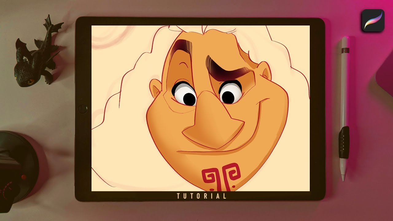
Welcome to the world of digital art! If you’re a budding artist or an experienced illustrator looking to explore new techniques, you’ve come to the right place. In this article, we will delve into the intricacies of shading in Procreate.
Procreate is a powerful software used by many artists to create stunning digital artwork on their iPads. It offers a wide array of tools and features, including a variety of brushes and an intuitive interface. Shading is a fundamental aspect of art that adds depth, dimension, and realism to your drawings. Mastering shading in Procreate can elevate your artwork to a whole new level, making it more vibrant and lifelike.
In this comprehensive guide, we will walk you through the process of shading in Procreate, from selecting the right brush to understanding light and shadow. So, grab your iPad, launch Procreate, and let’s dive into the marvelous world of shading!
Inside This Article
- What is Procreate?
- Understanding Shading
- Setting up your Canvas
- Choosing the Right Brush
- Layering Techniques for Shading
- Using the Smudge Tool
- Adjusting Opacity and Flow
- Applying Lighting and Highlights
- Adding Depth with Shadows
- Blending and Softening Edges
- Tips for Realistic Shading
- Troubleshooting Common Issues
- Conclusion
- FAQs
What is Procreate?
Procreate is a powerful digital illustration app designed for artists and creatives. Developed specifically for the iPad and Apple Pencil, Procreate offers a wide range of features and tools that allow users to create stunning artwork, including realistic shading.
Unlike traditional drawing and painting methods, Procreate provides a seamless and intuitive digital platform that replicates the experience of working with real art materials. The app’s sophisticated brush engine, layering system, and customizability make it a popular choice among professional artists, hobbyists, and students.
With Procreate, artists can sketch, paint, blend colors, and add intricate details to their artwork with ease. The app offers a vast selection of brushes that accurately emulate various media, such as pencils, pens, markers, and airbrushes. This versatility enables artists to achieve a wide range of shading effects, from subtle gradients to dramatic shadows.
One of the standout features of Procreate is its ability to handle large canvas sizes and high-resolution artwork, allowing artists to work with immense detail. The app also provides advanced layer management tools, making it easier to organize and edit different elements of a composition, including shading layers.
Procreate also offers a variety of built-in features that simplify the shading process. These include adjustable brush opacity and flow settings, as well as customizable blending modes. Artists can easily experiment with different shading techniques and effects to achieve their desired results.
Whether you’re a digital artist looking to enhance your shading skills or a beginner wanting to explore the world of digital art, Procreate is a fantastic tool that provides endless possibilities for realistic and captivating shading.
Understanding Shading
Shading is a fundamental element in art that can bring depth, dimension, and realism to your Procreate artwork. By understanding shading techniques, you can effectively create the illusion of light and shadow, giving your drawings a more three-dimensional appearance. Let’s explore some key concepts and principles to help you grasp the fundamentals of shading in Procreate.
One crucial aspect of shading is understanding how light interacts with objects. Light can be a primary source, such as the sun, or a secondary source, like a lamp or candle. The direction, intensity, and angle of light will determine how the shadows are cast and where the highlights appear on an object.
To effectively shade in Procreate, it’s essential to develop a keen observation of light and shadow in the real world. Take time to study how light falls on different objects and notice the subtle variations in tones and values. This observation will help you replicate the effects of light and shadow in your digital artwork.
When shading in Procreate, it’s helpful to break down complex shapes into basic forms, such as spheres, cubes, or cylinders. This simplification allows you to understand how light interacts with each form and how shadows are cast. By mastering shading on these basic shapes, you can then apply your knowledge to more complex subjects.
Understanding the concept of value is also crucial when it comes to shading. Value refers to the degree of lightness or darkness in a color. By utilizing a range of values, from light to dark, you can effectively depict form and create the illusion of depth in your artwork. Experimenting with different values and contrasts will help you achieve a more realistic shading effect.
In Procreate, you have a range of tools at your disposal to create shading effects. From brushes with different textures to the smudge tool for blending, explore the various options and experiment with their settings to achieve the desired shading effect in your artwork.
Remember, shading is not just about adding shadows; it’s also about capturing the interplay of light and shadow and replicating the subtle nuances that create a sense of depth and realism in your artwork. With practice, observation, and experimentation, you can master the art of shading in Procreate and take your digital artwork to the next level.
Setting up your Canvas
Before diving into shading in Procreate, it’s essential to set up your canvas properly. This step will ensure that you have the perfect foundation to start adding depth and dimension to your artwork. Here are a few steps to follow when setting up your canvas:
1. Selecting the right canvas size: Consider the type of artwork you’re creating and the intended use. If you’re working on a high-resolution illustration, choose a larger canvas size. For social media graphics, a smaller canvas size may be suitable. Procreate offers a variety of preset sizes, or you can customize your canvas dimensions to fit your requirements.
2. Adjusting the canvas orientation: Decide whether you want a horizontal or vertical canvas orientation. This choice can impact the composition and overall feel of your artwork. Think about the subject and consider which orientation will best accentuate its features.
3. Setting the background color: Consider the mood you’re trying to convey in your artwork. Are you going for a bright and vibrant piece, or do you prefer a more subdued and atmospheric feel? Choose an appropriate background color that complements your shading intentions.
4. Enabling or disabling layers: Layers can be incredibly useful when shading in Procreate. By separating different elements of your artwork onto different layers, you can easily make adjustments and work on specific areas without affecting the rest of the composition. Decide whether you want to work with a single layer or multiple layers based on your preferences and workflow.
5. Adjusting the opacity: If you prefer to sketch out your shading before committing to it, lower the opacity of your base sketch layer. This will allow you to work on top of it without completely covering it up. You can always increase the opacity later when you’re ready to finalize your shading.
By following these steps and setting up your canvas appropriately, you’ll have a solid foundation to begin shading in Procreate. Remember, experimentation is key, so don’t be afraid to try different techniques and settings to achieve the desired effect.
Choosing the Right Brush
When it comes to shading in Procreate, one of the most crucial aspects is selecting the right brush. The brush you choose will greatly impact the texture and effect you achieve in your artwork. With Procreate offering a wide range of brushes, it can be overwhelming to choose the best one for shading. However, by considering a few key factors, you can make an informed decision that suits your artistic vision.
Firstly, pay attention to the brush type. Certain brushes are specifically designed for shading, such as the Soft Airbrush or the Charcoal brush. These brushes have characteristics that make them ideal for creating smooth gradients and subtle transitions. They offer control over opacity and flow, allowing for precise control over the shading effect.
Another factor to consider is the brush texture. Different brushes have unique textures that can simulate various traditional art mediums, like pencils, pastels, or watercolor. Experimenting with different textures can add a touch of realism to your shading, giving your artwork depth and dimension.
Furthermore, take note of the brush size. The size of the brush will determine the scale and intensity of the shading. For larger areas, a larger brush size with a softer edge can be used to lay down a base shade. On the other hand, a smaller brush size with a sharper edge can be ideal for adding intricate details and highlights.
Lastly, don’t be afraid to experiment and mix and match brushes. Combining multiple brushes can create unique shading styles and effects. Procreate allows you to create custom brush sets, so you can easily switch between brushes while working on different areas of your artwork.
Keep in mind that the brush you choose ultimately depends on your personal preference and the style you want to achieve. It’s essential to spend time exploring different brushes and experimenting with their settings to find the perfect fit for your shading needs. So, don’t be afraid to dive into Procreate’s vast brush library and unleash your creativity!
Layering Techniques for Shading
Layering techniques are essential when it comes to creating realistic and nuanced shading in Procreate. By strategically layering different shades of color and texture, you can add depth and dimension to your artwork. Here are some effective layering techniques for shading:
1. Base Layer: Start by creating a base layer with the overall color of the object or area you want to shade. This layer will serve as the foundation for your shading.
2. Mid-tone Layer: Create a new layer above the base layer and choose a slightly darker shade for the mid-tones of your shading. Use a brush with a soft edge to apply the shading, focusing on areas where shadows naturally fall.
3. Highlights Layer: Add another layer above the mid-tone layer and choose a lighter shade for the highlights. Use a brush with a soft edge and low opacity to apply subtle highlights to areas that catch the light.
4. Texture Layer: To add texture and depth to your shading, create a new layer and experiment with different brushes and textures. Apply the texture layer on top of the existing layers and adjust the opacity and blending mode for a desired effect.
5. Blend and Refine: Once you have applied the different layers of shading, use the blending brush to blend the colors together smoothly. This will help create a seamless transition between the different shades and give a more realistic appearance to your shading.
6. Additional Detail Layers: Depending on the complexity and level of detail in your artwork, you can create additional layers for more specific details. This could include layering subtle textures, wrinkles, or gradients to enhance the shading even further.
Remember to always work in separate layers for each element of shading, as this allows for maximum flexibility and control over your artwork. Experiment with different layering techniques and brush settings to find the perfect combination that suits your style and desired effect.
Using the Smudge Tool
The smudge tool is a powerful feature in Procreate that allows you to blend and smudge colors together, creating smooth transitions and realistic shading effects. Whether you’re a beginner or an experienced artist, mastering the smudge tool can greatly enhance your digital artwork. Here are some tips on how to use the smudge tool effectively in Procreate:
1. Start by selecting the smudge tool from the toolbar on the left side of the screen. It looks like a finger smudging a paint stroke.
2. Adjust the size and opacity of the smudge tool to achieve the desired effect. You can do this by tapping on the brush settings menu and adjusting the sliders for size and opacity.
3. When using the smudge tool, consider the direction of the brush strokes. For example, if you want to blend colors vertically, choose a brush shape that has vertical bristles.
4. Experiment with different brush shapes and textures to create unique smudging effects. Procreate offers a wide selection of brushes that can be customized to your liking.
5. Use short, controlled strokes when smudging to avoid overblending. This will give your artwork a more natural and detailed appearance.
6. Combine the smudge tool with other brush tools, such as the airbrush or soft brush, to create even smoother gradients and blending effects.
7. If you make a mistake while smudging, simply use the undo button or the eraser tool to correct it. Procreate allows you to easily undo and redo your actions, giving you more flexibility in your artwork.
8. Remember to save your progress regularly to avoid losing any changes. Procreate has an auto-save feature, but it’s always a good practice to manually save your artwork.
Using the smudge tool in Procreate opens up a world of possibilities for creating stunning shading and blending effects in your artwork. With practice and experimentation, you’ll be able to achieve realistic and professional-looking results. So, give it a try and see how the smudge tool can take your digital art to the next level!
Adjusting Opacity and Flow
When it comes to shading in Procreate, one of the key factors to consider is adjusting the opacity and flow of your brush. These settings play a crucial role in controlling the transparency and strength of the color as you apply it to your artwork.
Opacity refers to the transparency of the brush strokes. By adjusting the opacity, you can control how much of the underlying layers or colors are visible through your shaded areas. If you want a more subtle shading effect, you can lower the opacity to allow the base colors to show through.
On the other hand, flow determines the intensity or strength of the color as you apply it. Higher flow values create bolder and more solid strokes, while lower values result in lighter and more delicate shading. By adjusting the flow, you can achieve different levels of tonal variation and create more dynamic shading effects.
To adjust the opacity and flow of your brush, you can use the Brush Properties panel in Procreate. Simply select your desired brush and tap on the brush icon on the top toolbar to open the panel. From there, you’ll find sliders for both opacity and flow.
Experimenting with different combinations of opacity and flow can give your artwork a unique and personalized shading style. By finding the right balance, you can achieve realistic gradients, smooth transitions, and add depth to your illustrations.
Remember, when adjusting the opacity and flow, it’s important to take into consideration the desired effect and the overall look you want to achieve. Play around with different values, test them on a separate layer, and see how they interact with your artwork.
While it may take some practice to find the perfect settings for your shading, don’t be afraid to experiment and trust your artistic instincts. The beauty of digital art is the ability to make adjustments easily, so don’t hesitate to go back and fine-tune your opacity and flow settings until you’re satisfied with the result.
Adjusting opacity and flow in Procreate gives you the power to create stunning shading effects that bring your artwork to life. So, take the time to explore and master these settings, and watch as your shading skills elevate to a whole new level.
Applying Lighting and Highlights
When it comes to creating realistic shading in Procreate, applying lighting and highlights is essential. This technique adds depth and dimension to your artwork, making it visually striking and lifelike. Here are some tips on how to effectively apply lighting and highlights in Procreate:
1. Understand Light Source: Before you start adding lighting and highlights, it’s important to have a clear understanding of the light source in your artwork. Determine where the light is coming from and how it interacts with the objects or subjects in your composition. This will help you determine where to place highlights and shadows.
2. Use the Airbrush or Soft Brush: To create soft and natural-looking highlights, consider using the Airbrush or Soft Brush in Procreate. These brushes allow you to build up the highlights gradually and blend them seamlessly with the surrounding colors. Adjust the opacity and size of the brush for more control.
3. Start with Midtones: Begin by adding the midtones of your subject. These are the areas that are neither in shadow nor directly hit by the light source. Use a brush with a medium opacity to establish the base color of the object. This will serve as a foundation for the highlights to come.
4. Add Highlights: Once you’ve established the midtones, focus on adding highlights to areas that directly face the light source. Think about where the light would naturally hit the object and create subtle strokes or dots of lighter color. Build up the highlights gradually and observe how they interact with the rest of the artwork.
5. Consider Reflection and Refraction: When applying highlights, consider the reflective and refractive properties of the surface or material you’re shading. Keep in mind that glossy surfaces may have more pronounced highlights, while translucent objects may show softer and more diffused highlights. This attention to detail will enhance the realism of your artwork.
6. Blend and Soften: Use the Smudge tool or a soft brush to blend and soften the edges of the highlights. This will create a smoother transition between the highlighted areas and the rest of the artwork. Be mindful of maintaining a balance between softness and definition to achieve a natural look.
7. Adjust Opacity and Layer Modes: Experiment with adjusting the opacity and layer modes of your highlight layers. Lowering the opacity can create a subtle glow effect, while changing the layer blending mode can add different lighting effects. Play around with these settings to achieve the desired result.
8. Study Real-life References: To improve your understanding of lighting and highlights, spend time studying real-life references such as photographs or observing objects in different lighting conditions. Pay close attention to how the light interacts with the objects and try to replicate those effects in your artwork.
By applying these techniques and practicing regularly, you’ll be able to master the art of applying lighting and highlights in Procreate. Remember, it’s all about understanding light source, using the right brushes, creating gradual transitions, and paying attention to details. So, go ahead and bring your artwork to life with stunning lighting and highlights!
Adding Depth with Shadows
One crucial element in creating realistic shading is incorporating shadows to add depth to your artwork. Shadows play a vital role in conveying the three-dimensional form of an object. By understanding how to use shadows effectively, you can create a sense of depth and dimensionality in your artwork.
Here are some techniques to help you add depth with shadows in your Procreate artwork:
- Study real-life objects: Observing how shadows are cast on different objects in real life can provide valuable insights into how light interacts with various surfaces. Study the way shadows form and how they change based on the direction and intensity of light.
- Consider the light source: Before adding shadows, determine the position of your light source. Shadows are formed opposite to the light source, so understanding where the light is coming from will help you accurately place shadows in your artwork.
- Create a new layer for shadows: It’s advisable to work on a separate layer when adding shadows. This allows you to have more control over the opacity and blending modes of the shadows. It also makes it easier to make adjustments without affecting the rest of your artwork.
- Choose the right color for shadows: Shadows are not just black or gray. The color of shadows can be influenced by the surrounding environment and the object’s material. For example, shadows cast on a white wall might have a slightly cooler or warmer tone. Experiment with different colors to achieve the desired effect.
- Gradually build up the shadows: Start by applying lighter shades of your shadow color and gradually build up the intensity by layering darker shades. This gradual approach helps you achieve a more realistic and smooth transition from light to shadow.
- Vary the intensity of shadows: Shadows are not uniformly dark throughout. They tend to be lighter towards the edges and darker towards the areas where the object blocks the light completely. By varying the intensity of your shadows, you can add depth and dimension to your artwork.
- Consider the shape and direction of objects: Shadows are influenced by the shape, texture, and angle of objects. Pay attention to how shadows wrap around curved surfaces and how they appear on different materials like glass or metal. Understanding these nuances will make your shading more accurate and lifelike.
Remember, shading is a skill that requires practice and observation. Experiment with different techniques and gradually refine your approach to adding shadows. With time and experience, you’ll develop a keen eye for creating depth and realism in your Procreate artwork.
Blending and Softening Edges
Blending and softening edges is an important step in achieving realistic shading in Procreate. It helps to create smooth transitions between different elements in your artwork and gives it a more polished and professional look. Here are some techniques you can use to blend and soften edges effectively:
1. Smudge Tool: The smudge tool in Procreate is a powerful tool for blending and softening edges. It allows you to drag and blend colors together, creating a seamless transition. To use the smudge tool, select a soft brush and drag it along the edges you want to blend. Experiment with different pressure and stroke lengths to achieve the desired effect.
2. Gaussian Blur: Another way to blend and soften edges is by using the Gaussian Blur effect. This effect blurs the edges of a selected area, creating a smooth transition between colors or shading. To apply Gaussian Blur, select the area you want to soften using the selection tool, go to the “Filters” menu, and choose “Gaussian Blur.” Adjust the blur radius until you achieve the desired softness.
3. Layer Opacity: Adjusting the opacity of a layer is another effective technique for blending and softening edges. By reducing the opacity of a layer, you can create a semi-transparent effect that allows the colors underneath to show through, resulting in a smoother transition. Experiment with different opacity levels to find the right balance.
4. Feathering Selections: When working with selections, feathering the edges can help blend the selected area with the background. To feather a selection, make your selection using the selection tool, and then go to the “Modify” menu and choose “Feather.” Adjust the feather radius to control the softness of the edges.
5. Smoother Brushes: Using brushes with softer edges can also help in blending and softening edges. Procreate offers a wide range of brushes with different textures and hardness. Experiment with brushes like the airbrush or soft round brush to achieve smoother edges and blend colors seamlessly.
By incorporating these techniques into your shading process, you can enhance the realism and depth of your artwork in Procreate. Remember to practice and experiment with different tools and settings to find the blending and softening techniques that work best for your style and desired effect.
Tips for Realistic Shading
Shading is a crucial element in creating realistic and dimensional artwork in Procreate. It adds depth, volume, and dimension to your drawings, making them appear more lifelike. Here are some tips to help you achieve realistic shading in Procreate:
1. Study Real-Life References: Observing how light falls on different objects in real life can greatly improve your understanding of shading. Take time to study and analyze references such as photographs or still life objects to observe how shadows are formed and how light interacts with different surfaces.
2. Start with a Basic Line Drawing: Before diving into shading, make sure you have a solid line drawing as a foundation. This will help you define the forms and structure of your subject before adding shadows and highlights.
3. Use Multiple Layers: To maintain flexibility and control, utilize multiple layers when shading. Separate the different elements of your artwork onto different layers, such as the character, background, or objects. This way, you can adjust the shading individually without affecting the other elements.
4. Vary Brush Opacity and Size: Experiment with different brush opacities and sizes to achieve a more natural and dynamic shading effect. Start with a larger brush size to quickly block in the general areas of shadow, then switch to a smaller brush to add finer details and textures.
5. Blend and Smudge: The Smudge tool in Procreate is a powerful tool for blending and softening edges, creating smooth transitions between different shades. Use it to blend the areas of shadow and highlight together and achieve a more realistic and seamless shading effect.
6. Consider Light Sources: Always keep in mind the direction and intensity of the light source in your artwork. This will determine where the shadows and highlights fall. Consistency in light source will add credibility and coherence to your shading.
7. Pay Attention to Contrast: One of the key factors in realistic shading is the contrast between light and dark areas. Ensure that there is a noticeable difference in value between your shadows and highlights to create depth and dimension in your artwork.
8. Use Reference Layers: If you’re unsure of how to shade a particular texture or material, consider using reference layers. Overlay a reference image with the desired texture onto a separate layer and use it as a guide for shading. This can be especially helpful for complex surfaces like fabrics or metal.
9. Experiment with Layer Blending Modes: Procreate offers a variety of layer blending modes that can enhance your shading. Try different blending modes such as Multiply or Overlay to achieve different effects and intensify the shadows and highlights in your artwork.
10. Practice and Experiment: The key to achieving realistic shading in Procreate is practice and experimentation. Don’t be afraid to try different techniques, brushes, and approaches to find what works best for you. The more you practice, the better your understanding of shading will become.
Remember, realistic shading takes time and practice to master. Be patient with yourself and enjoy the process of learning and improving. With these tips and your creativity, you’ll be able to create stunning artwork with realistic shading in Procreate.
Troubleshooting Common Issues
While shading in Procreate can be a rewarding and immersive experience, it is not without its challenges. If you find yourself facing issues along the way, fear not! Here are some common problems that artists encounter while shading in Procreate and how to troubleshoot them:
1. Pixelation: One common issue that artists may face is pixelation, where the shading appears blocky or distorted. This can be due to a low canvas resolution. To fix this, try increasing the canvas size or selecting a higher resolution when starting a new project. Remember to keep your layers organized and avoid excessive zooming in too much, as this can also contribute to pixelation.
2. Blotchy Shading: If your shading appears blotchy or uneven, it could be due to the brush settings you are using. Check the brush opacity and flow settings to make sure they are appropriate for the effect you want to achieve. You can also try using a softer brush or adjusting the pressure sensitivity settings for a smoother shading result.
3. Streaky Lines: Sometimes, when shading, you may notice streaky or jagged lines instead of smooth, seamless shading. This can be caused by using a low brush resolution or a brush with low opacity. Increase both the brush resolution and opacity for better results. You can also experiment with different brush types to find the one that suits your shading style.
4. Color Bleeding: Color bleeding occurs when the shading colors bleed into neighboring areas, leading to a messy and undefined look. This can happen if the brush settings, such as brush blending mode or flow, are set too high. Adjust the settings to ensure that the colors blend only where intended and do not bleed excessively.
5. Hard Edges: Sometimes, despite your best efforts, you may end up with hard edges in your shading instead of the desired soft and blended look. This can be caused by using a brush with a hard edge or not properly blending the colors together. Try using a softer brush and utilize the smudge tool to blend the colors for a smoother transition.
6. Undoing Mistakes: Making mistakes is a natural part of the artistic process. In Procreate, if you make a shading error, you can easily undo it by tapping the undo button on the top toolbar or using the two-finger tap gesture. You can also use the eraser tool to remove unwanted shading and start fresh.
7. Lack of Depth: If your shading feels flat or lacks depth, it can take away from the overall impact of your artwork. Experiment with different lighting angles and intensities to create more depth and dimension. You can also add subtle shadows and highlights to emphasize the form and make your shading more dynamic.
8. Slow Performance: If you experience lag or slow performance while shading, it might be due to a high number of layers or complex brush settings. Consider merging unnecessary layers, clearing the canvas of unused elements, or reducing the brush size and complexity. This can help improve the overall performance and responsiveness of Procreate.
9. Exporting Quality: Finally, when exporting your shaded artwork, you may notice a decrease in quality or resolution. To maintain the highest quality, make sure to export your work as a PNG or TIFF file with the highest resolution available. This will ensure that your shading retains its richness and detail when viewed or printed.
By troubleshooting and addressing these common issues, you can improve your shading techniques and create stunning artwork in Procreate. Remember to experiment, practice, and have fun along the way!
Conclusion
In conclusion, shading in Procreate is a powerful technique that can elevate your digital art to a whole new level. Whether you’re a professional artist or a hobbyist, the ability to effectively shade can bring depth, dimension, and realism to your artwork. By experimenting with different brush settings, layer modes, and light sources, you can create stunning shading effects that capture the viewer’s attention and bring your creations to life.
Additionally, Procreate offers a wide range of tools and features specifically designed for shading, making the process intuitive and seamless. With the ability to adjust opacity, blend colors, and add texture, you have the freedom to explore endless possibilities and add your unique touch to every artwork. So don’t be afraid to dive in and experiment with shading in Procreate. With practice and creativity, you’ll be amazed at the incredible results you can achieve.
FAQs
1. Can I shade in Procreate?
Yes, absolutely! Procreate is a powerful digital illustration app that offers a wide range of shading tools and techniques to enhance your artwork. Whether you’re a beginner or an experienced artist, Procreate provides a seamless and intuitive platform for shading your creations.
2. What are some shading techniques in Procreate?
Procreate offers several shading techniques to bring depth and dimension to your artwork. Some of the popular techniques include using layers, blending modes, opacity adjustments, and the use of brushes with varying opacity and flow settings. Experimenting with these techniques will help you achieve stunning shading effects in your artwork.
3. How do I shade in Procreate using layers?
To shade in Procreate using layers, create a new layer above your base artwork. Use an appropriate brush with the desired color and opacity settings to add shading to the designated areas. Adjust the layer’s blending mode to “Multiply” or “Overlay” for more realistic shading effects. This allows the underlying layers to show through, creating depth and volume.
4. Can I use custom brushes for shading in Procreate?
Yes, Procreate provides the flexibility to import and use custom brushes. You can find a vast array of shading brushes created by artists in the Procreate community or create your own. These brushes offer unique textures and effects that can enhance your shading techniques and bring your artwork to life.
5. Is it possible to adjust the shading after its application in Procreate?
Yes, Procreate allows you to make adjustments to your shading even after it has been applied. By using the selection tools, you can isolate the shaded area and make adjustments to the opacity, color, or texture. This flexibility allows you to experiment and refine your shading until you achieve the desired result.